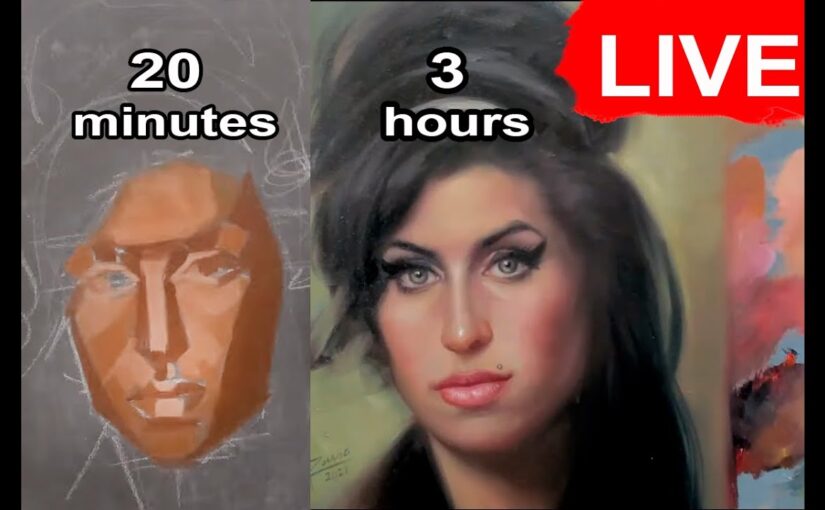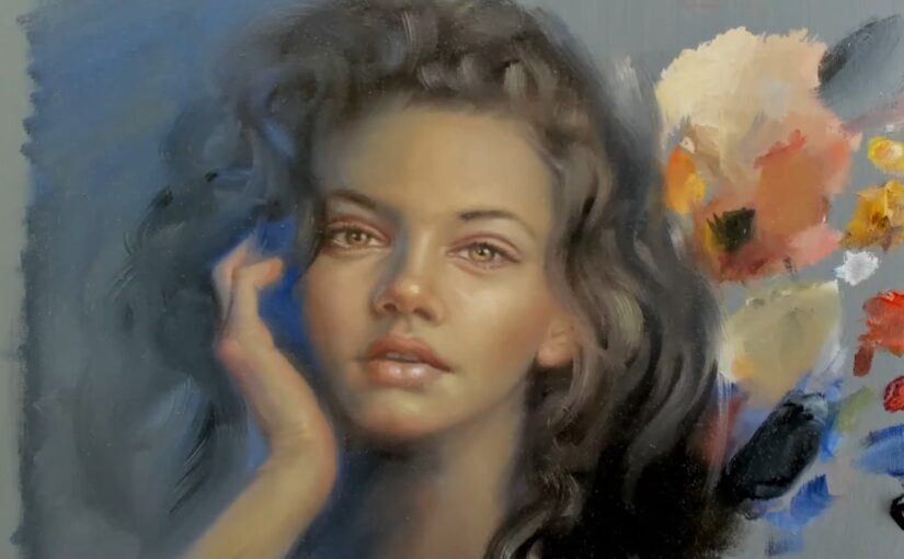
Portrait painting is more than just capturing a likeness; it’s about telling a story through light, color, and emotion. In a recent live stream, I embarked on the journey of painting a portrait of a beautiful woman, and the process was both challenging and deeply rewarding. From selecting the right colors to adjusting proportions and refining details, every step was a lesson in patience, precision, and the art of bringing a face to life on canvas.
The Starting Point: Colors and Composition
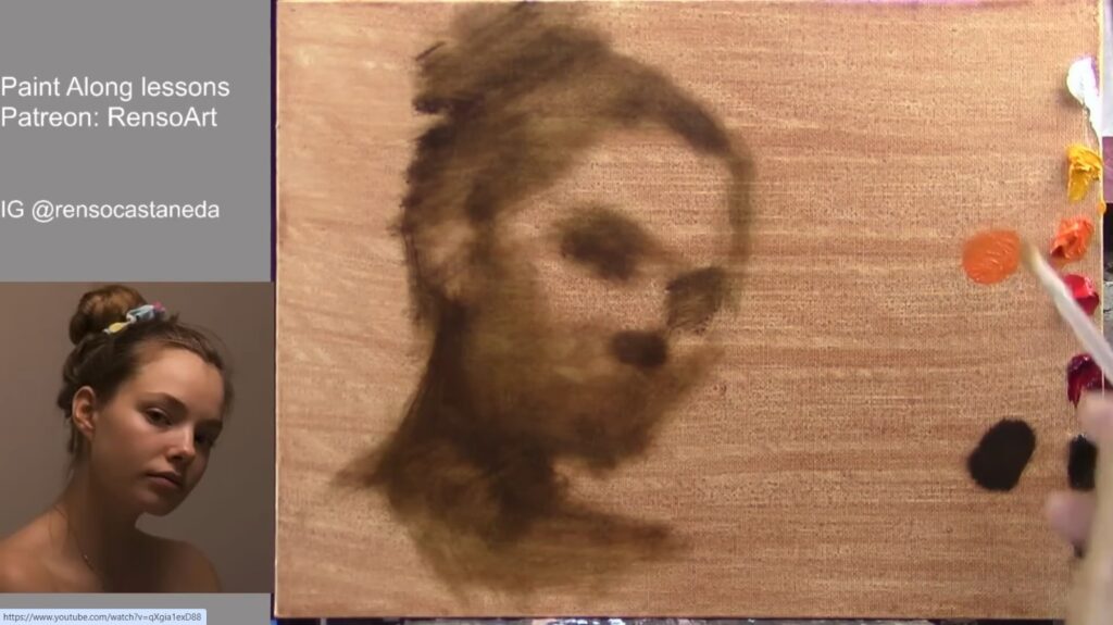
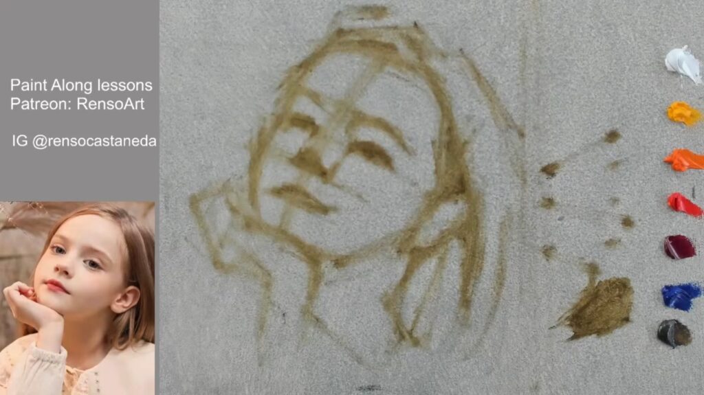
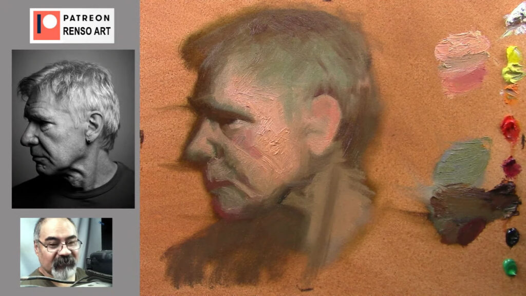
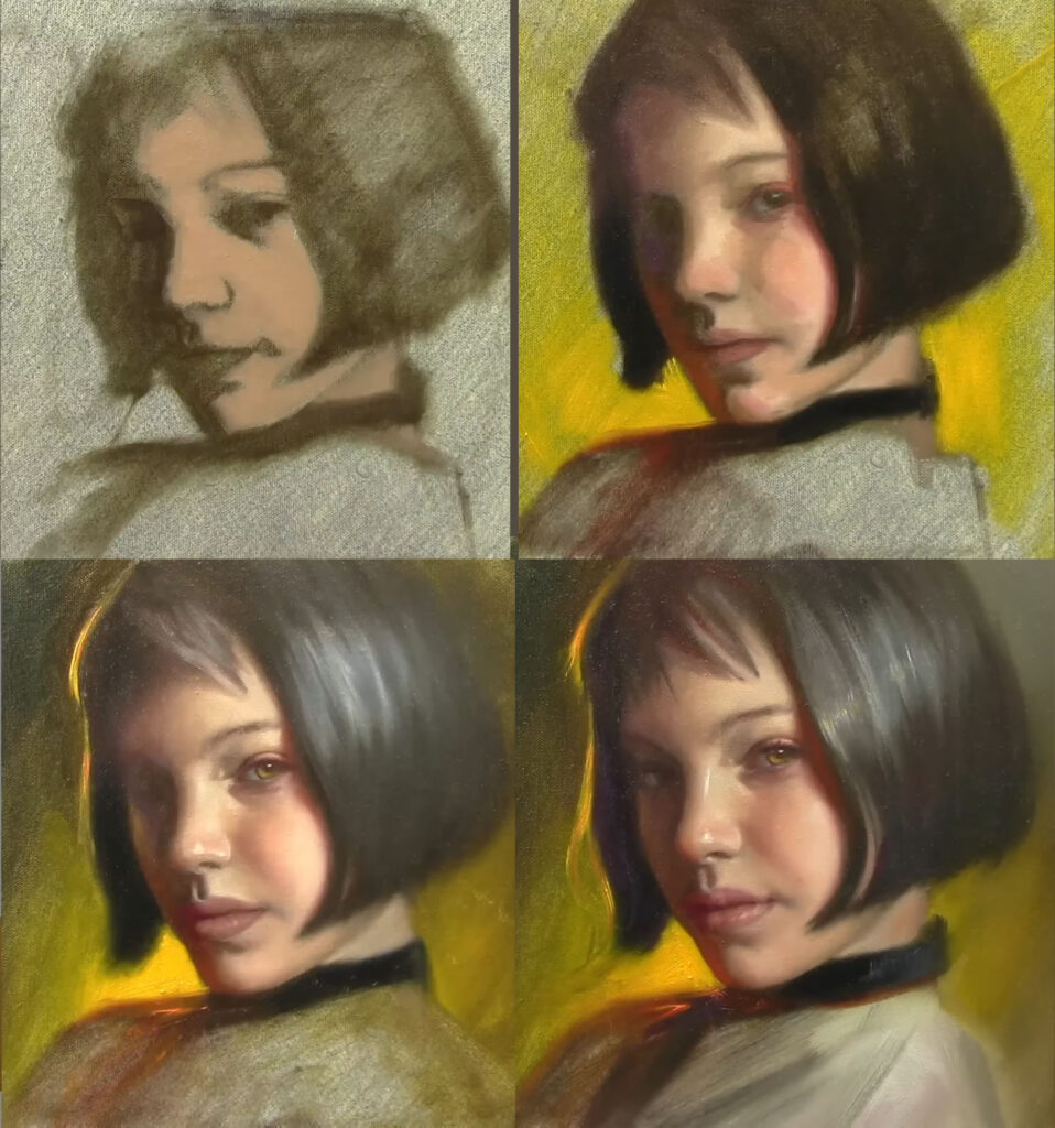
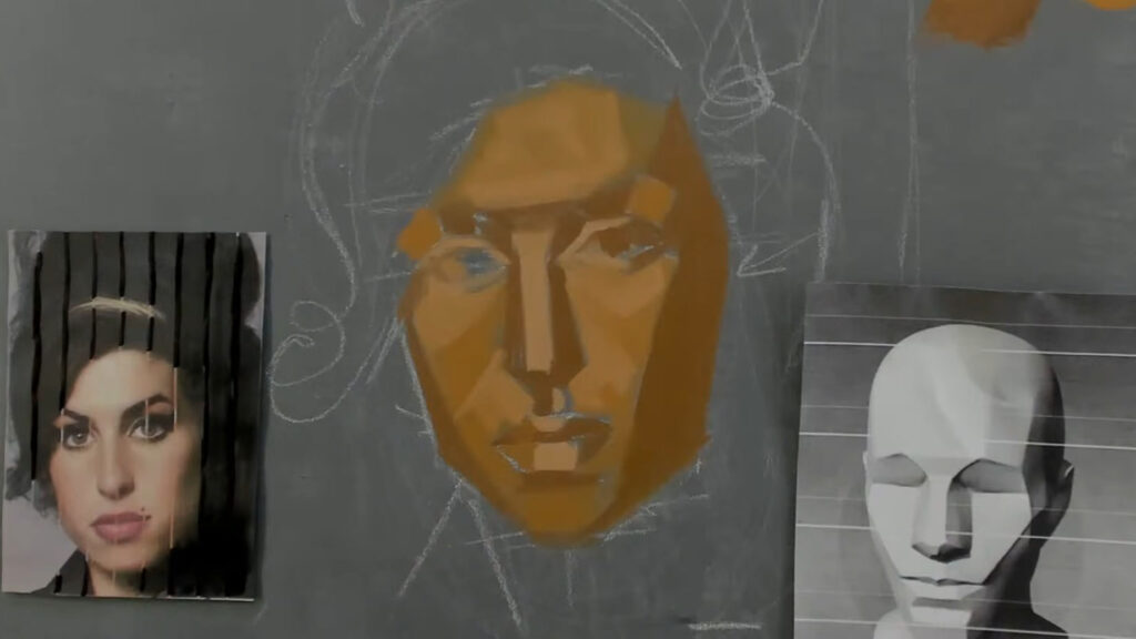
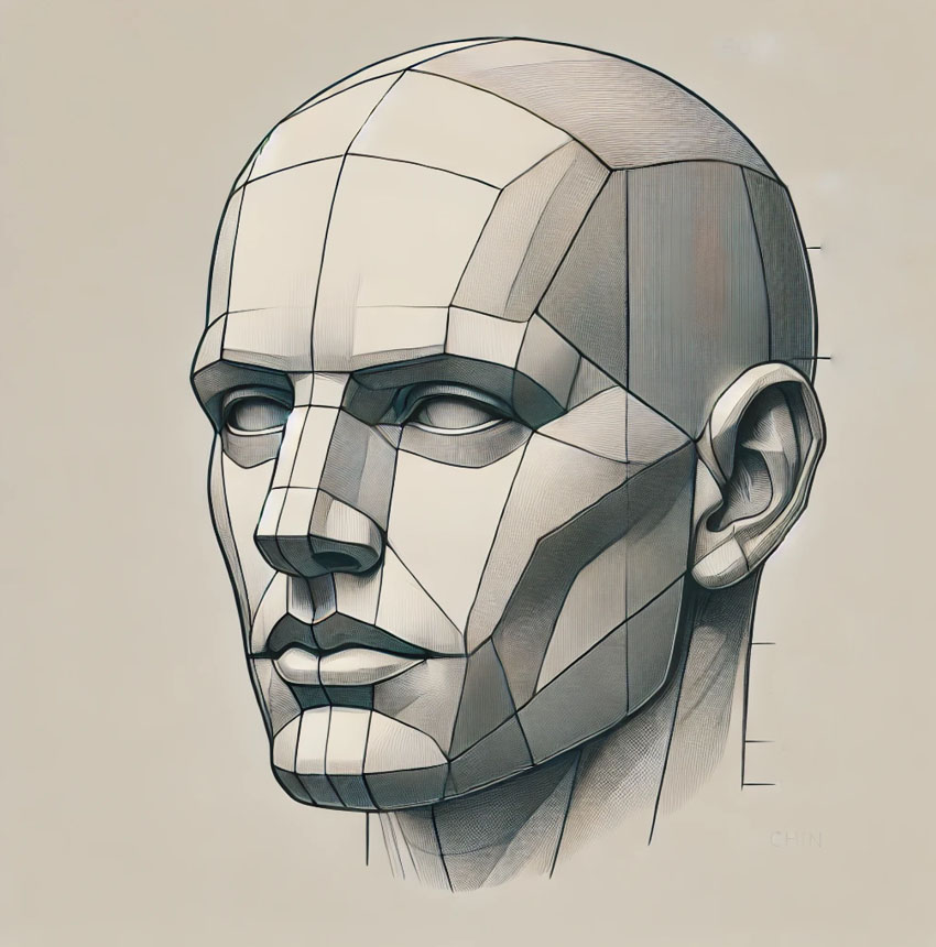
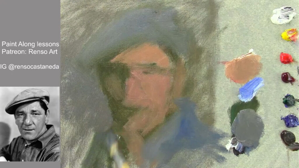
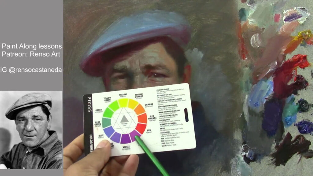
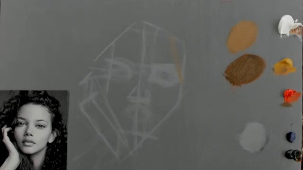
I began by selecting my palette: titanium white, yellow ocher, cadmium red, ultramarine blue, ivory black, cadmium yellow, and alizarin crimson. These colors form the foundation of any portrait, allowing me to create a range of skin tones, shadows, and highlights. The initial sketch was simple—just an oval shape to map out the head and a few lines to establish the basic proportions. This stage is crucial because it sets the groundwork for the entire painting.
Using a synthetic brush number 10, I mixed a light gray with a touch of linseed oil and turpentine to create a smooth base for the drawing. The goal was to simplify the shapes and focus on the overall structure of the face and hand, which were central to the composition.
The Process: Building Layers and Adjusting Proportions
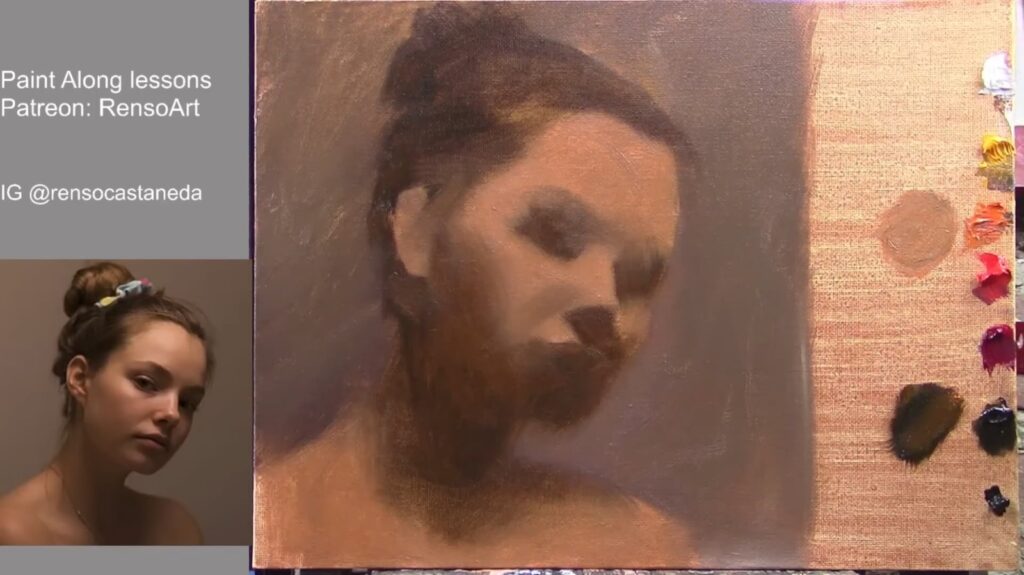
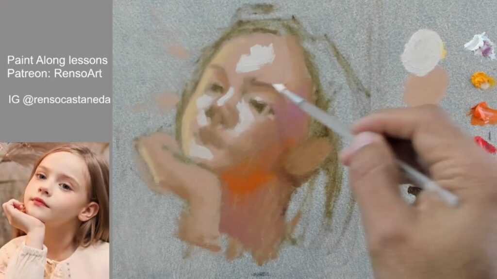
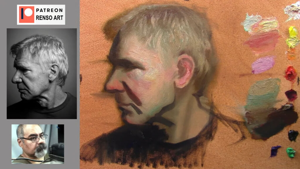
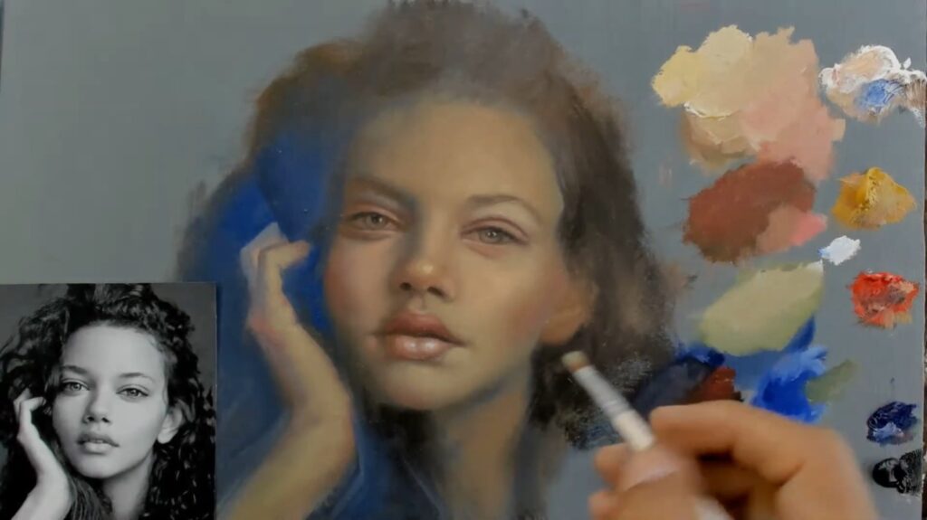
Portrait painting is a constant dance between accuracy and artistry. As I progressed, I noticed that some areas needed adjustment. The eyes, for example, are one of the most striking features of any portrait, and getting their placement right is essential. I used a combination of brushes to achieve the right texture, switching between a round brush for detail work and a softer brush for blending.
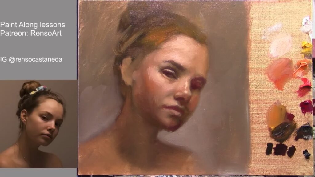
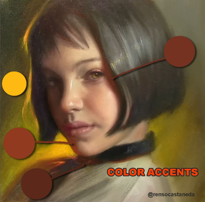
One of the most important aspects of portrait painting is understanding how light interacts with the subject. In this case, the light was coming from the left, casting soft shadows on the right side of the face. I focused on creating smooth transitions between light and shadow to mimic the natural glow of the skin.

The Details: Bringing the Portrait to Life
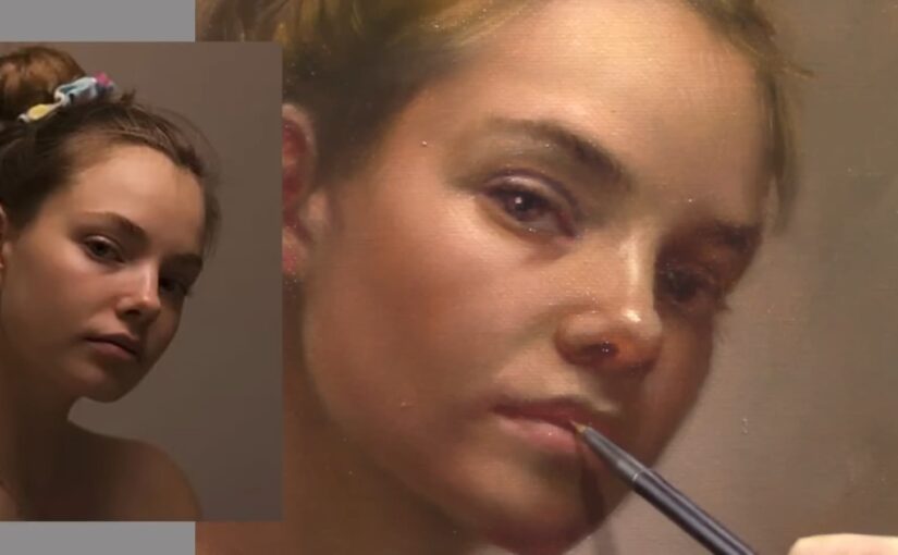
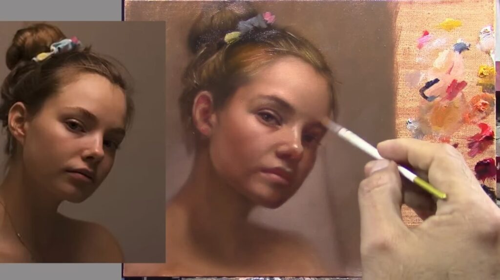
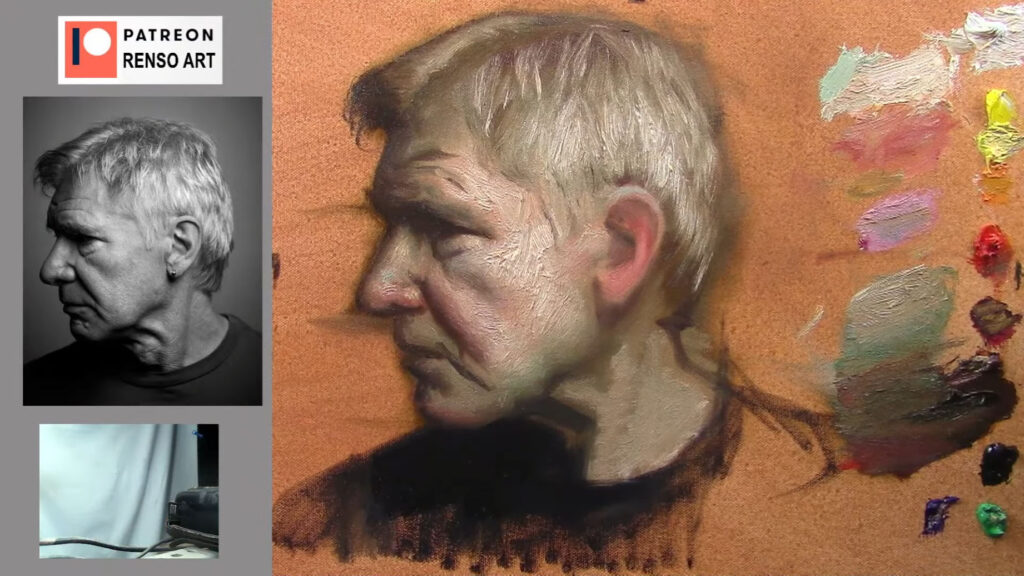
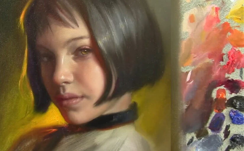
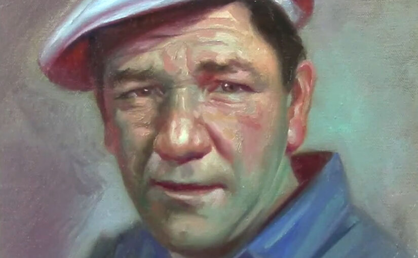
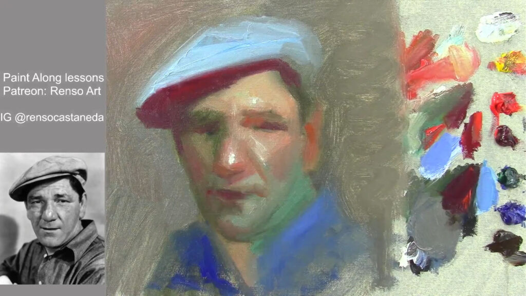
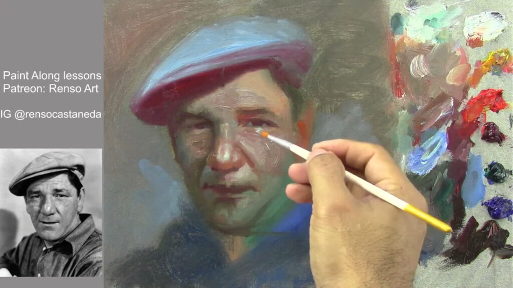
As the painting began to take shape, I focused on the finer details—the eyes, nose, and mouth. These features are the focal points of any portrait, and getting them right is essential. I used a small liner brush to define the eyes, carefully painting the iris and adding highlights to give them a lifelike sparkle. The lips required a delicate touch, with subtle shifts in color to capture their softness and shape.
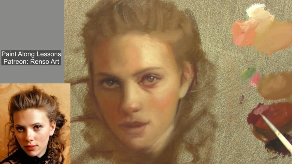
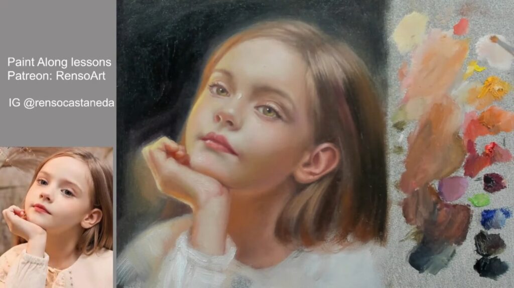
One of the most rewarding parts of the process was painting the hair. I used a combination of raw umber and alizarin crimson to create depth and texture. The flow of the hair added a sense of movement to the portrait, making it feel more dynamic and alive.

The Final Touches: Refining and Reflecting
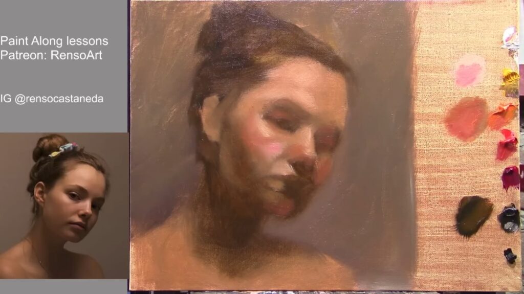
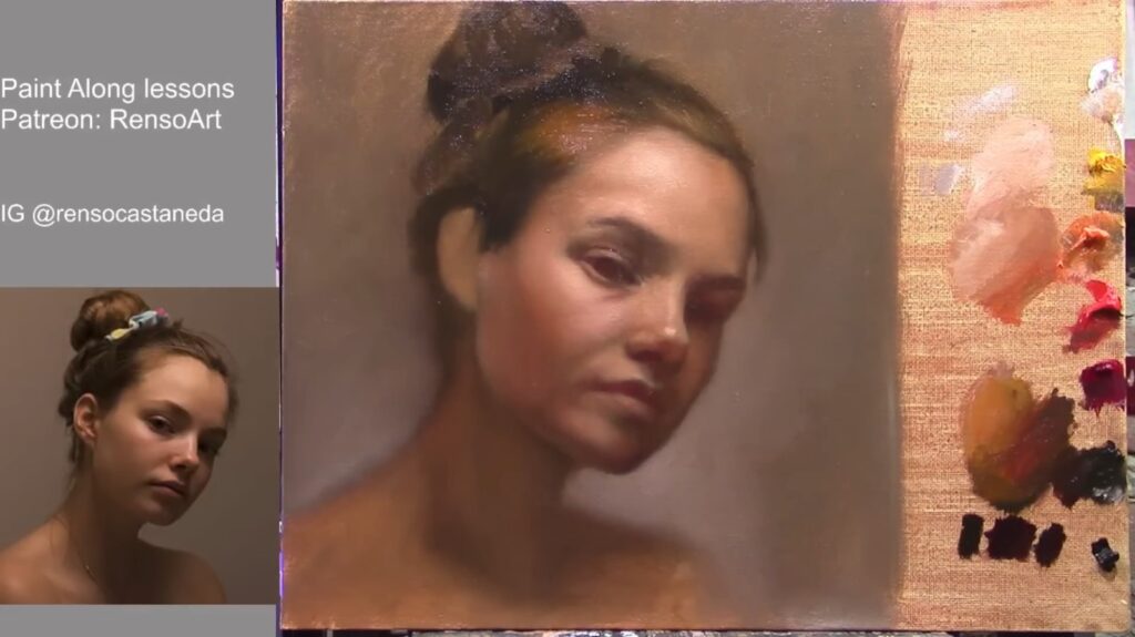
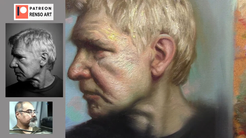
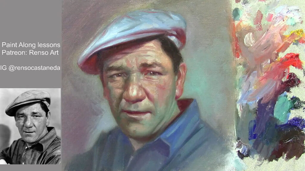
As I neared the end of the painting, I stepped back to assess the overall composition. I made a few final adjustments, darkening some areas to increase contrast and adding highlights to bring out the lightest parts of the face. I also softened some edges to create a more natural look, ensuring that the transitions between light and shadow were smooth and seamless.
Throughout the process, I was reminded of the importance of patience and persistence. Portrait painting is not about achieving perfection in one stroke; it’s about building up layers, making adjustments, and refining the details until the portrait comes to life. It’s a journey that requires both technical skill and a deep connection to the subject.

Conclusion: The Beauty of the Process
In the end, the portrait was a reflection of not just the photograph, but also the time, effort, and emotion I poured into it. The softness of the skin, the warmth of the colors, and the gentle expression all came together to create a piece that felt alive.
Painting a portrait is more than just a technical exercise—it’s a way of connecting with the subject, of capturing their essence on canvas. It’s a process that requires both skill and intuition, and it’s one that I find endlessly rewarding.
If you’re interested in watching the full process, you can check out the live stream on my YouTube channel. And if you’re inspired to try portrait painting yourself, remember to be patient, trust the process, and most importantly, enjoy the journey.
Q&A Section
Q: From Michonne – Do you always sketch before painting?
A: Yes, I usually start with a rough sketch to establish proportions. It helps me map out the face and ensure everything is in the right place before adding color.
Q: From Nikki – How do you decide where to place highlights?
A: I look at the light source in the reference photo. For this portrait, the light was coming from the left, so I added highlights on the left side of the face, nose, and lips to create a natural glow.
Q: From Manuel – Do you use black in your mixtures?
A: I do, but sparingly. Black can be too strong and can dull colors if overused. I often mix it with other colors to create deeper, richer shadows without losing vibrancy.
Q: From Jay Kishan – How many brushes do you use in a session?
A: I typically use around 8-10 brushes, depending on the level of detail. I have a mix of round brushes for details and softer brushes for blending.
Q: From Christine – How do you keep your brushes clean?
A: I clean them regularly with a paper towel or cloth. For frayed brushes, I repurpose them for blending, as they work great for creating soft transitions.

Thank you for joining me on this artistic adventure. Until next time, keep creating and exploring the beauty of art.