Blog

From Flat Shapes to Form: Building a Portrait Step by Step

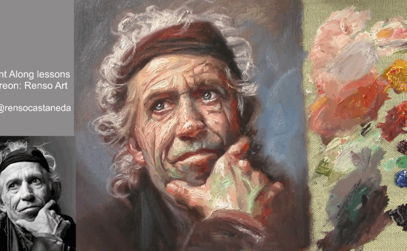
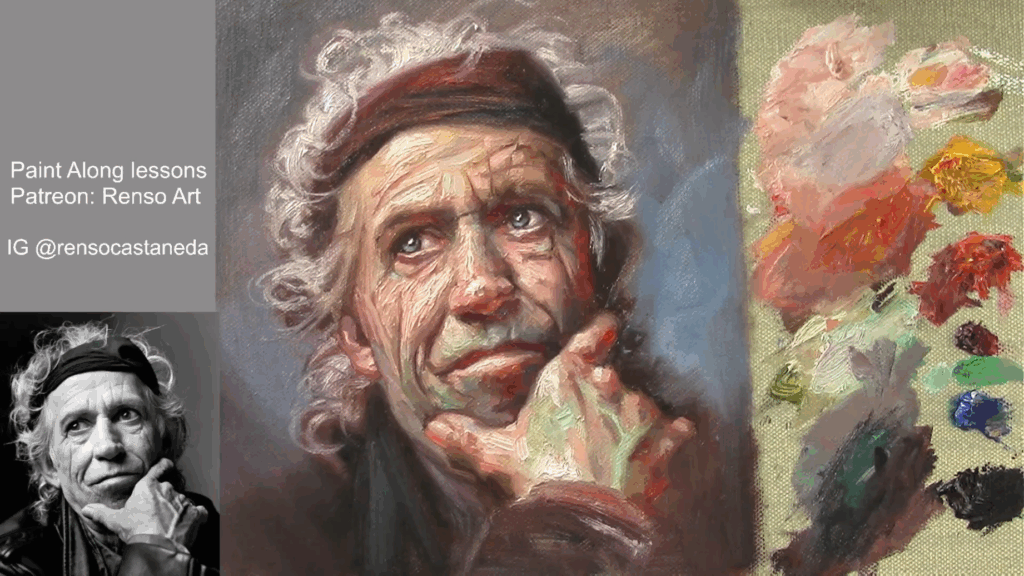
It took me a lot of time to understand that I did not needto paint details, I always expend a lot of time painting the eyes aoutlinining the eyelids, the result a cartonish portrait, but that did not stop to try again and again, and the result was worseI heard my teaches saying so many times, less is more but I did not get it it did not make sense for me, how less details would be more on a portrait.

I learnd more from my friends from the ones that listening the teachers and apply this rule less is more, I rem,ember specially ne of my friends, how his portraits looks so natural from a distance, so real and when I got closer to analize details, there was not details, from that day I understood that should see a painting a s a awhole a unity, not agroup of detailed eyes , nose and mouth is was another story try to get that degree of simplifications and softness, I ceated a bad habit trying to copy every single thing now I had to change this habit and everything started with big shapes, ignoring small parts, ignoring otulining the the eyes and more.

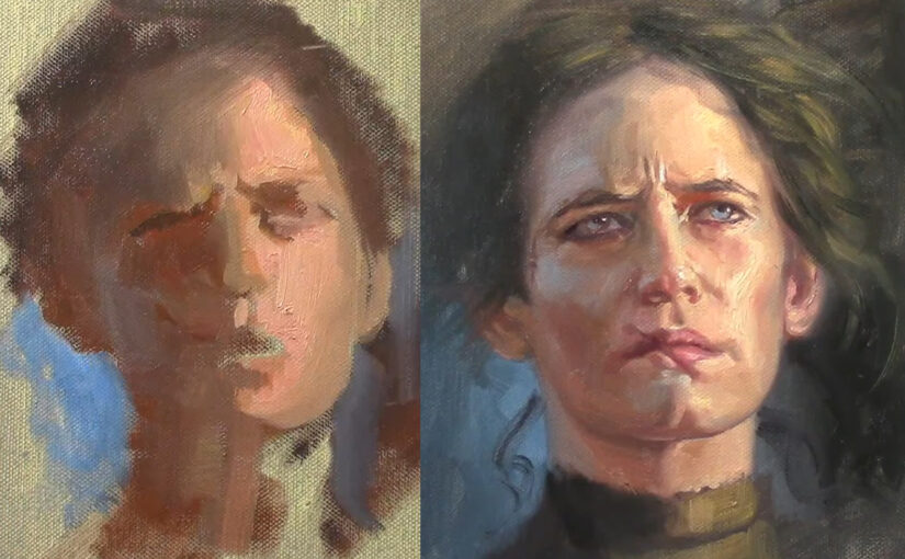
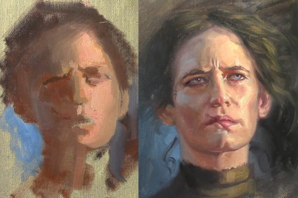
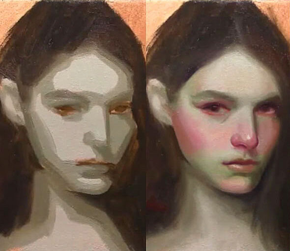
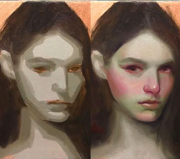
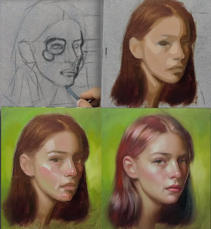
When painting a face, it’s tempting to chase the details too early—eyes, lips, little highlights. But the secret to a strong, lifelike portrait lies in how you begin. Starting with flat shapes and blocking in major values creates clarity, structure, and momentum. Only later do we move into form, blending, and more refined color. This step-by-step approach doesn’t just make portraits easier—it makes them better.

1. Why Flat Shapes First?

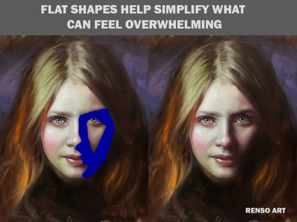
Blocking in the face with flat shapes is like setting the stage before the actors arrive. You’re laying down the big ideas: where the light falls, where the shadows sit, and how the head is turned in space.

Flat shapes help simplify what can feel overwhelming. Instead of trying to paint a “nose,” you paint a dark triangle. Instead of painting an “eye socket,” you drop in a midtone mass. These shapes establish a visual map. They remove the emotional pressure to get things “just right” too soon—and allow you to see your painting as a whole.

2. Keeping Values Clean and Simple

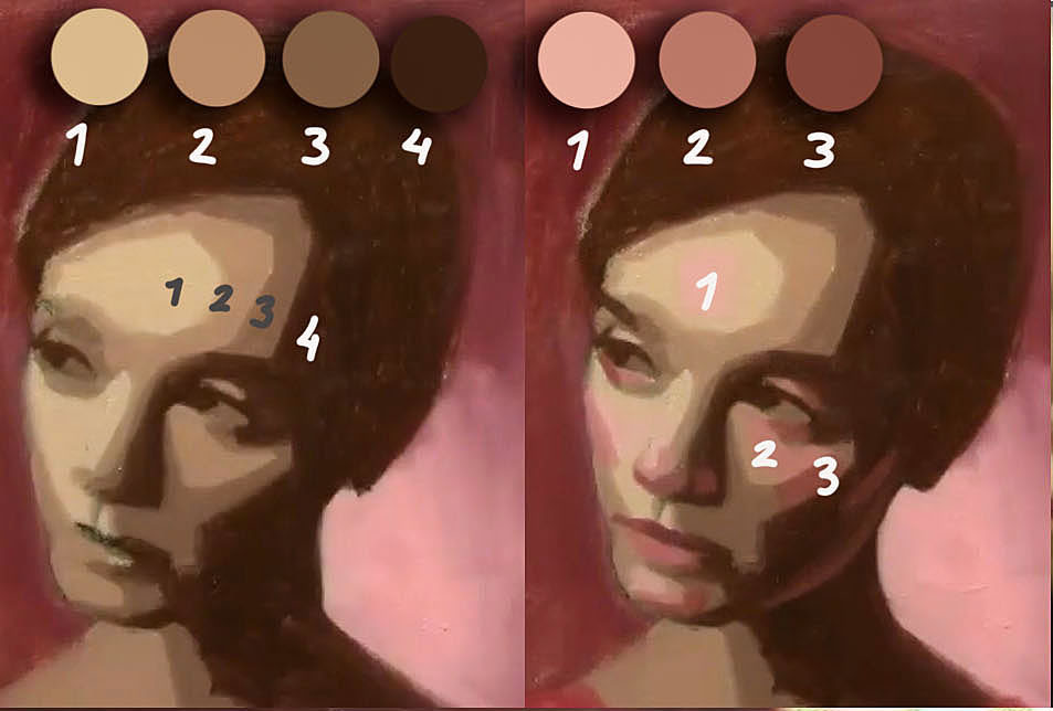
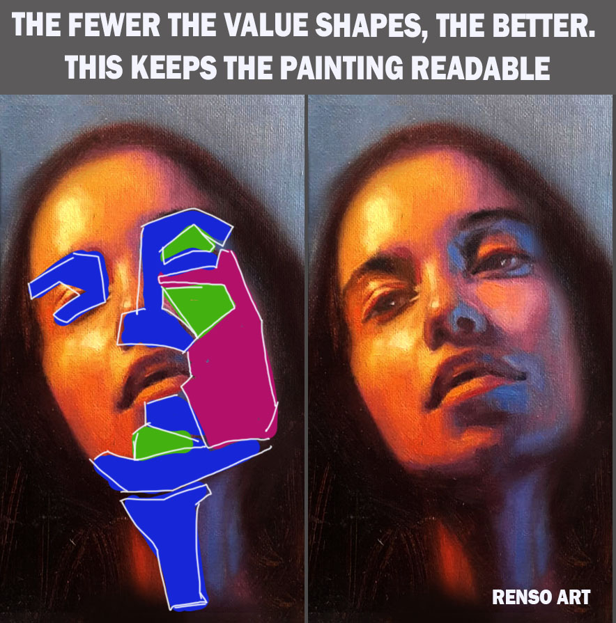
At this stage, you’re not blending. You’re being bold and decisive. Think of it like cutting pieces of colored paper to build a collage. The forehead might be one tone. The cheek, a slightly darker one. The shadow under the nose? A solid, deep value. The fewer the value shapes, the better. This keeps the painting readable, even from across the room.

This is also the best time to adjust proportions. It’s much easier to shift a big shape than to fix a fully rendered eye that’s half an inch too low.

3. Transitioning Into Form

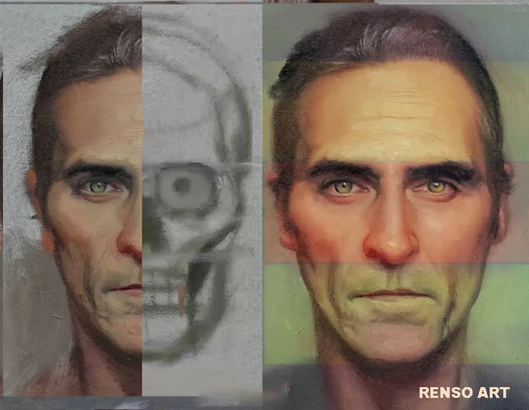
Once your flat shapes are in place and you feel confident in the structure, you can begin to blend. Now is when you shift gears—from graphic design to sculpture. You smooth the transitions between values to suggest roundness. You start seeing the cheekbone turn, the forehead curve, the nose project, for this part you need anatomy knowledge and know how to render primary forms (sphere)

This is where form begins to emerge. Suddenly, that flat color patch becomes a face with dimension.

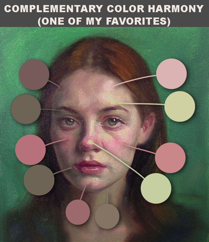
4. Introducing Subtle Color Variations

As you move into the blending and modeling phase, you can also introduce more color. Early on, you may have blocked in a simplified, warm tone for the light areas and a cooler tone for the shadows. Now, you can start letting small shifts in hue breathe life into the skin. Maybe the cheeks lean pink. The forehead picks up a golden note. The jaw cools into greenish tones.

Don’t think of these as decoration—they’re part of how form is communicated. The way skin catches light depends on temperature, not just value.

5. Patience, Rhythm, and Control

By separating the painting into phases—flat shapes first, blending second—you give yourself control. You also give your eye time to understand the face. You’re not rushing. You’re building.

This method gives your painting a rhythm. Each phase has a purpose. Each decision builds on the last.


Final Thoughts

Painting a face isn’t about chasing realism immediately. It’s about building structure first, then letting it evolve. Blocking in with flat shapes gives you clarity. Blending into form gives you life. And adding subtle color brings soul.

Whether you’re working in oil, acrylic, or digital media, this process—flat to form—is a timeless way to paint portraits with confidence and character.

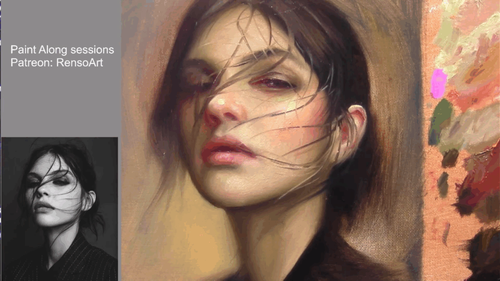
Why Painting from a Black-and-White Reference is a Powerful Exercise for Artists

I painted most of the time from color photos or a live model. But as a teacher, I started to think: what would be the best way to remove the idea that color is more important than values? How could students better understand how light behaves and creates form?

This reflection came from listening to many beginners who came to my classes and were always asking how to match colors. That was all they cared about. The truth is, if you match colors correctly, you’re also matching values — but doing both at the same time is very difficult.

That’s why many teachers separate value from color. When students focus on values first, they start to see real improvement. And once they’ve mastered that, they become much better at mixing color too.

Working from a black-and-white (B&W) reference is a highly effective exercise that strengthens an artist’s ability to perceive and replicate values, improves observational skills, and builds a solid foundation for more advanced techniques.

Link to full video: https://www.youtube.com/live/9QXBP0SYxS8

1. Mastering Values: The Backbone of Realism

Values—the spectrum of lightness and darkness in an image—are fundamental to creating the illusion of depth and three-dimensionality. When painting from a B&W reference, you eliminate the distraction of color, forcing yourself to focus solely on tonal relationships. This helps you:

  • Distinguish subtle shifts in contrast that define form.
  • Avoid over-relying on color to create depth (a common mistake among beginners).
  • Develop a stronger sense of light logic—how highlights, midtones, and shadows interact.

Many great classical artists, such as Rembrandt and Caravaggio, used strong value structures to achieve dramatic realism. By practicing in grayscale, you train your eye to see like they did.

Link to full video: https://www.youtube.com/live/Jt0QoDY9SSY

2. Simplifying Composition and Form

Color can sometimes obscure the underlying structure of a subject. A B&W reference strips away hues, making it easier to analyze:

  • Shapes and Silhouettes – Without color, you see the purest form of an object’s outline.
  • Focal Points – High-contrast areas naturally draw the eye, helping you understand visual hierarchy.
  • Edges and Transitions – Soft vs. hard edges become more apparent, improving your rendering techniques.

This simplification is especially useful for portrait artists, as facial features rely heavily on accurate value transitions rather than just skin tones.

Painting a Portrait with Renso Art

Link to full video: https://www.youtube.com/live/uz4toKd09MM

3. Enhancing Color Application Later

Once you’ve trained your eye to see values correctly, adding color becomes much more intuitive. Many artists struggle with muddy or flat paintings because they haven’t established a strong value structure first. By practicing in black and white:

  • You learn how colors behave in terms of lightness/darkness (e.g., yellow is naturally lighter than purple).
  • Mixing colors becomes easier because you understand their value relationships.
  • You avoid the pitfall of relying on hue shifts instead of value contrast for dimension.

Digital artists, in particular, can benefit from starting a painting in grayscale before adding color layers—a technique known as “value blocking.”

4. Improving Observational Skills

Since our brains are wired to prioritize color, removing it forces you to look more carefully at:

  • Subtle gradients (e.g., how a shadow transitions smoothly into a midtone).
  • Texture and detail (e.g., how different materials reflect light differently, even in B&W).
  • Negative space (e.g., how the background interacts with the subject).

This heightened observation translates into all areas of art, from still life to landscapes.

Link to full video: https://youtube.com/live/08iolV2ZcYw

5. Versatility Across Mediums and Styles

Whether you work in oils, watercolor, charcoal, or digital art, value studies are universally applicable. Even abstract and stylized artists benefit from understanding core value relationships. Additionally:

  • Traditional artists can use B&W studies as underpaintings (grisaille technique).
  • Concept artists use grayscale thumbnails to quickly establish lighting and composition.
  • Animators and illustrators rely on clear value separation for readability.

How to Practice Effectively

To get the most out of this exercise:

  1. Start with high-contrast references (e.g., chiaroscuro lighting) before moving to subtle gradations.
  2. Limit your palette—try using just black, white, and one or two grays to force decision-making.
  3. Compare your work to the reference by squinting or flipping the image upside down to spot errors.
  4. Transition to color gradually—apply what you’ve learned by glazing color over a monochrome base.

Conclusion

Painting from black-and-white references is one of the most effective ways to sharpen your artistic eye. It builds a critical foundation in value control, composition, and form—skills that directly improve your ability to work with color later. Incorporating grayscale studies into your practice will lead to more confident, dynamic, and realistic artwork.

So next time you pick up a brush or stylus, try starting in black and white—you might be surprised at how much it improves your art!


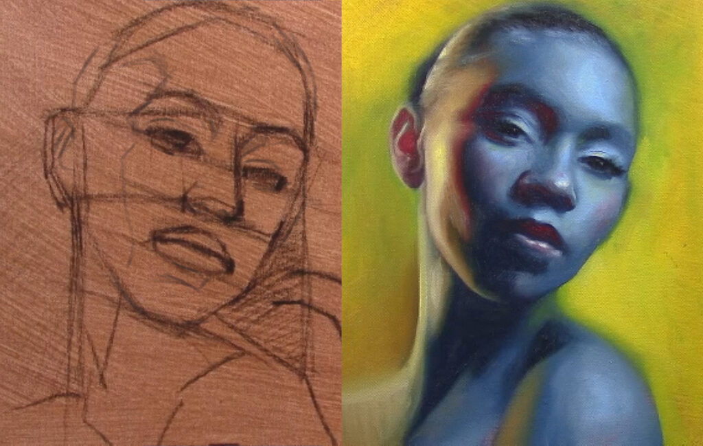
Two Roads to a Portrait: Linear vs. Sculptural Approaches to Painting

Every artist has a way of seeing. And how we see directly shapes how we paint. Some artists begin with careful outlines, building a painting like a drawing brought to life. Others start with masses and values, shaping the face as if carving it out of clay. These are the linear and sculptural approaches to painting—and understanding the difference can dramatically shift your process and results.

Let’s look at what defines each method, their strengths, and how they can work together.


1. The Linear Approach: Drawing First

The linear approach starts with drawing—clear contours, careful placement, and strong edges. It’s about line and design. Think of Renaissance drawings or academic figure studies where every edge is defined before the painting begins.

In a linear process:

  • The artist often begins with a detailed sketch.
  • Emphasis is placed on accurate proportions and clean outlines.
  • Painting becomes a process of “coloring in” the drawing, often staying within pre-drawn borders.
  • Form is revealed through controlled shading and modeling.

This approach is especially useful when precision is critical—such as in commissions or likeness-driven portraits. It offers clarity and structure, making it easier to correct mistakes early on.

Strengths of the linear method:

  • Strong control over proportions and likeness.
  • Excellent for beginners who need to train their eye.
  • Useful in tightly rendered, classical realism.

2. The Sculptural Approach: Mass First

The sculptural approach thinks less about edges and more about volume. It’s as if the artist is molding the face out of paint, starting with broad tonal shapes rather than detailed lines.

In a sculptural process:

  • You block in big value masses right away—light vs. dark.
  • Drawing happens within the painting, guided by the flow of light.
  • Edges may remain soft and organic early on.
  • The form emerges through modeling, not outline.

This is the approach you often see in painters like Sargent or Zorn—where the illusion of form and life seems to rise out of loose, confident brushwork.

Strengths of the sculptural method:

  • Promotes seeing the subject as a three-dimensional form.
  • Encourages expressive brushwork and painterly surfaces.
  • Great for quick studies and alla prima (wet-into-wet) painting.

3. When to Use Each Approach

You don’t have to choose just one method forever. In fact, many artists blend the two.

  • Use linear thinking when you want control—early in the piece, or when proportions really matter.
  • Use sculptural thinking when you want life and movement—especially in light, shadow, and edges.

For example, you might begin with a loose, sculptural block-in, then overlay linear drawing to tighten the eyes and features. Or start with a clean linear sketch, then break out of it with juicy sculptural strokes in the cheeks and hair.


4. Which One Is Right for You?

If you’re a more analytical thinker, you may gravitate toward the linear approach. If you’re more intuitive or tactile, the sculptural method may feel more natural.

But the truth is: mastering both gives you freedom. It’s like being bilingual in the language of painting. You can switch modes depending on the subject, mood, or even your energy that day.


Final Thoughts

Painting is never one-size-fits-all. Whether you build your portrait like a cathedral (linear) or carve it like marble (sculptural), both methods are valid and powerful.

Try both. Explore. Observe which feels more natural—and which challenges you in good ways. Often, your best work comes from the dance between line and mass, between structure and gesture.

In the end, it’s not about choosing sides. It’s about expanding your tools so that your painting becomes not just a picture, but a conversation between what you see and how you feel.

The Zygomatic Bone: How the Cheekbone Shapes Light, Form, and Expression in Portrait Painting

I’ve always cared about studying anatomy, but I realized I learned even more when I started teaching at the art school ESFA San Pedro de Cajas(2018). Watching students struggle with understanding facial planes made me see things from a new angle. Many of them found it difficult to grasp how light transitions into shadow—from the cheek area down to the jawline. One bone is largely responsible for this shift: the zygomatic bone.

To help them understand it better, I began to structure some of our drawing sessions around comparing the zygomatic bone to the planar head. This helped students see how, from this bone outward, the head begins to turn and create volume. It became a powerful way to bridge anatomy and form — not just identifying the bone, but understanding how it shapes the face in space.

the chick bone on the face

🧠 What Is the Zygomatic Bone?

Anatomically, the zygomatic bone is a paired facial bone located on each side of the face. It forms the prominence of the cheek, part of the outer rim of the eye socket, and contributes to the zygomatic arch (the bridge connecting to the temporal bone near the ear).

Its placement forms a bridge between the front and side planes of the face — making it one of the most structurally defining elements in portraiture.


🎨 Why the Zygomatic Bone Matters in Portrait Painting

1. It Separates Key Planes of the Face

One of the most important things for a painter to understand is how planes of the face change direction and catch light differently.

The zygomatic bone acts as a ridge where:

  • The frontal plane of the face (forehead and midface) meets the
  • Lateral plane (side of the head and cheek).

This creates an edge that, even when softened by fat and skin, is almost always visible through shifts in light and tone. It’s this transition that helps define the form — and gives the head its three-dimensionality.

In a well-lit portrait, you’ll often notice:

  • A highlight on the cheekbone,
  • A midtone just above and below it,
  • And a shadow underneath (especially near the masseter muscle and lower cheek).

Understanding and observing this plane break gives your portraits structure and realism — even if you’re painting in a loose or expressive style.

Planes of the face

2. It Helps You Anchor Facial Features

The cheekbone helps establish important proportional relationships:

  • It defines the width of the midface,
  • Helps place the eyes correctly in their sockets,
  • Guides the outward flare of the nostrils, and
  • Acts as a lower border for the orbital cavity.

This makes it an essential landmark, especially when the head is turned or tilted. In three-quarter or profile views, the zygomatic arch becomes even more visually prominent, casting subtle shadows and catching light that help you define volume.


3. It Adds Personality and Likeness

No two cheekbones are alike. The shape, height, and projection of the zygomatic bone are essential parts of what makes a face look youthful, aged, masculine, feminine, or ethnically distinct.

For example:

  • High, prominent zygomatic bones are often seen in fashion or idealized portraits.
  • Softer or lower cheekbones may appear more subtle or rounded, especially in fuller faces.
  • Age affects the volume of the soft tissue around the cheekbone, altering its visibility and form.

By observing and carefully rendering the unique contour of the cheekbone, you capture a vital part of the subject’s identity.


4. It Influences Expression Through Musculature

The zygomatic bone is not just a sculptural landmark — it’s also a foundation for expression. Two major muscles responsible for smiling and facial emotion attach directly to it:

  • Zygomaticus major
  • Zygomaticus minor

When someone smiles, these muscles pull the corners of the mouth upward and outward, emphasizing the cheekbone’s form. Even in a neutral expression, the pull of these muscles and their placement can affect how shadows form across the face.


🛠️ Practical Tips for Painters

Observe Planes and Transitions

Use lighting setups that emphasize form — like a 45° angle light source or Rembrandt lighting — to study how the cheekbone divides the face into planes. Squint your eyes to simplify values and notice how the light changes across the zygomatic ridge.

Study the Skull

Spend time sketching or sculpting the skull, especially the zygomatic area. You’ll begin to see through the skin when painting real faces, giving you more control and believability in your work.

Use the Loomis Method or Reilly Rhythms

Both Loomis and Reilly methods emphasize the zygomatic arch as a structural marker when constructing the head. In Loomis’s method, the side plane of the head starts just where the cheekbone turns away. In Reilly’s rhythms, the flow lines pass over the cheekbone, linking it visually to the nose and mouth.

Keep It Subtle in Soft Faces

In younger or fuller faces, the zygomatic bone may not be sharply visible — but it still affects how light and shadow behave. Even the hint of a plane change can anchor the structure of your portrait.


🎯 Final Thoughts

The zygomatic bone is far more than just a cheekbone — it’s a key to unlocking facial structure, capturing light accurately, and portraying the unique character of your subject.

By understanding its form, position, and function, you can breathe life into your portraits and elevate your work from flat to fully dimensional. Whether you’re painting in oils, sketching in graphite, or sculpting digitally, the zygomatic bone is one of your most trusted anatomical allies.


Seeing the Skull in Planes – My First Anatomy Class

I still remember my very first anatomy class — not because it was technical or intimidating, but because it opened my eyes in a way that changed how I saw every face after that.

On the table in front of us were two objects: a human skull, and a planar head sculpture — the one used in classical drawing classes to simplify the face into basic geometric forms. At first, they looked like opposites. One was organic, bony, a symbol of mortality. The other was simplified, almost robotic, made up of planes and angles like a blocky mask.

planar face

But then the instructor asked us to do something: “Look for the similarities, not the differences.”

And suddenly, it clicked.

The zygomatic bone — the cheekbone — became the flat triangular plane under the eye socket. The brow ridge formed a hard, sloped plane that transitioned into the forehead. Even the jawline, which I always thought of as round and curved, revealed a set of angular planes that echoed the structure beneath the skin.

I just painted the upper image on a livestream on YouTube, you can watch it here

That class taught me that anatomy isn’t just about memorizing bones or muscle names (but tried anyway). It’s about seeing structure, understanding how form turns in space, and realizing that every great portrait is built on what’s underneath.

skull anatomy

To this day, whenever I paint a portrait, I think back to that skull and that blocky sculpture. And I try to find the balance — the harmony between the reality of bone and the abstraction of planes and practice drawing the planar portrait.

That’s where portraiture lives.

I use this website to see a skull in 3d

Mastering Facial Structure for Oil Painters: Planes, Anatomy, and the Art of Realism

In my second year at the School of Fine Arts, we started focusing on portraits — drawing them at night, painting in the mornings, and studying anatomy in the afternoons. It was all synchronized to help us get the most out of our training.

I remember trying to memorize every bone and muscle in the face. Don’t do that — I wasted so much time. I wish I had spent that time drawing the bones and muscles instead of trying to recall their names, which I still don’t remember.

Don’t worry about understanding the bone or muscle structure at first — just draw them.
The more you draw the skull, the more you’ll begin to see the bone structure beneath the skin. Drawing is like reading: the more you revisit the same book, the more you understand and remember.

Capturing the human face is one of the most challenging — and rewarding — artistic pursuits.

To achieve true realism—or even expressive stylization—you must understand both the geometric planes of the face it means simplified the face into planes and the underlying anatomy that shapes them.

Visit: https://www.rensoart.com/mastering-planes-of-the-face-a-complete-guide-to-painting-portraits-with-depth/


Part 1: The Planes of the Face – Simplifying Complexity

Before diving into anatomy, painters must first grasp the major planes that define facial structure. These planes act as a roadmap for light and shadow, helping artists render form convincingly.

Key Facial Planes in Oil Painting

  1. Forehead Plane – A broad, slightly rounded surface that transitions into the temples. The supraorbital ridge (brow bone) marks a subtle shift in plane.
  2. Orbital Planes (Eye Sockets) – Deep-set, concave areas that influence how light wraps around the eyes.
  3. Nasal Planes – The nose is not a single shape but a series of angular shifts:
  • The bridge (frontal plane)
  • The sides (descending into the cheeks)
  • The tip and nostrils (with subtle curvature)
  1. Zygomatic (Cheekbone) Planes – The most prominent forward-facing planes, affecting how light catches the face.
  2. Maxillary & Mandibular Planes – The upper and lower jaw define the structure around the mouth and chin.
  3. Chin Plane – A protruding form with subtle curves, often overlooked in beginner studies.

Painter’s Tip: When blocking in a portrait, start by massing in these planes with a mid-tone underpainting (such as burnt umber or raw umber). This establishes the foundational light logic before adding color.


Part 2: The Anatomy Beneath – Why It Matters for Oil Painters

The planes don’t exist in isolation—they are shaped by bones, muscles, and fat. Understanding these structures allows for more convincing rendering, especially in subtle transitions and aging faces.

1. Bony Landmarks Every Painter Should Know

  • Frontal Bone – Dictates forehead curvature.
  • Zygomatic Arch – The cheekbone’s prominence affects the face’s width and light reflection.
  • Nasal Bones – Determine the nose’s angle and bridge structure.
  • Maxilla (Upper Jaw) – Supports the nasal base and upper teeth.
  • Mandible (Lower Jaw) – Defines the chin and jawline sharpness.

Painter’s Insight: In older faces, bone resorption (loss of bone mass) causes the jawline to recede, altering the planes dramatically.

2. Muscles That Shape Expression & Form

Facial muscles stretch, compress, and fold the skin, creating dynamic forms. Key muscles for painters:

  • Orbicularis Oculi – Wraps around the eyes, creating folds in laughter or squinting.
  • Zygomaticus Major & Minor – Pull the mouth into a smile, stretching the cheeks.
  • Corrugator Supercilii – Creates frown lines between the brows.
  • Masseter – A thick muscle that bulges when clenching the jaw.
  • Mentalis – Puckers the chin (seen in doubt or tension).

Painter’s Tip: When painting expressions, observe how muscles pull the skin and create shadows (e.g., nasolabial folds in a smile).

3. Fat Pads & How They Affect Light

Fat distribution varies by age, gender, and genetics, influencing softness and shadow:

  • Buccal Fat Pad – Gives youthful roundness to cheeks.
  • Nasolabial Fat – Creates the “smile lines” that deepen with age.
  • Submental Fat – Softens the jawline (important for rendering realism in portraits).

Painter’s Insight: In older faces, fat loss leads to hollower cheeks and sharper transitions between planes.


Part 3: Applying Planes & Anatomy in Oil Painting

Step 1: Structural Sketching (Grisaille or Imprimatura)

  • Start with a toned ground (e.g., a warm gray or burnt sienna wash).
  • Use a brush or charcoal to map the skull structure before adding planes.
  • Indicate major shadow blocks where planes turn away from light.

Step 2: Blocking in Planes with Limited Palette

  • Use a monochromatic underpainting (raw umber + white) to establish values.
  • Keep edges softer in fleshy areas (cheeks, lips) and sharper on bone (brow, jawline).

Step 3: Layering Flesh Tones with Anatomical Awareness

  • Youthful Skin: Subtle transitions, softer edges, warmer highlights.
  • Aged Skin: More pronounced planes, sharper shadows, cooler undertones in recesses.
  • Gender Differences: Male faces often have more angular planes, while female faces retain softer fat distribution.

Step 4: Final Refinement – Bringing Life to the Portrait

  • Add subsurface scattering (thin layers of translucent reds/ochres) for realistic skin.
  • Use broken color (impasto in highlights, glazes in shadows) for depth.
  • Sharpest details (eyes, lips) should align with anatomical landmarks.

Conclusion: The Painter’s Journey into Facial Mastery

Great portraitists—from Rembrandt to Sargent—knew that light follows anatomy. By studying both the planes and the structures beneath, oil painters can move beyond superficial representation into true realism and expressive depth.

Want to go further?

  • Practice skull studies to internalize bone structure.
  • Paint age progressions to see how planes shift over time.
  • Experiment with different lighting (Rembrandt, split, butterfly) to see how planes react.

Now, pick up your brushes—your next portrait awaits!


Understanding the Color Planes of the Face

Bring depth, light, and life to your portraits through color awareness.

I remember my first portraits were pretty light. Even though I liked some of them, the reason they didn’t feel complete was that they lacked contrast, my shadows weren’t dark enough, and the colors were too muted. I can’t blame my teachers, though; I clearly remember one of them repeating over and over where to place the colors on the face. But back then, my main goal was to capture the likeness and include as many details as possible.

Here’s my advice: don’t repeat my mistakes. Make sure your shadows are dark enough, and don’t be afraid to add more color to the face. Why are we so hesitant? In my case, I was afraid of making the shadows too dark or the colors too bright—I didn’t want the painting to look like a clown. But the sooner you embrace that challenge, the faster you’ll improve.

One essential concept in portrait painting is understanding the color planes of the face: how light interacts with the form, and how subtle color shifts define structure, mood, and realism.


color planes of the face

🎨 What Are Color Planes?

The human face isn’t flat. It’s made of angled surfaces (planes) that catch light differently depending on their direction. Each of these planes reflects light—and thus color—uniquely. By recognizing and painting these variations, you can create a more believable, dimensional face rather than a flat or overly blended one.


🔺 Key Facial Planes and Their Color Tendencies

  1. Frontal Planes (Forehead, Cheeks, Chin)
    These areas often face the light directly and tend to reflect cooler and lighter tones, especially in natural light. You’ll often see a mix of soft pinks, peach, and neutral skin tones here.
  2. Side Planes (Temples, Sides of the Nose, Jaw)
    These turn away from the light and fall into shadow. Shadows on skin often contain cooler, desaturated versions of the skin tone—think mauves, blues, and soft grays.
  3. Midtones (Transitional Planes)
    Between light and shadow, you’ll find subtle shifts: warm ochres, muted oranges, and browns. This is where artists often lose structure—learning to preserve these transitions is key to painting believable portraits.
  4. Planes with More Blood Flow (Nose, Cheeks, Ears)
    These areas are usually warmer and redder. Blood vessels closer to the surface add a rosy tone, especially in fairer skin.
  5. Planes Affected by Bone or Cartilage (Brow Ridge, Jawline, Nose Bridge)
    These may appear slightly cooler or have a greenish or bluish undertone, especially in thinner skin types or under cooler lighting.

color planes of the face

🌈 The “Zonal Color Theory” in Portraiture

Many traditional painters—like John Singer Sargent and Anders Zorn—understood that different zones of the face carry different dominant color temperatures:

  • Forehead → Yellowish (due to bone and thin skin)
  • Cheeks and Nose → Reddish (due to blood flow)
  • Chin and Jaw → Cooler or more bluish (due to shadow and beard area in men)

This approach, sometimes referred to as “zonal color theory,” helps create vibrant yet believable skin tones.

color planes of the face

🖌️ Painting Tip: Don’t Blend Too Much

A common beginner mistake is over-blending the face, which erases the subtle changes between planes and flattens the form. Try blocking in colors with distinct edges first, then softly transition only where needed. The structure of the face is often lost in the blending—not the drawing.


👁️ Train Your Eye

Learning to see the planes of the face takes time. Try studying portrait sculptures or doing monochromatic studies (in one color) to focus only on value and form before reintroducing color. Over time, you’ll notice how light shapes the face through color, not just value.

Image suggestion: A simplified 3D model of the head with labeled planes and color zones.

Final Thoughts

Understanding and applying the color planes of the face will transform your portraits from flat to full of life. Light, form, and color all work together to create the illusion of depth. As you practice, you’ll begin to see the face not just as a collection of features, but as a landscape of subtle color and form.


Want to practice color planes with guided feedback? Join my next portrait painting session where we break down the head step-by-step. [Learn more →


Facial Highlights and Bone Structure: A Guide for Artists

Understanding how light interacts with the bone structure of the face is essential for any artist aiming to create realistic, dimensional portraits, knowing where to place highlights can dramatically enhance the lifelike quality of your work.

In this article, we’ll explore the key areas of the face where highlights naturally appear due to the underlying bones—and why they matter.


Highlights and Bone Structure of the face

Why Bone Structure Matters in Portrait Lighting

Light doesn’t fall evenly across the face. It catches on the protruding parts of the skull, such as the brow ridge, cheekbones, and the bridge of the nose, creating areas of brightness—or highlights.

These highlights aren’t just decorative—they help describe form, suggest volume, and guide the viewer’s attention.

If you place highlights based only on instinct or guesswork, your portrait might look flat or “off.” But when you understand the structure beneath the skin, your lighting becomes more believable—even stylized art gains depth.


10 Key Facial Highlight Areas (Due to Bone Structure)

Here’s a breakdown of where highlights tend to appear most naturally:

1. Forehead (Frontal Bone)

The upper center of the forehead catches light easily, especially under overhead lighting. This area is typically broad and slightly curved, making it a natural reflector.

2. Brow Ridge (Supraorbital Ridge)

Just above the eyes, this bony ridge creates a subtle shelf. It catches light from above and defines the top of the eye socket.

3. Bridge of the Nose (Nasal Bone)

This slender ridge is often the brightest point in portrait lighting, particularly in front or 3/4 views.

4. Cheekbones (Zygomatic Arch)

One of the most prominent facial structures. Highlights here define facial width and contour. The exact placement varies depending on lighting direction and facial angle.

5. Tip of the Nose

Though cartilage-based, the tip reflects light strongly. A small, sharp highlight here can suggest skin texture and shine.

6. Cupid’s Bow & Upper Lip (Philtrum)

The curve of the upper lip, especially the cupid’s bow, often reflects light subtly—especially when the skin is slightly moist or under soft lighting.

7. Chin (Mental Protuberance)

Depending on chin shape and the light source, this can be a strong or subtle highlight. It often helps balance the light hitting the forehead.

8. Jawline

Though not always directly highlighted, the jawline reflects light differently depending on the head’s tilt. It’s especially visible in profile or under-rim lighting.

9. Above the Eyelids (Orbital Rim)

This area softly reflects light, helping to shape the eyes and give them dimension.

10. Sides of the Face (Temporal Region)

If the light source is from the side or above, this area can pick up a gentle gradient highlight—important for framing the face.

Highlights and Bone Structure of the face

Tips for Painting Highlights Naturally

  • Soften edges: Highlights are rarely sharp. Unless you’re painting a moist or oily surface, keep transitions smooth and gradual.
  • Avoid white: Pure white can flatten your highlights. Try using a slightly warmer or cooler tone to keep them integrated into the skin.
  • Consider the light source: A single strong source (like sunlight) creates more defined highlights. Diffused or ambient light softens them.
  • Use subtle shifts: Sometimes, less is more. A slight change in value can suggest structure just as effectively as a bright highlight.

Practice and Observation Are Key

The best way to master facial highlights is through practice and keen observation. Study real faces under different lighting conditions. Paint from life or use references with clear directional light.

Understanding how bone structure affects highlights will give your portraits more realism, drama, and presence.


Final Thoughts

Great portraiture isn’t just about capturing a likeness—it’s about bringing structure to life through light. Once you start seeing the face as a landscape of planes and angles, your approach to highlights will never be the same.

Keep painting. Keep observing. And don’t be afraid of a little shine.


The Warm Glow of Light Through Skin: Understanding Subsurface Scattering in Art

Have you ever noticed how, on a sunny day, the edges of your fingers glow with a warm red or orange hue when you hold your hand up to the light? Or how a portrait seems more lifelike when the ears or nostrils show a subtle flush of warmth? This visual effect isn’t imagination—it’s a natural phenomenon called subsurface scattering, and it plays a powerful role in bringing realism and warmth to your artwork.

In this article, we’ll explore what subsurface scattering is, how it appears in real life, and how you can capture it effectively in your paintings or drawings.


Subsurface Scattering in Art

What Is Subsurface Scattering?

Subsurface scattering happens when light penetrates the surface of a translucent material—like human skin—bounces around beneath the surface, and then exits at a different point. As the light travels inside the skin, it interacts with blood, tissue, and fat, which tint it with warm colors such as red, orange, and pink.

Unlike opaque surfaces where light reflects directly, subsurface scattering gives skin a soft, glowing quality, particularly in strong lighting conditions. This glow is most visible when light shines through parts of the body, rather than directly onto them.


When and Where You’ll See It

You’re most likely to notice this effect under direct sunlight or a strong backlight. Some common areas where this warm glow appears include:

  • Fingertips and hands (when held against the sun)
  • Ears, especially the outer edge (helix)
  • Nostrils and the tip of the nose
  • Cheek edges and jawline
  • Toes and knees (in strong lighting)

These are all areas where the skin is thinner and where light can pass through more easily. In some cases, even candlelight or a soft lamp can produce a similar—though subtler—effect.

Jpeg

Why It Matters in Art

Capturing subsurface scattering in your artwork can transform a flat or lifeless figure into something vibrant and believable. It’s a small detail that signals warmth, life, and natural light interaction—especially important in portraits, figure studies, and scenes set outdoors.

Without it, your subjects may appear cold or artificial. With it, even stylized work can evoke a stronger emotional response and a greater sense of presence.


How to Paint or Draw Subsurface Scattering

Here are a few practical tips to incorporate this effect into your art:

1. Observe Real Life and References

Look at how the light glows through ears, fingers, and other translucent areas. Use reference photos taken in natural sunlight or backlit conditions to study the color temperature and intensity.

Subsurface Scattering in Art

2. Use Warm Tones—But Not Just Red

The glow isn’t pure red—it often includes oranges, pinks, and even a touch of yellow, depending on the skin tone and light source. Blend carefully into surrounding skin to avoid a “stuck-on” look.

3. Paint Soft Transitions

The glow should fade gently into the surrounding skin. Avoid harsh edges unless the lighting is extremely dramatic. Soft brushes or glazing techniques work well in digital and traditional media.

4. Balance With Cooler Shadows

To make the warm glow stand out, balance it with cooler tones in the shaded areas—like bluish or purplish undertones. This contrast adds depth and realism.

5. Use It Sparingly

A little goes a long way. Only highlight the areas where light naturally passes through. Overusing this effect can make skin look too artificial or rubbery.


Final Thoughts

Subsurface scattering might sound technical, but it’s a visual experience we all recognize intuitively. As artists, learning to observe and replicate it thoughtfully adds subtle beauty and realism to our work. Whether you’re painting in oils, drawing with colored pencils, or using digital tools, this warm glow can be the missing piece that makes your figures feel alive.

Next time you’re sketching in the sun—or just studying your hand against the light—take a moment to notice that soft, fiery edge. It’s a small detail with a big impact.


The Power of Complementary Contrast in Portraits

🎨 The Power of Complementary Contrast in Portrait Painting

In the school of art we had painting classes which were sync with color theory classes, it was pretty good to apply what you learned in Color into oil painting, understanding complementary colors in portrait painting can be a game-changer. be patient and apply this knowledge step by step, try first with desaturated colors and move on to saturated colors painting after painting, it worked for me I hope it works for you too.

Complementary Contrast

✅ What Are Complementary Colors?

Complementary colors are pairs of colors located opposite each other on the color wheel. Classic examples include:

  • Blue and orange
  • Red and green
  • Yellow and violet

When used together, these pairs create strong visual contrast and naturally draw the viewer’s attention — a powerful effect in portrait painting.

🎨 How to Use Complementary Colors in Portraits

Using complementary contrast doesn’t mean bold, clashing colors. It’s about applying them intentionally and harmoniously to enhance your subject. Here are a few ways to apply color contrast in portraits:

  • Skin tones vs. background: Warm skin tones (peach, rose, or terracotta) stand out beautifully against a cool background like teal or muted green.
  • Eyes and clothing: Highlight green eyes with hints of red in the background or use a violet blouse to make golden skin glow.
  • Light and shadow: Use warm and cool opposites to model form — for example, warm light with cooler, complementary shadows.
  • Mood and expression: Complementary contrasts can also create emotional tension or harmony depending on how you balance them.

🖌️ Why Complementary Contrast Matters

Complementary contrast in portrait painting helps:

  • Emphasize the focal point (usually the face or eyes)
  • Add energy and balance to your composition
  • Create depth without relying solely on value shifts
  • Make the portrait feel more lifelike and luminous

Using complementary colors effectively gives your painting a professional and dynamic quality that stands out — both on the wall and online.

Complementary Contrast

💡 Practical Tip for Artists

When starting your next portrait, choose one dominant color (like warm browns or cool blues), and then introduce its complementary color subtly in the background, clothing, or reflected light. Even a small amount can create a powerful effect.


📈 Final Thoughts on Color Contrast in Portraits

Whether you’re painting realistic portraits or stylized ones, learning how to use complementary colors in portrait painting helps you guide the viewer’s eye, enhance the subject’s features, and add emotional impact.

Explore your color wheel, test combinations, and most importantly — have fun experimenting with color contrast in your art!