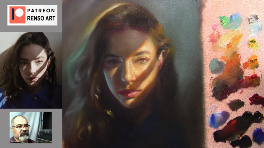
Struggling with your portraits? You might find my E-book helpful. Click here
Portrait painting is a delicate balance of observation, technique, and patience. In this article, I’ll walk you through my process of creating a portrait, sharing key insights and practical tips that can help art students and portrait enthusiasts refine their skills. Whether you’re just starting out or looking to improve, these lessons will guide you in capturing the essence of your subject.
1. Starting with the Basics: Simplifying Complex Forms
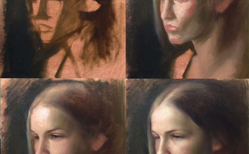
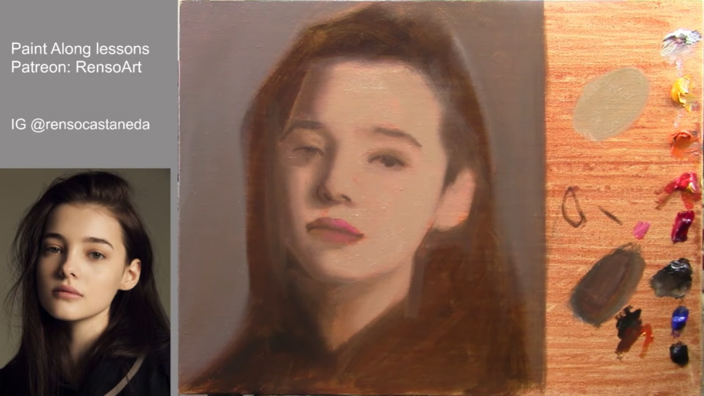
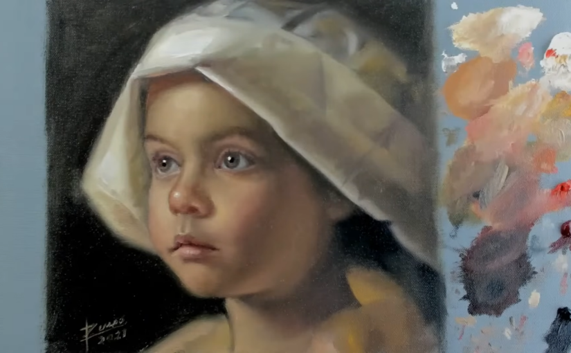
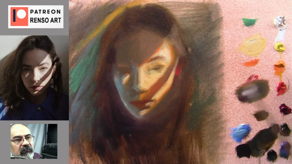
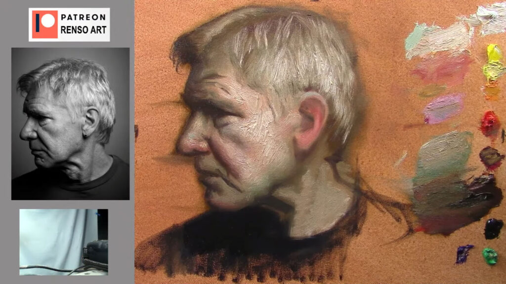
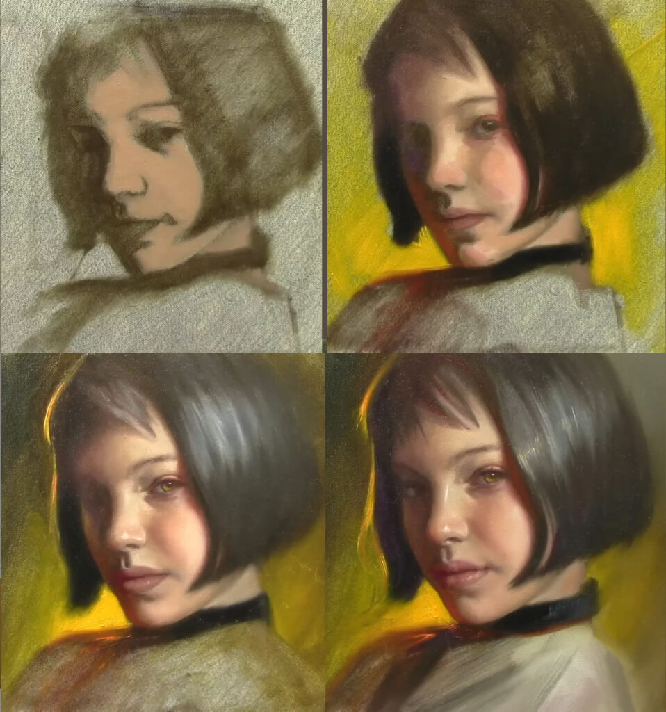
Every portrait begins with a blank canvas and a vision. To tackle the complexity of the human face, I start by breaking it down into simple shapes. For this portrait, I began by sketching the forehead as a triangle. This approach helps establish proportions and placement before diving into details.
When painting a baby, I pay close attention to unique facial proportions—eyes are lower, and the head is larger relative to the face. Measuring carefully and using my brush as a guide ensures the center line is balanced. These foundational details are crucial for creating a lifelike portrait.
2. The Power of Squinting: Seeing Values and Shapes
Throughout the process, I squint my eyes—a habit I’ve developed to simplify what I see. Squinting helps me focus on values and shapes, stripping away unnecessary details. It’s a trick I highly recommend to students. By training your eye to see the big picture first, you can avoid getting lost in the minutiae.
For example, when painting the baby’s face, I squinted to identify the lightest highlights and darkest shadows. This allowed me to create a sense of volume and roundness, essential for bringing the portrait to life.
3. The Classical Approach: Underpainting and Layering
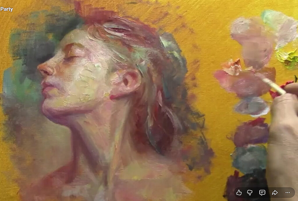
One of my favorite techniques is underpainting with green. This classical method, often used by the Old Masters, creates a luminous base that adds depth to the final piece. As I layered the paint, I aimed for a museum-like quality—soft edges, rich tones, and a timeless feel.
For skin tones, I mixed burnt umber, cadmium red, and yellow, gradually building up the layers. The goal was to achieve a translucent effect, allowing the green undertones to subtly shine through. This technique requires patience and a keen eye for color harmony, but the results are worth it.
4. Refining the Details: Drawing and Painting Simultaneously
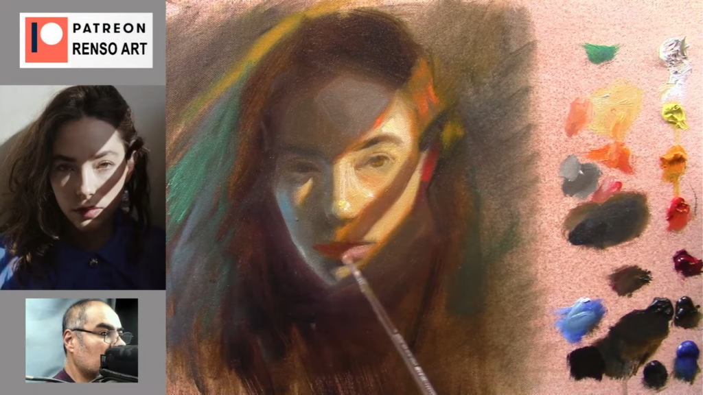
As I progressed, I switched between drawing and painting modes. Using a fine liner brush, I refined the features, paying close attention to the eyes, nose, and mouth. The key is to simplify what you see—focus on shapes and values rather than getting bogged down by details.
For the eyes, I used pure black for the pupils and added subtle highlights to create depth. The nose and mouth were shaped using simple forms, with careful attention to light and shadow. This step-by-step approach ensures accuracy and likeness.
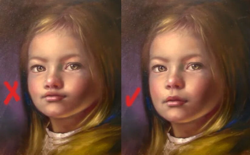
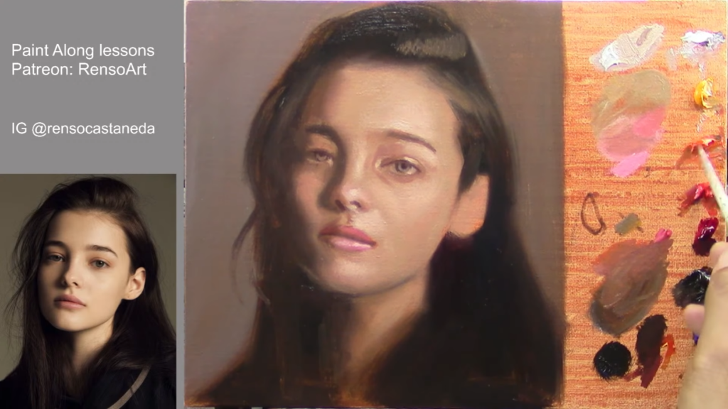
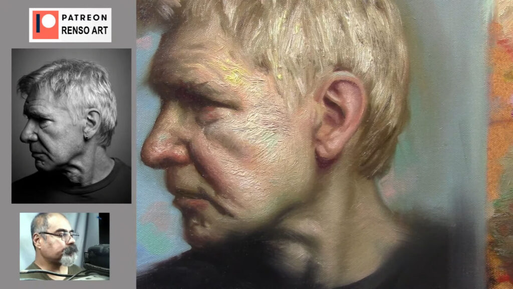
5. The Importance of Softness: Blending and Transitions
Soft edges are crucial for achieving a lifelike appearance. I used a clean brush to blend the colors, creating smooth transitions between light and shadow. This step is especially important for areas like the cheeks and chin, where the skin should appear soft and natural.
I also paid close attention to the lightest highlights, placing them on the tip of the nose and the cheeks. These subtle touches added warmth and dimension to the face. Remember, portrait painting is about balance—knowing when to add detail and when to step back.
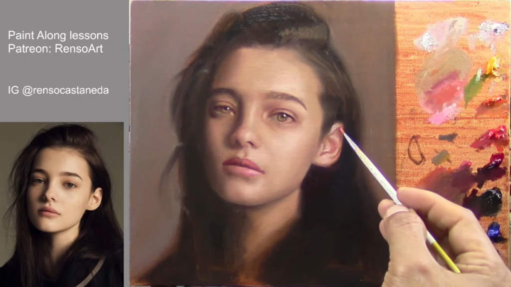
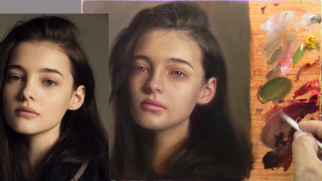
6. Final Touches: Adjusting Values and Perfecting Likeness
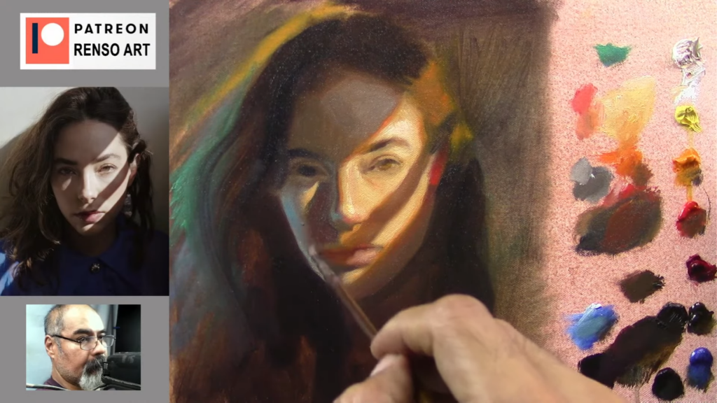
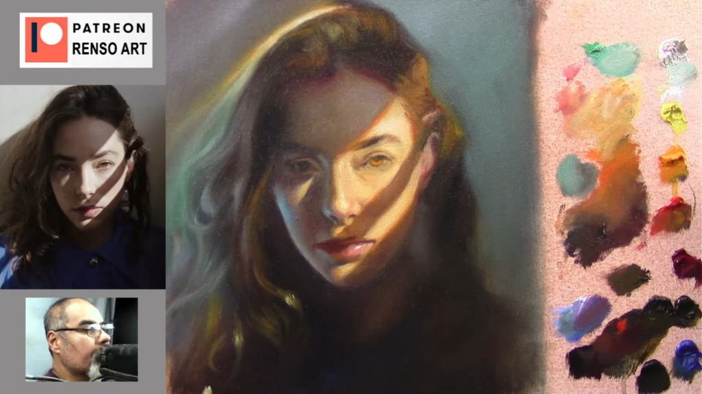
As I neared the end of the painting, I stepped back to assess the overall composition. Using Photoshop, I compared my painting to the reference photo, identifying areas that needed adjustment. Darkening the shadows and adding more light to the highlights helped refine the likeness.
The final touches included softening edges, adding subtle details to the eyes, and adjusting the background to complement the portrait. These small changes made a big difference, bringing the painting to life.
7. Lessons from the Studio: Patience and Practice
Portrait painting is a journey of patience and practice. It’s about embracing the process, learning from mistakes, and continually refining your skills. As I worked on this portrait, I was reminded of the importance of observation, technique, and perseverance.
To all the art students and portrait enthusiasts reading this, I encourage you to keep practicing. Experiment with techniques, learn from your mistakes, and never stop creating. Every brushstroke is a step forward in your artistic journey.
Conclusion: Art as a Journey
Painting is more than just a skill; it’s a way of seeing the world. It’s about finding beauty in the ordinary, turning mistakes into opportunities, and sharing stories through your work. Whether you’re painting a portrait or exploring other subjects, remember that every piece you create is a reflection of your unique perspective.
Keep painting, keep learning, and most importantly, enjoy the process.
Struggling with your portraits? You might find my E-book helpful. Click here
Portrait painting is a journey of observation, technique, and storytelling. As an artist, I’ve spent years honing my craft, learning to capture the essence of a subject through brushstrokes and color. In this article, I’ll share insights from my process, practical tips for aspiring portrait painters, and a few personal stories that remind us why art is as much about the journey as it is about the final piece. Whether you’re an art student or a portrait enthusiast, I hope these lessons inspire you to pick up your brush and create.
Starting with the Basics: Simplifying Complex Forms
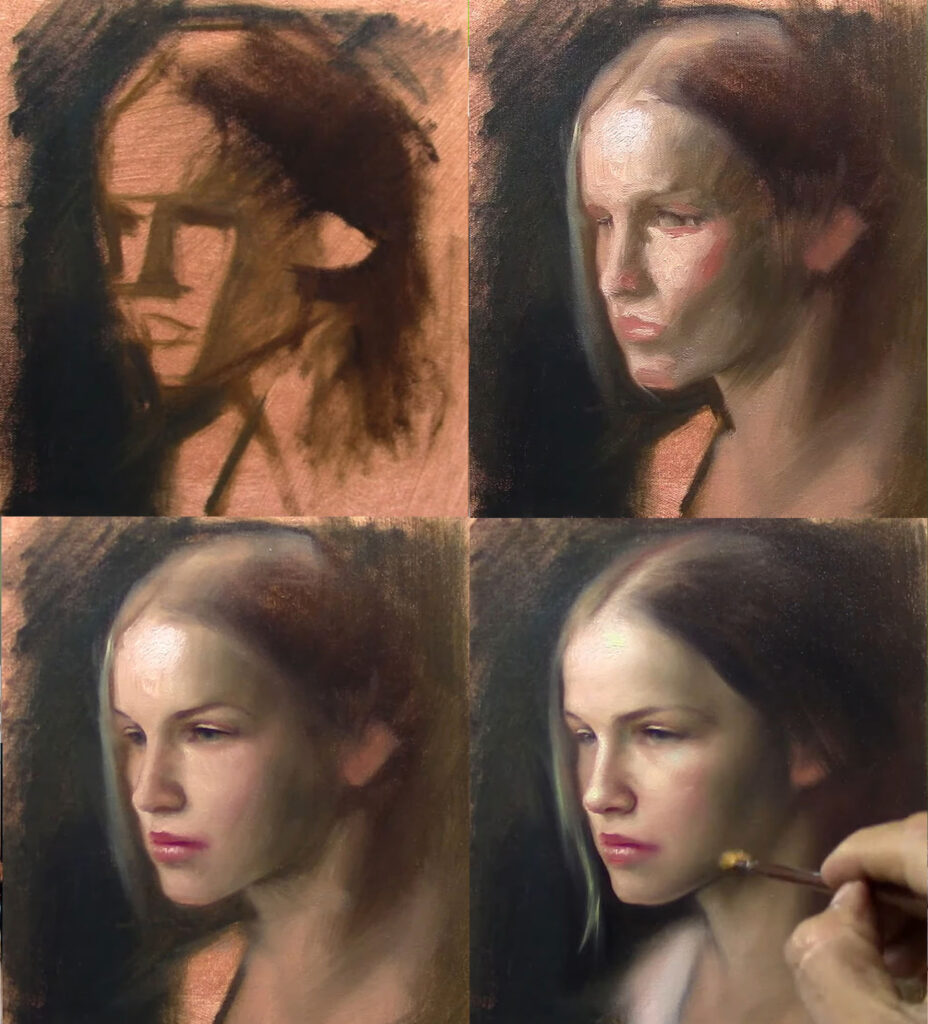
Every portrait begins with a blank canvas and a vision. For me, the key to tackling the complexity of the human face is to break it down into simple shapes. When I started the portrait of a baby featured in this session, I began by sketching the forehead as a triangle. This approach helps me establish proportions and placement before diving into details.
Babies, in particular, present unique challenges. Their facial proportions differ from adults—eyes are lower, and the head is larger relative to the face. To accurately capture these subtleties, I measured carefully, using my brush as a guide to ensure the center line was balanced. This attention to foundational details is crucial for creating a lifelike portrait.
The Classical Approach: Underpainting and Layering
One of my favorite techniques is underpainting with green. This classical method, often used by the Old Masters, creates a luminous base that adds depth to the final piece. As I layered the paint, I aimed for a museum-like quality—soft edges, rich tones, and a timeless feel.
For skin tones, I mixed burnt umber, cadmium red, and yellow, gradually building up the layers. The goal was to achieve a translucent effect, allowing the green undertones to subtly shine through. This technique requires patience and a keen eye for color harmony, but the results are worth it.
The Power of Squinting: Seeing Values and Shapes
Throughout the process, I found myself squinting—a habit I’ve developed to simplify what I see. Squinting helps me focus on values and shapes, stripping away unnecessary details. It’s a trick I highly recommend to students. By training your eye to see the big picture first, you can avoid getting lost in the minutiae.
For example, when painting the baby’s face, I squinted to identify the lightest highlights and darkest shadows. This allowed me to create a sense of volume and roundness, essential for bringing the portrait to life.
A Lesson from New York: Taking Risks and Embracing Challenges
A Story from New York: The Art Gallery and the False Name
As the painting began to take shape, I found myself reminiscing about my time in New York. It was 17 years ago, and I had just arrived in the city, wide-eyed and full of dreams. My English was shaky, but my passion for art was unwavering. One day, while on my way to the Metropolitan Museum, I stumbled upon two painters in the subway. They were speaking Spanish, and I felt an instant connection. We struck up a conversation, and they invited me to join them at an art gallery in Manhattan.
The gallery was unlike anything I had ever seen. It was more like a store, filled with paintings from floor to ceiling. The owner, a woman from China, handed me a canvas with a poster in the middle and instructed me to paint the borders. It was a strange request, but I didn’t question it. I painted diligently, blending the colors to match the image. By the end of the day, I had completed three paintings. The woman offered me a job on the spot, paying $8 an hour. I accepted, but there was one problem—I had given her a false name.
For two months, I worked at the gallery under my assumed name. Every Friday, the painters would gather at a local bar to unwind. It was there that I met some of the most incredible people I’ve ever known. They were from all over the world—Russia, China, Latin America—and we bonded over our shared love of art. One of them told me, “In this city, we have to help each other.” Those words stayed with me, a reminder of the kindness and camaraderie I found in New York.
But my time at the gallery wasn’t without its challenges. On my first payday, I realized I couldn’t cash my check because it was made out to the false name I had given. Panicked, I confided in one of my coworkers. He assured me it wouldn’t be a problem, and sure enough, the bank cashed the check without question. It was a small victory, but it taught me an important lesson: sometimes, you have to take risks to pursue your dreams.
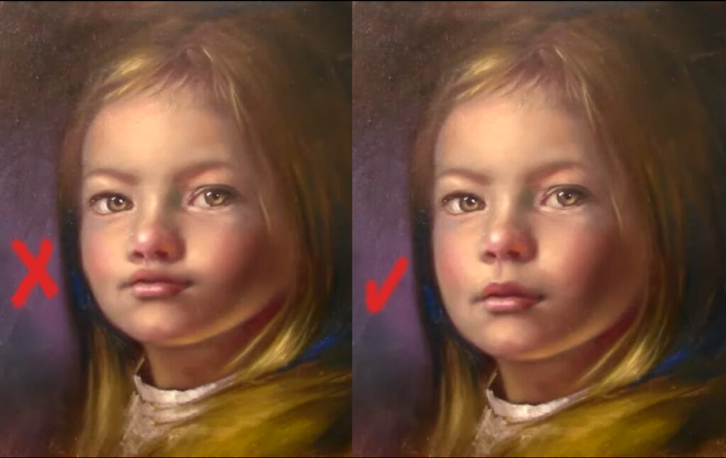
The Importance of Softness: Blending and Transitions
Back in the studio, I focused on refining the portrait. The baby’s face was almost complete, but the shadows felt too harsh. I softened the edges, blending the colors to create a more natural, translucent effect. This step is crucial for achieving a lifelike appearance.
I also paid close attention to the lightest highlights, placing them on the tip of the nose and the cheeks. These subtle touches added warmth and dimension to the face. Remember, portrait painting is about balance—knowing when to add detail and when to step back.
Final Thoughts: Art as a Journey
As I signed the finished portrait, I reflected on the journey that brought me here. Painting is more than just a skill; it’s a way of seeing the world. It’s about finding beauty in the ordinary, turning mistakes into opportunities, and sharing stories through your work.
To all the art students and portrait enthusiasts reading this, I encourage you to embrace the process. Experiment with techniques, learn from your mistakes, and never stop creating. And most importantly, remember that every brushstroke is a step forward in your artistic journey.
Struggling with your portraits? You might find my E-book helpful. Click here
Hi everyone! I’m Renso, and in this article, I want to take you through my detailed process of creating an Portrait Painting during one of my live painting sessions. Whether you’re a beginner or an experienced artist, I hope you’ll find valuable tips, techniques, and inspiration here. Portrait painting is a deeply rewarding art form, but it can also be challenging. By breaking down my process into manageable steps, I aim to make it more accessible and enjoyable for everyone. Let’s dive into the steps I follow to bring a portrait to life, along with the lessons I’ve learned along the way.
1. Preparing My Materials
Before I even touch the canvas, I make sure I have all the right tools ready. For this session, I used:
Brushes: A mix of bristle brushes for bold, expressive strokes and soft synthetic brushes for finer details.
Paints: My palette included titanium white, Naples yellow, cadmium orange, cadmium red, alizarin crimson, raw umber, and cobalt blue. These colors give me a wide range of tones to work with.
Canvas: I chose a 9×9-inch canvas, which is a great size for a detailed yet manageable portrait.
Mediums: I used linseed oil to thin the paint and improve its flow, especially when working on larger areas like the background.
I also like to use different brands of paint depending on the area I’m working on. For example, I use the more affordable Winton paints for larger areas like the background or hair, while I save my Rembrandt paints for finer details and highlights. This helps me manage costs without compromising on quality.
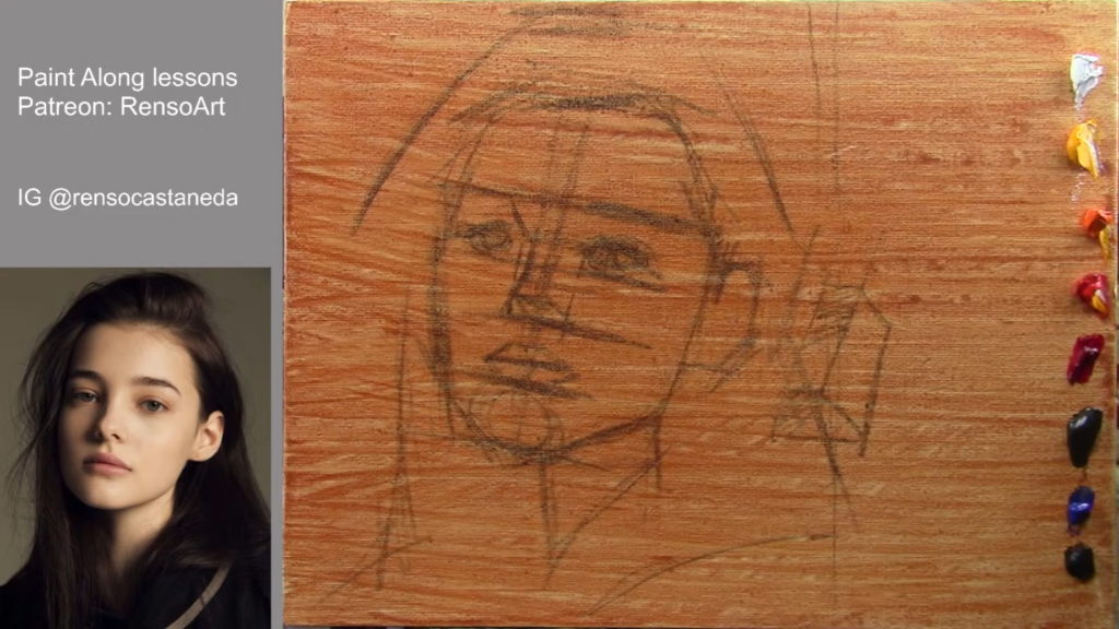
2. Starting with a Sketch
The first step in my process is to lightly sketch the basic shapes of the portrait. I use raw umber and a larger brush to outline the face, focusing on proportions and placement. I often rely on the Loomis method, which breaks down the face into simple measurements:
The distance from the eyebrow to the nose is repeated to place the chin.
The eyes are positioned on a line dividing the face into thirds.
The mouth is placed halfway between the nose and chin.
This method helps me ensure accuracy and provides a solid foundation for the painting. I don’t worry about perfection at this stage—it’s more about getting the basic structure right.
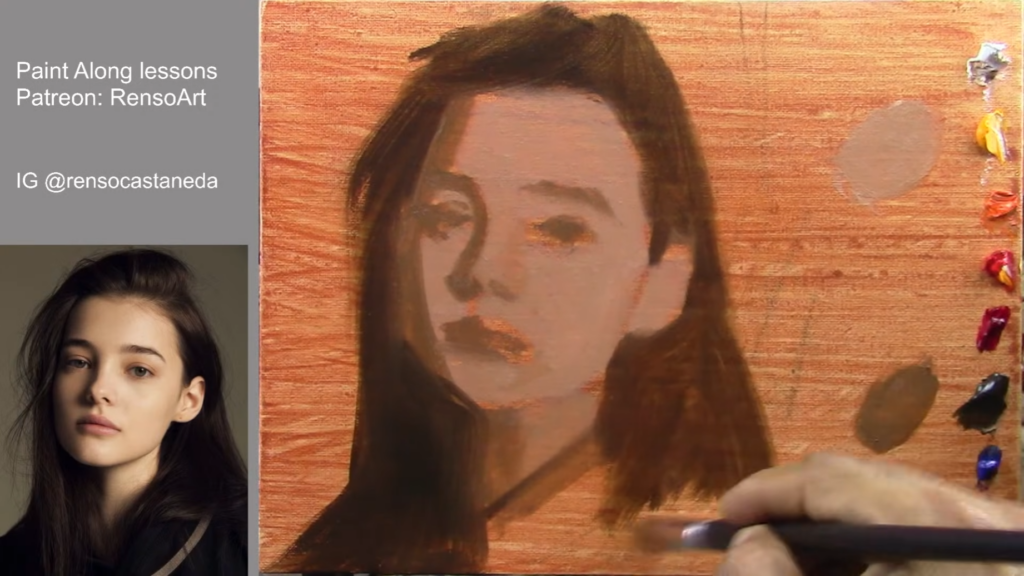
3. Blocking in Shadows and Background
Once the sketch is complete, I move on to blocking in the darkest areas, such as the hair and shadows. I use raw umber and black to create a dark base, which helps establish the values (light and dark areas) of the Portrait Painting.
I always advise squinting your eyes to simplify the shapes and focus on the overall composition. This technique helps me identify the major light and shadow areas without getting bogged down in details. It’s amazing how much this simple trick can improve your understanding of the subject.
4. Building Up the Mid-Tones and Highlights
With the shadows in place, I start adding mid-tones and highlights. I mix Naples yellow, cadmium orange, and white to create a warm, glowing light on the face. I apply thicker paint for the highlights, making them stand out against the darker background.
I also introduce color harmony by using complementary colors. For example, I contrast the warm orange highlights with cool blue shadows, creating a dynamic and visually appealing effect. This interplay of warm and cool tones adds depth and interest to the painting.
5. Refining the Features
As the painting progresses, I focus on refining the facial features. I use a smaller brush to add details like the eyes, nose, and mouth. I emphasize the importance of softening edges to create depth and realism. For instance, I soften the edges around the cheeks and jawline to make the face appear more three-dimensional.
I also pay close attention to the reflected light, adding touches of blue and green to the shadows to enhance the overall color harmony. This technique helps create a more lifelike and vibrant portrait.
6. Adding Texture and Final Touches
To add texture and depth, I use a palette knife for areas like the hair and clothing. I also use a dry brush technique to create scratchy, textured effects for details like tree bark or grass.
For the final touches, I add small details like eyelashes, highlights on the lips, and subtle color accents. I always step back frequently to assess the overall composition and make any necessary adjustments. This helps me ensure that the painting looks balanced and complete.
7. Knowing When to Stop
One of the most important lessons I’ve learned is knowing when to stop. Overworking a painting can lead to muddy colors and lost details. I always remind myself to step back and evaluate the painting from a distance. If it looks balanced and complete, I know it’s time to put the brush down.
8. Lessons Learned and Tips for Beginners
Throughout my years of painting, I’ve picked up several tips and tricks that I’d like to share:
Practice Regularly: The more you paint, the more comfortable you’ll become with the process.
Don’t Fear Mistakes: Every mistake is an opportunity to learn and improve.
Experiment with Techniques: Try different brushstrokes, color combinations, and styles to find what works best for you.
Seek Feedback: Share your work with others and ask for constructive criticism. This can provide new perspectives and help you grow as an artist.
9. Common Challenges and How to Overcome Them
Portrait painting comes with its own set of challenges. Here are a few common ones and how I address them:
Getting the Likeness Right: Capturing the likeness of a person can be tricky. I focus on the basic proportions and features first, then refine the details as I go.
Avoiding Muddy Colors: To avoid muddy colors, I clean my brushes thoroughly before switching colors and avoid over-blending.
Creating Depth: I use a combination of values, colors, and edges to create depth. Softening edges in the background and sharpening them in the foreground can make a big difference.
10. The Importance of Color Harmony
Color harmony is crucial in creating a cohesive and visually appealing painting. I often use complementary colors to create contrast and interest. For example, pairing warm orange highlights with cool blue shadows can make the painting pop.
I also pay attention to the saturation of colors. While it’s tempting to use bright, saturated colors everywhere, I find that balancing them with more muted tones creates a more harmonious composition.
11. The Role of Light and Shadow
Light and shadow play a key role in defining the form and volume of the subject. I always start by identifying the light source and how it affects the subject. This helps me determine where the highlights and shadows should be.
I also use reflected light to add depth and realism. For example, if the light is warm and orangey, the reflected light will often have a similar tone. However, I sometimes introduce cool colors like blue or green to create contrast and add interest.
12. The Final Stages: Adding Details and Refining
As I near the end of the painting, I focus on adding the final details and refining the overall composition. This includes adding highlights, adjusting colors, and softening or sharpening edges as needed.
I also take the time to step back and assess the painting from a distance. This helps me see the overall composition and make any final adjustments.
13. Conclusion
A Portrait Painting is a journey, and every piece teaches me something new. Whether you’re just starting out or have been painting for years, I encourage you to keep experimenting and pushing your boundaries. Remember, the key is to enjoy the process and let your creativity flow.
Here are some questions from viewers during Renso’s live painting session, along with his answers, which provide valuable insights for beginners and aspiring artists:
1. Viewer: “When do you use linseed oil in your painting?”
“I usually don’t use linseed oil that much, but for today’s painting, I used it because I was planning to change the colors. If I’m not sure about the color harmony, I start with very little paint and then add thicker paint later. I also use linseed oil when painting larger areas, like the background, to help the paint flow better.”
2. Viewer: “How do you avoid overworking your painting?”
“Overworking happens when you spend too much time blending or adding too many details. I recommend working on the entire painting in stages and stepping back frequently to assess the overall composition. Knowing when to stop is key—sometimes less is more.”
3. Viewer: “What are some bad habits to avoid as a beginner?”
“One bad habit is over-blending or adding too many sharp edges everywhere. It’s important to balance soft and sharp edges to create depth. Another habit is not cleaning your brushes properly, which can muddy your colors. Always clean your brush before picking up a new color.”
4. Viewer: “How do you paint realistic eyes?”
“I start by sketching the basic shape of the eyes and then add details like the iris, pupil, and highlights. I use a small round brush for precision and soften the edges around the eyes to create a natural look. Observing the reference photo closely is crucial for accuracy.”
5. Viewer: “How do you create a warm light effect?”
“To create a warm light effect, I use warm colors like cadmium orange and Naples yellow for the highlights. I then contrast this with cooler colors like blue or green in the shadows to enhance the warmth of the light.”
6. Viewer: “What is the Lumis method for drawing faces?”
“The Loomis method is a technique for drawing faces by breaking them into simple shapes and proportions. For example, you measure the distance from the eyebrow to the nose and repeat that measurement to place the chin. The eyes are placed on a line dividing the face into thirds, and the mouth is placed halfway between the nose and chin.”
7. Viewer: “How do you fix mistakes in your painting?”
“Don’t be afraid of mistakes. If you make a mistake, let the paint dry and then paint over it. I also recommend using thicker paint to cover errors and adjusting values or colors as needed. Sometimes, mistakes can lead to happy accidents!”
8. Viewer: “How do you paint realistic hair?”
“I start by blocking in the darkest areas of the hair with raw umber and black. Then, I add highlights with warmer colors like orange or yellow, using quick, directional brushstrokes to mimic the flow of hair. It’s all about creating texture and movement.”
9. Viewer: “How do you create contrast in your painting?”
“I create contrast by using complementary colors (like orange and blue) and ensuring there’s a clear difference between light and dark values. I also add small accents of bright color (like red or green) to make certain areas pop.”
10. Viewer: “How do you paint a glowing effect?”
“To create a glowing effect, I use warm, bright colors like cadmium yellow and white for the highlights. I contrast this with darker, cooler colors in the shadows to make the light areas appear even brighter.”
11. Viewer: “How do you mix colors for skin tones?”
“I mix Naples yellow, cadmium orange, and white for warm highlights on the face. For shadows, I use raw umber and alizarin crimson. I also add touches of blue or green in the shadows to create contrast and harmony with the warm highlights.”
12. Viewer: “How do you paint a dark background?”
“I mix raw umber and cobalt blue to create a dark background. I apply the paint thinly at first and then build up the layers to create depth. Darkening the background further helps the subject (like a face or flower) stand out.”
13. Viewer: “How do you add texture to your painting?”
“I use a palette knife to add texture, especially in areas like hair or clothing. I also use a dry brush technique to create scratchy, textured effects for details like tree bark or grass.”
14. Viewer: “How do you avoid muddy colors?”
“To avoid muddy colors, clean your brush thoroughly before picking up a new color. Also, avoid over-blending—sometimes it’s better to leave colors slightly separate to maintain their vibrancy.”
15. Viewer: “How do you know when a Portrait Painting is finished?”
“It’s finished when you feel like adding more might ruin it. I often step back and assess the painting from a distance. If it looks balanced and complete, I stop. Sometimes, less is more.”
Conclusion
A Portrait Painting doesn’t have to be complicated. By breaking the process into simple steps and focusing on basic techniques, you can create beautiful artwork even as a beginner. Remember, the key is to enjoy the process and keep practicing.
So grab your brushes, pick up your palette, and start painting! Whether it’s a portrait, landscape, or abstract piece, the possibilities are endless. Happy painting! 🎨
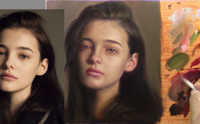
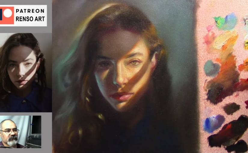
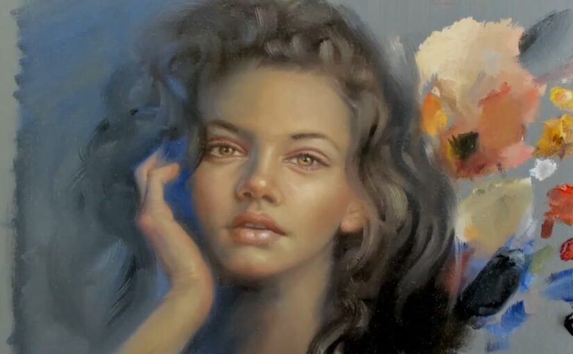
Portrait painting is more than just capturing a likeness; it’s about telling a story through light, color, and emotion. In a recent live stream, I embarked on the journey of painting a portrait of a beautiful woman, and the process was both challenging and deeply rewarding. From selecting the right colors to adjusting proportions and refining details, every step was a lesson in patience, precision, and the art of bringing a face to life on canvas.
The Starting Point: Colors and Composition
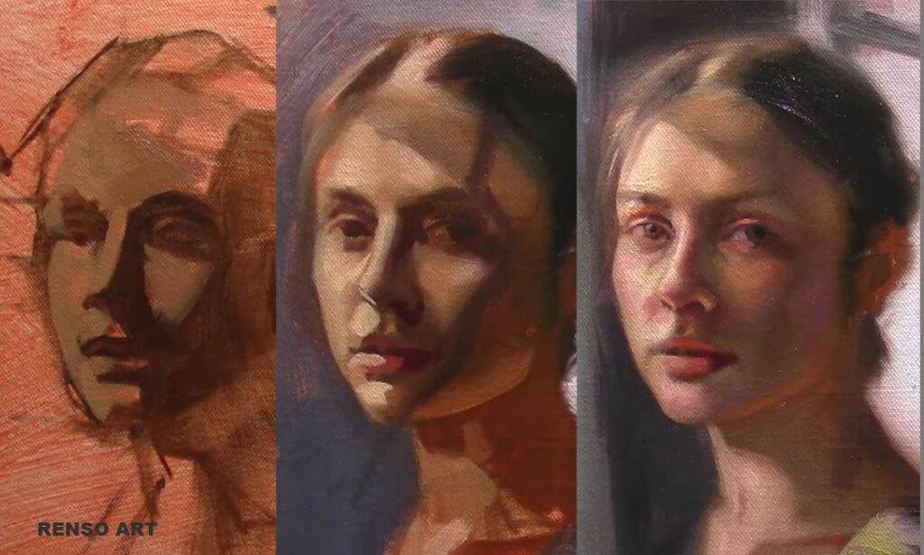
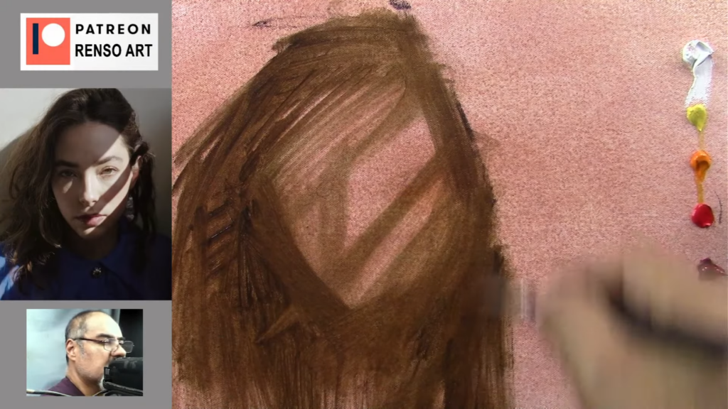
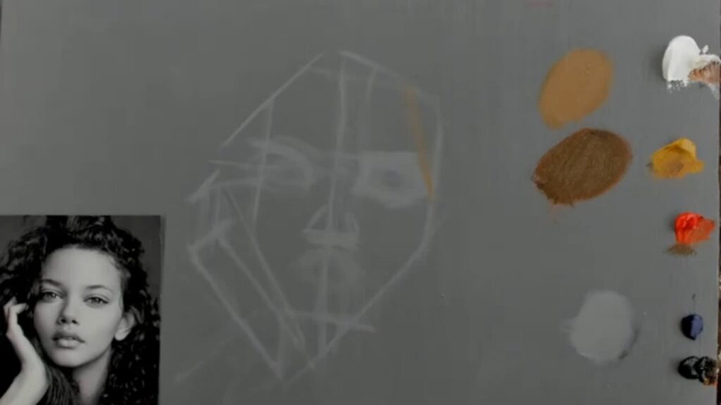
I began by selecting my palette: titanium white, yellow ocher, cadmium red, ultramarine blue, ivory black, cadmium yellow, and alizarin crimson. These colors form the foundation of any portrait, allowing me to create a range of skin tones, shadows, and highlights. The initial sketch was simple—just an oval shape to map out the head and a few lines to establish the basic proportions. This stage is crucial because it sets the groundwork for the entire painting.
Using a synthetic brush number 10, I mixed a light gray with a touch of linseed oil and turpentine to create a smooth base for the drawing. The goal was to simplify the shapes and focus on the overall structure of the face and hand, which were central to the composition.
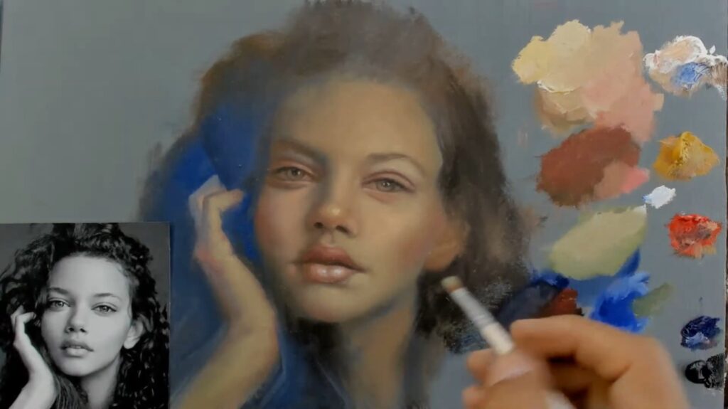
The Process: Building Layers and Adjusting Proportions
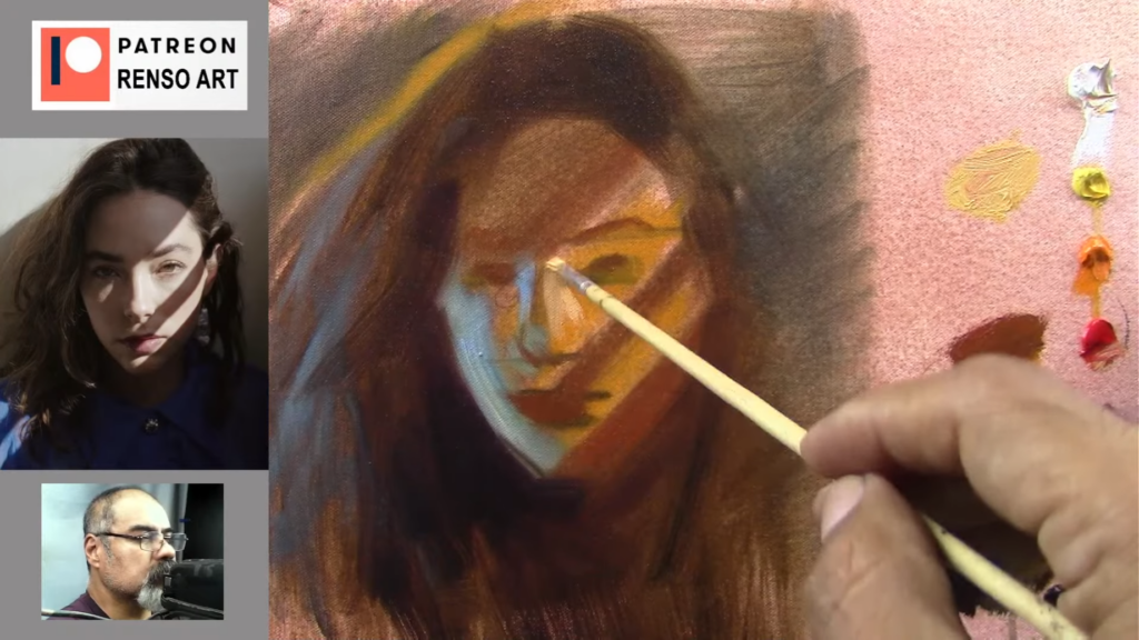
Portrait painting is a constant dance between accuracy and artistry. As I progressed, I noticed that some areas needed adjustment. The eyes, for example, are one of the most striking features of any portrait, and getting their placement right is essential. I used a combination of brushes to achieve the right texture, switching between a round brush for detail work and a softer brush for blending.
One of the most important aspects of portrait painting is understanding how light interacts with the subject. In this case, the light was coming from the left, casting soft shadows on the right side of the face. I focused on creating smooth transitions between light and shadow to mimic the natural glow of the skin.
The Details: Bringing the Portrait to Life
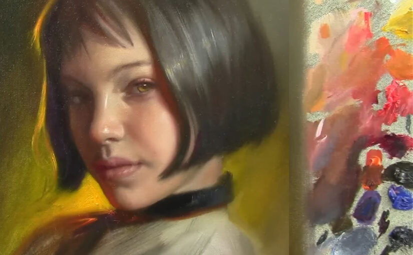
As the painting began to take shape, I focused on the finer details—the eyes, nose, and mouth. These features are the focal points of any portrait, and getting them right is essential. I used a small liner brush to define the eyes, carefully painting the iris and adding highlights to give them a lifelike sparkle. The lips required a delicate touch, with subtle shifts in color to capture their softness and shape.
One of the most rewarding parts of the process was painting the hair. I used a combination of raw umber and alizarin crimson to create depth and texture. The flow of the hair added a sense of movement to the portrait, making it feel more dynamic and alive.
The Final Touches: Refining and Reflecting
As I neared the end of the painting, I stepped back to assess the overall composition. I made a few final adjustments, darkening some areas to increase contrast and adding highlights to bring out the lightest parts of the face. I also softened some edges to create a more natural look, ensuring that the transitions between light and shadow were smooth and seamless.
Throughout the process, I was reminded of the importance of patience and persistence. Portrait painting is not about achieving perfection in one stroke; it’s about building up layers, making adjustments, and refining the details until the portrait comes to life. It’s a journey that requires both technical skill and a deep connection to the subject.
Conclusion: The Beauty of the Process
In the end, the portrait was a reflection of not just the photograph, but also the time, effort, and emotion I poured into it. The softness of the skin, the warmth of the colors, and the gentle expression all came together to create a piece that felt alive.
Painting a portrait is more than just a technical exercise—it’s a way of connecting with the subject, of capturing their essence on canvas. It’s a process that requires both skill and intuition, and it’s one that I find endlessly rewarding.
If you’re interested in watching the full process, you can check out the live stream on my YouTube channel. And if you’re inspired to try portrait painting yourself, remember to be patient, trust the process, and most importantly, enjoy the journey.
Q&A Section
Q: From Michonne – Do you always sketch before painting? A: Yes, I usually start with a rough sketch to establish proportions. It helps me map out the face and ensure everything is in the right place before adding color.
Q: From Nikki – How do you decide where to place highlights? A: I look at the light source in the reference photo. For this portrait, the light was coming from the left, so I added highlights on the left side of the face, nose, and lips to create a natural glow.
Q: From Manuel – Do you use black in your mixtures? A: I do, but sparingly. Black can be too strong and can dull colors if overused. I often mix it with other colors to create deeper, richer shadows without losing vibrancy.
Q: From Jay Kishan – How many brushes do you use in a session? A: I typically use around 8-10 brushes, depending on the level of detail. I have a mix of round brushes for details and softer brushes for blending.
Q: From Christine – How do you keep your brushes clean? A: I clean them regularly with a paper towel or cloth. For frayed brushes, I repurpose them for blending, as they work great for creating soft transitions.
Thank you for joining me on this artistic adventure. Until next time, keep creating and exploring the beauty of art.
Struggling with your portraits? You might find my E-book helpful. Click here
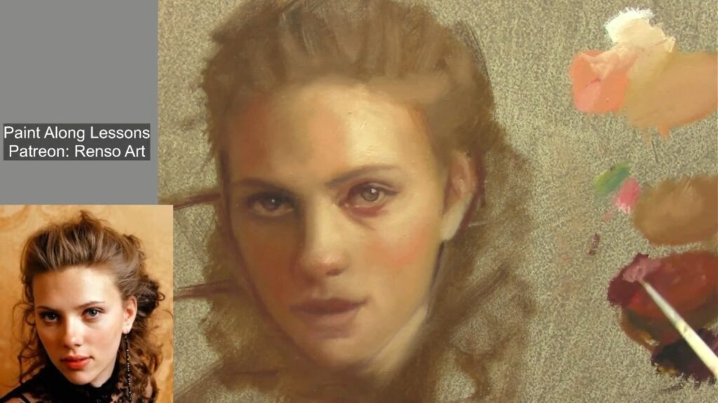
A Portrait painting is more than just capturing a likeness; it’s about telling a story through light, color, and emotion. In a recent live stream, I embarked on the journey of painting a portrait of the iconic actress Scarlett Johansson, and the process was both challenging and deeply rewarding. From selecting the right colors to adjusting proportions and refining details, every step was a lesson in patience, precision, and the art of bringing a face to life on canvas.
The Starting Point: Colors and Composition
I began by selecting my palette: titanium white, yellow ocher, cadmium red, permanent alizarin crimson, Prussian blue, and ivory black. These colors form the foundation of any portrait, allowing me to create a range of skin tones, shadows, and highlights. Scarlett’s complexion has a unique warmth and softness, so I knew I had to balance warm tones like cadmium red and yellow ocher with cooler shades like Prussian blue to capture her features accurately.
The initial sketch was simple—just an oval shape to map out the head and a few lines to establish the basic proportions. This stage is crucial because it sets the groundwork for the entire painting. Scarlett’s face has a distinct symmetry and elegance, so I paid close attention to the placement of her eyes, nose, and mouth to ensure the likeness would shine through.
The Process: Building Layers and Adjusting Proportions
Portrait painting is a constant dance between accuracy and artistry. As I progressed, I noticed that some areas needed adjustment. Scarlett’s eyes, for example, are one of her most striking features—slightly almond-shaped and full of depth. I had to carefully adjust their placement to capture her gaze accurately. The nose also needed refinement, as its shape is central to her overall facial structure.
One of the most important aspects of portrait painting is understanding how light interacts with the subject. In this case, the light was coming from the left, casting soft shadows on the right side of her face. I used a combination of brushes to achieve the right texture, switching between a round brush for detail work and a softer brush for blending. Scarlett’s skin has a luminous quality, so I focused on creating smooth transitions between light and shadow to mimic that glow.
The Details: Bringing Scarlett to Life
As the painting began to take shape, I focused on the finer details—her eyes, nose, and mouth. These features are the focal points of any portrait, and getting them right is essential. I used a small liner brush to define her eyes, carefully painting the iris and adding highlights to give them a lifelike sparkle. Her lips required a delicate touch, with subtle shifts in color to capture their softness and shape.
One of the most rewarding parts of the process was painting her hair. Scarlett’s hair often has a rich, warm tone, so I used a combination of raw umber and alizarin crimson to create depth and texture. The flow of her hair added a sense of movement to the portrait, making it feel more dynamic and alive.
The Final Touches: Refining and Reflecting
As I neared the end of the painting, I stepped back to assess the overall composition. I made a few final adjustments, darkening some areas to increase contrast and adding highlights to bring out the lightest parts of her face. I also softened some edges to create a more natural look, ensuring that the transitions between light and shadow were smooth and seamless.
Throughout the process, I was reminded of the importance of patience and persistence. Portrait painting is not about achieving perfection in one stroke; it’s about building up layers, making adjustments, and refining the details until the portrait comes to life. It’s a journey that requires both technical skill and a deep connection to the subject.
Conclusion: The Beauty of the Process
In the end, the portrait was a reflection of not just Scarlett Johansson’s photograph, but also the time, effort, and emotion I poured into it. The softness of her skin, the warmth of the colors, and the gentle expression all came together to create a piece that felt alive.
Painting a portrait is more than just a technical exercise—it’s a way of connecting with the subject, of capturing their essence on canvas. It’s a process that requires both skill and intuition, and it’s one that I find endlessly rewarding.
If you’re interested in watching the full process, you can check out the live stream on my YouTube channel. And if you’re inspired to try portrait painting yourself, remember to be patient, trust the process, and most importantly, enjoy the journey.
Q&A Section
Q: How do you choose the right colors for a portrait? A: It depends on the subject’s skin tone and lighting. For Scarlett Johansson, I used a mix of warm tones like cadmium red and yellow ocher, balanced with cooler shades like Prussian blue. The key is to observe the subtle shifts in color and blend them seamlessly.
Q: What’s the most challenging part of painting a portrait? A: Capturing the likeness is always the biggest challenge. It’s not just about getting the proportions right—it’s about capturing the subject’s essence and personality. For Scarlett, her eyes and smile were the most important features to get right.
Q: How do you handle mistakes during the painting process? A: Mistakes are part of the process! I often adjust proportions or colors as I go. If something looks off, I step back, assess, and make corrections. It’s all about being patient and trusting the process.
Q: What advice do you have for beginners who want to try portrait painting? A: Start simple. Focus on basic proportions and values before diving into details. Practice sketching faces and studying light and shadow. And most importantly, don’t be afraid to make mistakes—they’re how you learn!
Viewer Questions from the Live Stream
Q: From Michonne – Do you always sketch before painting? A: Yes, I usually start with a rough sketch to establish proportions. It helps me map out the face and ensure everything is in the right place before adding color.
Q: From Nikki – How do you decide where to place highlights? A: I look at the light source in the reference photo. For Scarlett’s portrait, the light was coming from the left, so I added highlights on the left side of her face, nose, and lips to create a natural glow.
Q: From Manuel – Do you use black in your mixtures? A: I do, but sparingly. Black can be too strong and can dull colors if overused. I often mix it with other colors to create deeper, richer shadows without losing vibrancy.
Q: From Jay Kishan – How many brushes do you use in a session? A: I typically use around 8-10 brushes, depending on the level of detail. I have a mix of round brushes for details and softer brushes for blending.
Q: From Christine – How do you keep your brushes clean? A: I clean them regularly with a paper towel or cloth. For frayed brushes, I repurpose them for blending, as they work great for creating soft transitions.
Thank you for joining me on this artistic adventure. Until next time, keep creating and exploring the beauty of art.
Struggling with your portraits? You might find my E-book helpful. Click here
Hi. Today, I’m taking you along as I paint a portrait from scratch. I’ll be sharing my process, tips, and techniques, and hopefully, you’ll find some inspiration for your own artistic journey. Whether you’re an experienced artist or just starting out, I hope this session gives you a glimpse into my world of portrait painting.
The Palette: My Symphony of Colors
I always start by setting up my palette, and today is no different. Here are the colors I’ve chosen for this portrait:
Titanium White
Chrome Yellow
Naples Yellow
Deep Cam Orange
Cam Red
Alizarin Crimson
Raw Umber
Ivory Black
Emerald Green
These colors are my tools for creating harmony and depth in the painting. Each one has its own personality, and I love experimenting with how they interact on the canvas.
The Process: From Sketch to Life
I begin by sketching the portrait using Raw Umber. It’s a warm, earthy tone that’s perfect for laying down the initial shapes. I always squint my eyes when I sketch—it helps me simplify the image and focus on the dark shapes and shadows. This technique keeps me from getting lost in the details too early.
As I sketch, I love interacting with my viewers. Today, I’m greeted by Michael from Austria, Christine, Monique, and many others. It’s always a joy to connect with people from all over the world while I paint. It makes the process feel like a shared experience.
The Art of Observation and Measurement
One of the most important things I’ve learned about portrait painting is to pay attention to the distances between key facial features—like the eyebrows, nose, and chin. While these measurements aren’t always perfect, they serve as a guide to keep the proportions in check. It’s a combination of observation and measurement that helps me achieve a realistic likeness.
Painting from Black and White: My Creative Freedom
I often paint from black and white photographs because it gives me the freedom to create my own color harmony. Without the constraints of the original colors, I can experiment with different palettes and moods. Sometimes I keep the face muted, and other times I add vibrant colors. It’s all about what feels right in the moment.
Layering Colors: Building Depth and Texture
I start with a base layer of muted grayish-green, which acts as the foundation for the portrait. This thin layer allows me to build up more colors on top without the painting becoming muddy. I love how the colors blend and interact as I add more layers. It’s like watching the portrait come to life, one brushstroke at a time.
I’m careful not to use too much paint in the beginning. If the base layer is too thick, it can be hard to add vibrant colors on top. Instead, I keep it thin and build up gradually. This way, I can adjust the colors and tones as I go.
The Role of Texture: Adding Dimension
Texture is one of my favorite elements in painting. I use thick brushstrokes to add dimension to the face, creating a sense of depth and realism. The texture not only enhances the visual appeal but also adds a tactile quality that draws the viewer in.
For example, I might use texture to simulate the roughness of a beard or the softness of skin. By varying the pressure of my brush, I can create different effects that add character to the portrait. It’s a delicate balance, but it’s so rewarding when it works.
The Background: Choosing the Right Color
As I move to the background, I ask my viewers for their input. Should I go with teal blue, light gray, or green? Each color creates a different contrast with the portrait. After some thought, I decide on teal blue. It complements the warm tones of the face and adds a sense of balance to the composition.
The background is just as important as the subject. It shouldn’t compete with the portrait but rather enhance it. I always keep that in mind as I work.
The Final Touches: Refining the Portrait
As I near the end, I focus on refining the details. I soften some edges to create a more natural look, while keeping others sharp to define the contours of the face. I add subtle touches of color to the nose, cheeks, and ears, enhancing the portrait’s realism.
I also pay attention to the light and shadow. By adding highlights and deepening the shadows, I create a sense of volume and depth. It’s these small details that bring the portrait to life.
Conclusion: A Portrait in the Making
This portrait is a reflection of my passion for art. Through careful observation, thoughtful color choices, and a love for texture, I’ve transformed a blank canvas into a vibrant, lifelike image. Painting is not just about the final product—it’s about the journey, the learning, and the joy of creation.
As I wrap up, I invite you to join me in future sessions. Whether you’re here to learn, to be inspired, or simply to enjoy the process, I’m glad to have you along for the ride. So grab your brushes, set up your palette, and let’s create something beautiful together.
Final Thoughts
Painting is a journey, and every brushstroke is a step forward. I hope this session has given you some insights into my process and inspired you to explore your own creativity. Remember, there are no rules in art—only possibilities. So trust your instincts, experiment with colors, and most importantly, enjoy the process.
Struggling with your portraits? You might find my E-book helpful. Click here
Welcome to my website! Today, I’m going to walk you through the process of painting a portrait, with a special focus on color theory. Color is one of the most powerful tools in an artist’s arsenal, and understanding how to use it effectively can transform your work. Whether you’re a beginner or an intermediate artist, this guide will help you create a realistic portrait while mastering the principles of color. Let’s dive in!
Main Points
1. Materials and Setup
Brushes: I primarily use synthetic brushes, especially thick ones for the initial layers. For fine details, I switch to smaller brushes like liner brushes (size 00 or 0).
Colors: My palette includes Titanium White, Cadmium Yellow, Cadmium Orange, Cadmium Red, Permanent Alizarin Crimson, Raw Umber, Cobalt Blue, and Lamp Black. These colors allow me to mix a wide range of skin tones and shadows.
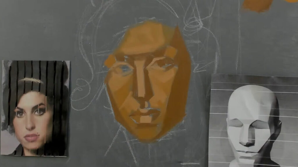
Reference Photo: The photograph I’m using is linked in the description box. I always keep it next to my canvas for easy reference. I also use a toned gray canvas, which helps me judge values more accurately.
2. Starting the Painting
Sketching: Sometimes I start with a detailed drawing, but today I’m diving straight into painting with Raw Umber. This helps me establish the values (lights and shadows) early on.
Proportions: I always keep proportions in mind. For example, the distance from the eyebrow to the bottom of the nose is usually the same as from the nose to the chin. This helps maintain accuracy in the portrait.
Squinting: Squinting helps me see the basic shapes and values more clearly. It simplifies the image into light, mid-tone, and shadow areas.
3. Understanding Color Theory
Color Wheel: The color wheel is the foundation of color theory. It consists of primary colors (red, blue, yellow), secondary colors (green, orange, purple), and tertiary colors (mixtures of primary and secondary colors).
Warm and Cool Colors: Warm colors (reds, oranges, yellows) advance in a painting, while cool colors (blues, greens, purples) recede. This is crucial for creating depth.
Complementary Colors: Colors opposite each other on the color wheel (e.g., red and green, blue and orange) create strong contrast and can make each other appear more vibrant.
Simultaneous Contrast: This is the phenomenon where colors influence each other when placed side by side. For example, a gray will appear warmer next to a cool color and cooler next to a warm color.
4. Building the Portrait
Layering: I start with a thin layer of Raw Umber to block in the shadows and mid-tones. This creates a foundation for the portrait.
Skin Tones: For the skin, I mix Cadmium Orange, Raw Umber, and White. I keep the colors simple at first, focusing on getting the mid-tones right before adding highlights and darker shadows.
Highlights: I use Titanium White with a touch of Cadmium Yellow for warm highlights.
Shadows: Shadows are created by adding Raw Umber and a touch of Cobalt Blue to cool them down.
Reddish Areas: Areas like the cheeks, nose, and chin often have a reddish tint. I mix Cadmium Red with a bit of White and Raw Umber for these areas.
Background: The background color can significantly affect the portrait. I choose a warm, yellowish tone to complement the skin tones and create contrast. This is an example of color harmony.
5. Refining Details
Eyes and Mouth: These features require careful attention. I use smaller brushes for details like the eyelashes and lips. I also pay close attention to the highlights in the eyes to make them look alive.
Eyes: The eyes often have a hint of green or blue in the shadows, especially near the tear ducts. I use a mix of Cobalt Blue and Raw Umber for this.
Mouth: The lips have a reddish tone, but I also add a touch of Alizarin Crimson to make them more vibrant.
Hair: Hair is painted in layers. I start with dark tones (Lamp Black and Raw Umber) and gradually add lighter strands (Raw Umber and White) to create depth and texture.
Blending: I use a fan brush to soften edges and blend colors smoothly, especially in areas like the cheeks and neck.
6. Color and Contrast
Warm and Cool Colors: I balance warm and cool tones to create a sense of depth. For example, I add a touch of green to the shadows on the face to contrast with the warm highlights. This is an example of simultaneous contrast.
Highlights: I use Titanium White mixed with a bit of yellow for the brightest highlights. This makes the skin look more luminous.
Final Adjustments: I step back frequently to check the overall composition. Sometimes I darken the background to make the face pop or adjust the shadows to enhance the three-dimensional effect.
7. Advanced Color Techniques
Glazing: This is a technique where a thin, transparent layer of paint is applied over a dry layer. It’s great for adjusting colors without losing the underlying details.
Scumbling: This involves applying a thin, opaque layer of paint over a dry layer to create texture or soften colors.
Color Temperature: Understanding color temperature is key. For example, warm light creates cool shadows, and cool light creates warm shadows. This is known as local color and is essential for realism.
Conclusion
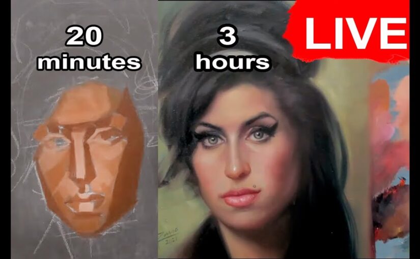
Painting a portrait is a rewarding but challenging process. It requires patience, practice, and a good understanding of proportions, values, and color theory. Today’s session took about three hours, and while I’m happy with the result, I know there’s always room for improvement. Remember, art is a journey, and every painting teaches us something new.
Key Takeaways:
Start with values: Focus on lights and shadows before diving into details.
Keep proportions in mind: This ensures the likeness of the portrait.
Balance warm and cool tones: This adds depth and realism to the painting.
Use color theory: Understanding complementary colors, simultaneous contrast, and color temperature can elevate your work.
Practice makes perfect: Don’t be afraid to make mistakes and learn from them.
Thank you for joining me today! If you enjoyed this tutorial, don’t forget to like, subscribe, and leave a comment. I’d love to hear your thoughts and answer any questions you have. Until next time, keep painting and exploring your creativity!
Recommended Reading:
For those interested in diving deeper into color theory, I highly recommend the book “Color Theory” by Johannes Itten. It’s a comprehensive guide that covers everything from the basics to advanced techniques. You can find a free PDF version online, but I encourage you to read it multiple times to fully absorb the concepts.
Struggling with your portraits? You might find my E-book helpful. Click here
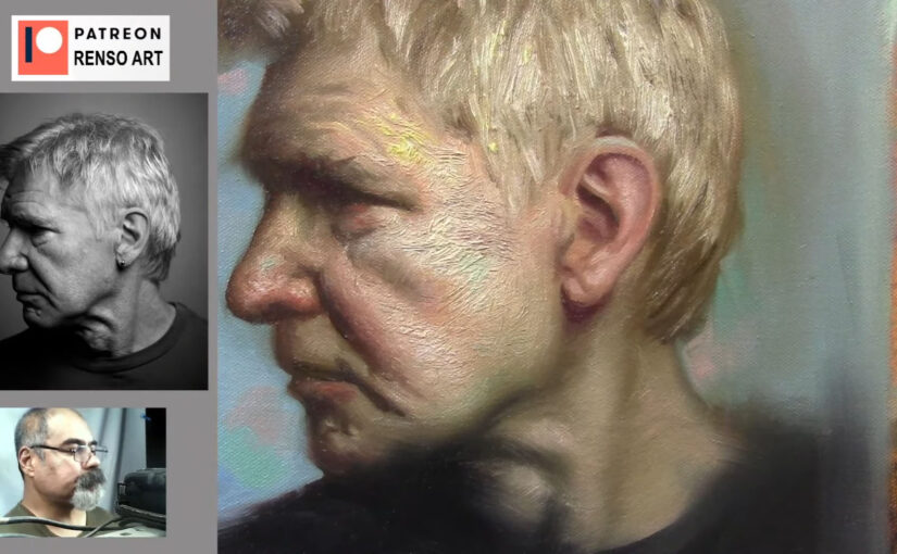
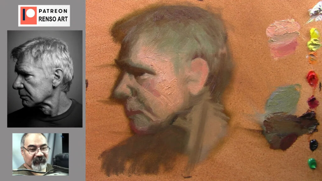
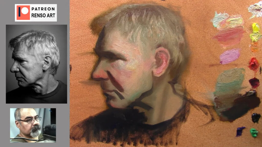
Alright, let’s get into it. Painting a portrait is like building a house—you need a solid foundation, and in this case, that foundation is the planes of the face. These planes are the flat and curved surfaces that make up the structure of a face. Think of them as the puzzle pieces that, when put together, create a realistic, three-dimensional likeness. But here’s the thing: it’s not just about drawing the eyes, nose, and mouth in the right place. It’s about understanding how light and shadow interact with those planes to give the face its form and depth. So, let’s break it down, step by step, and keep it casual while we’re at it.
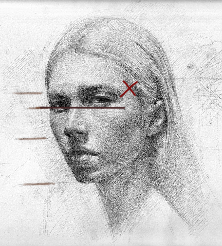
Starting with the Basics: The Center Line
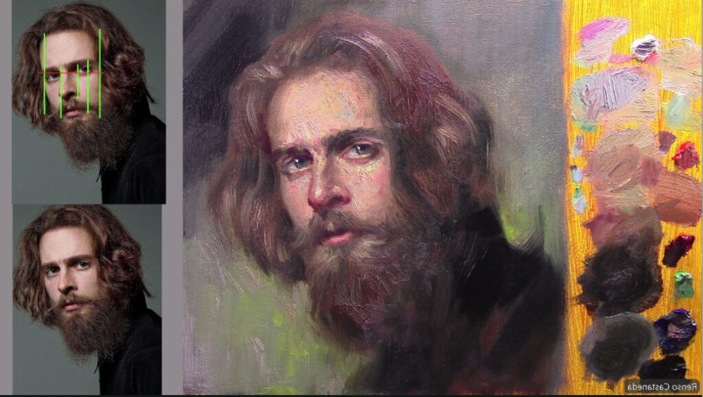
Every portrait starts with the center line. This is the imaginary line that runs vertically down the middle of the face, dividing it into two symmetrical halves. But here’s the kicker: faces aren’t perfectly symmetrical. One eye might be slightly higher, the nose might tilt a little, or the mouth might curve more on one side. So, while the center line is your guide, you’ve got to be flexible with it.
As I was working on this portrait, I kept checking the center line, the eye line, the nose line, and the mouth line. It’s like a constant dance—you’re always measuring, adjusting, and re-measuring. And don’t even get me started on the triangle formed by the eyes and the nose. That triangle is your best friend when it comes to getting the proportions right. If the triangle is off, the whole face feels wrong.
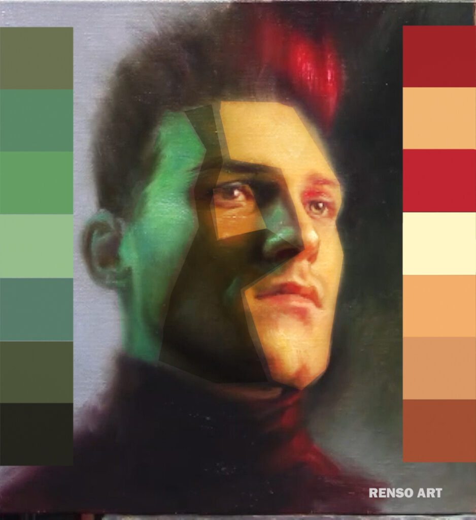
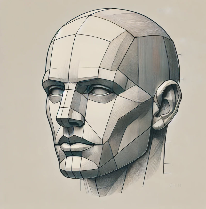
Studying the planes of the face is essential for understanding structure, form, and light in portrait painting. Breaking the face into simplified geometric planes helps in achieving depth and realism. Here’s a breakdown of the key planes:
1. Major Planes
These are the broadest divisions of the head, which establish the overall structure:
Front Plane – The face’s flat front surface.
Side Planes – The areas that wrap around from the temples to the cheeks.
Top Plane – The forehead and upper skull.
Bottom Plane – The underside of the chin and jawline.
2. Primary Facial Planes
These define the major shapes within the face:
Forehead Plane – Often divided into the upper, middle, and lower sections.
Cheek Planes – The prominent areas that catch light, shifting toward shadow at the edges.
Eye Sockets – Recessed areas that define the brow ridge and contribute to facial depth.
Nose Planes – The bridge, sides, and bottom of the nose have distinct planes.
Mouth Area Planes – The upper lip angles inward, while the lower lip has fuller, rounded planes.
Chin and Jaw Planes – These define the transition between the face and neck.
3. Light & Shadow Considerations
Understanding planes helps control how light interacts with the face:
Flat planes catch more light (like the forehead and cheekbones).
Angled planes create shadows (such as the sides of the nose and under the jaw).
Subtle transitions between planes give a realistic form.
How to Study the Planes of the Face
Use Asaro Heads (Planes of the Head models) for a simplified geometric approach.
Practice sketching faces in blocky, angular forms before softening into natural curves.
Use lighting from different angles to observe plane changes.
Sculpting (even digitally) can reinforce your understanding of form.
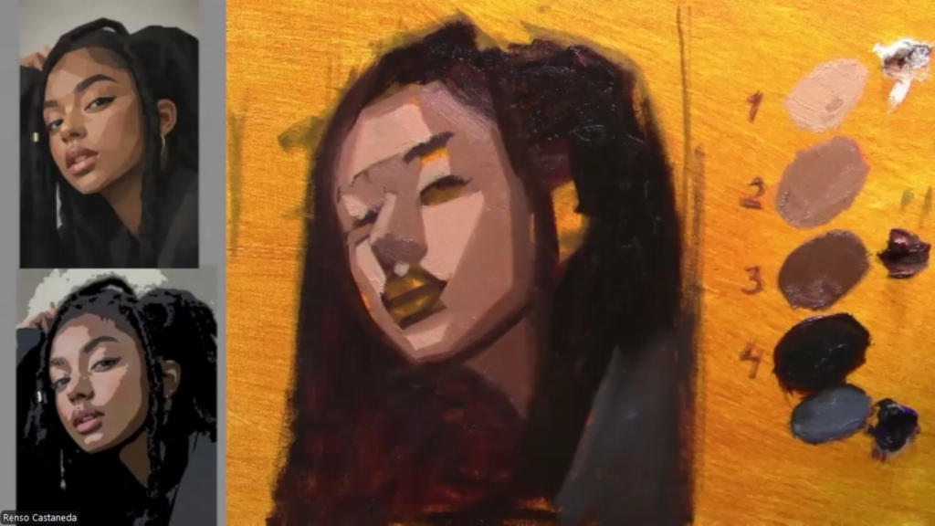
Mixing Colors: The Art of Skin Tones
Now, let’s talk about skin tones. Mixing the perfect skin color is like trying to find the right spice blend for a recipe—it’s all about balance. You start with a base color, something close to the person’s skin tone, but then you tweak it. A little more red for the cheeks, a touch of yellow for warmth, maybe a hint of blue for cooler areas like the shadows under the chin or around the eyes.
But here’s the thing: skin isn’t just one color. It’s a symphony of tones. The forehead might be a bit yellower, the cheeks pinker, and the shadows around the jawline cooler. And don’t forget about local color—that’s the base color of an object before light and shadow affect it. For skin, the local color is usually somewhere between peach, pink, and ochre, depending on the person.
I spent a lot of time mixing variations of the base color—lighter versions for highlights, darker versions for shadows, and more saturated versions for areas like the cheeks and lips. And sometimes, I’d throw in a wild card, like a touch of blue or green, just to see how it would affect the overall harmony. It’s all about experimentation.
Shadows and Highlights: Creating Depth
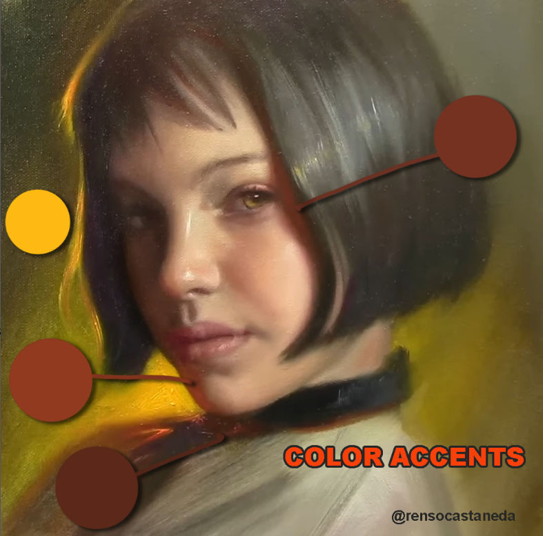
Shadows are where the magic happens. They give the face its three-dimensionality. But not all shadows are created equal. Some are warm, some are cool, and some are neutral. It depends on the light source and the surrounding colors. For this portrait, I kept the shadows relatively neutral, but I added a touch of warmth to areas like the nose and cheeks to make them pop forward.
Highlights, on the other hand, are all about catching the light. The brightest highlights are usually on the forehead, the bridge of the nose, the cheekbones, and the chin. But here’s a pro tip: don’t make your highlights pure white. Mix a bit of yellow or pink into the white to keep it natural.
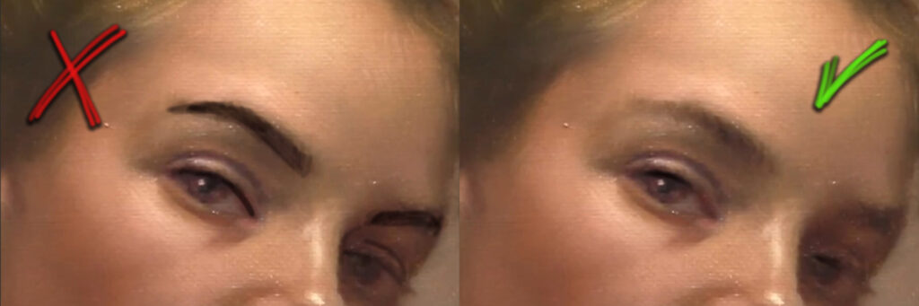
The Eyes: Windows to the Soul
The eyes are the focal point of any portrait. They’re what people look at first, so you’ve got to get them right. But here’s the thing: eyes aren’t just white with a colored iris. They’re full of subtle colors and reflections. The whites of the eyes, for example, are rarely pure white. They’re usually a bit gray or yellowish, especially in shadow.
I spent a lot of time on the eyes, adding tiny highlights to make them look alive. And don’t forget the eyelids—they’re warmer and more reddish than the rest of the skin because they’re thinner and have more blood vessels. But you’ve got to be careful not to make them too red, or it’ll look like the person has been crying.
The Nose and Mouth: Balancing the Features
The nose and mouth are just as important as the eyes, but they’re often overlooked. The nose, for example, has its own set of planes—the bridge, the sides, the nostrils, and the tip. Each plane catches light differently, so you’ve got to pay attention to the transitions between light and shadow.
The mouth is another tricky area. It’s not just a line with some color inside. It’s a complex shape with its own highlights and shadows. The upper lip is usually darker than the lower lip, and there’s often a subtle highlight on the lower lip that gives it a moist, natural look. And don’t forget the corners of the mouth—they’re usually a bit darker and can add a lot of expression to the face.
Hair and Background: Framing the Face
Hair can make or break a portrait. It’s not just a mass of color—it’s made up of individual strands that catch light and create texture. But for this portrait, I decided to keep the hair relatively simple. I didn’t want it to distract from the face. Instead, I focused on getting the shape and volume right, adding a few highlights here and there to suggest movement.
The background is another important element. It’s not just empty space—it’s part of the composition. I added a bit of yellow to warm up the background, but I’m not sure if I’ll keep it. Sometimes, a neutral background works better because it keeps the focus on the face.
Knowing When to Stop
Here’s the hardest part of painting a portrait: knowing when to stop. It’s so easy to keep tweaking and adjusting, but at some point, you’ve got to step back and say, “It’s done.” Overworking a painting can ruin it. You start losing the freshness and spontaneity that make it come alive.
I’ve learned to trust my instincts. If something feels off, I’ll fix it. But if it feels right, I’ll leave it alone, even if it’s not perfect. Because here’s the thing: perfection is overrated. What matters is capturing the essence of the person—their expression, their personality, their soul.
Final Thoughts
Painting a portrait is a journey. It’s about more than just getting the proportions and colors right. It’s about capturing a moment, a feeling, a story. And the planes of the face are your roadmap. They guide you through the process, helping you build the structure, add the details, and bring the face to life.
So, next time you’re painting a portrait, take a moment to study the planes of the face. Pay attention to how light and shadow interact with them. And most importantly, have fun with it. Because at the end of the day, painting is about expressing yourself and connecting with the world around you.