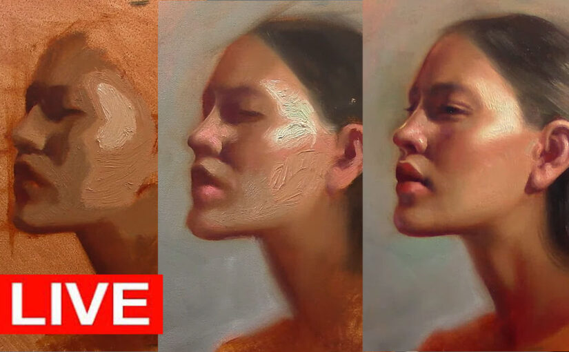
How I Mix Shadow Colors for Portraits

This is an exercise it does no apply for every portrait, I consider this a easy way to explain the logic behind mixing color for shadows

Hello, and welcome to my channel! Today, I want to take you through my process of mixing shadow colors for a portrait. This isn’t just about throwing complementary colors together or adding blue to shadows. It’s about understanding how light, form, and color interact to create depth and realism. I’ll walk you through my approach, step by step, and share some of the insights I’ve gained over the years. Whether you’re a beginner or an experienced artist, I hope this guide helps you see shadows in a new light.


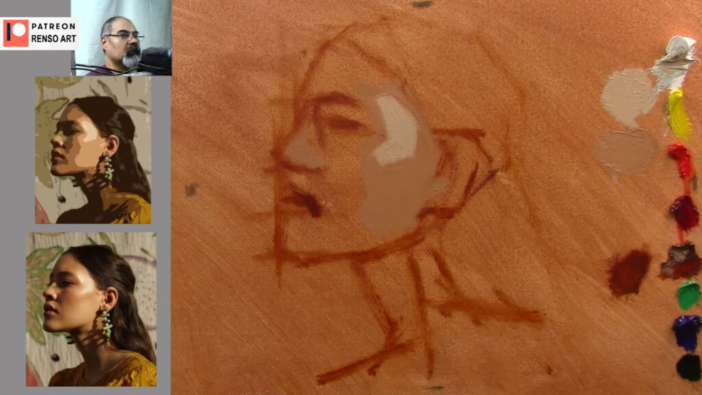
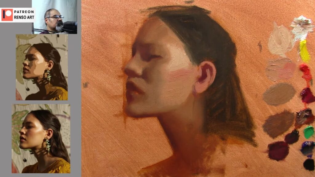
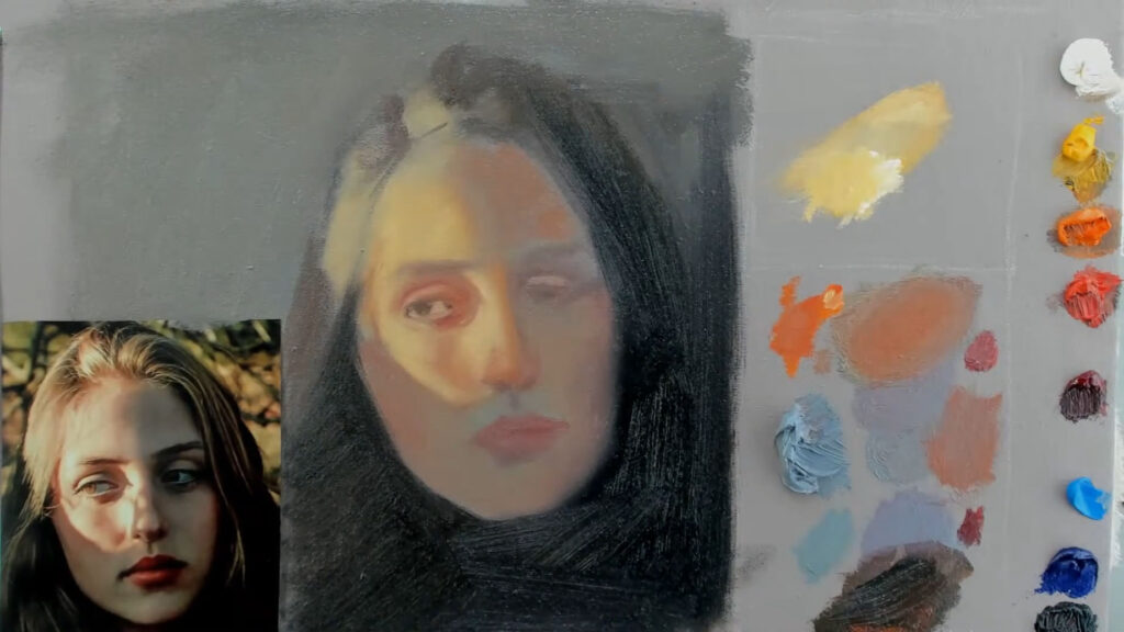
Setting Up My Palette

Before I start painting, I organize my palette into two sections: one for light colors and one for shadows. For shadows, I use the following colors:

  • White
  • Cameo Yellow Hue
  • Orange
  • Cameo Red Hue
  • Alizarin Crimson
  • Cerulean Blue
  • Ultramarine Blue
  • Ivory Black

These colors allow me to create a range of warm and cool shadows. The key is to start with a neutral gray (a mix of white and ivory black) and then adjust it by adding small amounts of other colors. This gray acts as a foundation, helping me match the value of the shadow I’m trying to create.


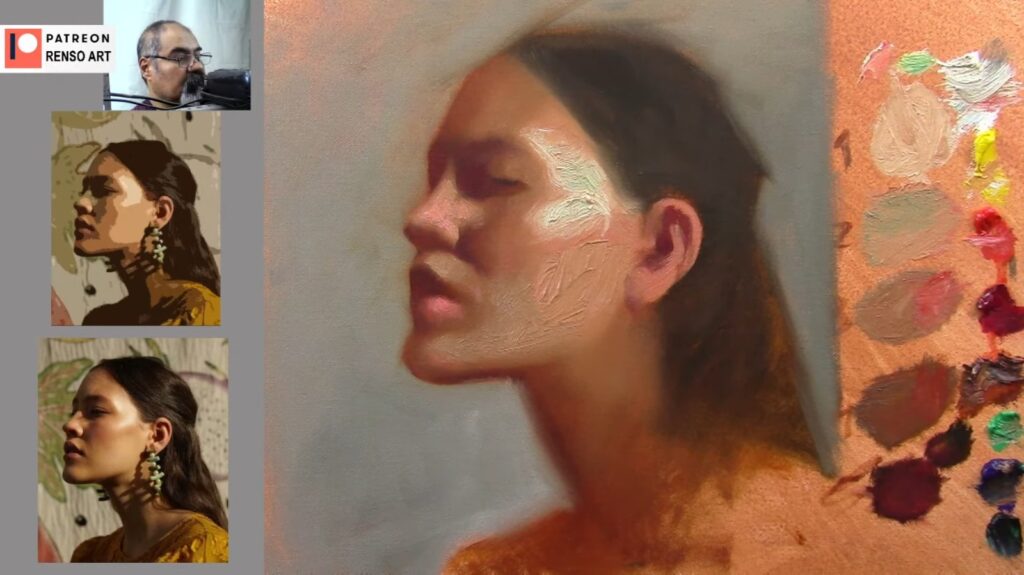
Mixing the Base Shadow Color

I begin by mixing a neutral gray. This gray should match the value (lightness or darkness) of the shadow I’m trying to create. Once I have my gray, I tweak it to make it warmer or cooler.

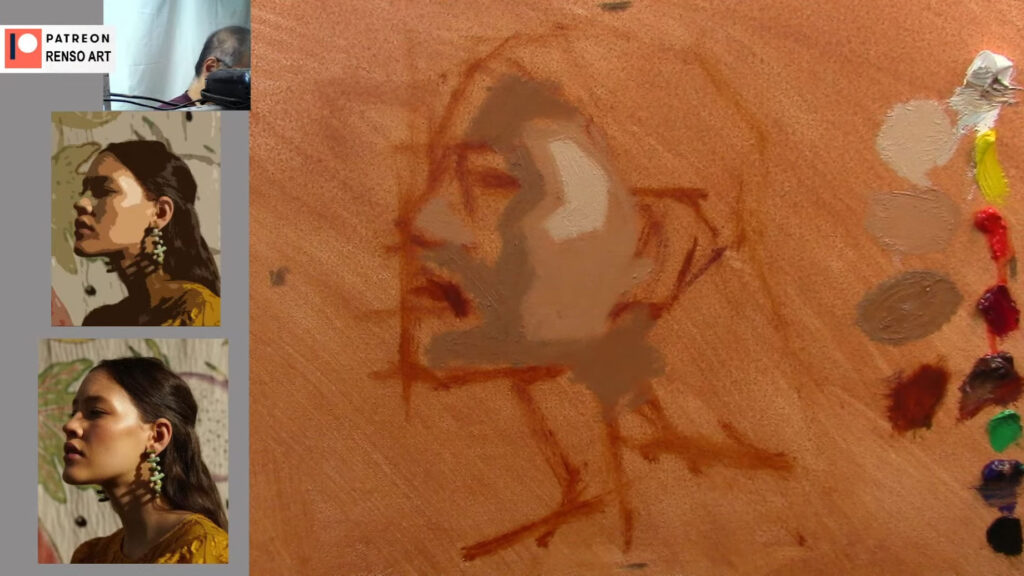
In one side of the palette there are pure clean colors as soon as you start mixing the colors imaging them getting closer to the gray mixture, you need to know when to stop is the color get to close to the gray is going to become too doll, remember this exercise is to understand how important are values and the gray mixture helps to calibrate lights mid tones and shadows and move the colors to a warmer tint or cooler.

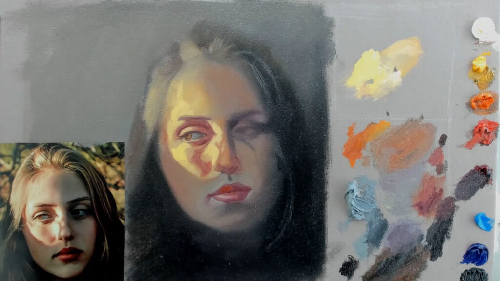
BUT when you are mixing colors is better to use complementary colors to get the shadows, continuing with this exercise follow the next.

  • Warm Shadows: I add a touch of orange or red. Warm shadows often appear in areas where light bounces off nearby surfaces, such as the cheeks or the sides of the nose.
  • Cool Shadows: I add a bit of blue or green. Cool shadows are typically found in areas that receive indirect light, like the forehead or the sides of the face.

I always keep in mind that the face is divided into warmer and cooler zones. The lower part of the face (cheeks, nose, and chin) tends to be warmer, while the upper part (forehead) is cooler. This natural variation adds depth and realism to the portrait.


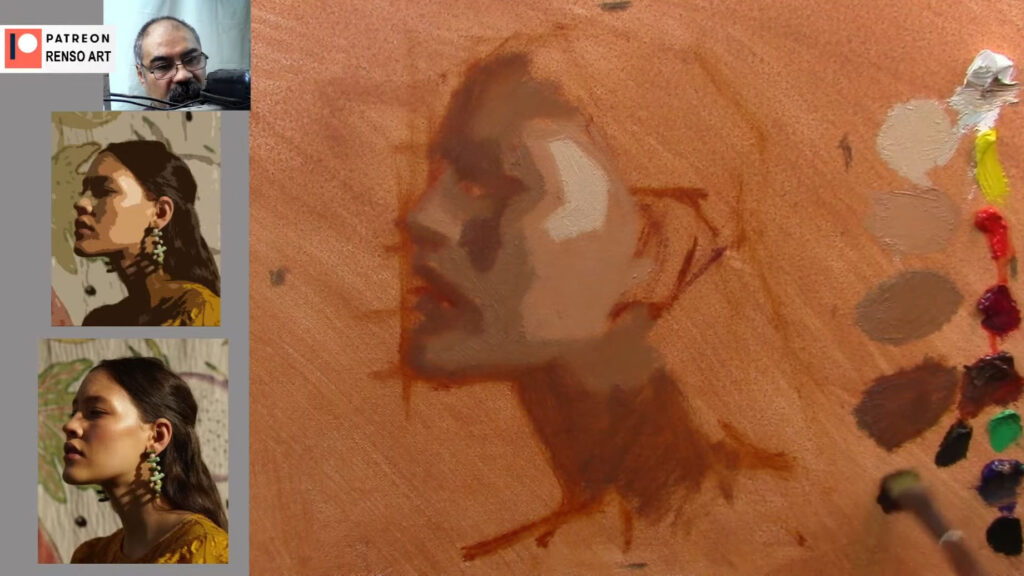
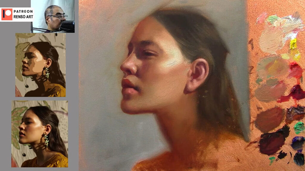
Applying the Shadows

When applying shadows, I think about the form of the face. Shadows aren’t flat—they follow the contours of the face. For example:

  • Cheeks: I use warmer, reddish tones to suggest the roundness of the cheeks.
  • Eyes: The eyelids and areas around the eyes are often warmer because the skin is thinner and more translucent.
  • Nose: I add a touch of warmth to the tip of the nose to make it stand out, while keeping the sides cooler.

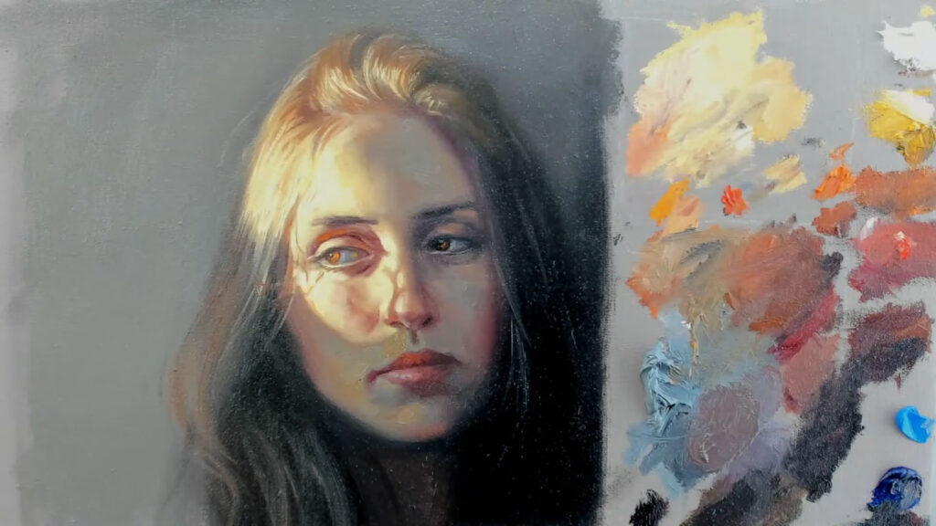
I also highlight the importance of transitions between light and shadow. I avoid harsh lines by blending the edges of my shadows. This creates a soft, natural look that mimics how light interacts with the skin.


Adjusting Values and Colors

As I paint, I constantly check the values (lightness or darkness) of my shadows. I squint my eyes to simplify the shapes and see if the shadows are too light or too dark. If a shadow feels off, I adjust it by adding more gray or tweaking the color temperature.

I often use a technique called exaggeration to test colors. I’ll apply a highly saturated color to see how it interacts with the surrounding areas, then tone it down if necessary. This helps me find the right balance between warmth and coolness in the shadows.


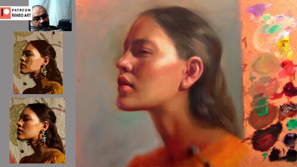
Refining the Details

Once the basic shadows are in place, I refine the details. I pay attention to areas like the eyes, nose, and mouth, where small changes can make a big difference. For example:

  • Eyes: I add subtle highlights to the whites of the eyes and a touch of warmth around the eyelids.
  • Nose: I use cooler tones for the sides of the nose and warmer tones for the tip.
  • Mouth: The upper lip is usually darker than the lower lip, and the corners of the mouth should be slightly shadowed.

I stress the importance of blending and softening edges, especially in shadow areas. This creates a more realistic and three-dimensional effect.


Knowing When to Stop

One of the biggest challenges in portrait painting is knowing when to stop. I often feel the urge to keep tweaking and adjusting, but overworking a painting can ruin its freshness. To avoid this, I step back frequently to assess the overall composition. If the values, colors, and proportions feel right, it’s time to call it finished.


Viewer Insights and Questions

Throughout my tutorial, viewers asked insightful questions and shared their own experiences. Here are some highlights:

  1. Patrick’s Question: When do you know you’re finished?
    I responded that it’s a combination of technical accuracy and intuition. When the values, colors, and proportions feel right, and when nothing feels “annoying” or out of place, it’s time to stop. I also mentioned that stepping back and looking at the painting from a distance helps me make this decision.
  2. Cindy’s Comment: How do you handle the transition between light and shadow?
    I explained that blending is key. I use a soft brush to blend the edges of shadows, creating a smooth transition. I also emphasized the importance of squinting to see the overall shapes and values.
  3. Joyce’s Observation: The shadow on the right cheek is so strong. Do you keep it sharp or blend it?
    I clarified that I prefer to blend the edges of shadows, even if they appear sharp in the reference image. This creates a more natural and painterly effect.
  4. Chris’s Question: Do you use black in your shadows?
    I acknowledged that many artists avoid using black, but I find it useful for creating deep, rich shadows. I mix black with other colors to avoid flat, lifeless tones.

Final Thoughts

Mixing shadow colors for a portrait is both a technical and intuitive process. By starting with a neutral gray and adjusting the warmth or coolness of your shadows, you can create a harmonious and realistic painting. Remember to pay attention to the form of the face, blend your edges, and constantly check your values. And most importantly, trust your instincts—painting is as much about feeling as it is about technique.

My approach is a reminder that painting is a journey. It’s about experimenting, learning, and growing with each brushstroke. As one viewer, Terry, commented, “It’s amazing how much depth you can create with just a few well-placed shadows.” So, grab your brushes, set up your palette, and start experimenting with shadow colors. With practice, you’ll develop your own approach and create portraits that truly come to life.

Happy painting! 🎨


Inspired by my portrait painting techniques. Watch my full tutorial for more insights and join the conversation in the comments section!

The Importance of Values in Portrait Painting: A Comprehensive Guide to Mastering Light and Shadow

Creating a compelling portrait is one of the most rewarding challenges an artist can undertake. But what separates a flat, lifeless portrait from one that feels alive and three-dimensional? The answer lies in understanding and mastering values. Values—the lightness or darkness of a color—are the backbone of any successful painting. They define the structure of the face, create depth, and bring realism to your work. Even if your colors are vibrant and accurate, a portrait with poorly executed values will lack impact.

In this blog post, we’ll dive deep into the importance of values in portrait painting. We’ll explore what values are, why they matter, and how to use them effectively to create stunning, realistic portraits. Plus, don’t forget to watch the accompanying video demo, where I’ll walk you through the entire process of painting a portrait with a strong focus on values. Whether you’re a beginner or an experienced artist, this guide will help you elevate your portrait painting skills.


What Are Values, and Why Are They So Important?

Values refer to how light or dark a color is, regardless of its hue. In portrait painting, values are essential because they define the form and structure of the face. Here’s why they matter:

  1. They Create Depth and Dimension: Values help distinguish between the planes of the face, making it look three-dimensional. Without proper values, a portrait can appear flat and lifeless.
  2. They Establish Contrast: The interplay of light and shadow adds drama and interest to your painting. Strong contrasts can make your portrait more dynamic and engaging.
  3. They Guide the Viewer’s Eye: Well-defined value patterns can direct attention to the focal points of your portrait, such as the eyes or mouth.
  4. They Simplify Complexity: By breaking down the face into light and dark shapes, values help you simplify complex features and focus on the big picture.

In the video demo, I’ll show you how to use values to transform a flat sketch into a realistic, three-dimensional portrait.

The Importance of Values in Portrait Painting

How to See and Understand Values

Training your eye to see values is a skill that takes practice, but it’s absolutely essential for creating realistic portraits. Here are some tips to help you develop this skill:

  1. Squint Your Eyes: Squinting simplifies the image, allowing you to see the major light and dark shapes without getting distracted by details. This is a great way to identify the overall value structure of a face.
  2. Use a Black-and-White Reference: Converting your reference photo to grayscale removes the distraction of color, making it easier to focus on values. You can also use a grayscale filter on your phone or computer to help with this.
  3. Identify the Light Source: Determine where the light is coming from and how it affects the planes of the face. This will help you understand where the highlights, midtones, and shadows should be.
  4. Practice Value Studies: Spend time drawing or painting portraits using only black, white, and gray. This will help you focus on values without the added complexity of color.

In the video, I’ll demonstrate how I analyze values in a reference photo and translate them into my painting.

The Importance of Values in Portrait Painting

The Value Structure of a Portrait

To paint a realistic portrait, it’s helpful to break down the face into a simple value structure. Here’s how I approach it:

  1. Light Areas: These are the parts of the face that catch the most light, such as the forehead, cheekbones, nose, and chin. These areas will have the lightest values in your painting.
  2. Midtones: These are the transitional areas between light and shadow, such as the sides of the face, the lower cheeks, and the area around the mouth. Midtones help create a smooth transition between light and dark.
  3. Shadow Areas: These are the parts of the face that receive little to no light, such as the eye sockets, under the nose, under the chin, and the sides of the neck. These areas will have the darkest values in your painting.

By simplifying the face into these three value groups, you can create a strong foundation for your portrait. Once the basic value structure is in place, you can refine the details and add subtle shifts in value to create a more realistic effect.


The Importance of Values in Portrait Painting

Common Mistakes to Avoid

Even experienced artists can struggle with values from time to time. Here are some common mistakes to watch out for:

  1. Overcomplicating Values: Beginners often try to include too many subtle shifts in value, which can make the painting look muddy and overworked. Start with broad value shapes and refine later.
  2. Ignoring the Light Source: Inconsistent lighting can make your portrait look unnatural. Always keep the light source in mind and ensure that your highlights and shadows are consistent.
  3. Relying Too Much on Color: Color can be deceptive. A vibrant color might still be dark in value, so always check your values independently of color.
  4. Neglecting Edges: The transition between light and shadow (also known as the edge) is just as important as the values themselves. Soft edges create a sense of realism, while hard edges can add drama and focus.

In the video demo, I’ll show you how to avoid these mistakes and create a balanced, realistic portrait.

The Importance of Values in Portrait Painting

Watch the Video Demo!

In the video, I’ll walk you through the entire process of painting a portrait with a strong focus on values. You’ll see how I:

  • Analyze the reference photo for value patterns.
  • Block in the major light and shadow areas.
  • Refine the values to create a realistic, three-dimensional effect.
  • Add subtle details and transitions to bring the portrait to life.

This demo is perfect for artists of all levels who want to improve their understanding of values and take their portrait painting to the next level.

The Importance of Values in Portrait Painting

Tips for Practicing Values in portrait painting

  1. Do Value Studies: Practice painting or drawing portraits using only black, white, and gray. This will help you focus on values without the distraction of color.
  2. Use a Limited Palette: When working with color, limit your palette to avoid overwhelming yourself. This will help you concentrate on value relationships.
  3. Study Master Paintings: Look at how the Old Masters used values to create depth and realism in their portraits. Pay attention to how they simplified complex forms into light and shadow.
  4. Experiment with Lighting: Try painting the same subject under different lighting conditions to see how it affects the values.

The Importance of Values in Portrait Painting

Conclusion

Mastering values is one of the most important skills you can develop as an artist. It’s the key to creating portraits that feel alive, three-dimensional, and full of depth. By understanding how light interacts with the planes of the face and simplifying complex forms into basic value shapes, you can take your portrait painting to the next level.

I hope this blog post and video demo inspire you to focus on values in your own work. Don’t forget to watch the video to see these concepts in action, and let me know in the comments how you plan to apply these tips to your next portrait!

Happy painting! – Values in portrait painting🎨✨

The Importance of Values in Portrait Painting