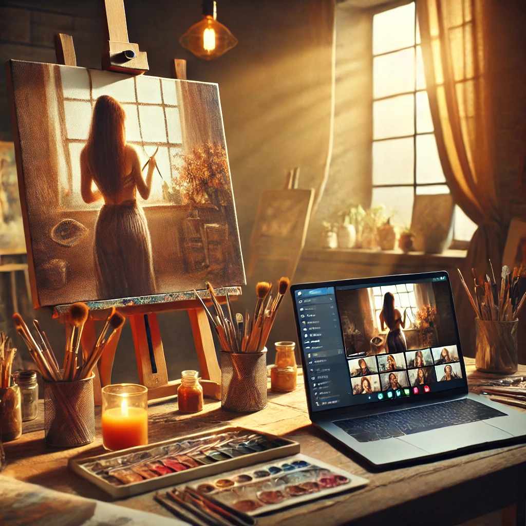
Struggling with your portraits? You might find my E-book helpful. Click here
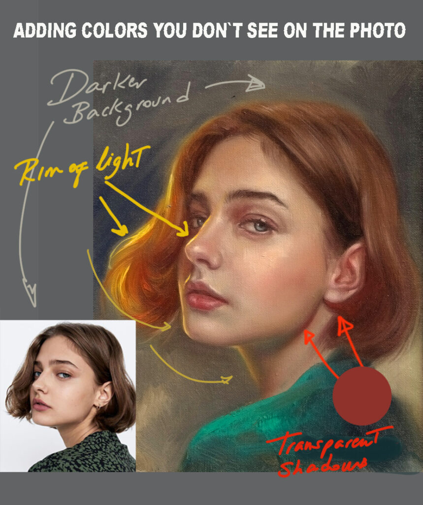
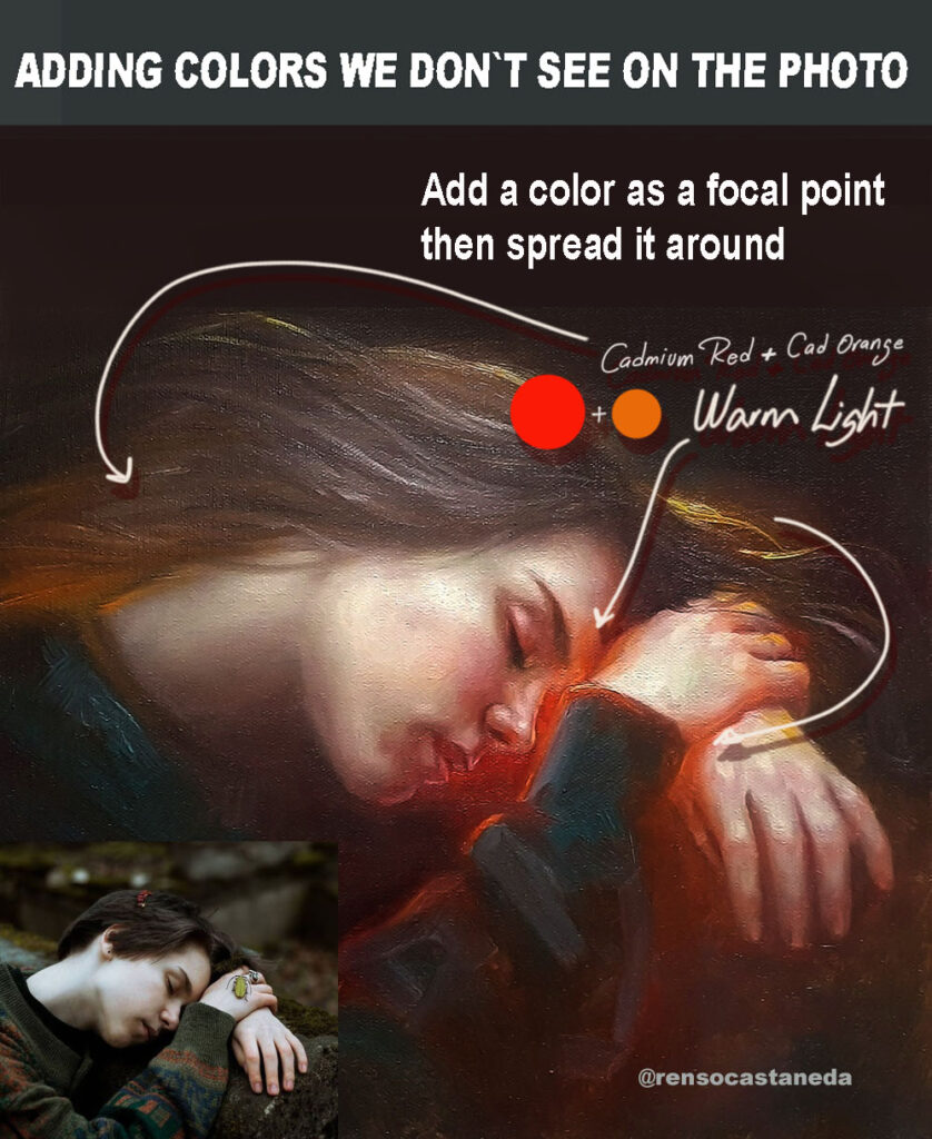
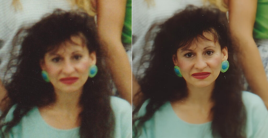
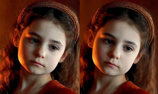
Have you ever tried to match every single color in a reference photo while painting—only to end up with a flat, dull result? I’ve been there too. At first glance, it makes sense: if we want realism, shouldn’t we replicate what we see? But here’s the catch—cameras don’t see the world the way our eyes do. And one of the biggest culprits? Shadows.
The Problem with Photo Shadows
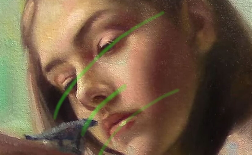
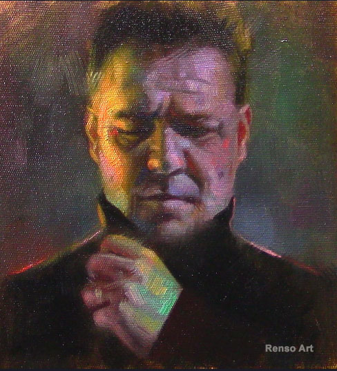
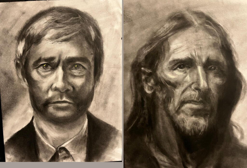
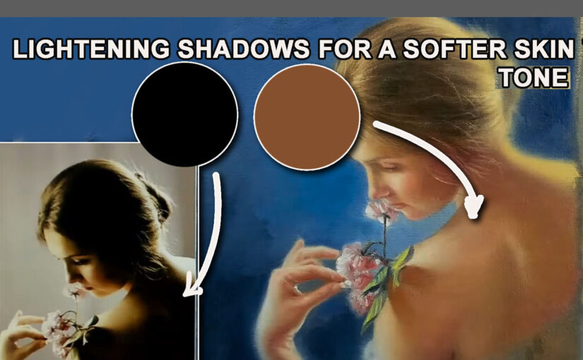
In real life, shadows are rarely pure black. They’re filled with subtle shifts—hints of reflected color, soft transitions, and delicate variations in tone. But cameras, especially in high-contrast lighting, tend to “crush” shadows into unnatural darkness. Details vanish, colors flatten, and what should be a gentle gradient turns into an abyss.
If we copy these shadows exactly, our paintings inherit the same problem: harsh, lifeless areas that suck the depth right out of the image. Instead of enhancing form, they flatten it. Instead of suggesting texture, they obscure it.

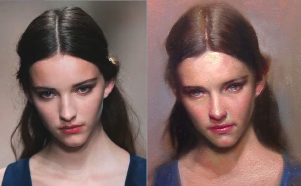
The Artist’s Job: Translation, Not Replication
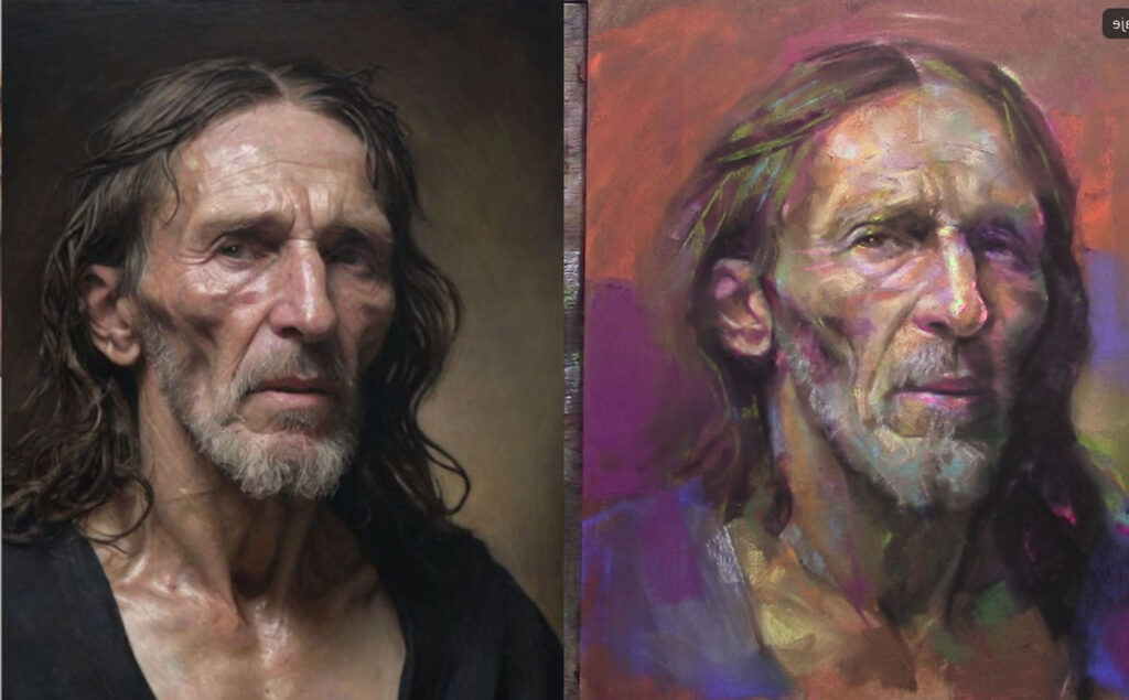
Is a concept that highlights the creative responsibility of the artist to interpret the world rather than simply copy it. Instead of aiming for a photo-realistic reproduction of what they see, artists are called to translate emotions, atmosphere, and meaning through their own unique lens.
This idea suggests that true artistry lies in capturing the essence of a subject — its soul, movement, or mood — and expressing it through color, form, brushwork, and composition. It’s not about duplicating reality, but transforming it into something that resonates on a deeper, often more poetic level. The artist becomes a bridge between reality and imagination, guiding the viewer toward a deeper understanding or new perspective.
The Bigger Picture: Guiding the Eye
Art is about control. When we blindly follow a photo, we surrender decisions to the camera’s limitations. But when we adjust shadows intentionally, we:
- Direct attention (letting the viewer’s eye glide through the piece, not get stuck in black holes).
- Enhance depth (using softer, more nuanced shadows to push and pull forms in space).
- Add mood (cool shadows for tranquility, warm ones for energy).
Trust Your Eyes, Not Just the Photo
Next time you paint from a reference, try this: squint at the photo, then squint at your subject in real life (if possible). Notice how much more your eye perceives compared to the camera. That’s your artistic license at work.
So don’t be afraid to stray from the photo. Lighten a shadow. Tweak a color. Let intuition guide you. After all, a great painting doesn’t just show what was there—it reveals what could be seen.