A good portrait is built in stages.
If you skip stages, things fall apart—proportions, values, everything.
So instead of thinking:
“I need to paint a portrait”
Think:
“I need to solve one step at a time”
Let me show you exactly how I approach it.
Step 1: The Blank Canvas (and the plan)
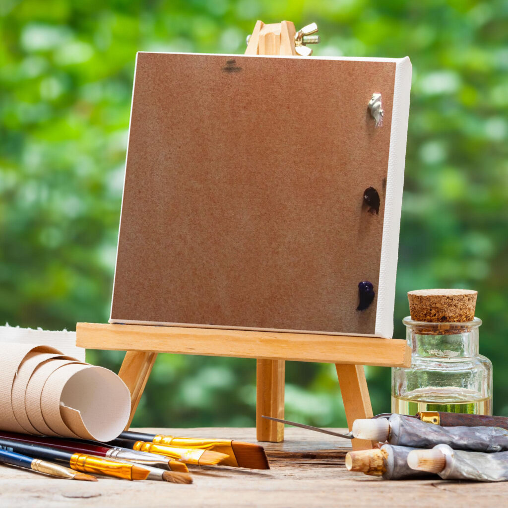
Before touching the brush, I already have a plan.
- Where is the light coming from?
- What is the main shadow shape?
- What is the focus?
If you don’t decide this early, you’ll keep guessing later.
Sometimes I tone the canvas slightly so I’m not working on pure white.
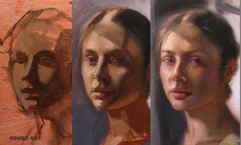
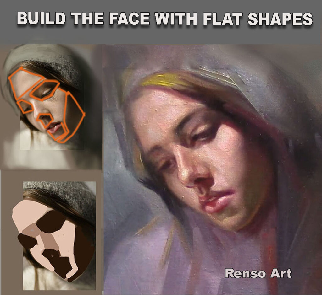
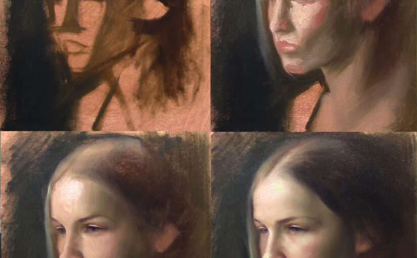
Step 2: Block-in (big shapes only)
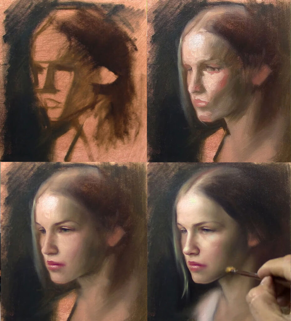
This is where most beginners rush.
Don’t.
At this stage:
- no details
- no eyelashes
- no small corrections
Only:
- big shape of the head
- big shadow vs light
If the block-in is wrong, everything after will be harder.
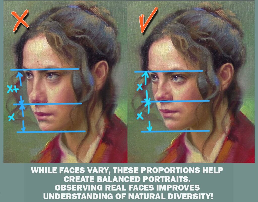
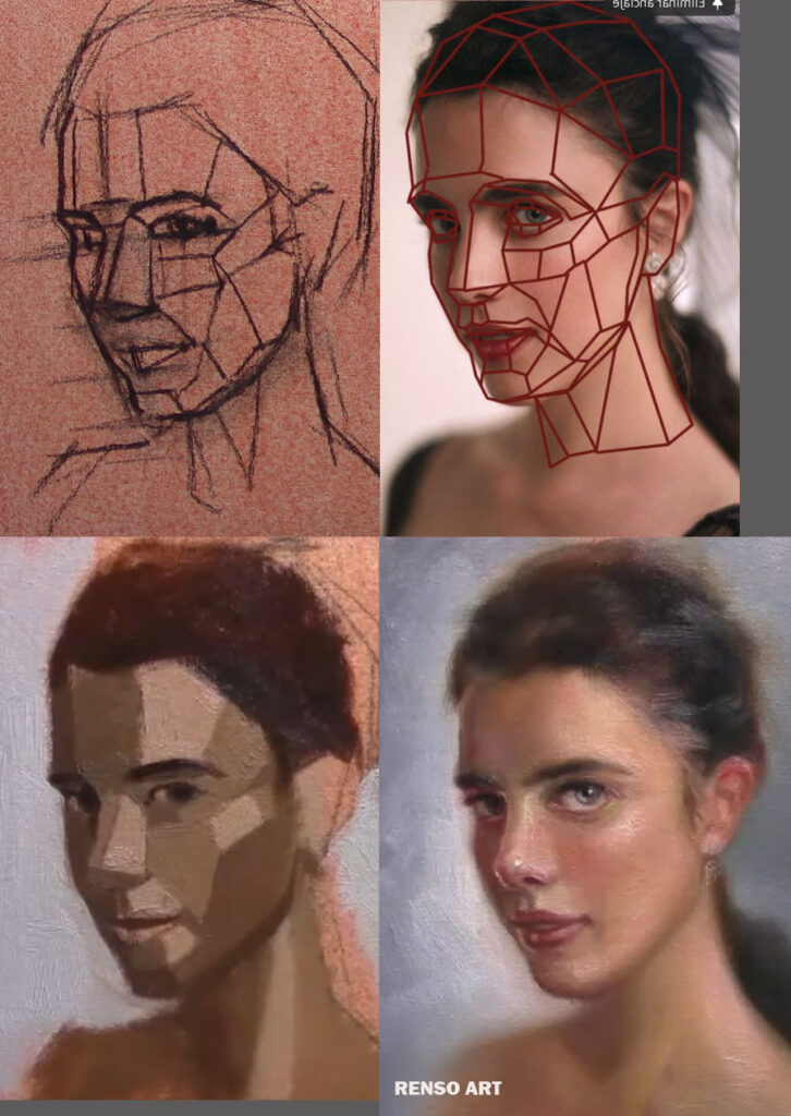
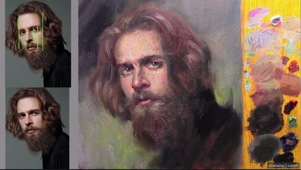
Step 3: Proportions and placement


Now I start checking:
- Are the eyes too high?
- Is the nose too long?
- Is the angle of the head correct?
I don’t guess—I compare.
This is where I combine measuring and understanding.
You don’t need perfect lines, but you need correct relationships.
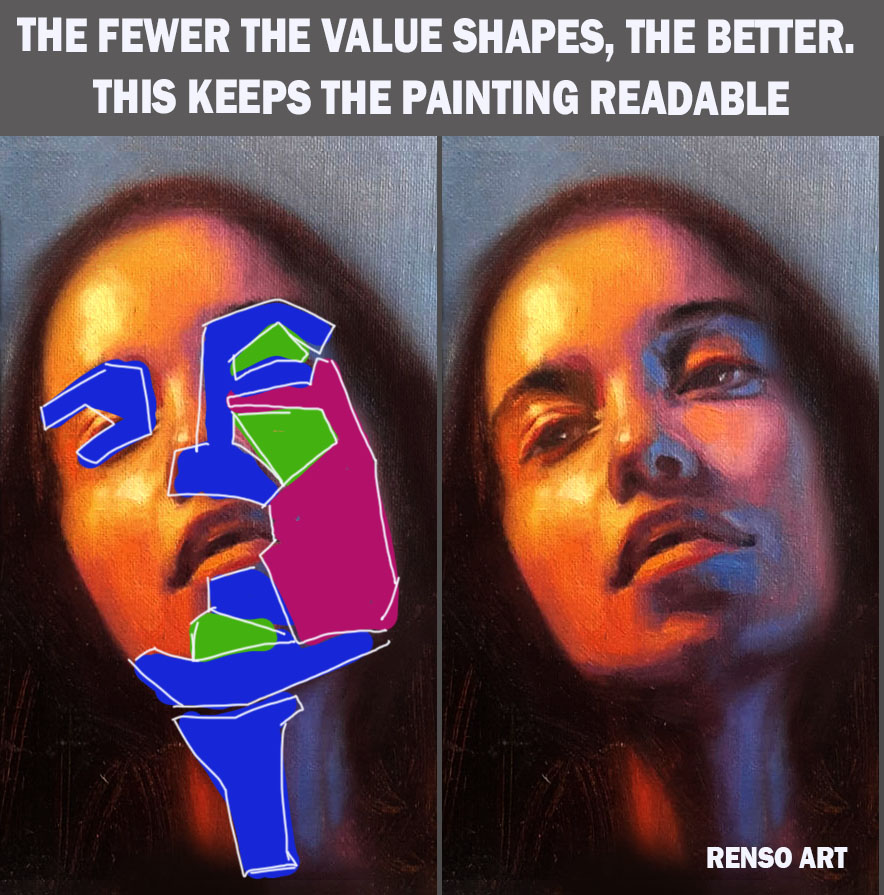
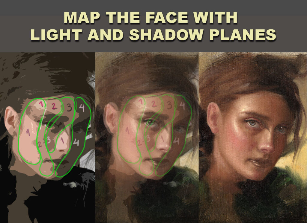
Step 4: Establish values (this is everything)
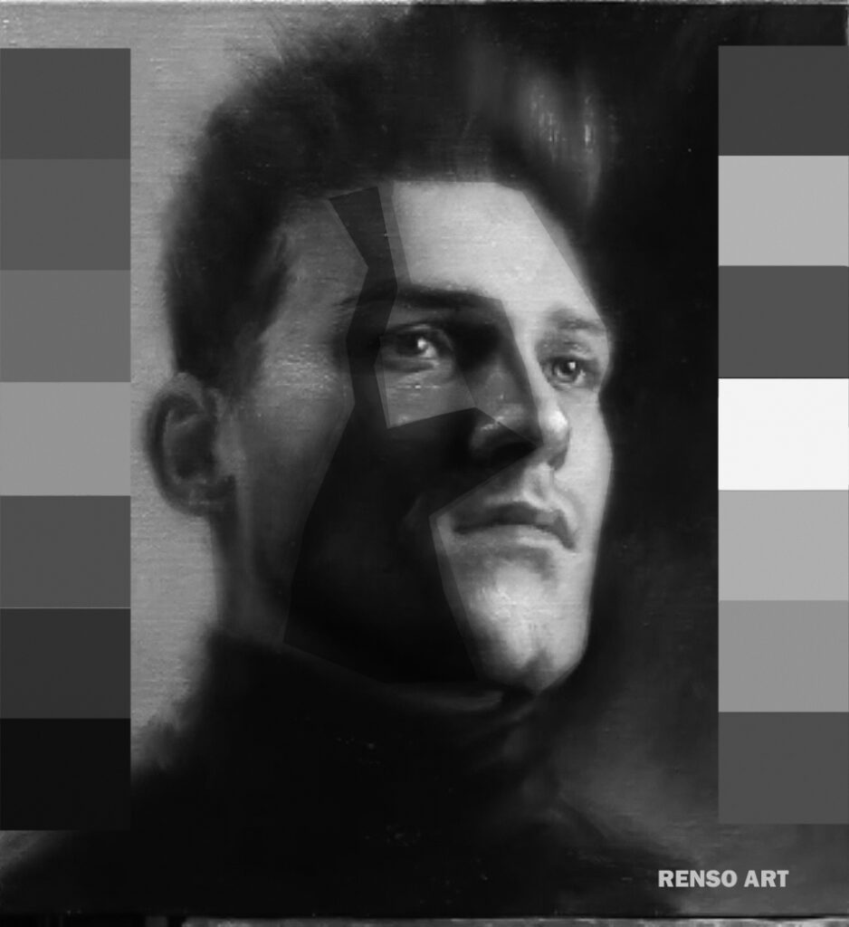
This is the step that makes or breaks your portrait.
I simplify into:
- light family
- shadow family
No over-blending.
I keep the planes visible.
If your values are right, the portrait will feel solid—even without details.
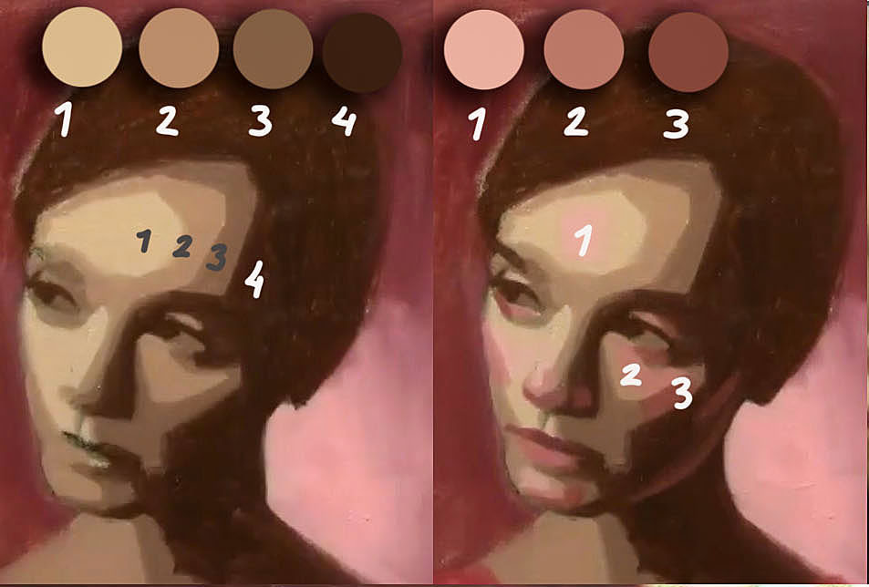
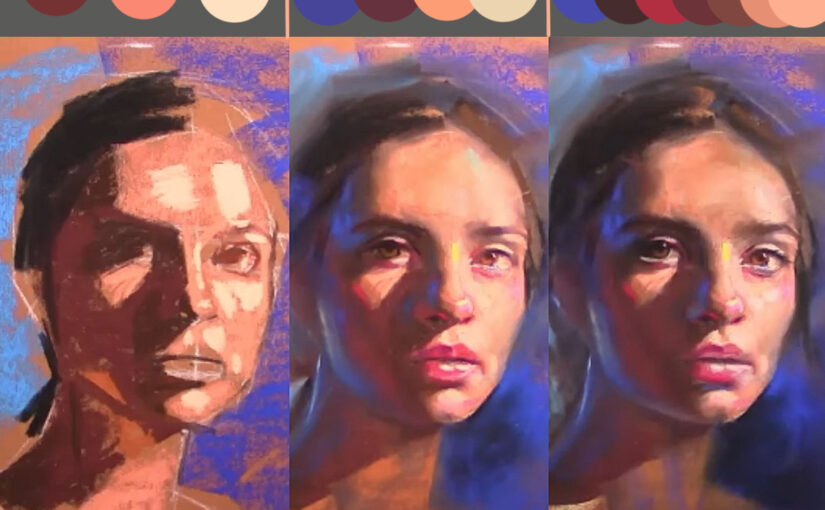
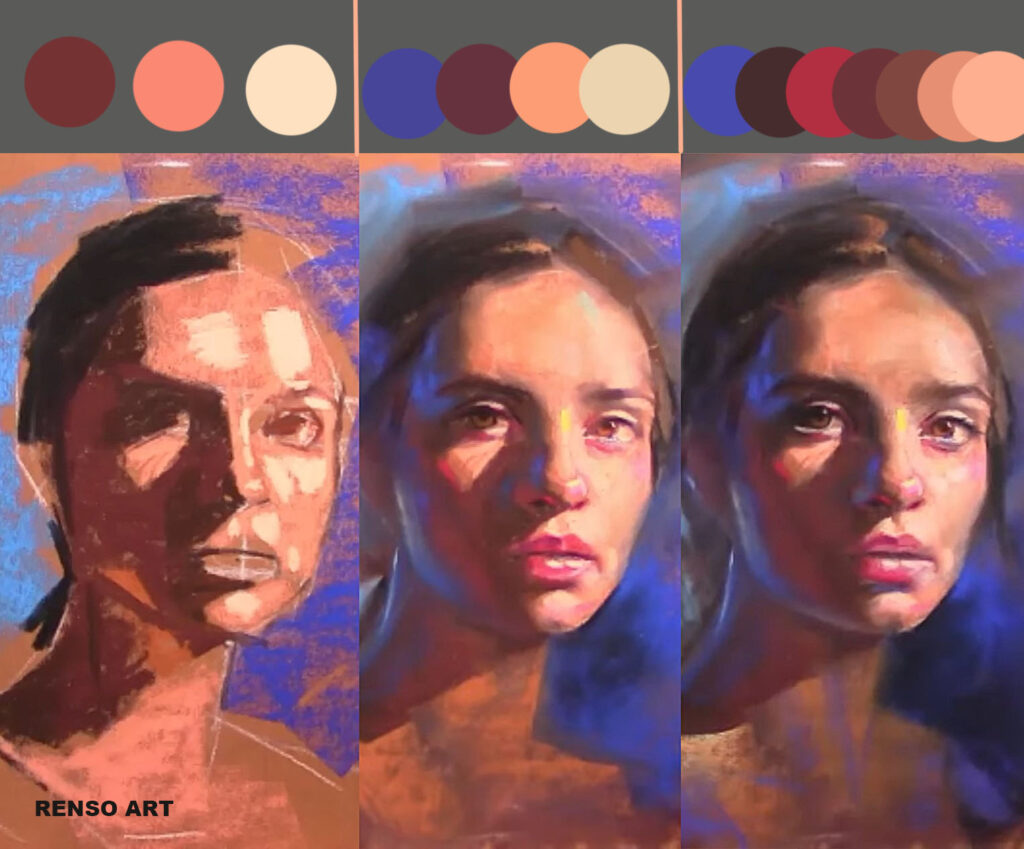
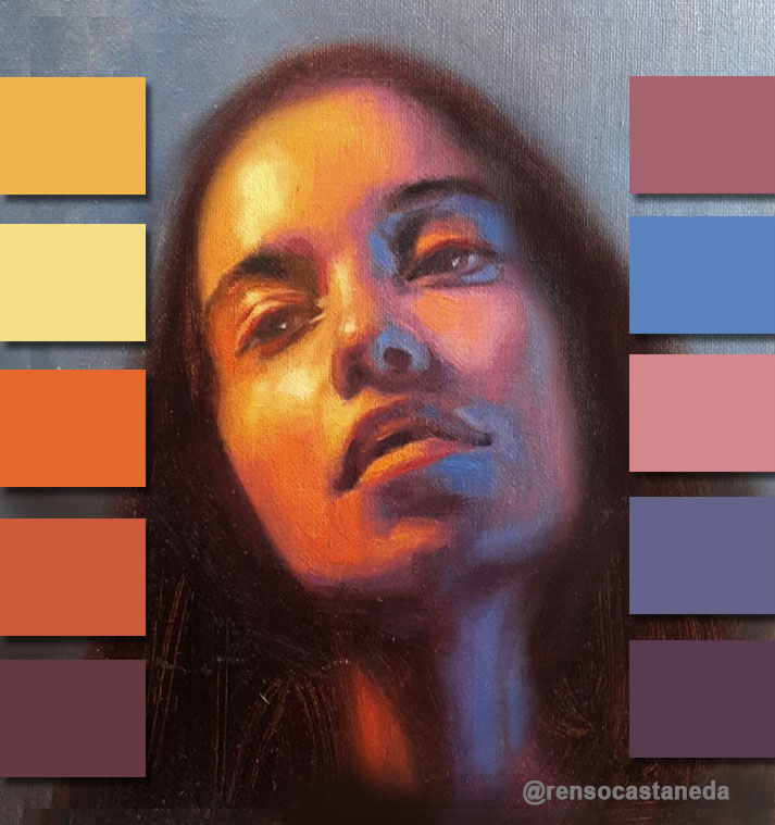
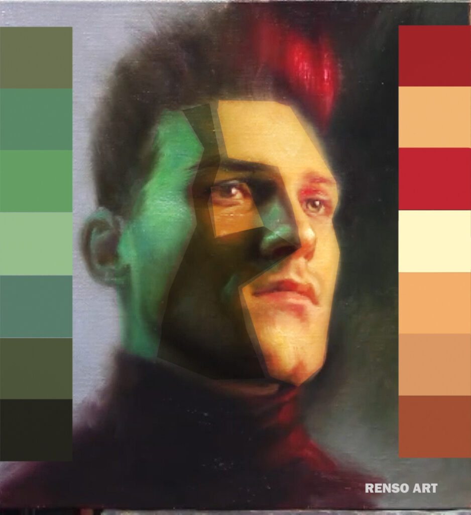
Step 5: Add color (keep it simple)

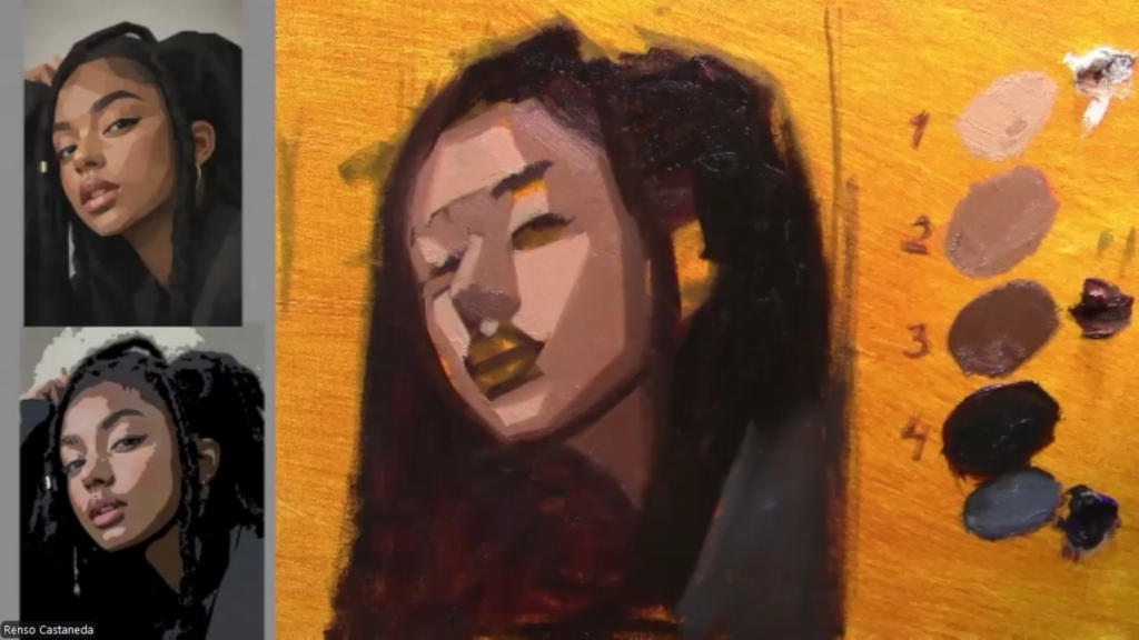
Now color comes in—but controlled.
I don’t use 20 colors.
I often work with something like the Zorn palette to keep things simple.
Think in terms of:
- warm vs cool
- not exact color matching
Too many colors = confusion.
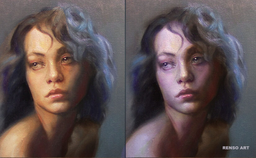
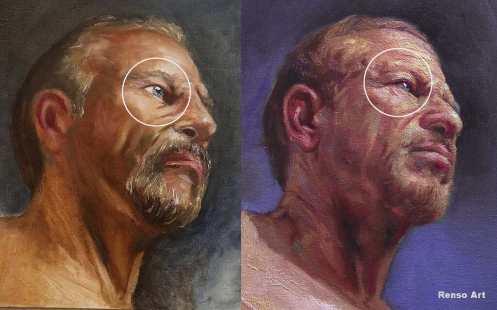
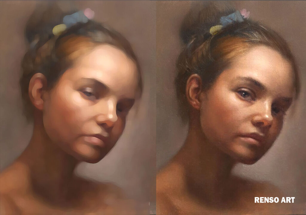
Step 6: Edges and transitions
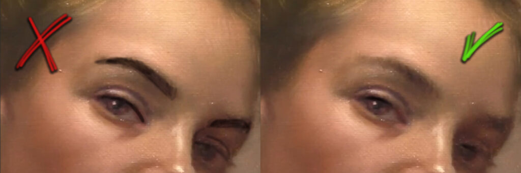

Now I start refining:
- soft edges where forms turn
- sharper edges where I want focus
Not everything should be sharp.
Edges create depth and realism.
Step 7: Final adjustments (not overworking)
At the end, I don’t “add more.”
I adjust:
- small value corrections
- subtle highlights
- balance
And sometimes the best decision is to stop.
Overworking can kill a good painting.
A simple way to remember the process
- Plan
- Block-in
- Proportions
- Values
- Color
- Edges
- Adjust
That’s it.
Where most people go wrong
They jump from:
👉 blank canvas → details
And skip:
- structure
- values
- simplification
That’s why things feel out of control.
For your next painting
Don’t try to do everything at once.
Focus on one stage at a time.
If your painting looks wrong, don’t panic—just ask:
👉 “Which step did I skip?”
Go back. Fix that step.
Final thought
A strong portrait is not about talent.
It’s about building it correctly, step by step.
Do that consistently, and your results will change.
My E books could help you improve faster: https://www.rensoart.com/e-books-practical-tips-color-harmony/