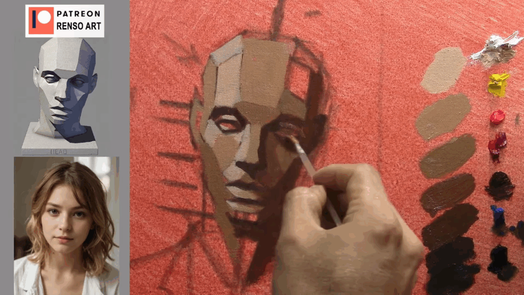
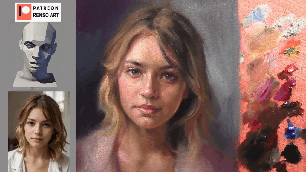
Struggling with your portraits? You might find my E-book helpful. Click here
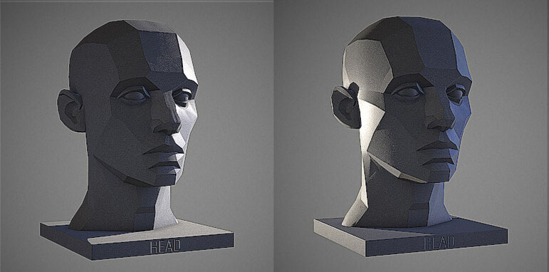
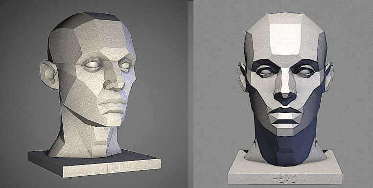
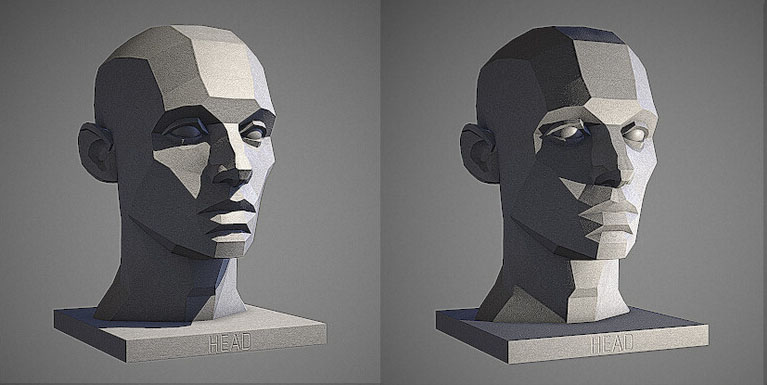
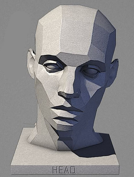
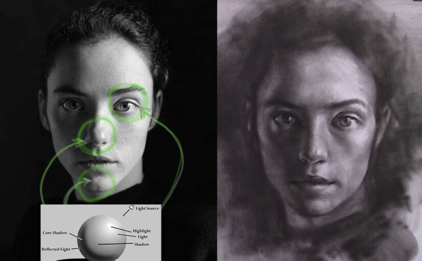
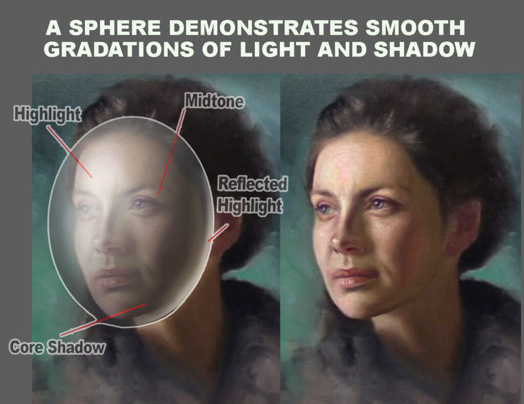
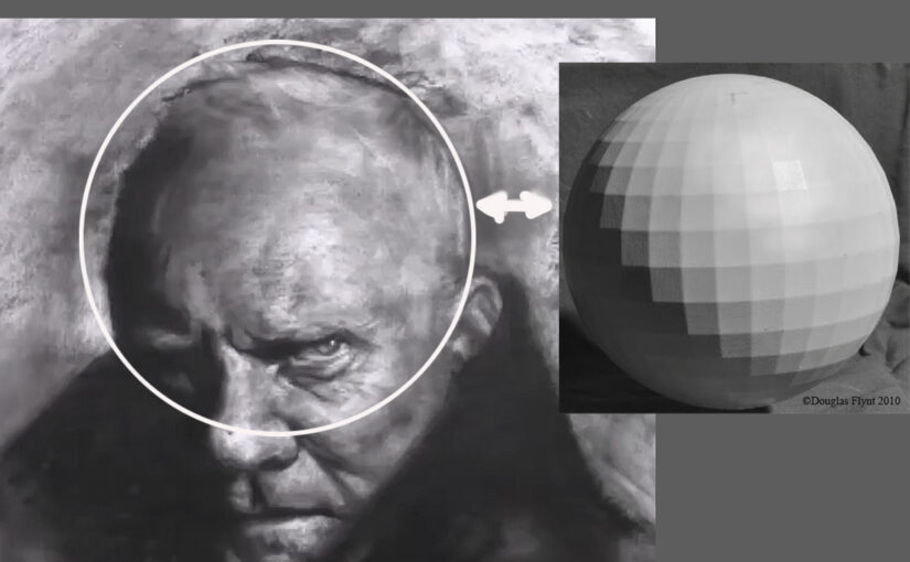
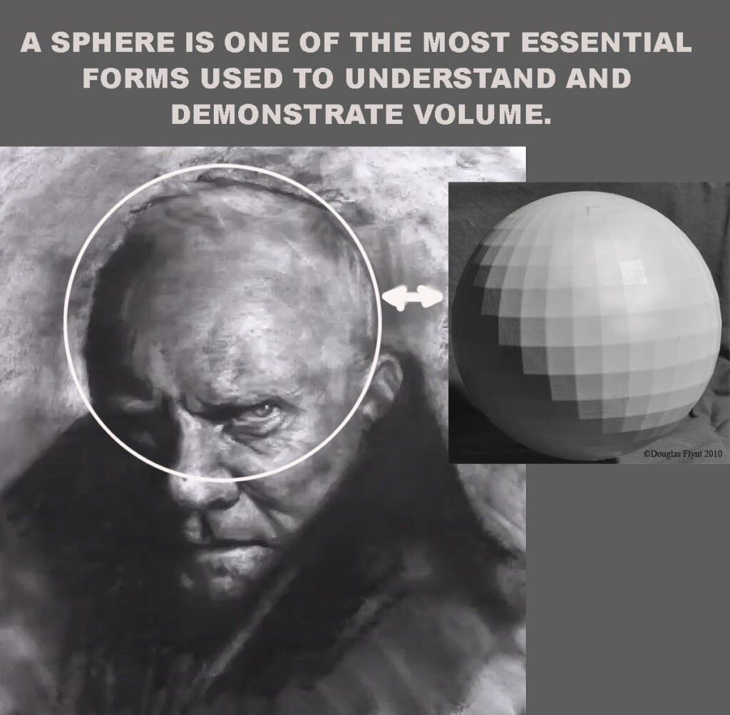
Understanding how light interacts with the bone structure of the face is essential for any artist aiming to create realistic, dimensional portraits, knowing where to place highlights can dramatically enhance the lifelike quality of your work.
In this article, we’ll explore the key areas of the face where highlights naturally appear due to the underlying bones—and why they matter.

Why Bone Structure Matters in Portrait Lighting
Light doesn’t fall evenly across the face. It catches on the protruding parts of the skull, such as the brow ridge, cheekbones, and the bridge of the nose, creating areas of brightness—or highlights.
These highlights aren’t just decorative—they help describe form, suggest volume, and guide the viewer’s attention.
If you place highlights based only on instinct or guesswork, your portrait might look flat or “off.” But when you understand the structure beneath the skin, your lighting becomes more believable—even stylized art gains depth.
10 Key Facial Highlight Areas (Due to Bone Structure)
Here’s a breakdown of where highlights tend to appear most naturally:
1. Forehead (Frontal Bone)
The upper center of the forehead catches light easily, especially under overhead lighting. This area is typically broad and slightly curved, making it a natural reflector.
2. Brow Ridge (Supraorbital Ridge)
Just above the eyes, this bony ridge creates a subtle shelf. It catches light from above and defines the top of the eye socket.
3. Bridge of the Nose (Nasal Bone)
This slender ridge is often the brightest point in portrait lighting, particularly in front or 3/4 views.
4. Cheekbones (Zygomatic Arch)
One of the most prominent facial structures. Highlights here define facial width and contour. The exact placement varies depending on lighting direction and facial angle.
5. Tip of the Nose
Though cartilage-based, the tip reflects light strongly. A small, sharp highlight here can suggest skin texture and shine.
6. Cupid’s Bow & Upper Lip (Philtrum)
The curve of the upper lip, especially the cupid’s bow, often reflects light subtly—especially when the skin is slightly moist or under soft lighting.
7. Chin (Mental Protuberance)
Depending on chin shape and the light source, this can be a strong or subtle highlight. It often helps balance the light hitting the forehead.
8. Jawline
Though not always directly highlighted, the jawline reflects light differently depending on the head’s tilt. It’s especially visible in profile or under-rim lighting.
9. Above the Eyelids (Orbital Rim)
This area softly reflects light, helping to shape the eyes and give them dimension.
10. Sides of the Face (Temporal Region)
If the light source is from the side or above, this area can pick up a gentle gradient highlight—important for framing the face.

Tips for Painting Highlights Naturally
- Soften edges: Highlights are rarely sharp. Unless you’re painting a moist or oily surface, keep transitions smooth and gradual.
- Avoid white: Pure white can flatten your highlights. Try using a slightly warmer or cooler tone to keep them integrated into the skin.
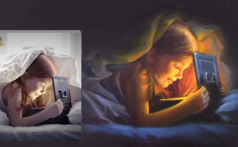
- Consider the light source: A single strong source (like sunlight) creates more defined highlights. Diffused or ambient light softens them.
- Use subtle shifts: Sometimes, less is more. A slight change in value can suggest structure just as effectively as a bright highlight.
Practice and Observation Are Key
The best way to master facial highlights is through practice and keen observation. Study real faces under different lighting conditions. Paint from life or use references with clear directional light.
Understanding how bone structure affects highlights will give your portraits more realism, drama, and presence.
Final Thoughts
Great portraiture isn’t just about capturing a likeness—it’s about bringing structure to life through light. Once you start seeing the face as a landscape of planes and angles, your approach to highlights will never be the same.
Keep painting. Keep observing. And don’t be afraid of a little shine.

- From Planes to Realism: How to Soften Structure Without Losing Form
- How to Paint Planes of the Face in Warm and Cool Light
- Top 5 Mistakes Beginners Make in Portraits
- How to Self-Critique Your Own Paintings
- The Secret Rhythm of Brushstrokes on Skin