
Struggling with your portraits? You might find my E-book helpful. Click here
A lot of students tell me this:
“Renso, I think my drawing is correct… but it still doesn’t look real.”
And they’re right.
The proportions are fine. The features are in the right place. Nothing is “wrong”…
But the portrait still looks flat.
So what’s happening? – It’s not your drawing – It’s your values.
Drawing Is Not Enough
Good drawing gives you structure.
But values give you form.
You can have a perfect Loomis construction, correct proportions, good likeness…
But if your values are off, the face will look like a sticker. Flat. No volume.
Think of it this way:
- Drawing = map
- Values = light + depth + reality
Without values, the drawing doesn’t “turn” in space.
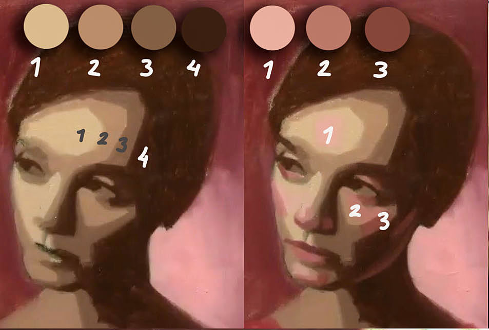
What “Flat” Really Means
When a portrait looks flat, usually one of these is happening:
1. Not enough value range
Everything is sitting in the middle.
- No real darks
- No clear lights
- Too much “gray thinking”
So the face has no contrast → no structure.
2. Shadows are too light
This is very common.
Students are afraid to go dark, especially in:
- Eye sockets
- Under the nose
- Under the chin
But shadows define the planes of the head.
If your shadows are too light → the face doesn’t turn.
3. Lights are not organized
Light is not random.
Usually, you have:
- One main light source
- Clear separation: light side vs shadow side
If you start mixing everything, blending everywhere, adding light inside shadows…
You destroy the structure.
4. Too much blending
This is a big one.
Blending feels good… but it kills form.
If everything is soft:
- No edges
- No planes
- No direction
You end up with a “foggy face”
Instead, think in planes first, softness later.
My Approach (What I Teach)
When I paint portraits, I don’t start thinking about details.
I think:
“Where is the light, and where is the shadow?”
That’s it.
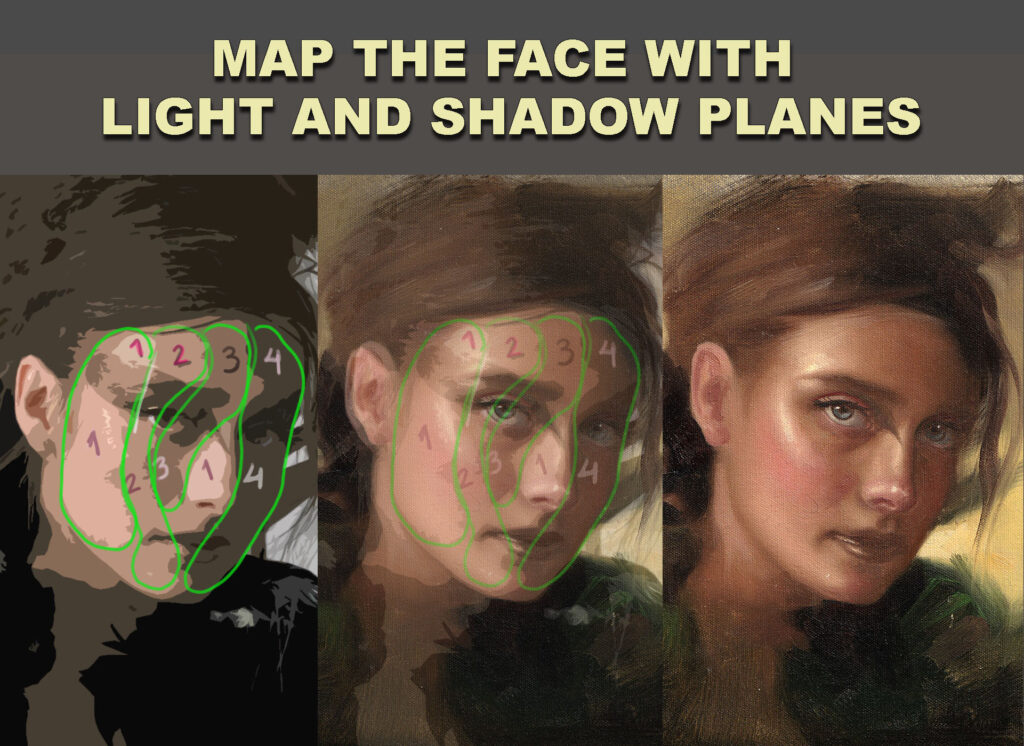
Step 1: Separate light and shadow
No details yet.
Just two big masses:
- Light family
- Shadow family
Keep the shadow simple and unified.
Step 2: Push the shadow darker
Most students stay too safe.
I usually go a bit darker than I think.
Because:
It’s easier to lighten later than to fix a weak structure.
Step 3: Control the lights
Lights are not all the same.
You have:
- Highlight (strong)
- Halftones (softer)
- Planes turning away
If everything is equally bright → flat again.
Step 4: Edges last
Only after values are working, I start softening edges.
Not everywhere.
- Some edges sharp (focus)
- Some edges lost (soft transitions)
This creates depth.
A Simple Test
If you want to check your painting:
👉 Squint your eyes
Ask yourself:
- Can I clearly see light vs shadow?
- Does the head feel like a 3D form?
If not → it’s a value problem.
Not a drawing problem.
Important Shift
Most beginners think:
“I need to draw better.”
But often the real answer is:
“I need to see values better.”
That’s a completely different skill.
Final Thought
You don’t need perfect drawing to create a convincing portrait.
But you do need strong values.
If you focus on:
- Clear light vs shadow
- Strong value decisions
- Simplicity first
Your portraits will immediately feel more real… even with simple drawing.