Understanding the Color Planes of the Face

Bring depth, light, and life to your portraits through color awareness.

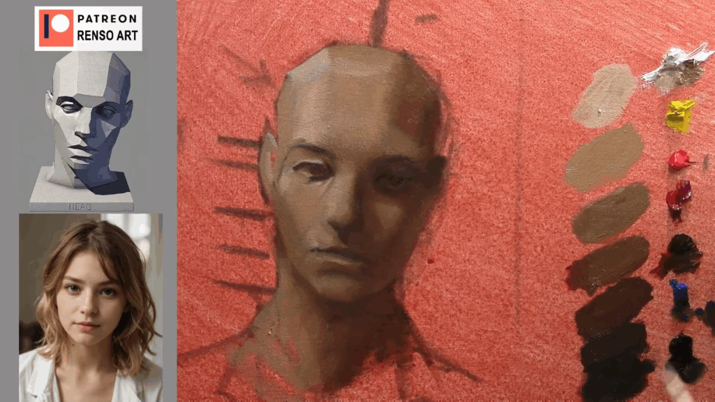
I remember my first portraits were pretty light. Even though I liked some of them, the reason they didn’t feel complete was that they lacked contrast, my shadows weren’t dark enough, and the colors were too muted. I can’t blame my teachers, though; I clearly remember one of them repeating over and over where to place the colors on the face. But back then, my main goal was to capture the likeness and include as many details as possible.

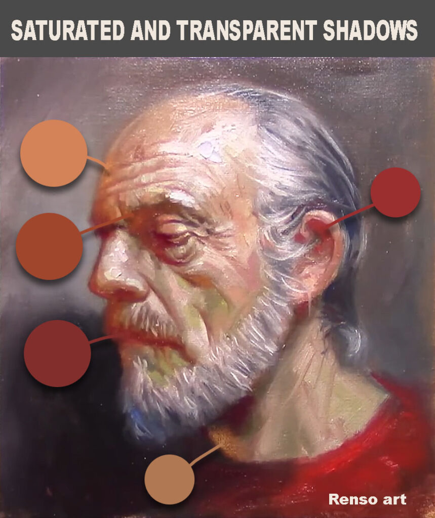
Here’s my advice: don’t repeat my mistakes. Make sure your shadows are dark enough, and don’t be afraid to add more color to the face. Why are we so hesitant? In my case, I was afraid of making the shadows too dark or the colors too bright—I didn’t want the painting to look like a clown. But the sooner you embrace that challenge, the faster you’ll improve.

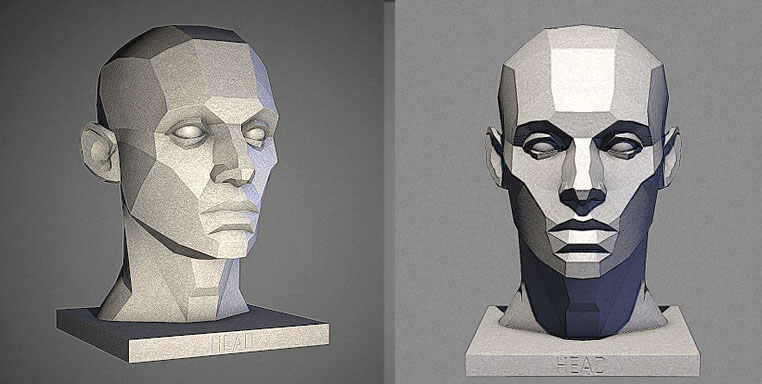
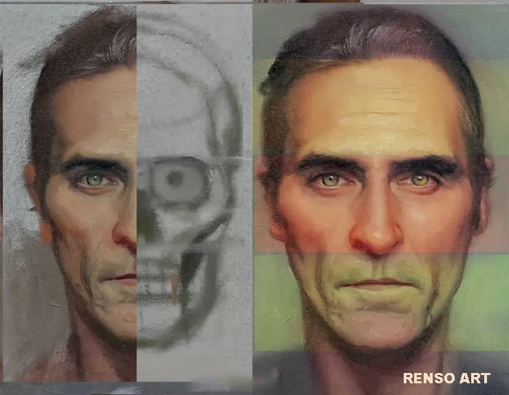
One essential concept in portrait painting is understanding the color planes of the face: how light interacts with the form, and how subtle color shifts define structure, mood, and realism.


color planes of the face

🎨 What Are Color Planes?

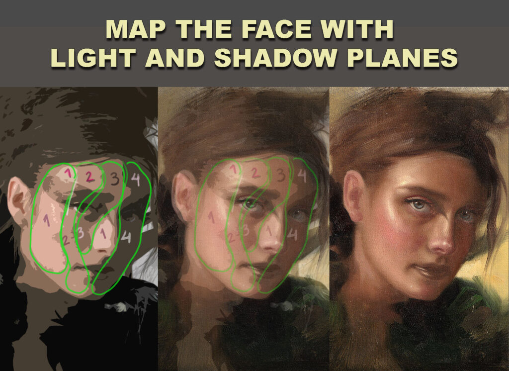
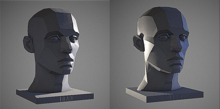
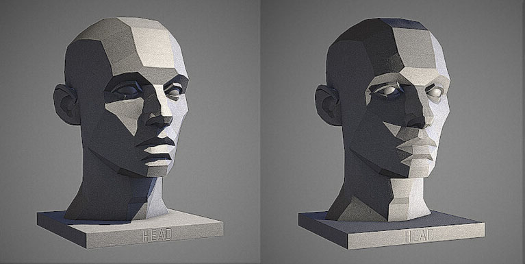
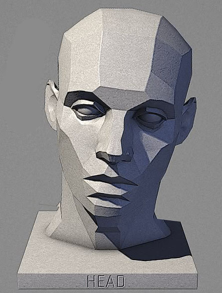
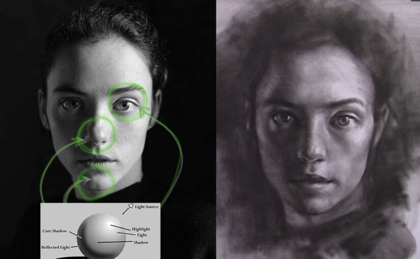
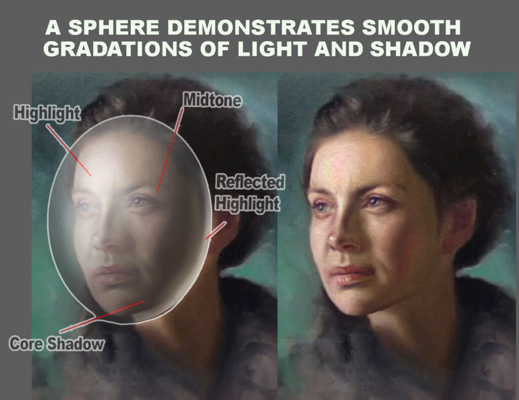
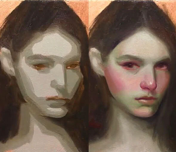
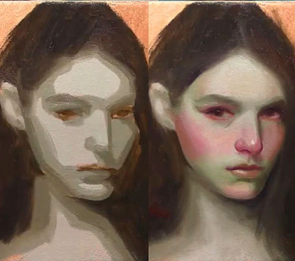
The human face isn’t flat. It’s made of angled surfaces (planes) that catch light differently depending on their direction. Each of these planes reflects light—and thus color—uniquely. By recognizing and painting these variations, you can create a more believable, dimensional face rather than a flat or overly blended one.


🔺 Key Facial Planes and Their Color Tendencies

  1. Frontal Planes (Forehead, Cheeks, Chin)
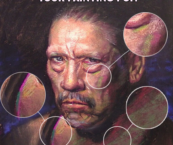
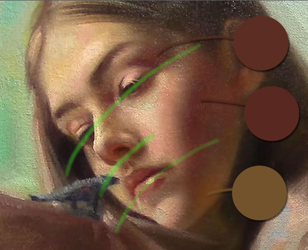
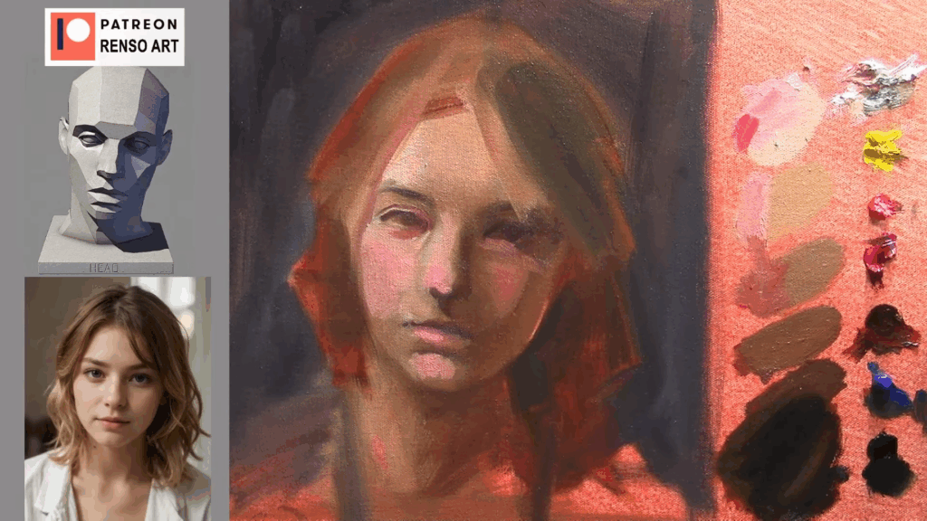
    These areas often face the light directly and tend to reflect cooler and lighter tones, especially in natural light. You’ll often see a mix of soft pinks, peach, and neutral skin tones here.
  2. Side Planes (Temples, Sides of the Nose, Jaw)
    These turn away from the light and fall into shadow. Shadows on skin often contain cooler, desaturated versions of the skin tone—think mauves, blues, and soft grays.
  3. Midtones (Transitional Planes)
    Between light and shadow, you’ll find subtle shifts: warm ochres, muted oranges, and browns. This is where artists often lose structure—learning to preserve these transitions is key to painting believable portraits.
  4. Planes with More Blood Flow (Nose, Cheeks, Ears)
    These areas are usually warmer and redder. Blood vessels closer to the surface add a rosy tone, especially in fairer skin.
  5. Planes Affected by Bone or Cartilage (Brow Ridge, Jawline, Nose Bridge)
    These may appear slightly cooler or have a greenish or bluish undertone, especially in thinner skin types or under cooler lighting.

color planes of the face

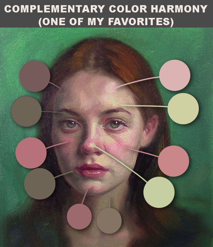
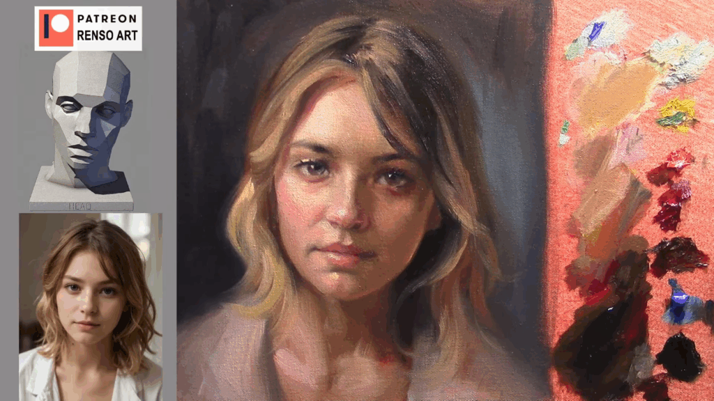
🌈 The “Zonal Color Theory” in Portraiture

Many traditional painters—like John Singer Sargent and Anders Zorn—understood that different zones of the face carry different dominant color temperatures:

  • Forehead → Yellowish (due to bone and thin skin)
  • Cheeks and Nose → Reddish (due to blood flow)
  • Chin and Jaw → Cooler or more bluish (due to shadow and beard area in men)

This approach, sometimes referred to as “zonal color theory,” helps create vibrant yet believable skin tones.

color planes of the face

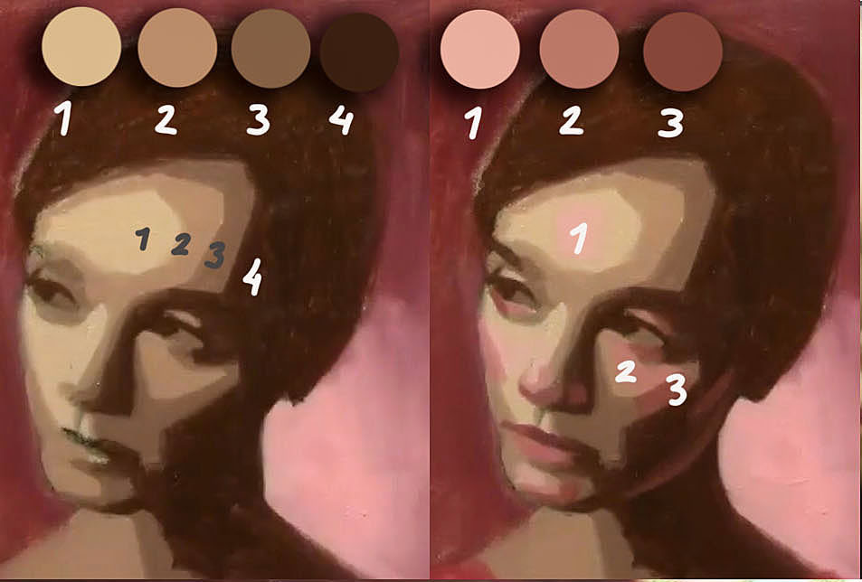
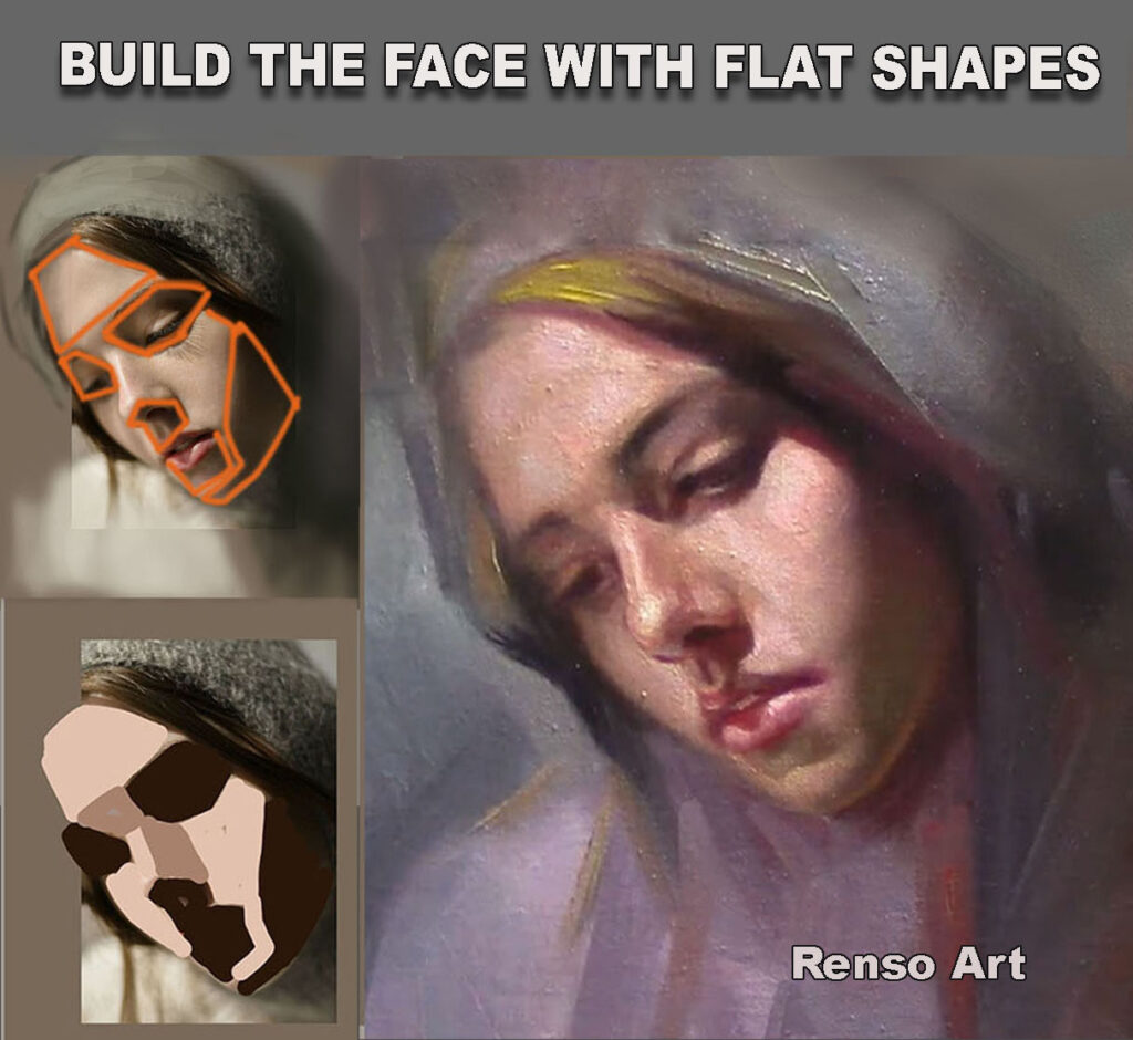
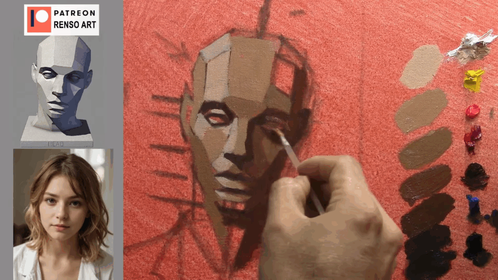
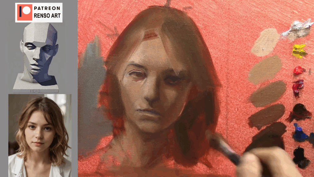
🖌️ Painting Tip: Don’t Blend Too Much

A common beginner mistake is over-blending the face, which erases the subtle changes between planes and flattens the form. Try blocking in colors with distinct edges first, then softly transition only where needed. The structure of the face is often lost in the blending—not the drawing.
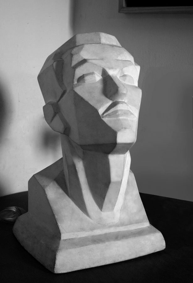

👁️ Train Your Eye

Learning to see the planes of the face takes time. Try studying portrait sculptures or doing monochromatic studies (in one color) to focus only on value and form before reintroducing color. Over time, you’ll notice how light shapes the face through color, not just value.

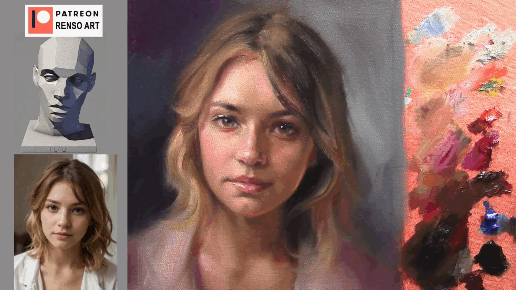
Image suggestion: A simplified 3D model of the head with labeled planes and color zones.

Final Thoughts

Understanding and applying the color planes of the face will transform your portraits from flat to full of life. Light, form, and color all work together to create the illusion of depth. As you practice, you’ll begin to see the face not just as a collection of features, but as a landscape of subtle color and form.


Want to practice color planes with guided feedback? Join my next portrait painting session where we break down the head step-by-step. [Learn more →


Facial Highlights and Bone Structure: A Guide for Artists

Understanding how light interacts with the bone structure of the face is essential for any artist aiming to create realistic, dimensional portraits, knowing where to place highlights can dramatically enhance the lifelike quality of your work.

In this article, we’ll explore the key areas of the face where highlights naturally appear due to the underlying bones—and why they matter.


Highlights and Bone Structure of the face

Why Bone Structure Matters in Portrait Lighting

Light doesn’t fall evenly across the face. It catches on the protruding parts of the skull, such as the brow ridge, cheekbones, and the bridge of the nose, creating areas of brightness—or highlights.

These highlights aren’t just decorative—they help describe form, suggest volume, and guide the viewer’s attention.

If you place highlights based only on instinct or guesswork, your portrait might look flat or “off.” But when you understand the structure beneath the skin, your lighting becomes more believable—even stylized art gains depth.


10 Key Facial Highlight Areas (Due to Bone Structure)

Here’s a breakdown of where highlights tend to appear most naturally:

1. Forehead (Frontal Bone)

The upper center of the forehead catches light easily, especially under overhead lighting. This area is typically broad and slightly curved, making it a natural reflector.

2. Brow Ridge (Supraorbital Ridge)

Just above the eyes, this bony ridge creates a subtle shelf. It catches light from above and defines the top of the eye socket.

3. Bridge of the Nose (Nasal Bone)

This slender ridge is often the brightest point in portrait lighting, particularly in front or 3/4 views.

4. Cheekbones (Zygomatic Arch)

One of the most prominent facial structures. Highlights here define facial width and contour. The exact placement varies depending on lighting direction and facial angle.

5. Tip of the Nose

Though cartilage-based, the tip reflects light strongly. A small, sharp highlight here can suggest skin texture and shine.

6. Cupid’s Bow & Upper Lip (Philtrum)

The curve of the upper lip, especially the cupid’s bow, often reflects light subtly—especially when the skin is slightly moist or under soft lighting.

7. Chin (Mental Protuberance)

Depending on chin shape and the light source, this can be a strong or subtle highlight. It often helps balance the light hitting the forehead.

8. Jawline

Though not always directly highlighted, the jawline reflects light differently depending on the head’s tilt. It’s especially visible in profile or under-rim lighting.

9. Above the Eyelids (Orbital Rim)

This area softly reflects light, helping to shape the eyes and give them dimension.

10. Sides of the Face (Temporal Region)

If the light source is from the side or above, this area can pick up a gentle gradient highlight—important for framing the face.

Highlights and Bone Structure of the face

Tips for Painting Highlights Naturally

  • Soften edges: Highlights are rarely sharp. Unless you’re painting a moist or oily surface, keep transitions smooth and gradual.
  • Avoid white: Pure white can flatten your highlights. Try using a slightly warmer or cooler tone to keep them integrated into the skin.
  • Consider the light source: A single strong source (like sunlight) creates more defined highlights. Diffused or ambient light softens them.
  • Use subtle shifts: Sometimes, less is more. A slight change in value can suggest structure just as effectively as a bright highlight.

Practice and Observation Are Key

The best way to master facial highlights is through practice and keen observation. Study real faces under different lighting conditions. Paint from life or use references with clear directional light.

Understanding how bone structure affects highlights will give your portraits more realism, drama, and presence.


Final Thoughts

Great portraiture isn’t just about capturing a likeness—it’s about bringing structure to life through light. Once you start seeing the face as a landscape of planes and angles, your approach to highlights will never be the same.

Keep painting. Keep observing. And don’t be afraid of a little shine.


The Warm Glow of Light Through Skin: Understanding Subsurface Scattering in Art

Have you ever noticed how, on a sunny day, the edges of your fingers glow with a warm red or orange hue when you hold your hand up to the light? Or how a portrait seems more lifelike when the ears or nostrils show a subtle flush of warmth? This visual effect isn’t imagination—it’s a natural phenomenon called subsurface scattering, and it plays a powerful role in bringing realism and warmth to your artwork.

In this article, we’ll explore what subsurface scattering is, how it appears in real life, and how you can capture it effectively in your paintings or drawings.


Subsurface Scattering in Art

What Is Subsurface Scattering?

Subsurface scattering happens when light penetrates the surface of a translucent material—like human skin—bounces around beneath the surface, and then exits at a different point. As the light travels inside the skin, it interacts with blood, tissue, and fat, which tint it with warm colors such as red, orange, and pink.

Unlike opaque surfaces where light reflects directly, subsurface scattering gives skin a soft, glowing quality, particularly in strong lighting conditions. This glow is most visible when light shines through parts of the body, rather than directly onto them.


When and Where You’ll See It

You’re most likely to notice this effect under direct sunlight or a strong backlight. Some common areas where this warm glow appears include:

  • Fingertips and hands (when held against the sun)
  • Ears, especially the outer edge (helix)
  • Nostrils and the tip of the nose
  • Cheek edges and jawline
  • Toes and knees (in strong lighting)

These are all areas where the skin is thinner and where light can pass through more easily. In some cases, even candlelight or a soft lamp can produce a similar—though subtler—effect.

Jpeg

Why It Matters in Art

Capturing subsurface scattering in your artwork can transform a flat or lifeless figure into something vibrant and believable. It’s a small detail that signals warmth, life, and natural light interaction—especially important in portraits, figure studies, and scenes set outdoors.

Without it, your subjects may appear cold or artificial. With it, even stylized work can evoke a stronger emotional response and a greater sense of presence.


How to Paint or Draw Subsurface Scattering

Here are a few practical tips to incorporate this effect into your art:

1. Observe Real Life and References

Look at how the light glows through ears, fingers, and other translucent areas. Use reference photos taken in natural sunlight or backlit conditions to study the color temperature and intensity.

Subsurface Scattering in Art

2. Use Warm Tones—But Not Just Red

The glow isn’t pure red—it often includes oranges, pinks, and even a touch of yellow, depending on the skin tone and light source. Blend carefully into surrounding skin to avoid a “stuck-on” look.

3. Paint Soft Transitions

The glow should fade gently into the surrounding skin. Avoid harsh edges unless the lighting is extremely dramatic. Soft brushes or glazing techniques work well in digital and traditional media.

4. Balance With Cooler Shadows

To make the warm glow stand out, balance it with cooler tones in the shaded areas—like bluish or purplish undertones. This contrast adds depth and realism.

5. Use It Sparingly

A little goes a long way. Only highlight the areas where light naturally passes through. Overusing this effect can make skin look too artificial or rubbery.


Final Thoughts

Subsurface scattering might sound technical, but it’s a visual experience we all recognize intuitively. As artists, learning to observe and replicate it thoughtfully adds subtle beauty and realism to our work. Whether you’re painting in oils, drawing with colored pencils, or using digital tools, this warm glow can be the missing piece that makes your figures feel alive.

Next time you’re sketching in the sun—or just studying your hand against the light—take a moment to notice that soft, fiery edge. It’s a small detail with a big impact.


The Power of Complementary Contrast in Portraits

🎨 The Power of Complementary Contrast in Portrait Painting

In the school of art we had painting classes which were sync with color theory classes, it was pretty good to apply what you learned in Color into oil painting, understanding complementary colors in portrait painting can be a game-changer. be patient and apply this knowledge step by step, try first with desaturated colors and move on to saturated colors painting after painting, it worked for me I hope it works for you too.

Complementary Contrast

✅ What Are Complementary Colors?

Complementary colors are pairs of colors located opposite each other on the color wheel. Classic examples include:

  • Blue and orange
  • Red and green
  • Yellow and violet

When used together, these pairs create strong visual contrast and naturally draw the viewer’s attention — a powerful effect in portrait painting.

🎨 How to Use Complementary Colors in Portraits

Using complementary contrast doesn’t mean bold, clashing colors. It’s about applying them intentionally and harmoniously to enhance your subject. Here are a few ways to apply color contrast in portraits:

  • Skin tones vs. background: Warm skin tones (peach, rose, or terracotta) stand out beautifully against a cool background like teal or muted green.
  • Eyes and clothing: Highlight green eyes with hints of red in the background or use a violet blouse to make golden skin glow.
  • Light and shadow: Use warm and cool opposites to model form — for example, warm light with cooler, complementary shadows.
  • Mood and expression: Complementary contrasts can also create emotional tension or harmony depending on how you balance them.

🖌️ Why Complementary Contrast Matters

Complementary contrast in portrait painting helps:

  • Emphasize the focal point (usually the face or eyes)
  • Add energy and balance to your composition
  • Create depth without relying solely on value shifts
  • Make the portrait feel more lifelike and luminous

Using complementary colors effectively gives your painting a professional and dynamic quality that stands out — both on the wall and online.

Complementary Contrast

💡 Practical Tip for Artists

When starting your next portrait, choose one dominant color (like warm browns or cool blues), and then introduce its complementary color subtly in the background, clothing, or reflected light. Even a small amount can create a powerful effect.


📈 Final Thoughts on Color Contrast in Portraits

Whether you’re painting realistic portraits or stylized ones, learning how to use complementary colors in portrait painting helps you guide the viewer’s eye, enhance the subject’s features, and add emotional impact.

Explore your color wheel, test combinations, and most importantly — have fun experimenting with color contrast in your art!


Map the face with light and shadow planes

Understanding the Structure Beneath the Surface

I remember my first drawings and paintings—they were full of details. I tried to paint every eyelash and every wrinkle, and I was always pretty happy with the result, even when my teachers used to say my paintings looked cartoonish and that the shadows were too light, which affected the volume of the face. I didn’t care at the time. But if you want to improve faster, stop trying to paint every single detail. You need simplification first. One of the most powerful ways to gain control and clarity in portrait art is to map the face using light and shadow planes and when you are good at that then paint all the details you want.

What Are Light and Shadow Planes?

The human face isn’t a flat surface—it’s made of intersecting planes that catch light differently depending on the form and light source. By breaking the face down into value-based planes (large areas of light or shadow), you can simplify the complexity and build a strong foundation for a realistic or stylized portrait.

Why Use Planes?

  • Clarity: You’re not guessing where the shadows go—you’re placing them with purpose.
  • Form: Planes help you sculpt the illusion of 3D on a 2D surface.
  • Efficiency: Fewer details, more impact. A well-mapped face reads clearly even with minimal rendering.
  • Lighting: You gain a better understanding of how different light sources affect facial structure.

How to Start Mapping Planes of the Face

  1. Choose a clear light source. A single light from the top or side works best to define major planes.
  2. Squint at your reference. This helps you see the simplified blocks of light and dark without distractions.
  3. Identify the five main zones:
    • Forehead
    • Eye sockets
    • Nose
    • Cheekbones
    • Mouth and chin
  4. Block in flat values. Think of them as large, angular shapes. No blending—just tone masses.
  5. Refine gradually. Once your planes are solid, you can add transitions or details, but only as needed.

Think Like a Sculptor

Imagine you’re carving the face out of clay or wood. Planes help you carve with your brush or pencil, giving volume and depth instead of outlining features. Artists like John Singer Sargent, Andrew Loomis, and contemporary concept artists all use this method to bring portraits to life.

Final Thought

Details are the dessert—structure is the main course. Mapping light and shadow planes of the face gives your work strength, believability, and style. So next time you begin a portrait, don’t dive into eyelashes or smile lines. Start with planes, and let the light do the talking.


Want to see this technique in action? Join me in an upcoming paint-along class or check out my portrait demos on http://www.youtube.com/@RensoArt


The Relationship Between Color Saturation and Transparent Shadows in Painting

To understand this rule, you need to stop thinking about copying the colors in the shadows. I remember ignoring this rule because I was trying to match the skin tones as closely as possible. I even mixed the colors with a palette knife and brought it close to the model’s face—almost touching her skin—to compare if the color was accurate. When I finally understood this rule, I stopped trying to match the colors. It had been frustrating; I never felt completely comfortable when the colors didn’t match. But once you see how a transparent shadow creates volume in your paintings, you’ll realize that the interplay between color saturation and transparency in shadows is a subtle but powerful tool that goes beyond just matching the colors.

Understanding how these elements work together can elevate your artwork—making your scenes feel more luminous, natural, and alive. knowing when and how to use saturated colors in transparent shadows will help you create depth, harmony, and mood.


🌑 What Are Transparent Shadows?

Transparent shadows are shadows where the paint is applied in a thin, allowing the colors underneath to show through. This technique is especially common in oil painting and watercolor, where the use of medium (like linseed oil, turpentine, or water) affects how much the light passes through the paint.

Transparent shadows allow painters to:

  • Suggest depth without heavy buildup of paint.
  • Achieve a luminous, glowing effect, especially when layers of color interact.
  • Keep the value range realistic, preventing shadows from becoming too dark or flat.

Color Saturation and Transparent Shadows

🌈 Where Does Saturation Come In?

Saturation refers to the intensity or purity of a color. Highly saturated colors are bold and vivid, while desaturated colors appear more muted or gray.

In general:

  • Lit areas tend to feature stronger saturation, especially when directly hit by warm or cool light.
  • Shadows, being areas of less direct light, are often less saturated—but not always.

Here’s where it gets interesting: shadows can still contain saturated color, especially when reflected light or colored environments influence them.


🔁 How Saturated Colors and Transparent Shadows Work Together

Contrary to the idea that shadows are always dull and gray, many artists use transparent paint to introduce rich, saturated hues into their shadows, often as a result of reflected light from nearby surfaces. For example:

  • In a landscape, the blue of the sky may tint the shadows a rich violet or ultramarine.
  • A red wall might reflect into the shadow side of a face, adding warm tones to the cooler shadow.
  • In still life, nearby colored objects can “bounce” light into the shadows, enriching them with saturated hues.

By keeping the paint thin and transparent, artists allow these colors to glow subtly without overpowering the shadow’s depth.

saturated shadows

🖌️ Practical Painting Tips:

  1. Keep shadows thin and lights thicker in paint
  2. Keep shadow colors cooler or warmer depending on your light source—this enhances realism.
  3. Introduce reflected local color into your shadows for harmony and color unity.
  4. Avoid over-mixing shadow colors; this can lead to dull, muddy results. Instead, layer colors for optical blending.
  5. Experiment with transparent pigments like Alizarin Crimson, Ultramarine Blue, or Burnt Sienna in your shadows.

🎯 Why This Matters Artist Learning Goals):

Artists who understand how to combine transparent painting techniques with saturated color in shadows will be able to:

  • Create more realistic and vibrant artwork
  • Add depth and mood to their compositions
  • Avoid flat or lifeless shadow areas
  • Improve their use of color theory in painting
  • Develop a professional-level understanding of light and color

Planes of the Face in Different Lighting Setups

When I was a student I used to practice with a real planar sculpture. the teacher placed the light on the left, rotated the sculpture every 10 minutes, and we sketched with charcoal. After five drawings, He moved the light to the right and repeated the process. It was a practice we used to do once a week. Do not think about perfection is practice, maybe you will find this exercises pretty stressful but practice always pay off.

Understanding the planes of the face is essential for creating convincing portraits. But knowing the planes alone isn’t enough—lighting determines how those planes are revealed or concealed. Different lighting setups dramatically affect how we perceive form, structure, and depth in a portrait.

These are the three lighting setups I practiced as a student, we will see how—front light, rim light, and Rembrandt lighting—interact with the planes of the face. Whether you’re drawing, painting, or sculpting, learning to observe these interactions will help you better capture the illusion of form.

There are more lighting setups than the ones I show in this article, but these are the foundation.

Here is a Planar head I have at home, I did it myself in my first year at the school of art.

planar head for drawing

🎯 What Are the “Planes of the Face”?

The human face isn’t a flat surface. It’s composed of angled planes—like the slope of the forehead, the curved structure of the cheekbones, or the boxy chin. When light hits these planes at different angles, it reveals form through contrast between light and shadow. That’s what gives a portrait its 3D illusion.


🔦 1. Front Lighting (Flat Light)

I do not like this lighting, we can not see shadows but we need to practice this because we will commissions from photos with this lighting. What I just to do is darken the picture with photoshop to see midtones and shadows

Overview:

  • Light is positioned directly in front of the face.
  • Often used in photography for beauty shots or ID photos.
  • Minimizes shadows, giving a smooth, evenly lit appearance.

Effect on Planes:

  • Flattens form: Since all planes receive similar amounts of light, depth is reduced.
  • Subtle transitions: Shadow areas are minimal, so changes between planes become harder to see.
  • Good for studying color and tone, but not ideal for structural learning.

Best Use:

  • Reference photos for soft skin tones or subtle shading practice.
  • Early stages of painting to block in color without distraction.
planes of the face

🌗 2. Rembrandt Lighting

This one is the best for a beginner, is necessary to see contrast to separate the lights from shadows when mix colors.

Overview:

  • Light is placed at ~45° from the subject and above eye level.
  • Named after the painter Rembrandt, known for his dramatic portraits.
  • Creates a triangle of light on the cheek opposite the light source.

Effect on Planes:

  • Strong light-shadow contrast: One side of the face is lit, the other falls into shadow.
  • Planes facing the light (forehead ridge, cheekbone, upper lip) catch highlights, while perpendicular planes recede into shadow.
  • The “core shadow” (where light transitions to shadow) clearly defines the form.

Best Use:

  • Ideal for studying facial structure and form modeling.
  • Adds drama and realism to a portrait.
planes of the face

🌙 3. Rim Lighting (Back or Edge Light)

This one is the best when we want to be creative about color, I usually add color to one of the lights, could be orange or blue or any color or a different color for each side.

Overview:

  • Light comes from behind or the side, grazing the edge of the face.
  • Often used in cinematography and dramatic portraits.
  • Creates a glowing outline or “halo” effect.

Effect on Planes:

  • Highlights edges, but leaves the front planes in shadow.
  • Obscures form in the central areas of the face.
  • Excellent for emphasizing silhouette and profile, but poor for revealing internal structure.

Best Use:

  • Stylized or mysterious portraits.
  • Studying facial outline and gesture rather than internal planes.
planes of the face

🎨 Side-by-Side Summary of Planes of the face

Lighting TypeForm VisibilityShadow ContrastBest For
Front LightLow (flattens form)MinimalColor study, soft portraits
Rembrandt LightingHigh (reveals form)StrongStructure, realism, drama
Rim LightLow (edge-focused)High at edgesSilhouette, mood, stylization

🧠 Final Thoughts

As artists, we don’t just copy what we see—we interpret and design. Understanding how lighting affects the planes of the face empowers you to choose references more wisely, control your compositions, and make more convincing portraits.

Next time you work from a reference or live model, ask yourself:
Which planes are catching light? Which are turning away? And how is this lighting setup helping—or hiding—the form?

Let light be your teacher, and the planes of the face your map.

Mastering Planes of the face: A Complete Guide to Painting Portraits with Depth

Introduction

Understanding the planes of the face is a fundamental skill for portrait artists. Whether you’re a beginner or an experienced painter, breaking down the face into geometric planes helps you simplify complex forms, control values, and create realistic lighting.

In this guide, I’ll walk you through my process of painting a portrait using planar analysis, combining classical techniques with modern approaches. I’ll also reference expert insights from renowned artists and anatomy books to deepen your understanding.


Why Study the Planes of the face?

Before diving into the tutorial, let’s explore why this method is so powerful:

1. Simplifies Complex Forms

The human face is a three-dimensional structure, but beginners often struggle to capture its curves. By breaking it into flat planes (like a low-poly 3D model), we can focus on value transitions rather than getting lost in details.

“Think of the head as a series of blocks before refining it into curves.”
Andrew Loomis, Figure Drawing for All It’s Worth

planes of the face

2. Improves Light & Shadow Understanding

Planes of the face reacts differently to light:

  • Front-facing planes (forehead, nose bridge) catch the most light.
  • Side planes (cheekbones, temples) are mid-toned.
  • Receding planes (eye sockets, under the chin) stay in shadow.

“Light reveals form. If you can’t see the planes, you can’t paint the light.”
Steve Huston, Nuts and Bolts of Figure Painting

planes of the face

3. Used by Classical & Digital Artists

From Bridgman’s anatomy studies to modern 3D sculpting, planar analysis remains a core technique. Even Disney animators use simplified planes to maintain structure in stylized faces.


Step-by-Step Painting Process

Materials Used

  • Paints: Titanium White, Cadmium Yellow, Burnt Sienna, Cobalt Blue, Ivory Black
  • Brushes: Flat, filbert, and soft blending brushes
  • Tools: Palette knife, sponge for texture
  • Reference: Sculpted head with clear planes (similar to Asaro Head model)

Step 1: Blocking in the Planes of the face

  1. Basic Structure
  • Sketch the egg-shaped cranium and jawline.
  • Mark the center line (adjust for tilt).
  • Place the eyebrows, nose, and mouth using the Loomis method (eyes at midpoint, nose at 1.5-eye-length down).
  1. Mapping Planes
  • Forehead: 3 main planes (center + two sides).
  • Nose: Pyramid-like structure with front, sides, and bottom.
  • Cheeks: Angular transitions from cheekbones to jaw.

Pro Tip: Use the Asaro Head model (a popular sculptural reference) to study the Planes of the face.

planes of the face

Step 2: Value Study

I mixed a 9-step value scale (from white to black) using Burnt Sienna and white, then darkened with blue/black.

Plane LocationValueColor Mix
Forehead (center)2 (light)White + touch of Burnt Sienna
Temples4 (mid)Burnt Sienna + white
Eye sockets7 (dark)Burnt Sienna + Cobalt Blue

🔹 Key Insight: Keep edges sharp where planes meet (e.g., jawline), but soften transitions on rounded areas (cheeks).

planes of the face

Step 3: Adding Color & Depth

While the underpainting was monochromatic, I introduced subtle color shifts:

  • Warm tones (red/yellow) on nose, cheeks, and lips.
  • Cool tones (blue/gray) in shadows for atmospheric depth.

“Shadows aren’t just darker—they’re cooler. Light isn’t just brighter—it’s warmer.”
James Gurney, Color and Light

planes of the face
planes of the face

Step 4: Refining Likeness

  • Adjusted eye tilt (a common mistake in portraits).
  • Added subtle reflected light under the chin.
  • Used broken edges (soft + hard transitions) for realism.

🔸 Common Mistake: Over-blending flattens the form. Preserve some brushwork to maintain structure.

planes of the face

Advanced Tips from Professional Artists

  1. Dynamic Lighting (From Michael Hampton’s Design & Invention)
  • Try Rembrandt lighting (triangle highlight on one cheek) for dramatic volume.
  1. Digital Shortcut (For Concept Artists)
  • Use a planar brush in Photoshop to block values quickly.
  1. Sculptural Approach (From Gnomon Workshop)
  • Study skull anatomy to understand why planes exist (e.g., brow ridge, zygomatic arch).
planes of the face

Final Thoughts & Further Study of the Planes of the face

This exercise isn’t about one perfect painting—it’s about training your brain to see like an artist. For deeper learning:

  • Books: Bridgman’s Life Drawing, Hampton’s Figure Drawing
  • Models: 3D scan an Asaro Head (free downloads available).
  • Practice: Paint 10+ planar heads in different lighting.

Now it’s your turn! Grab a brush and start simplifying the Planes of the face. 🎨


How Primary Forms Help You Understand Light and Shadow

How Primary Forms Help You Understand Light and Shadow

Mastering light and shadow is essential for any artist, whether you’re working in traditional mediums like painting and drawing or digital art. One of the most effective ways to grasp these concepts is by studying primary forms—basic geometric shapes such as spheres, cubes, and cylinders. These forms serve as the foundation for more complex subjects, helping artists break down and understand how light interacts with surfaces.

Why Primary Forms Matter

Before tackling intricate subjects like portraits or landscapes, it’s crucial to understand how light behaves on simple shapes. Primary forms act as a “training ground” because:

  1. They Have Predictable Light Behavior – Spheres, cubes, and cylinders react to light in consistent ways, making them ideal for studying highlights, midtones, core shadows, and reflected light.
  2. They Simplify Complex Objects – Everything in the world can be broken down into combinations of these basic forms. For example, a face can be thought of as a combination of spheres (eyes, head) and cylinders (nose).
  3. They Help You Understand Value Relationships – By practicing shading on primary forms, you learn how to create the illusion of three-dimensionality through contrast and gradation.

How Light Interacts With Primary Forms

1. The Sphere

A sphere demonstrates smooth gradations of light and shadow. Key elements include:

  • Highlight – The brightest spot where light hits directly.
  • Midtones – Gradual transition from light to shadow.
  • Core Shadow – The darkest part of the form shadow, just before the terminator (the edge where light stops hitting the surface).
  • Reflected Light – A subtle light bounce from surrounding surfaces, often visible in the shadow area.
  • Cast Shadow – The shadow the sphere projects onto the ground, darkest near the object and softer as it moves away.

2. The Cube

A cube has flat planes, each reacting differently to light:

  • Light Side – The plane facing the light source appears brightest.
  • Midtone Side – Planes at an angle to the light receive partial illumination.
  • Shadow Side – Planes facing away from the light fall into shadow.
  • Hard Edges – Unlike a sphere, transitions between light and shadow on a cube are abrupt.

3. The Cylinder

A cylinder combines aspects of both spheres and cubes:

  • Highlight – Runs along the length where light is most direct.
  • Gradient Transition – Similar to a sphere, but elongated.
  • Core Shadow & Reflected Light – Present along the rounded form.
  • Cast Shadow – Often oval-shaped, depending on the angle of light.

Applying Primary Form Knowledge to Complex Subjects

Once you understand how light behaves on these basic shapes, you can apply the same principles to more complex objects. For example:

  • A Portrait – The head is a modified sphere, the nose can be seen as a cylinder, and the jawline has planar shifts like a cube.
  • A Still Life – An apple is a sphere, a book is a rectangular prism, and a vase is a modified cylinder.

Practical Exercises to Improve Your Understanding

  1. Shading Drills – Practice rendering spheres, cubes, and cylinders under different light sources.
  2. Form Breakdowns – Sketch complex objects by simplifying them into primary forms first.
  3. Value Studies – Focus only on light and shadow without details to strengthen your sense of contrast.

Conclusion

Primary forms are the building blocks of realistic drawing and painting. By mastering how light interacts with spheres, cubes, and cylinders, you develop a strong foundation for tackling any subject with confidence. Whether you’re a beginner or an experienced artist, revisiting these basics can sharpen your observational skills and improve your artwork.

Now it’s your turn! Grab a sketchbook, set up a simple light source, and start practicing with these forms. How do you see light and shadow differently now? Share your progress in the comments!


Painting What You See, What You Know, and What You Want to See

A great painting is more than just a copy of reality—it’s a balance between observation, knowledge, and artistic intention. Should you paint exactly what’s in front of you? Should you rely on what you know about form and structure? Or should you push beyond reality to create something more expressive? The truth is, the strongest artwork often combines all three approaches.

1. Painting What You See (Observation)

The Foundation of Realism
Painting what you see means training your eye to observe shapes, colors, and values without letting preconceptions distort them.

Why It’s Important:

  • Helps you capture accurate proportions, lighting, and color relationships.
  • Prevents symbol drawing (e.g., painting an eye as a generic almond shape instead of the unique form in front of you).
  • Develops your ability to notice subtle shifts in edges and tones.

Challenges:

  • Our brains trick us—we tend to simplify or exaggerate what we see.
  • Lighting conditions change, altering colors and shadows.
  • Photographs lie—they distort perspective and flatten depth.

How to Improve:
Draw/paint from life as much as possible.
Squint to simplify values and ignore unnecessary details.
Compare relationships (e.g., “Is this shadow warmer or cooler than that one?”).


2. Painting What You Know (Knowledge)

The Structure Beneath the Surface
Even when painting from observation, you must rely on anatomy, perspective, and color theory to make your work convincing.

Why It’s Important:

  • Helps you correct mistakes when your eyes deceive you.
  • Allows you to paint from imagination when references are lacking.
  • Gives your work solidity and believability, even in loose styles.

Key Areas of Knowledge:

  • Anatomy (bones, muscles, how light wraps around form).
  • Light & Shadow (core shadows, reflected light, temperature shifts).
  • Perspective (foreshortening, spatial relationships).
  • Color Harmony (how colors interact under different lighting).

How to Apply It:
Study fundamentals even when working from reference.
Fix errors logically—if a shadow looks “off,” check if it aligns with light direction.
Practice constructive drawing (building forms from basic shapes).


3. Painting What You Want to See (Artistic Intention)

Where Creativity Takes Over
This is where you stylize, exaggerate, or simplify to enhance mood, composition, or emotional impact.

Why It’s Important:

  • Makes your work unique rather than just a copy.
  • Allows emotional expression—painting a face sadder, more dramatic, or more serene than reality.
  • Helps solve compositional problems (e.g., adjusting colors for harmony even if they’re not “accurate”).

Ways to Use It:

  • Exaggerate lighting (deeper shadows, brighter highlights).
  • Simplify details (merging background elements for focus).
  • Shift colors (warmer skin tones, cooler shadows for mood).
  • Break realism (intentional brushwork, abstraction).

Examples in Art History:

  • Rembrandt deepened shadows for drama.
  • Van Gogh swirled skies for emotional intensity.
  • Sargent softened edges to guide the viewer’s eye.

How to Balance All Three

  1. Start with observation—get the basic shapes and values right.
  2. Apply knowledge—fix anatomical errors, adjust lighting logic.
  3. Enhance with intention—push colors, soften edges, or emphasize focal points.

Exercise:

  • Paint a portrait first strictly from observation, then redo it with intentional changes (warmer/cooler palette, sharper/softer edges). Compare the two!

Final Thought: The Artist’s Choice

Great painters see accurately, understand deeply, and then bend reality to their will. Whether you lean toward realism or expressionism, mastering all three approaches gives you full creative control.

Which do you focus on most—seeing, knowing, or imagining? Try experimenting with the others to expand your artistic range!