Struggling with your portraits? You might find my E-book helpful. Click here
Introduction
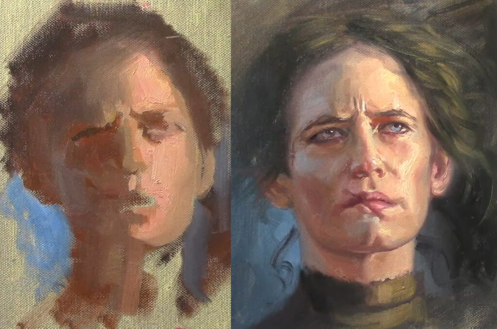
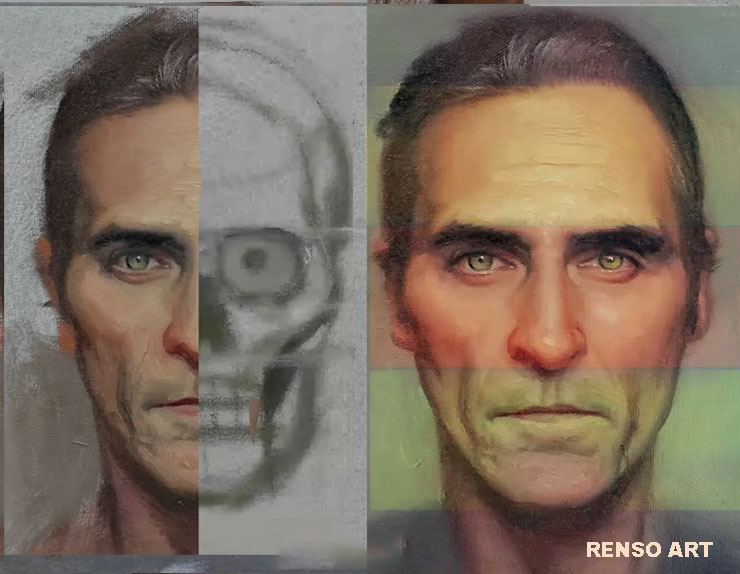
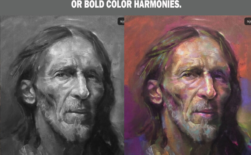
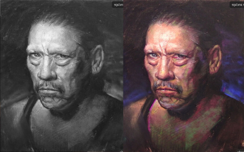
A well-painted portrait doesn’t rely solely on color—it depends on values (the lightness and darkness of tones). When values are correctly structured, you can experiment with almost any color harmony—complementary, triadic, or even seemingly clashing hues—and still achieve a cohesive, striking image.
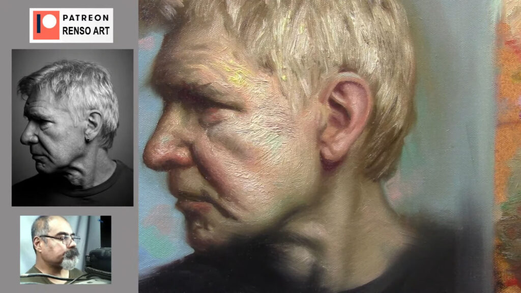
This principle is why master artists like Sargent, Zorn, and contemporary painters can use limited or unconventional palettes while maintaining realism and depth. In this article, we’ll explore why values are more important than color and how you can confidently apply bold color schemes to your portraits.
1. Values Define Form, Color Enhances Mood
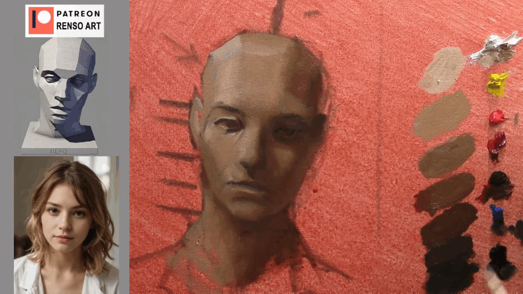
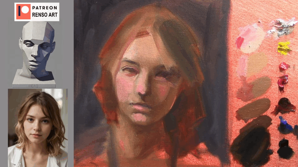
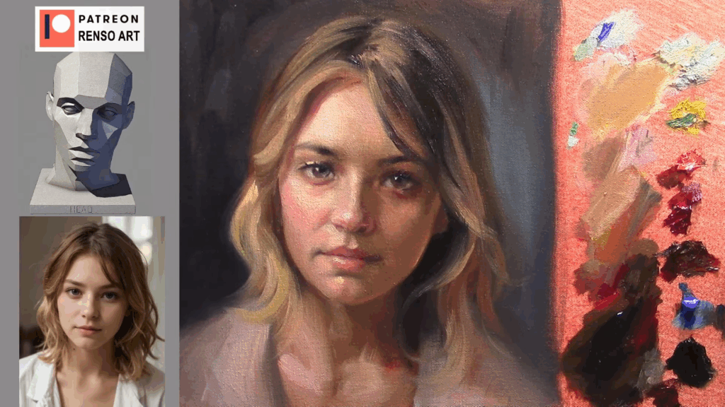
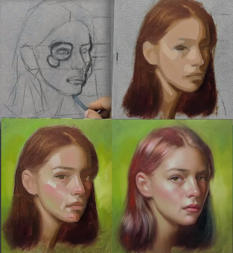
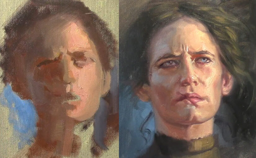
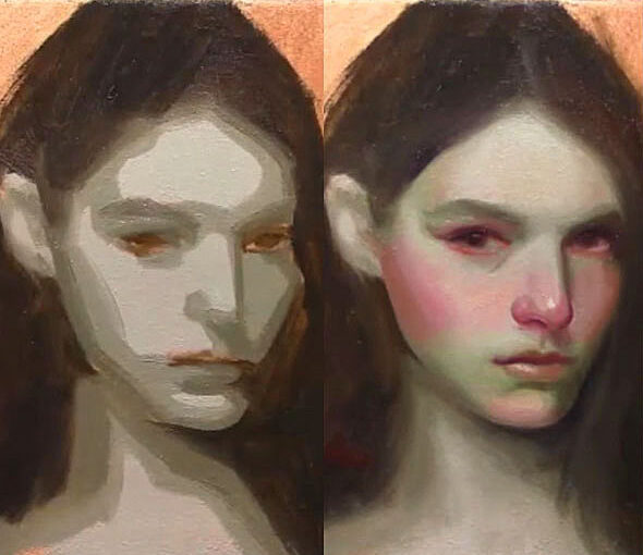
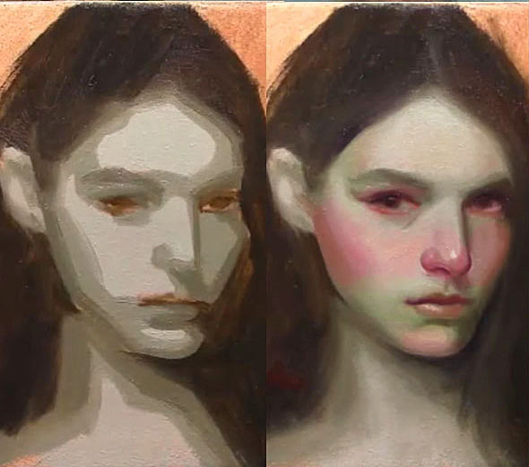
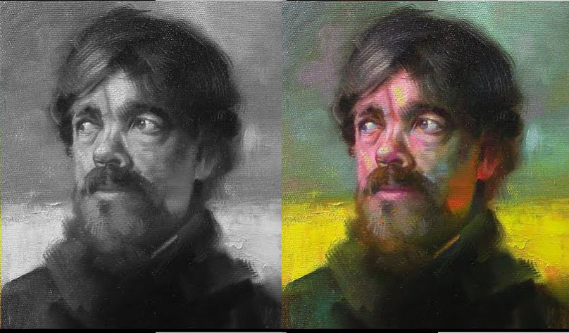
Before color even enters the picture, a portrait must work in grayscale. Strong value structure:
- Creates three-dimensional form
- Ensures proper contrast and readability
- Guides the viewer’s eye through the composition
Once values are correct, color choices become more flexible. You can shift hues dramatically—turning skin tones blue, shadows green, or highlights pink—as long as the light-to-dark relationships stay consistent.
Try This Exercise:
- Paint a portrait in grayscale first.
- Once the values are solid, apply different color harmonies (e.g., complementary, analogous, or split-complementary).
- Notice how the image remains believable even with unnatural colors.
2. How to Use Any Color Harmony Successfully
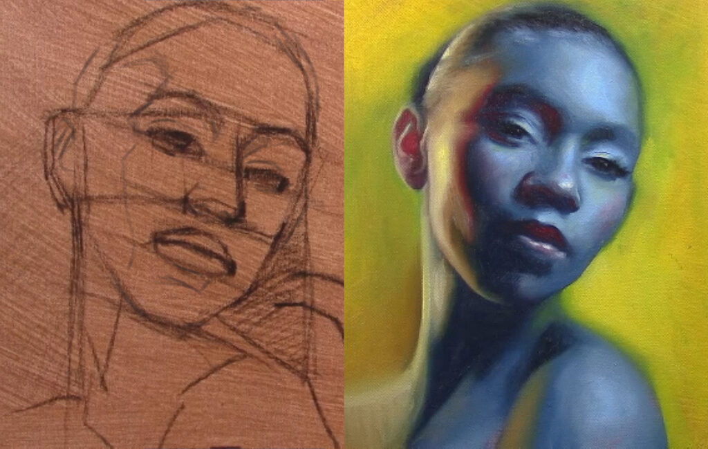
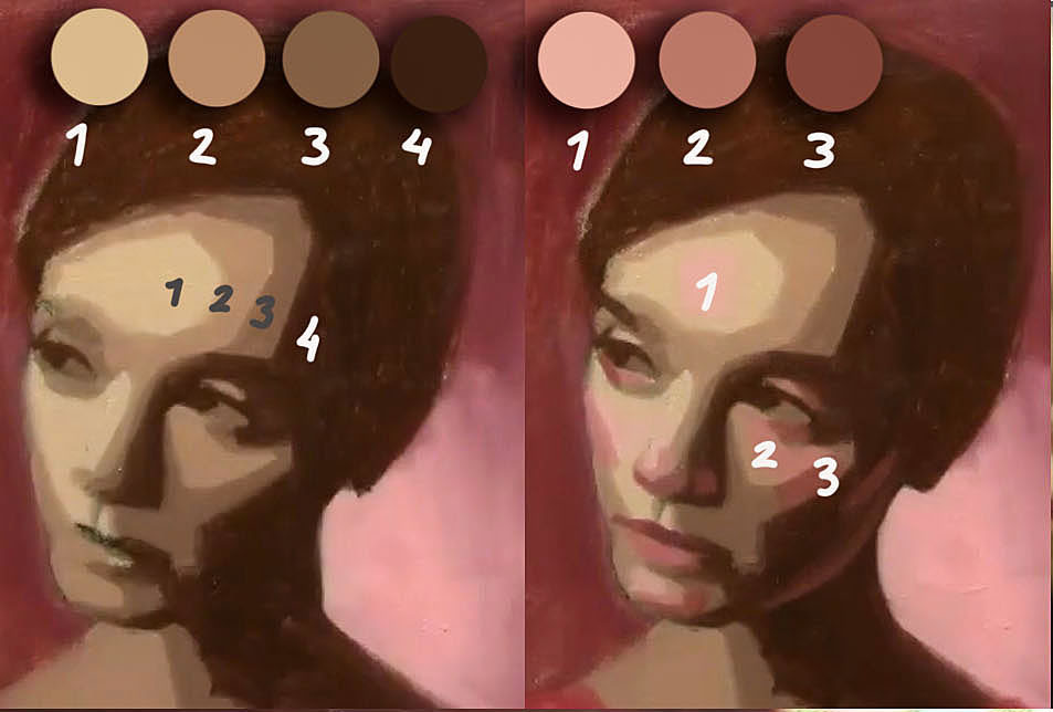
A. Match Values, Not Just Hues
If you replace a mid-tone brown with a mid-tone purple of the same value, the structure of the face won’t break. This is why stylized art (like anime or fantasy illustrations) can use vibrant, unrealistic colors while still looking “right.”
B. Control Saturation & Temperature
Even if hues clash, adjusting saturation (intensity) and temperature (warm vs. cool) can balance them:
- High saturation draws attention—use it sparingly (e.g., eyes, lips).
- Cool shadows vs. warm lights (or vice versa) enhance depth without relying on local color.
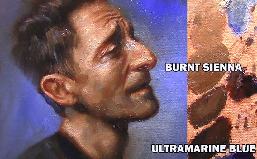
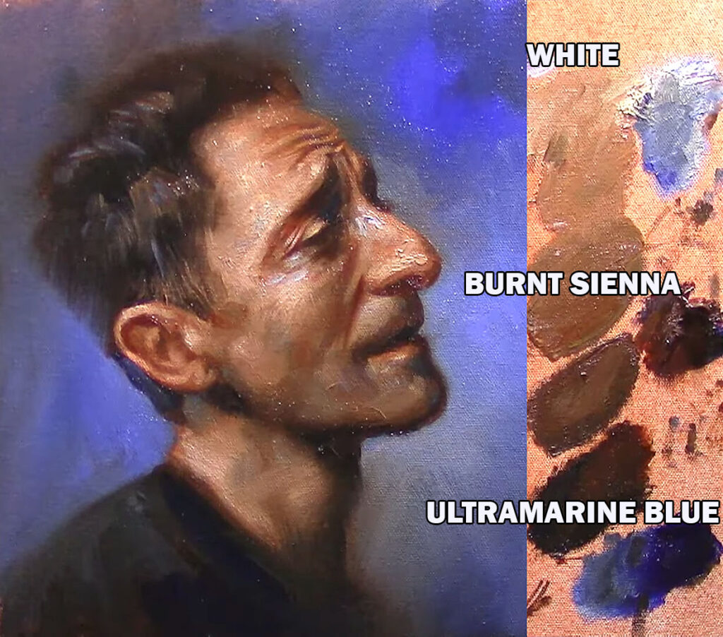
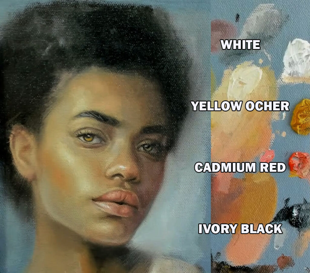
C. Borrow from Limited Palettes
Many classical artists used just a few colors but mastered value contrast:
- Zorn Palette (Black, White, Ochre, Red) – Creates realistic flesh tones through value control.
- Digital Artists – Use vibrant, non-realistic colors but keep values accurate.
3. Examples of Unconventional Color in Portraits
A. Complementary Colors (High Contrast)
Example: A portrait with blue shadows and orange highlights (opposite on the color wheel). If values are correct, the contrast feels dynamic rather than chaotic.
B. Triadic & Split-Complementary Harmonies
Example: A face with teal mid-tones, magenta shadows, and yellow highlights. Despite the bold hues, proper value structure keeps it readable.
C. Discordant Colors (Intentional “Wrong” Choices)
Example: A greenish skin tone with red undertones—unusual, but if values match natural lighting, it can look stylized rather than “off.”
4. Common Mistakes & Fixes
❌ Problem: Colors look muddy or clash.
✅ Fix: Check if values are too similar—increase contrast.
❌ Problem: Unnatural hues make the face look flat.
✅ Fix: Re-examine your grayscale—are the shadows and highlights correctly placed?
❌ Problem: Colors feel random, not harmonious.
✅ Fix: Use a color wheel to pick a defined scheme (analogous, complementary, etc.).
Conclusion: Values Are the Foundation, Color Is the Decoration
Mastering values gives you the freedom to experiment with any color harmony. Whether you’re working in realism, fantasy, or stylized art, a strong grayscale foundation allows for endless color creativity.
Next time you paint:
- Nail the values first.
- Apply colors fearlessly—try a new harmony!
- Adjust saturation and temperature for balance.
Do you prefer realistic or stylized color in portraits? Share your thoughts in the comments!

- From Planes to Realism: How to Soften Structure Without Losing Form
- How to Paint Planes of the Face in Warm and Cool Light
- Top 5 Mistakes Beginners Make in Portraits
- How to Self-Critique Your Own Paintings
- The Secret Rhythm of Brushstrokes on Skin