Struggling with your portraits? You might find my E-book helpful. Click here
This has always been difficult for me—mastering color harmonies, especially in portraits. I practiced more with still lifes and landscapes at first, but I remember seeing most of my paintings turn out kind of monochromatic. Some friends had really colorful work, while others, like me, stayed stuck in monochrome.
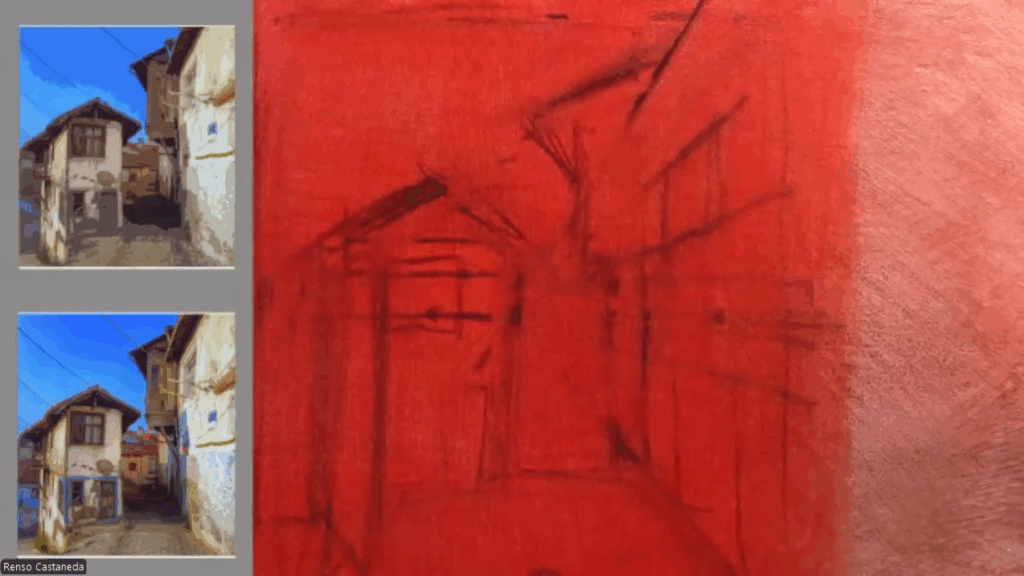
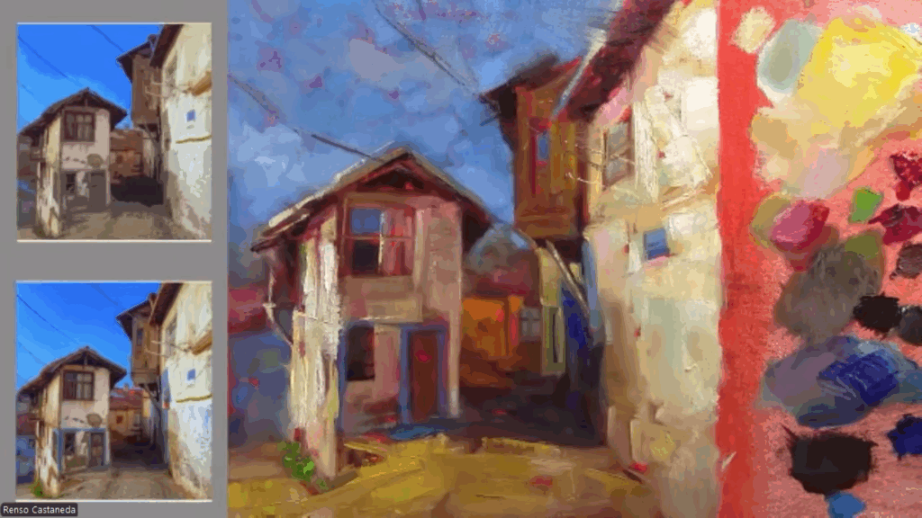
Trying to master color harmonies can be tough. A good way to start is by making small sketches, maybe 6 x 6 inches. Don’t focus on details—just use big brushstrokes and explore as many color harmonies as possible. It’s not about the final result of each sketch; it’s about the practice.
When you paint portraits, you’re not just recording a likeness—you’re also shaping mood, atmosphere, and story. One of the most powerful tools for this is your choice of color scheme. Color can heighten drama, create harmony, or suggest a personality that words can’t fully capture.
In this post, I’ll go through some of the most popular approaches to color in portrait painting, along with examples of how each scheme works.
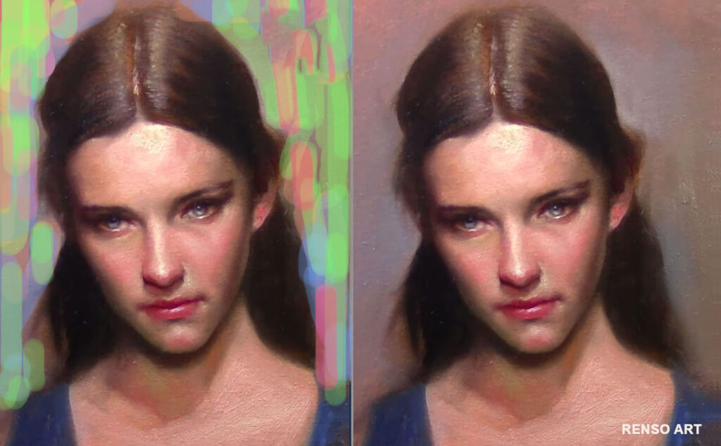
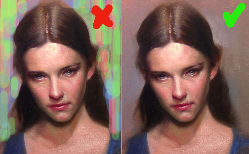
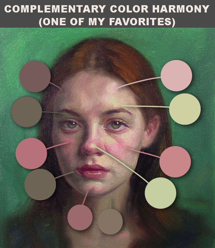
1. Complementary Color Schemes
Complementary colors are pairs that sit opposite on the color wheel—like blue and orange, red and green, or purple and yellow.
Why it works:
- The high contrast between complements makes portraits feel vibrant.
- Skin tones often carry natural warmth, so pairing them with a cooler background or clothing can create balance.
Example:
In this case I pair red and green on this portrait, I like the balance I got, look all different color variations, is not just about pure green and red.
2. Analogous Color Schemes
Analogous colors are neighbors on the wheel—such as blue, blue-green, and green.
Why it works:
- These schemes give a calm, cohesive effect.
- Perfect for portraits that need to feel serene, intimate, or unified.
Example:
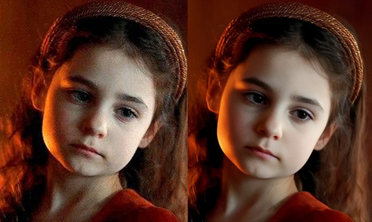
Think of a child’s portrait painted mostly with violets, pinks, and reds. Everything feels connected, soft, and tender without the distraction of clashing hues.
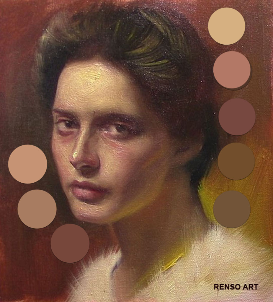
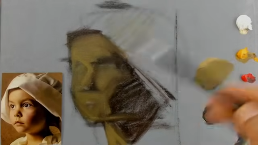
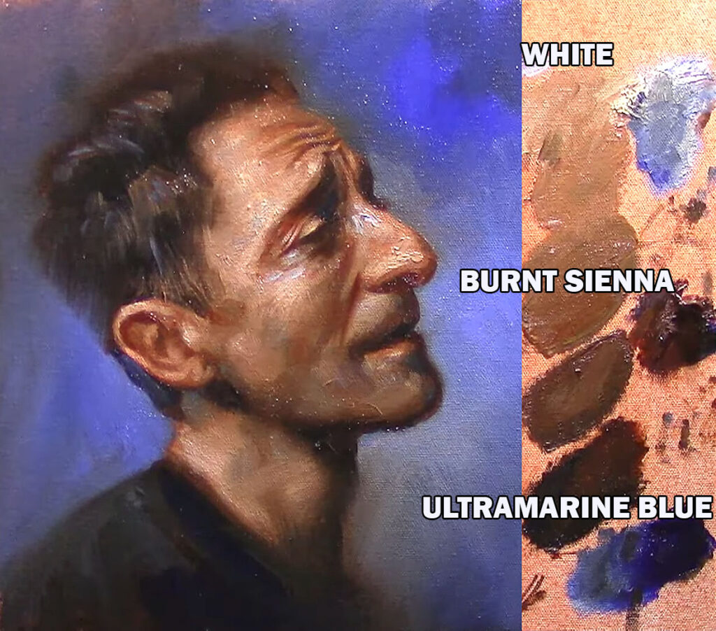
3. The Temperature Palette (A Limited Scheme)
The Temperature Palette uses just three colors: White, Burnt Sienna and Ultramarine blue
Why it works:
- It simplifies decisions and keeps the focus on value and temperature.
- Even with so few paints, you can suggest a full range of natural skin tones.
Example:
A portrait made with the Temperature Palette can feel timeless. Subtle grays and muted tones give the figure weight and depth, while the warm reds bring life to cheeks and lips.
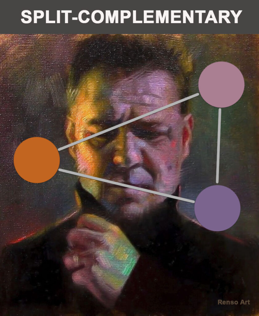
4. Split-Complementary Schemes
This is a twist on complements. Instead of using one opposite color, you use the two hues flanking it. For example: yellow paired with purple and violet.
Why it works:
- It offers contrast without the harshness of direct complements.
- Portraits painted this way often look lively and dynamic.
Example:
The left of the face is warm yellow the rigth side there are violets and purples creating a more dramatic effect.
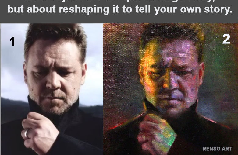
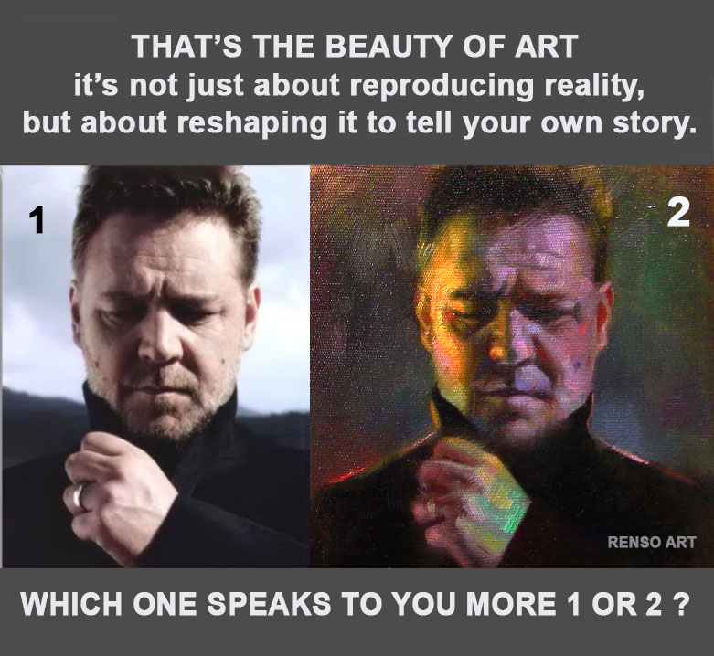
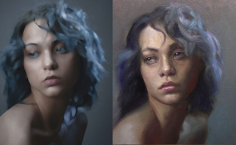
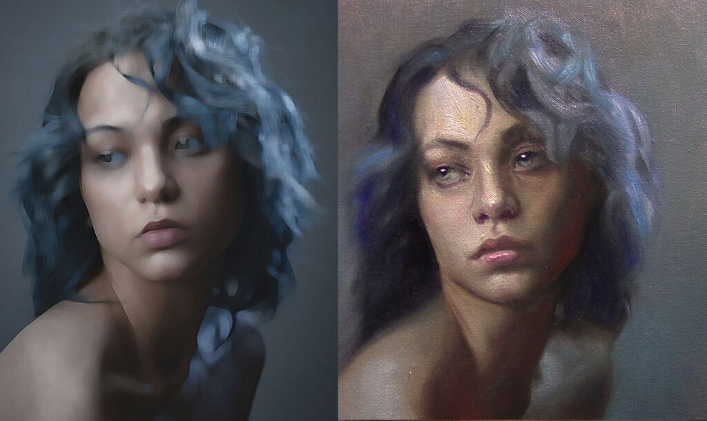
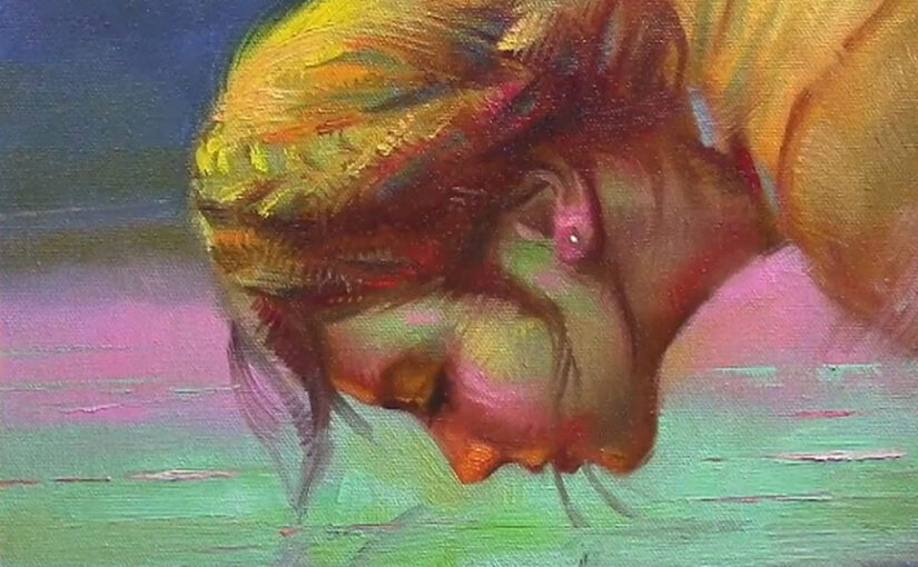
5. Expressive and Unconventional Schemes
Not every portrait aims for realism. Some of the most memorable works push color into unexpected places: purple shadows, green underpaintings, or neon backgrounds.
Why it works:
- It captures mood and personality rather than just physical likeness.
- It allows the artist’s voice to come forward strongly.
Example:
Van Gogh often used high-key, unnatural color in his portraits. A face might be tinged with yellows or greens, yet the overall image feels more “true” to the person’s spirit than a literal skin tone ever could.
6. Personal Favorites Evolve Over Time
When artists talk about their “favorite” color schemes, it’s rarely a fixed answer (even when i say a have a favorite one). Early in your journey, you might gravitate toward the drama of complementary contrasts. Later, you may become fascinated with the subtle beauty of analogous harmonies.
Color choices often mirror life experience and mood. A phase of exploring bright, saturated hues might give way to years of muted, earthy palettes. The important part is noticing what excites you at the easel right now.
Closing Thoughts
Portrait painting is as much about color choices as it is about anatomy or proportion. Color schemes help you set the tone—whether you want drama, calm, intimacy, or bold expression.
The real question isn’t just what are the best schemes, but: Which ones speak to you right now? Your favorite color harmony will shape not only your portraits, but the story you tell through them.