Struggling with your portraits? You might find my E-book helpful. Click here
We talk a lot about the power of art. It’s not just decoration—it’s an environment. Colors speak to us in a silent language, shaping our emotions and even the atmosphere of a space.
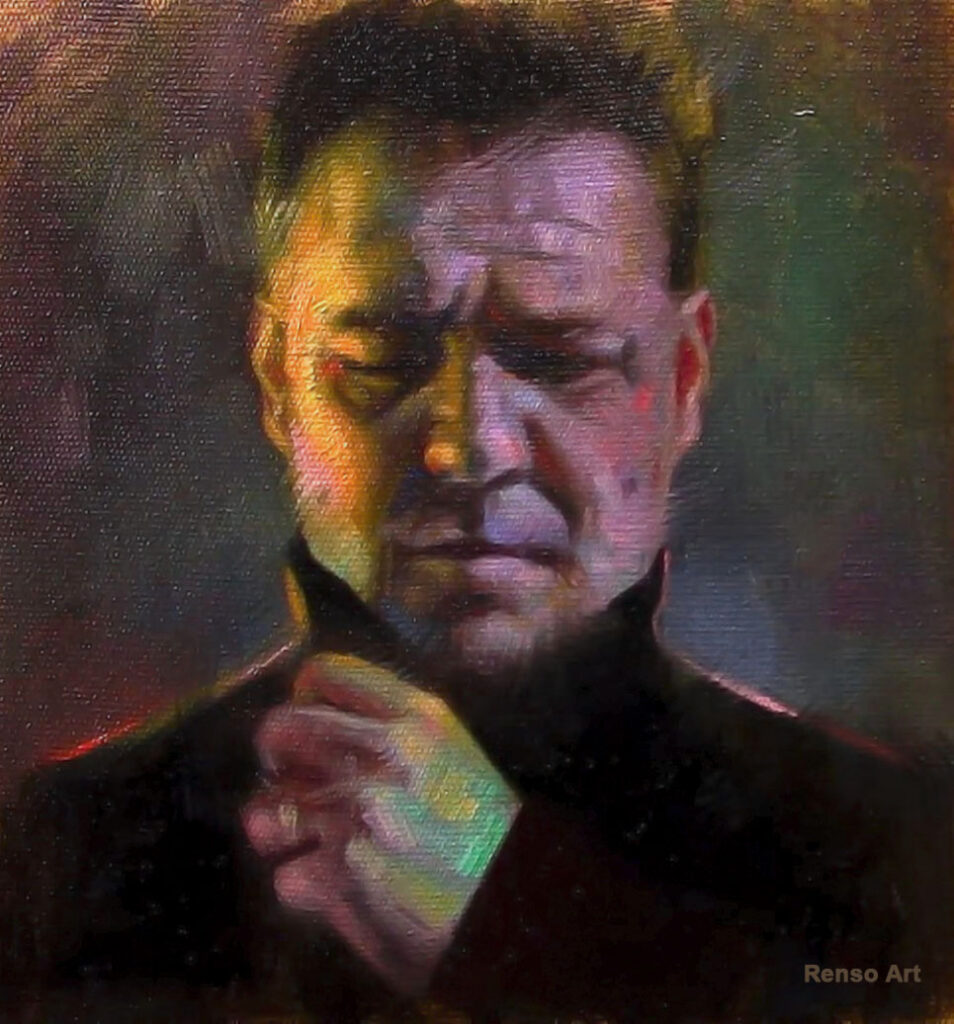
As painters, one of the most powerful tools we have is color temperature. Warm and cool colors can completely change the mood of a painting, and learning to use them with intention can make your work come alive.
Warm Colors: Energy, Comfort, and Passion
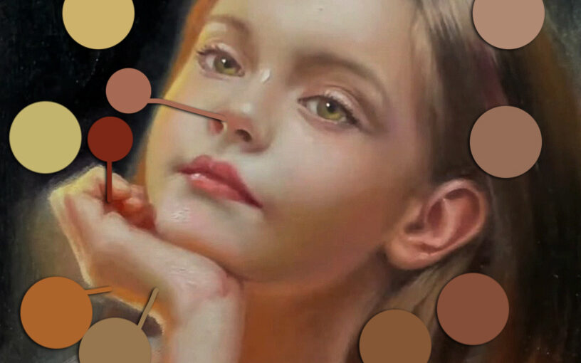
Think: reds, oranges, yellows, and earthy tones.
These are the colors of fire and sunlight. They feel close, lively, and full of energy.
- Reds bring passion and excitement, but too much can feel heavy or aggressive.
- Oranges feel warm, friendly, and creative.
- Yellows carry light and optimism but can be overwhelming if used too strongly.
In a painting: A portrait with warm golden tones feels approachable and alive. A landscape with a sunset instantly makes us feel nostalgic and peaceful.
Cool Colors: Calm, Serenity, and Distance
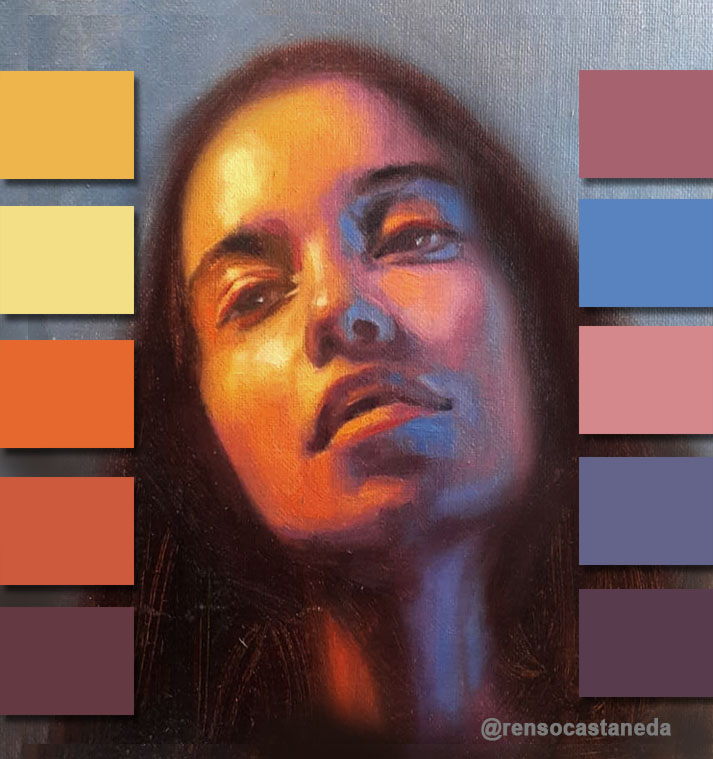
Think: blues, greens, purples.
These are the colors of water, sky, and nature. They tend to recede, giving calm and space to a painting.
- Blues are peaceful, clear, and trustworthy.
- Greens connect us to balance, harmony, and nature.
- Purples bring mystery, luxury, or spirituality, depending on how you use them.
In a painting: A seascape in cool blues doesn’t just show the ocean—it makes you feel its vastness and tranquility.
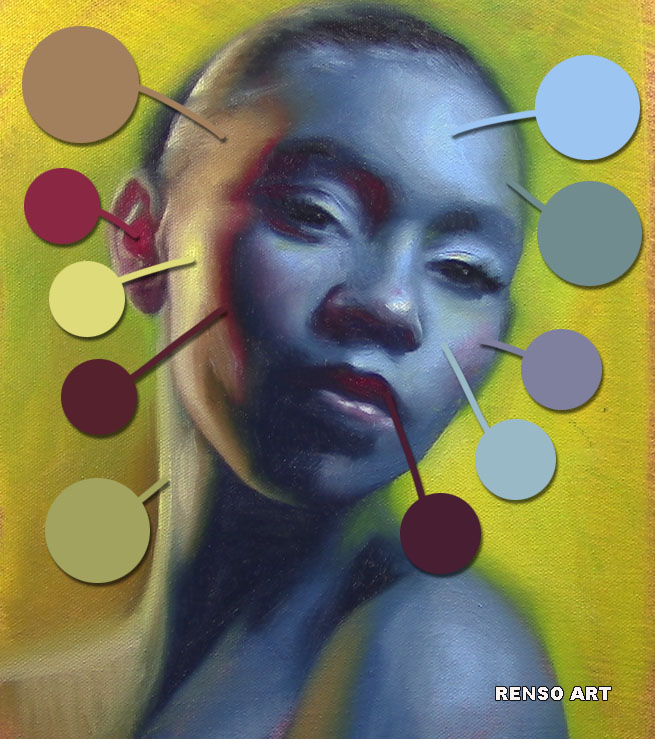
Neutral Colors: Balance, Subtlety, and Rest
Think: grays, browns, muted tones, or desaturated versions of any color.
Neutrals may not get as much attention as bright warms or cools, but they’re essential. They act as the “quiet” spaces in your painting, allowing brighter colors to stand out. Without neutrals, everything would compete for attention and the painting would feel overwhelming.
- Grays create calm, sophistication, or atmosphere.
- Browns add earthiness and stability.
- Muted versions of any color (for example, a soft gray-blue or a dusty rose) can suggest subtle emotion while still harmonizing with the rest of the painting.
In a painting: Neutrals are what make saturated colors sing. Place a bright red next to a muted gray background, and suddenly that red feels more powerful. Think of neutrals as the stage that lets the main colors perform.
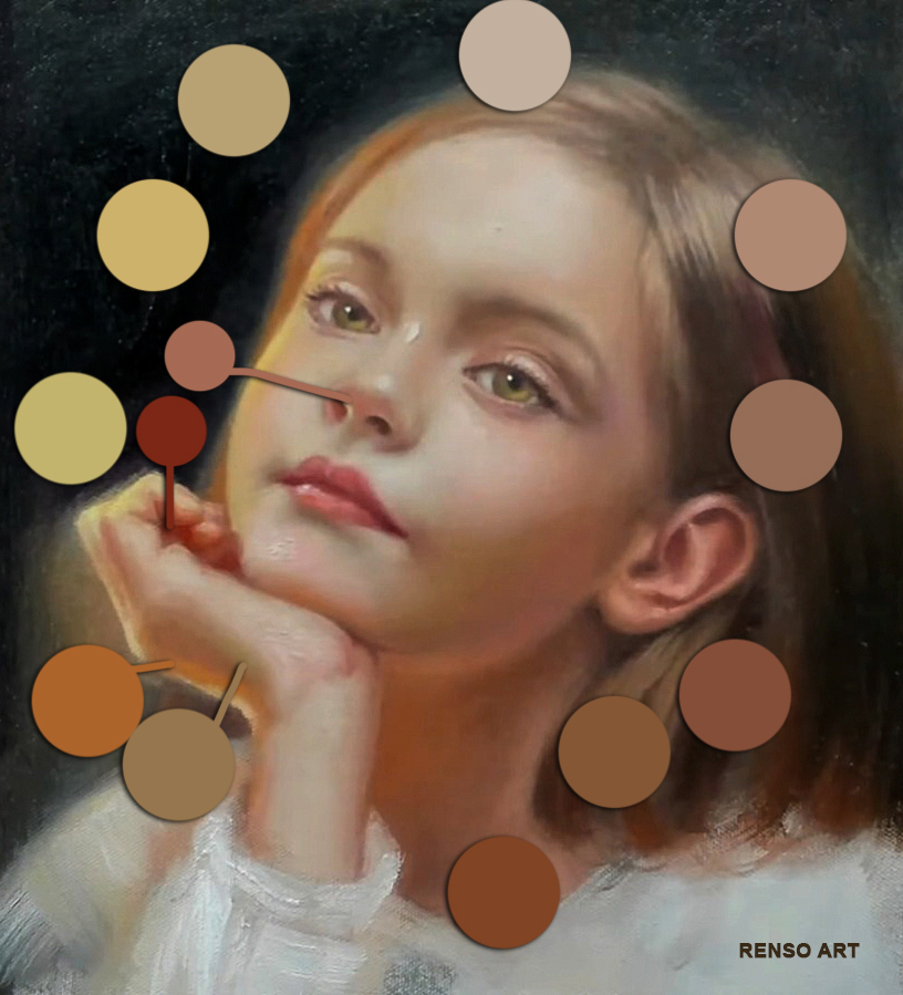
The Secret: Balancing Warm, Cool, and Neutral
The strongest paintings aren’t purely warm or cool. The magic happens in the balance—and neutrals are what tie everything together.
- A warm subject against a cool, muted background pops with energy.
- A neutral gray shadow makes a warm highlight glow even brighter.
- A touch of saturated color surrounded by neutrals instantly becomes the focus.
This interplay is what makes a piece feel alive and emotionally resonant.
Try It in Your Work
Next time you paint, experiment:
- Mix a gray or muted tone to use alongside your warm or cool colors.
- Try balancing a neutral background with a single bright accent.
- Notice how neutrals give your eye a place to rest, while color accents create impact.
You’ll see that neutrals aren’t boring—they’re the quiet strength of a painting.
I just love ❤️ 😍 ❤️ your work! Honestly, Renso, you explain exactly the balance and nuance to achieve that “magic” ratio. Color and temperature is to be observed and balanced after value is achieved. Everyone does not seem to have that natural “eye” of that close observance and actual visual equity to really “see” you help many by your gift to teach so well with your examples and clarification your students benefit so much. I have tremendous respect for you and your abilities! I am think I may be pretty naturally “Artistic” but you taught me how to handle oil paints and truly think through the “why” and “how” to manipulate the intrinsic value of the medium. Thank you my friend and favorite teacher!