Struggling with your portraits? You might find my E-book helpful. Click here
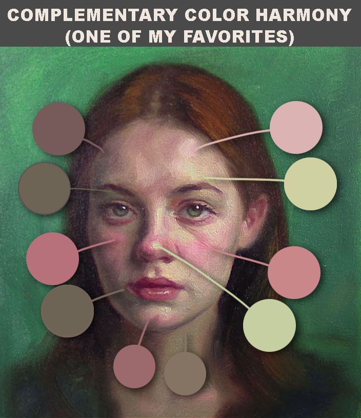
🎨 The Power of Complementary Contrast in Portrait Painting
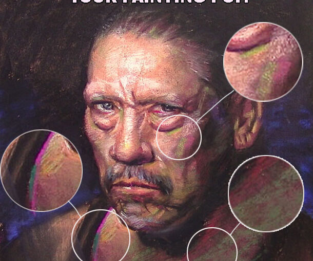
In the school of art we had painting classes which were sync with color theory classes, it was pretty good to apply what you learned in Color into oil painting, understanding complementary colors in portrait painting can be a game-changer. be patient and apply this knowledge step by step, try first with desaturated colors and move on to saturated colors painting after painting, it worked for me I hope it works for you too.

✅ What Are Complementary Colors?
Complementary colors are pairs of colors located opposite each other on the color wheel. Classic examples include:
- Blue and orange
- Red and green
- Yellow and violet
When used together, these pairs create strong visual contrast and naturally draw the viewer’s attention — a powerful effect in portrait painting.
🎨 How to Use Complementary Colors in Portraits
Using complementary contrast doesn’t mean bold, clashing colors. It’s about applying them intentionally and harmoniously to enhance your subject. Here are a few ways to apply color contrast in portraits:
- Skin tones vs. background: Warm skin tones (peach, rose, or terracotta) stand out beautifully against a cool background like teal or muted green.
- Eyes and clothing: Highlight green eyes with hints of red in the background or use a violet blouse to make golden skin glow.
- Light and shadow: Use warm and cool opposites to model form — for example, warm light with cooler, complementary shadows.
- Mood and expression: Complementary contrasts can also create emotional tension or harmony depending on how you balance them.
🖌️ Why Complementary Contrast Matters
Complementary contrast in portrait painting helps:
- Emphasize the focal point (usually the face or eyes)
- Add energy and balance to your composition
- Create depth without relying solely on value shifts
- Make the portrait feel more lifelike and luminous
Using complementary colors effectively gives your painting a professional and dynamic quality that stands out — both on the wall and online.
💡 Practical Tip for Artists
When starting your next portrait, choose one dominant color (like warm browns or cool blues), and then introduce its complementary color subtly in the background, clothing, or reflected light. Even a small amount can create a powerful effect.
📈 Final Thoughts on Color Contrast in Portraits
Whether you’re painting realistic portraits or stylized ones, learning how to use complementary colors in portrait painting helps you guide the viewer’s eye, enhance the subject’s features, and add emotional impact.
Explore your color wheel, test combinations, and most importantly — have fun experimenting with color contrast in your art!