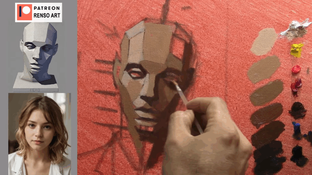
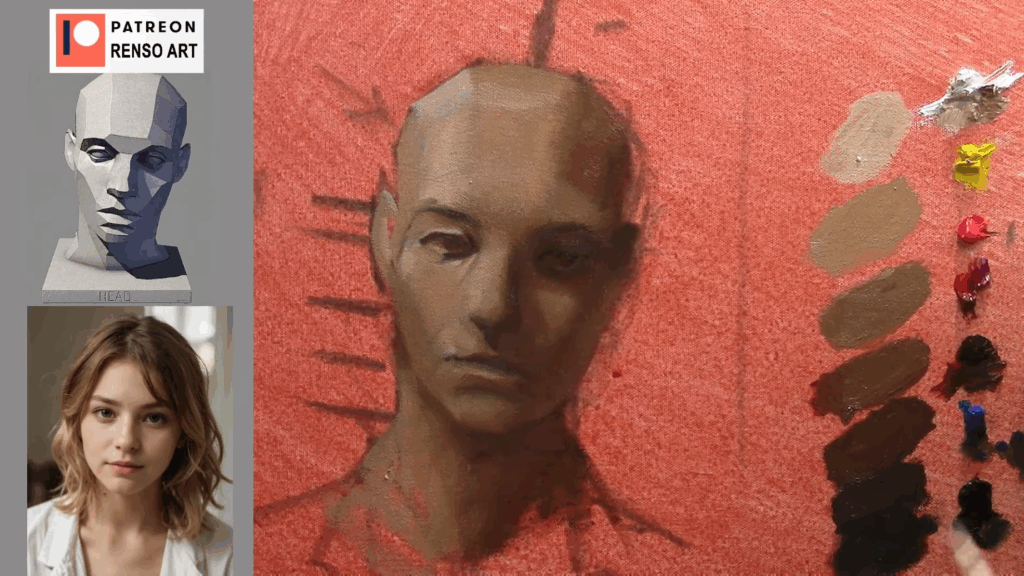
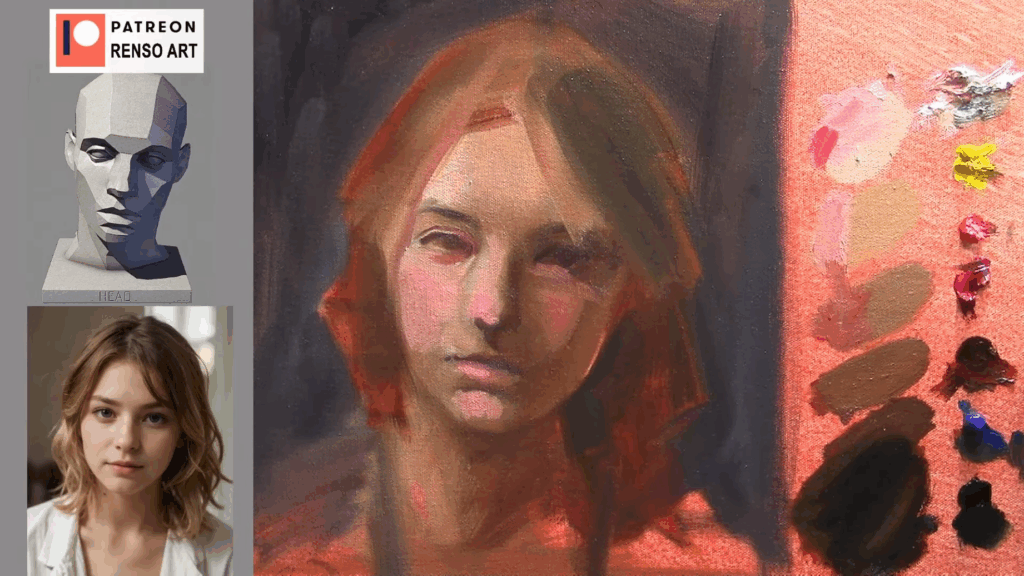
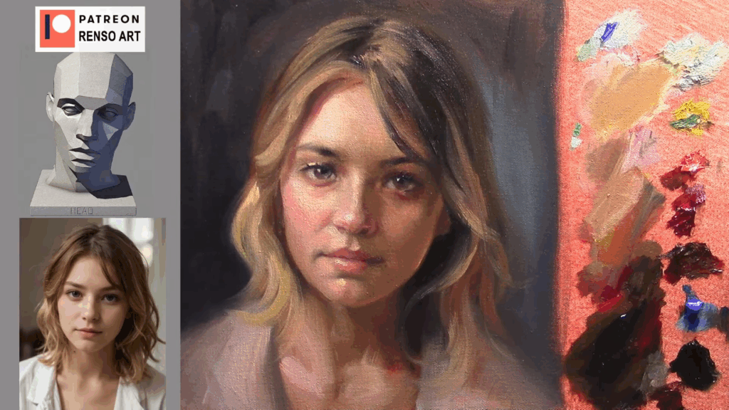
Over-Detailing Too Soon (Inability to See Large Planes)

Struggling with your portraits? You might find my E-book helpful. Click here

One of the problems when we paint a portrait is that we often think details will make it look beautiful. So we start painting part by part — the eyes, the nose, the mouth — individually. But what we really need to do is paint each feature while always checking the relationship between them: how sharp they are, how dark or light, how they connect. If you don’t do that, you often end up with a cartoonish face — sharp edges and lots of details, but no volume.

Here are some exercises to help improve your paintings:

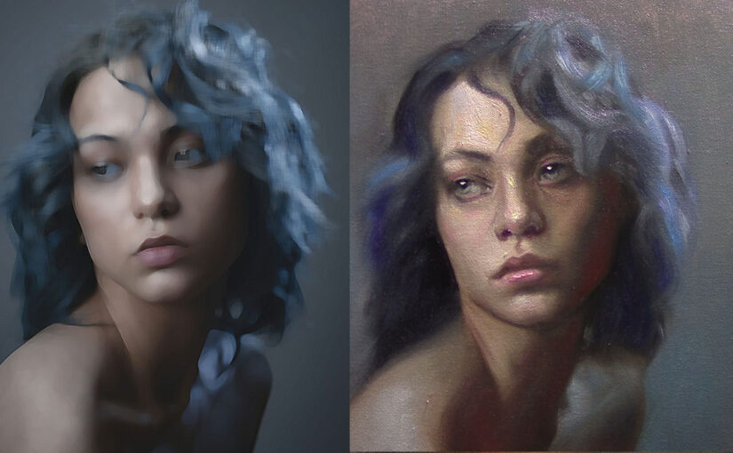
1.- First, imagine you’re a broken photo camera that can’t capture a sharp image. Every photo you take is blurry. That’s your reference.

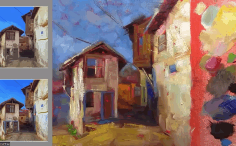
You can use a filter on your phone or in Photoshop.

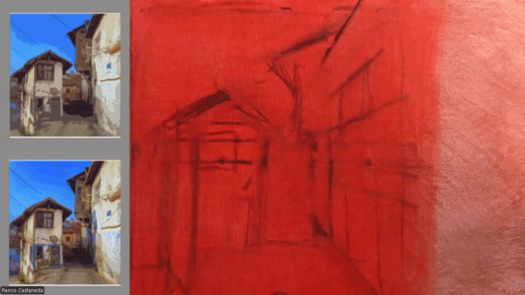
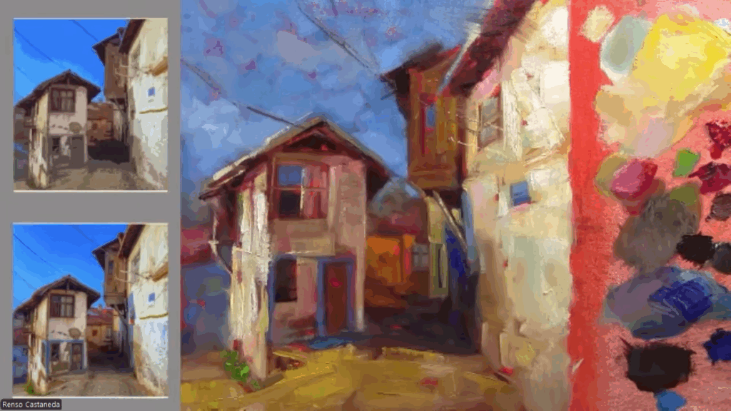
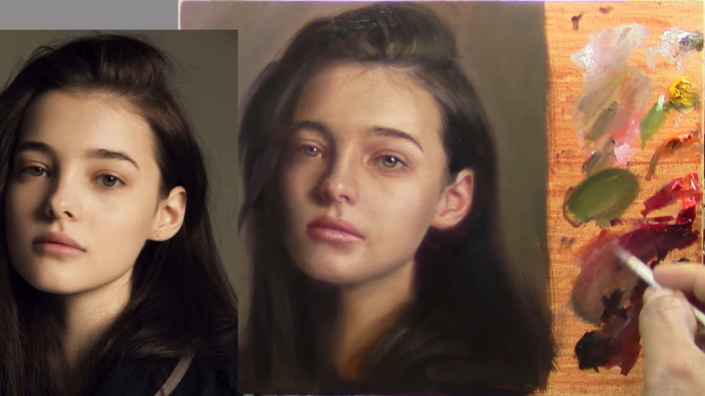
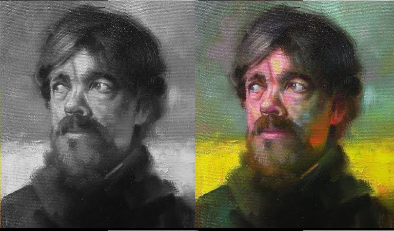
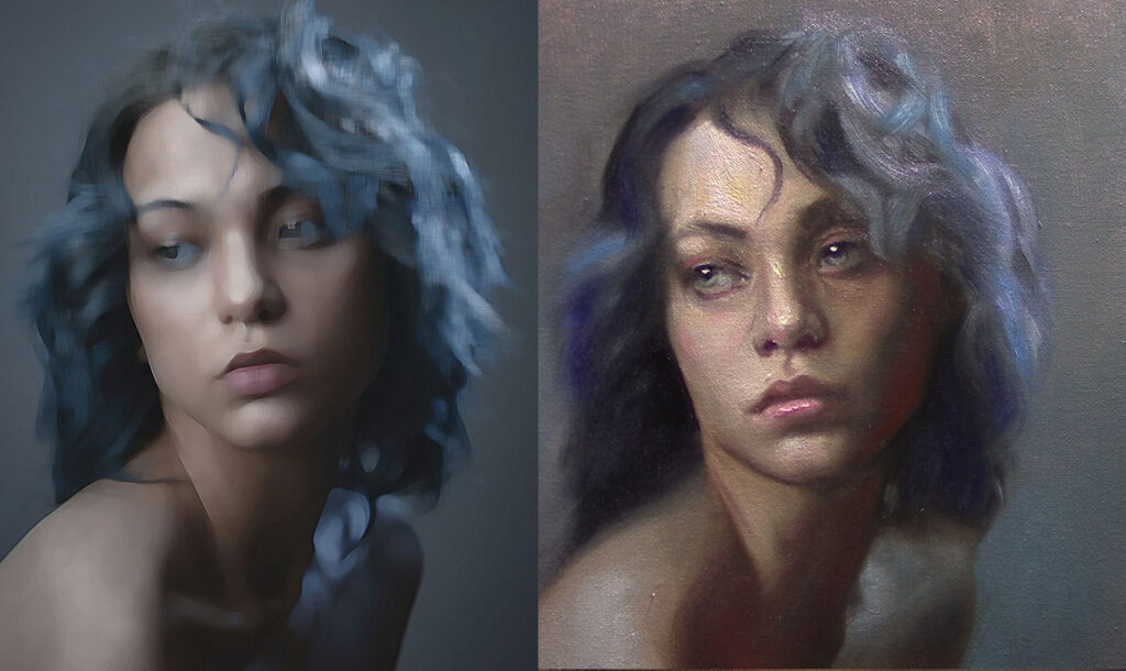
For example, I created the image on the left using a Photoshop filter called Paint Daubs. The one on the right is my painting. Feel free to use this kind of reference to practice. Remember: you’re not copying details — you’re painting the whole face, focusing on values and edges. The most important part of this exercise is to paint it blurry.

I recommend using small canvases — 6 x 6 inches — and doing quick sketches, no more than an hour. The goal is to train your eye to see the face as a whole. Once you’ve mastered that stage, then you can start adding details on top.

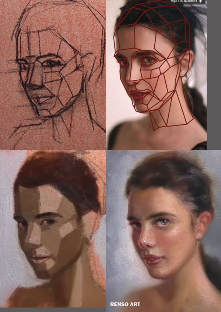
2.- Paint the planes of the face

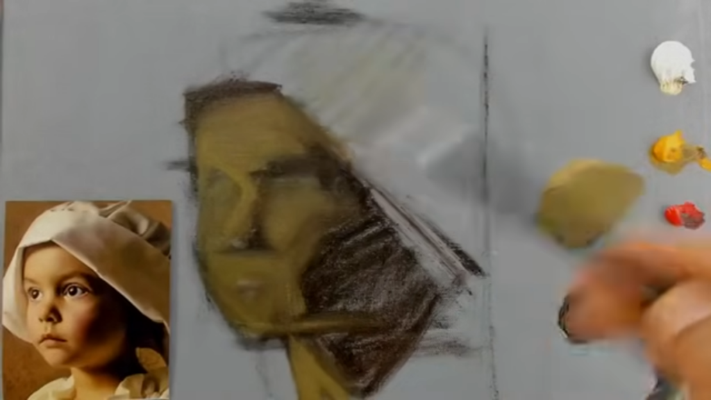
Forget the details — focus on the bigger planes. Think about how the light moves across the surface of the face, from the lighter planes to the darker ones. You’ll start to notice patterns in the structure of the face — shapes and transitions that repeat in every portrait. That’s what you want to train your eye to see.
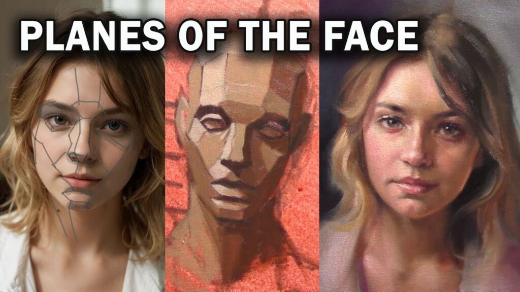
planes of the face

3.- Flat shapes

Of course! Here’s a longer, more detailed version that keeps your voice but improves clarity and flow:


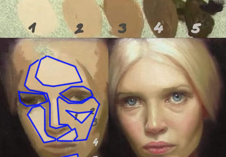
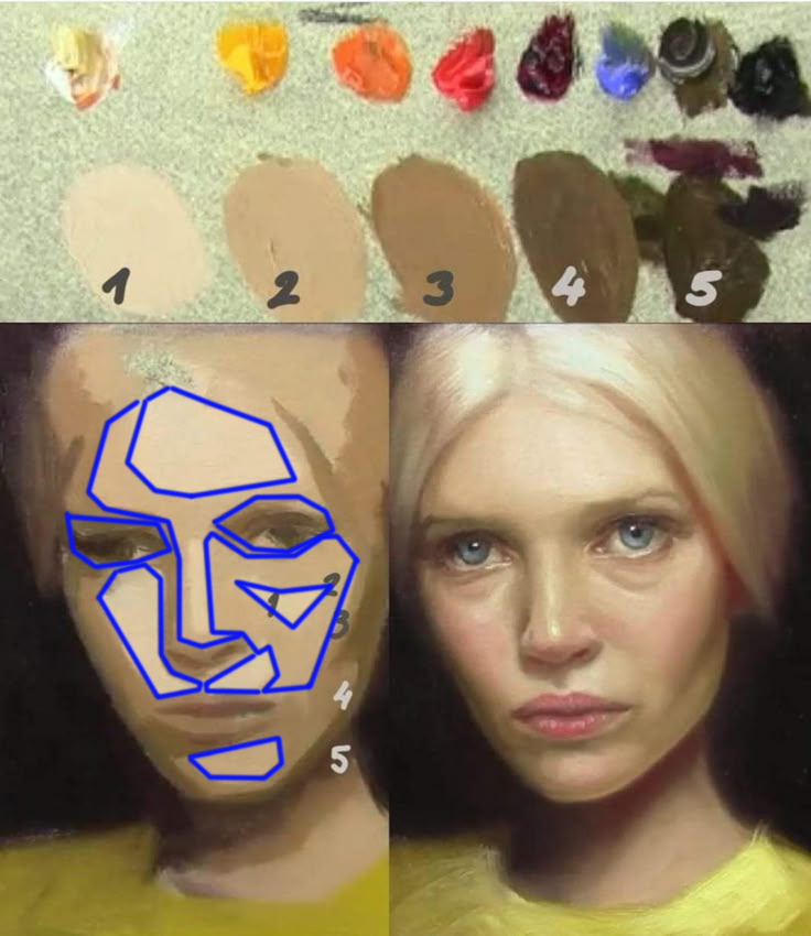
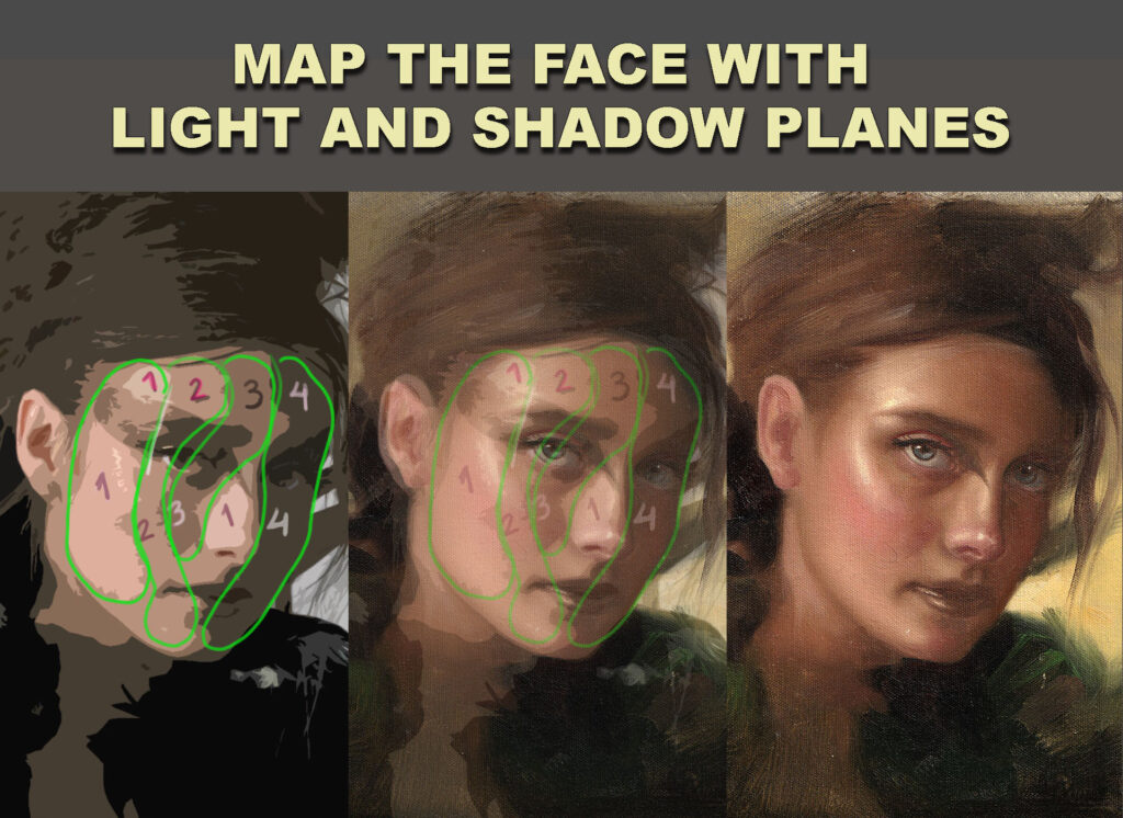
The difference between this study and the previous one is in how we simplify the face. In the first example, we focused on breaking the portrait down into planes, thinking about the structure and how light moves across the surface. In this second approach, the separation is based on values — light, midtones, and darks — instead of form.

This helps you train your eye to group areas by tonal value rather than getting distracted by small shapes or outlines. You’re not thinking about the three-dimensional form as much as you’re organizing the image into clear zones of light and shadow. This is a great way to develop a sense of design in your painting, and to better understand how light defines the structure of the face.

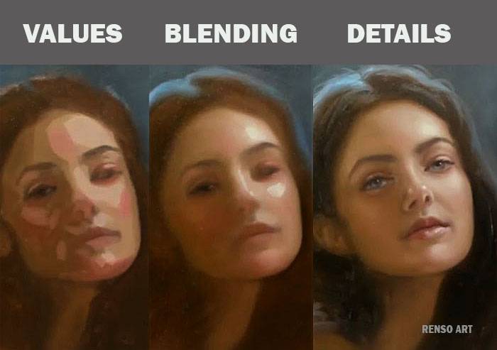
Also, notice how the details come in only at the very end of the process. First comes the big value masses, then the transitions, and finally small refinements. Don’t rush into details too early — they should sit on top of a solid foundation.

For the image on the left, I used a Photoshop filter called Cutout. It’s a great tool to simplify the reference and reduce it to just a few flat value shapes.
Why Painting on a Toned Canvas Can Transform Your Art

Struggling with your portraits? You might find my E-book helpful. Click here

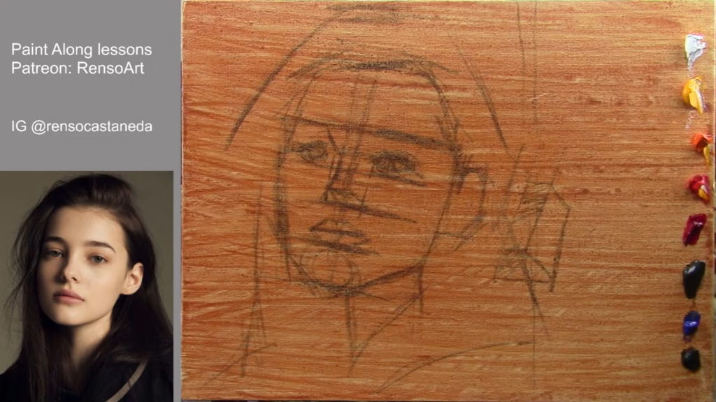
I’ve used white canvases my whole life, BUT from day one I learned that I should kill the white by adding a transparent layer of oil, or by painting a first layer with very thin paint—almost like watercolor. Only after that do I begin the actual painting process.

I remember a color theory class focused on the alla prima style that really showed the power of a toned canvas. We painted the same boat scene, but we had divided our canvas into four parts. Each section was toned with a different acrylic color: one a knocked-down orange, another pure yellow, one bright blue, and the last one gray. Two warm, two cool—one saturated, one desaturated. The results were completely different. I especially loved the parts where we used saturated tones—the color seemed to breathe through the layers, bringing more life, saturation, and harmony to the whole painting.

From that day on, I started using toned canvases. At first, I preferred gray. Later, I moved to orangey tones. I even experimented with fluorescent pink acrylic a few times—it looked amazing, but it was hard to make everything harmonize. That pink kept floating to the surface and demanded a lot of work.

Even today, I still use toned canvases for alla prima paintings. I only go back to white canvases when I plan to spend a long time on a piece with lots of layers. And when I paint with acrylics, I also prefer white. Acrylics dry fast and are more transparent, so applying light colors on a midtone base is harder—it takes more layers to get them to pop. For example, a yellow flower will glow more quickly on white canvas than on a toned one.

alla prima painting

Here a list of advantages of painting on a toned canvas:

1. Better Value Control

A white canvas can be blinding and make it difficult to judge mid-tones accurately. By starting with a neutral or warm undertone, you establish a middle ground, making it easier to gauge highlights and shadows. This helps prevent overly dark or washed-out paintings.

2. Enhanced Color Harmony

A toned ground subtly influences the colors layered on top, creating a unified feel. For example, a warm underpainting (like burnt sienna or yellow ochre) can add richness to landscapes, while a cool gray can help balance vibrant colors in portraits.

3. Faster Coverage & Fewer Gaps

White canvas peeking through can disrupt the illusion of depth. A toned background ensures that even if thin layers are applied, the painting looks cohesive from the first brushstroke.

4. Historical Precedence

Many classical masters, including Rubens and Rembrandt, used toned grounds to speed up their process and enhance depth. The Old Masters often worked on warm brown or gray imprimatura layers before adding details.

5. Reduced Intimidation

A blank white canvas can feel daunting. A toned surface breaks the “fear of the void,” allowing you to sketch loosely and build confidence before committing to finer details.

How to Choose Your Tone

  • Warm tones (ochre, sienna, reds): Great for landscapes, sunlit scenes, and classical realism.
  • Cool tones (gray, blue, green): Ideal for portraits, moody atmospheres, and modern works.
  • Neutral mid-tone (gray or beige): A versatile choice for any subject.

Try It Yourself!

Next time you start a painting, experiment with a toned canvas. Apply a thin wash of acrylic or oil paint diluted with solvent, let it dry, and observe how it changes your approach. You might find that this small adjustment makes a big difference in your art.

Have you tried painting on a toned ground? Share your experiences in the comments!


Mastering Portrait Painting
Oil portrait painting

Painting Tips / E-Book

$ 10.00

Portrait Painting Tips / E-Book

Category:

Why Good Values Let You Use Any Color Harmony in Portraits

Struggling with your portraits? You might find my E-book helpful. Click here

Introduction
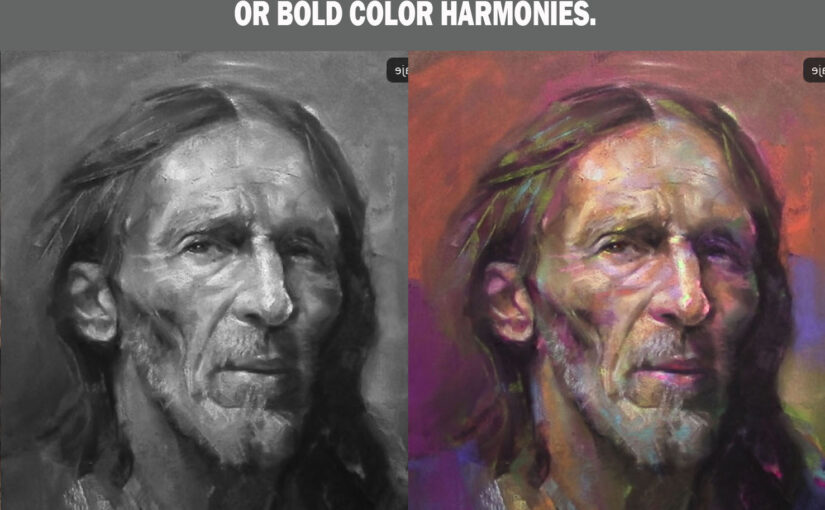
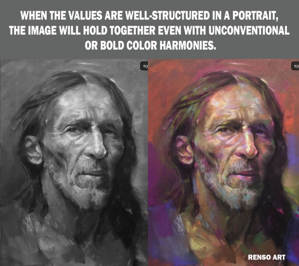
A well-painted portrait doesn’t rely solely on color—it depends on values (the lightness and darkness of tones). When values are correctly structured, you can experiment with almost any color harmony—complementary, triadic, or even seemingly clashing hues—and still achieve a cohesive, striking image.

This principle is why master artists like Sargent, Zorn, and contemporary painters can use limited or unconventional palettes while maintaining realism and depth. In this article, we’ll explore why values are more important than color and how you can confidently apply bold color schemes to your portraits.


1. Values Define Form, Color Enhances Mood

Before color even enters the picture, a portrait must work in grayscale. Strong value structure:

  • Creates three-dimensional form
  • Ensures proper contrast and readability
  • Guides the viewer’s eye through the composition

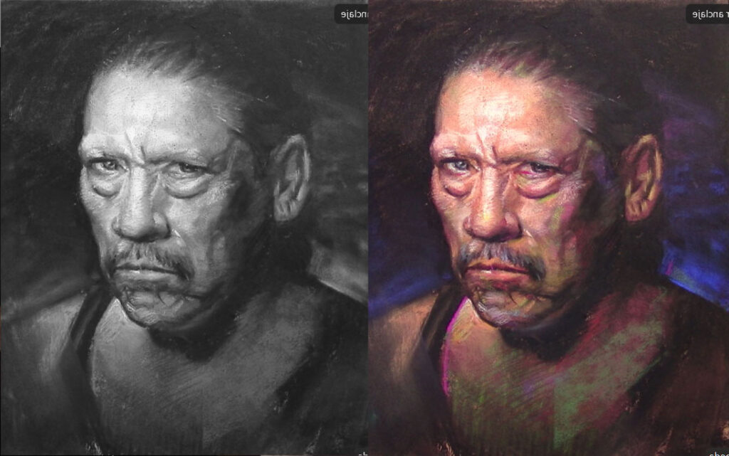
Once values are correct, color choices become more flexible. You can shift hues dramatically—turning skin tones blue, shadows green, or highlights pink—as long as the light-to-dark relationships stay consistent.

Try This Exercise:

  1. Paint a portrait in grayscale first.
  2. Once the values are solid, apply different color harmonies (e.g., complementary, analogous, or split-complementary).
  3. Notice how the image remains believable even with unnatural colors.

2. How to Use Any Color Harmony Successfully

A. Match Values, Not Just Hues

If you replace a mid-tone brown with a mid-tone purple of the same value, the structure of the face won’t break. This is why stylized art (like anime or fantasy illustrations) can use vibrant, unrealistic colors while still looking “right.”

B. Control Saturation & Temperature

Even if hues clash, adjusting saturation (intensity) and temperature (warm vs. cool) can balance them:

  • High saturation draws attention—use it sparingly (e.g., eyes, lips).
  • Cool shadows vs. warm lights (or vice versa) enhance depth without relying on local color.

C. Borrow from Limited Palettes

Many classical artists used just a few colors but mastered value contrast:

  • Zorn Palette (Black, White, Ochre, Red) – Creates realistic flesh tones through value control.
  • Digital Artists – Use vibrant, non-realistic colors but keep values accurate.

3. Examples of Unconventional Color in Portraits

A. Complementary Colors (High Contrast)

Example: A portrait with blue shadows and orange highlights (opposite on the color wheel). If values are correct, the contrast feels dynamic rather than chaotic.

B. Triadic & Split-Complementary Harmonies

Example: A face with teal mid-tones, magenta shadows, and yellow highlights. Despite the bold hues, proper value structure keeps it readable.

C. Discordant Colors (Intentional “Wrong” Choices)

Example: A greenish skin tone with red undertones—unusual, but if values match natural lighting, it can look stylized rather than “off.”


4. Common Mistakes & Fixes

Problem: Colors look muddy or clash.
Fix: Check if values are too similar—increase contrast.

Problem: Unnatural hues make the face look flat.
Fix: Re-examine your grayscale—are the shadows and highlights correctly placed?

Problem: Colors feel random, not harmonious.
Fix: Use a color wheel to pick a defined scheme (analogous, complementary, etc.).


Conclusion: Values Are the Foundation, Color Is the Decoration

Mastering values gives you the freedom to experiment with any color harmony. Whether you’re working in realism, fantasy, or stylized art, a strong grayscale foundation allows for endless color creativity.

Next time you paint:

  1. Nail the values first.
  2. Apply colors fearlessly—try a new harmony!
  3. Adjust saturation and temperature for balance.

Do you prefer realistic or stylized color in portraits? Share your thoughts in the comments!

Painting Tips / E-Book

$ 10.00

Portrait Painting Tips / E-Book

Category:


The Art of Simplification & the Planes of the Face

A step-by-step approach to building portraits with structure, clarity, and light

Struggling with your portraits? You might find my E-book helpful click here

When painting a portrait, it’s tempting to jump straight into the details—the eyes, the mouth, the expression. But focusing too early on those areas can lead to frustration and an unstructured painting. After painting hundreds of portraits, both live and in class, I’ve learned that one of the most powerful tools we have as artists is simplification.

Step One: From Reality to Flat Shapes

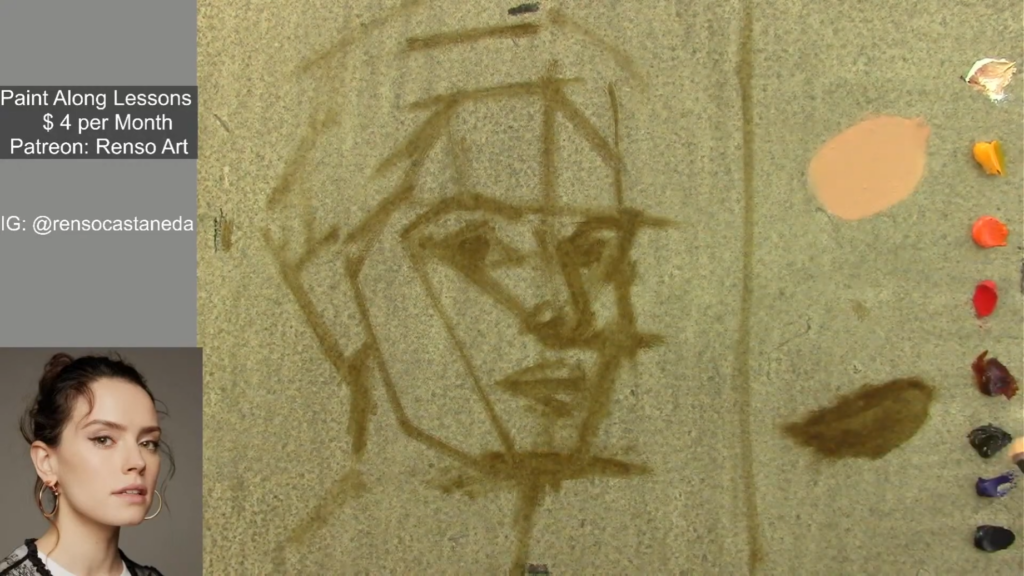
At the beginning of any portrait, I start by simplifying what I see into flat, abstract shapes. This means ignoring the small bumps, curves, and subtle variations and focusing only on:

  • The outline or contour of the head
  • The masses of shadow and light
  • The placement of facial features in terms of big shapes

This stage is not about making it look like the person yet—it’s about organizing the visual chaos into something readable and balanced. I often squint or blur my vision to help reduce the complexity and better see the big design of the portrait.

Why start here? Because a good portrait starts with good design. Simplifying to flat shapes allows us to make bold, clear decisions about proportion, placement, and overall structure.

Step Two: Introducing the Planes of the Face

Once the large forms are in place, I begin to break them down into planes—flat surfaces that turn at distinct angles, like the sides of a cube or the facets of a gem. The human face, though organic, can be broken down into major and minor planes that guide how we model light and shadow.

Some key examples:

  • The forehead has a top and front plane.
  • The nose has front, side, and underside planes.
  • The cheekbones form diagonal planes that catch side light.
  • The eye sockets recede into shadow, boxed in by the brow and the nose.

Understanding these planes helps us predict where the light will fall, even without perfect reference. When we know that the side plane of the face is turned away from the light, we can darken it. When a plane catches light, we know it deserves a highlight or a lighter value.

The planes are the bridge between structure and light. They are what make the portrait feel three-dimensional and believable.

Step Three: From Shapes to Forms

Once I have those flat shapes on the canvas or paper, the next step is to think in three dimensions. I begin turning those flat shapes into basic volumes—the head as a box or an egg, the nose as a wedge, the neck as a cylinder.

This transition from 2D to 3D thinking is crucial. It helps us understand how the head sits in space and how light interacts with its surface. Painting isn’t just copying what you see—it’s interpreting what you see through your knowledge of form.

In this stage, I’m not yet thinking about fine details like eyelashes or wrinkles. I’m asking:

  • What is the orientation of this form?
  • Is this surface facing the light or turning away from it?
  • What kind of shape best describes this part of the face?

These questions help me build a solid sculptural foundation.

Why This Matters

This whole process—from flat shapes, to simple forms, to planes of the face—helps build a portrait that is solid, readable, and full of life. It keeps us from getting lost in unnecessary detail, and gives us a clear roadmap for moving forward in each stage of the painting.

Beginners often worry about matching colors or rendering perfectly, but without structure underneath, all of that falls apart. When we take the time to simplify and understand form, our portraits become stronger, no matter what medium we use.


🖌️ Practice This With Me Live!

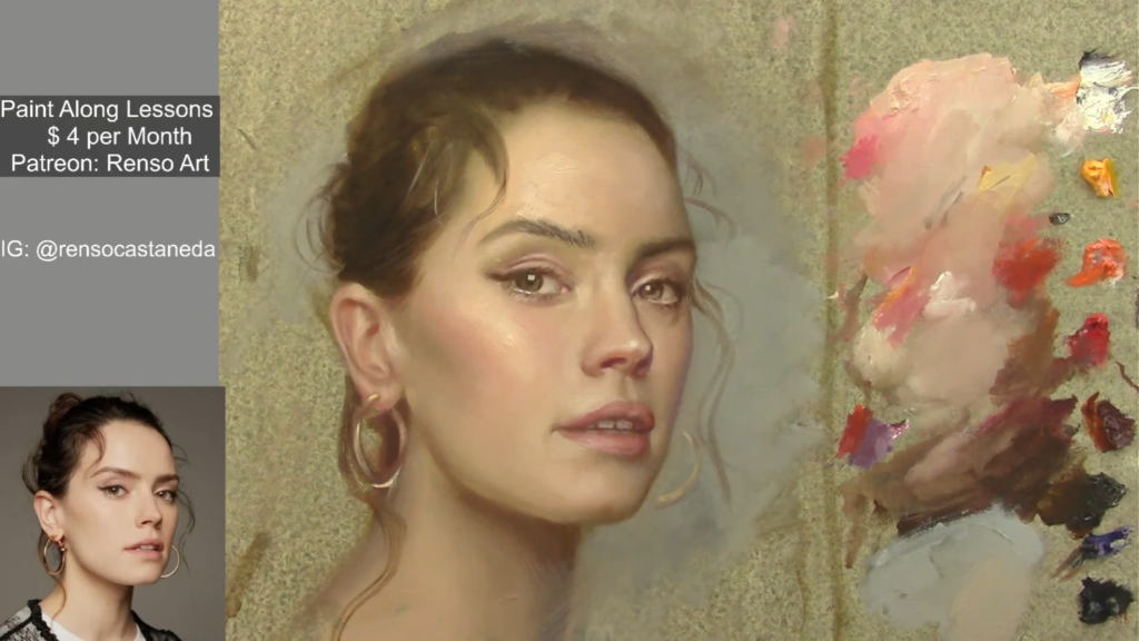
In my Thursday night Live Paint-Along Portrait Classes, we follow this exact approach step-by-step. We start with a clear block-in using flat shapes, then model simple forms, and finally explore how light moves across the planes of the face. Each session is a complete portrait, and we build skills week by week.

👁️ You’ll learn to see like a painter, not just copy photos.
🎨 You’ll understand how to use simplification to improve every stage of your process.
🧠 And most importantly, you’ll gain confidence in how you build a portrait—from the first stroke to the final detail.


P.S. If you’re working on your portraits, my e-book “Portrait Painting Tips” might help. It’s full of tips I use with my students.

Painting Tips / E-Book

$ 10.00

Portrait Painting Tips / E-Book

Category:

limited palettes for Portraits

Struggling with your portraits? You might find my E-book helpful. Click here

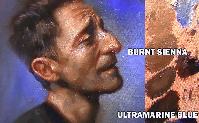
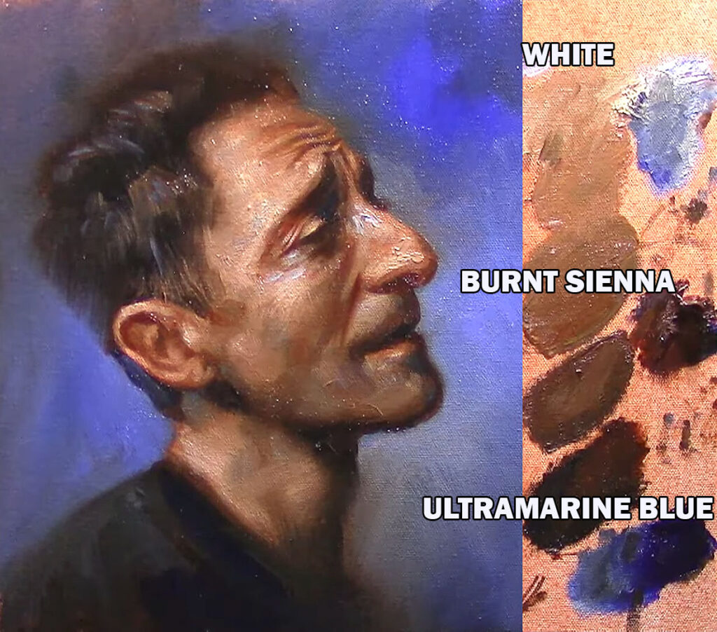
1.Temperature Palette (White, burnt sienna, Ultramarine blue)

This three-color palette is a powerful tool for portrait painters who want to simplify their choices and focus on the essentials—temperature, value, and form. Burnt Sienna brings warm, reddish-brown tones that resemble the warmth found in skin, while Ultramarine Blue adds depth and coolness, perfect for shadows and cooler areas like the jawline or under the nose. Titanium White (or your preferred white) is used to control value, create highlights, and desaturate mixtures for subtle skin tone variations.

Although it’s a limited palette, it allows for a surprising range of flesh tones by simply adjusting the balance between the warm and cool components. This palette also encourages a more unified and harmonious look, since all the tones come from just three sources. It’s especially useful for understanding how temperature shifts across the face and how to model form with minimal distraction from strong, saturated colors.

Ideal for studies, master copies, or expressive finished works, this palette helps artists focus on painting light and structure—key elements in creating lifelike and compelling portraits.

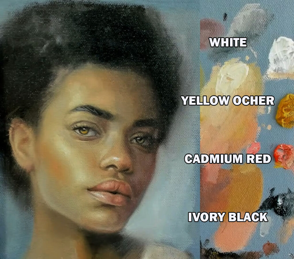
2. Zorn Palette (Black, White, Cad Red, Yellow Ochre)

Named after the Swedish painter Anders Zorn, this classic limited palette is a favorite among portrait artists for its simplicity and effectiveness. It includes just four colors: White for light and value control, Black (often Ivory Black) used as a cool blue substitute, Yellow Ochre for earthy warmth, and Cadmium Red for vibrant skin tones and blushes.

Despite its limitations, the Zorn Palette offers a remarkably broad range of naturalistic skin tones. The interaction between the warm Cad Red and Yellow Ochre, balanced by the coolness of Black, creates a subtle but powerful temperature contrast across the face. The palette avoids the distraction of intense color variety and instead emphasizes value, temperature, and edge control—essential aspects of strong portrait painting.

Zorn used this palette to paint luminous, lifelike portraits with a muted harmony and great emotional depth. For modern artists, it’s an excellent way to learn how to achieve more with less, making it perfect for both beginners seeking clarity and advanced painters focusing on refinement.

Using a limited palette (a small selection of colors) in art, design, or photography offers several advantages:

1. Enhanced Harmony & Cohesion

  • Fewer colors naturally create a more unified look.
  • Reduces visual clutter, making the composition feel balanced.

2. Stronger Visual Impact

  • Limiting colors forces you to focus on contrast, value, and composition.
  • Bold, intentional color choices stand out more.

3. Easier Color Mixing & Consistency

  • Fewer pigments simplify mixing (in traditional art).
  • Digital artists can maintain consistency across different elements.

4. Faster Decision-Making

  • Fewer choices speed up the workflow, reducing time spent on color selection.

5. Better Focus on Values (Light & Shadow)

  • With fewer hues, artists rely more on value contrast, improving depth and readability.

6. Emotional & Thematic Control

  • A restricted palette can evoke specific moods (e.g., monochromatic for minimalism, earthy tones for warmth).

7. Professional & Timeless Aesthetic

  • Many classic artworks and designs use limited palettes for elegance.
  • Avoids trendy or overwhelming color schemes.

8. Accessibility & Print-Friendly

  • Simplifies color management in printing (fewer inks).
  • Can improve readability for color-blind viewers.

9. Encourages Creativity Within Constraints

  • Forces problem-solving with fewer resources, leading to more innovative solutions.

Painting Tips / E-Book

$ 10.00

Portrait Painting Tips / E-Book

Category: