Struggling with your portraits? You might find my E-book helpful. Click here
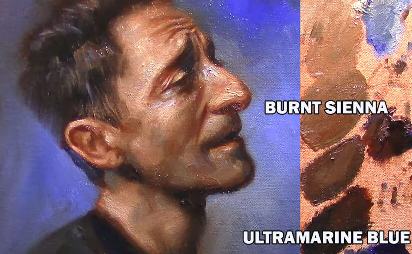
1.Temperature Palette (White, burnt sienna, Ultramarine blue)
This three-color palette is a powerful tool for portrait painters who want to simplify their choices and focus on the essentials—temperature, value, and form. Burnt Sienna brings warm, reddish-brown tones that resemble the warmth found in skin, while Ultramarine Blue adds depth and coolness, perfect for shadows and cooler areas like the jawline or under the nose. Titanium White (or your preferred white) is used to control value, create highlights, and desaturate mixtures for subtle skin tone variations.
Although it’s a limited palette, it allows for a surprising range of flesh tones by simply adjusting the balance between the warm and cool components. This palette also encourages a more unified and harmonious look, since all the tones come from just three sources. It’s especially useful for understanding how temperature shifts across the face and how to model form with minimal distraction from strong, saturated colors.
Ideal for studies, master copies, or expressive finished works, this palette helps artists focus on painting light and structure—key elements in creating lifelike and compelling portraits.
2. Zorn Palette (Black, White, Cad Red, Yellow Ochre)
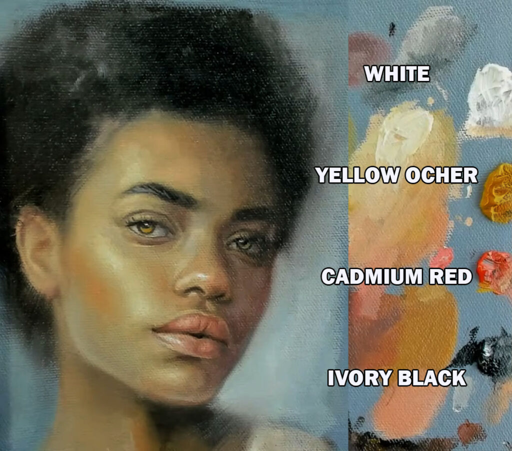
Named after the Swedish painter Anders Zorn, this classic limited palette is a favorite among portrait artists for its simplicity and effectiveness. It includes just four colors: White for light and value control, Black (often Ivory Black) used as a cool blue substitute, Yellow Ochre for earthy warmth, and Cadmium Red for vibrant skin tones and blushes.
Despite its limitations, the Zorn Palette offers a remarkably broad range of naturalistic skin tones. The interaction between the warm Cad Red and Yellow Ochre, balanced by the coolness of Black, creates a subtle but powerful temperature contrast across the face. The palette avoids the distraction of intense color variety and instead emphasizes value, temperature, and edge control—essential aspects of strong portrait painting.
Zorn used this palette to paint luminous, lifelike portraits with a muted harmony and great emotional depth. For modern artists, it’s an excellent way to learn how to achieve more with less, making it perfect for both beginners seeking clarity and advanced painters focusing on refinement.
Using a limited palette (a small selection of colors) in art, design, or photography offers several advantages:
1. Enhanced Harmony & Cohesion
- Fewer colors naturally create a more unified look.
- Reduces visual clutter, making the composition feel balanced.
2. Stronger Visual Impact
- Limiting colors forces you to focus on contrast, value, and composition.
- Bold, intentional color choices stand out more.
3. Easier Color Mixing & Consistency
- Fewer pigments simplify mixing (in traditional art).
- Digital artists can maintain consistency across different elements.
4. Faster Decision-Making
- Fewer choices speed up the workflow, reducing time spent on color selection.
5. Better Focus on Values (Light & Shadow)
- With fewer hues, artists rely more on value contrast, improving depth and readability.
6. Emotional & Thematic Control
- A restricted palette can evoke specific moods (e.g., monochromatic for minimalism, earthy tones for warmth).
7. Professional & Timeless Aesthetic
- Many classic artworks and designs use limited palettes for elegance.
- Avoids trendy or overwhelming color schemes.
8. Accessibility & Print-Friendly
- Simplifies color management in printing (fewer inks).
- Can improve readability for color-blind viewers.
9. Encourages Creativity Within Constraints
- Forces problem-solving with fewer resources, leading to more innovative solutions.