Struggling with your portraits? You might find my E-book helpful. Click here
One of the problems when we paint a portrait is that we often think details will make it look beautiful. So we start painting part by part — the eyes, the nose, the mouth — individually. But what we really need to do is paint each feature while always checking the relationship between them: how sharp they are, how dark or light, how they connect. If you don’t do that, you often end up with a cartoonish face — sharp edges and lots of details, but no volume.
Here are some exercises to help improve your paintings:
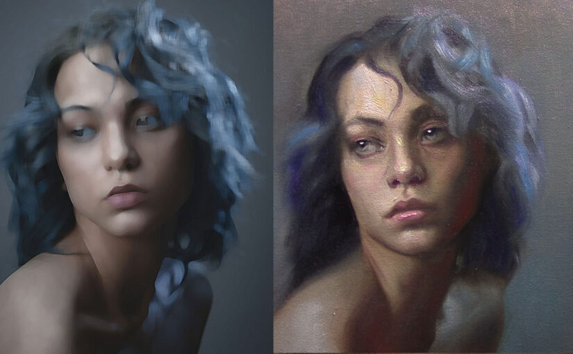
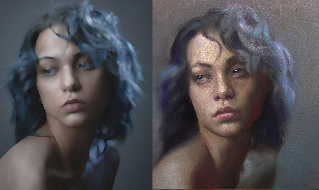
1.- First, imagine you’re a broken photo camera that can’t capture a sharp image. Every photo you take is blurry. That’s your reference.
You can use a filter on your phone or in Photoshop.
For example, I created the image on the left using a Photoshop filter called Paint Daubs. The one on the right is my painting. Feel free to use this kind of reference to practice. Remember: you’re not copying details — you’re painting the whole face, focusing on values and edges. The most important part of this exercise is to paint it blurry.
I recommend using small canvases — 6 x 6 inches — and doing quick sketches, no more than an hour. The goal is to train your eye to see the face as a whole. Once you’ve mastered that stage, then you can start adding details on top.
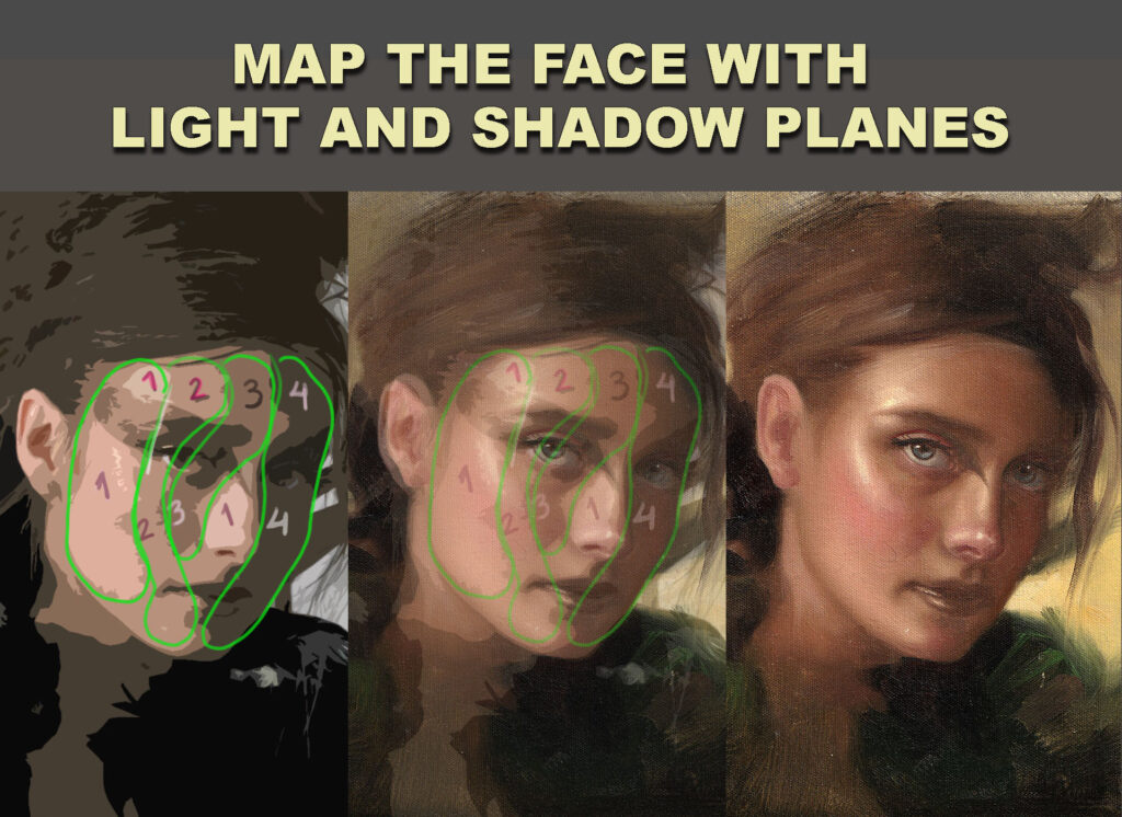
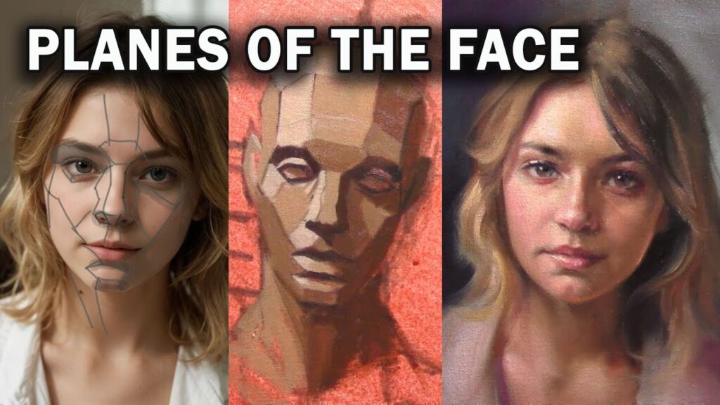
2.- Paint the planes of the face
Forget the details — focus on the bigger planes. Think about how the light moves across the surface of the face, from the lighter planes to the darker ones. You’ll start to notice patterns in the structure of the face — shapes and transitions that repeat in every portrait. That’s what you want to train your eye to see.
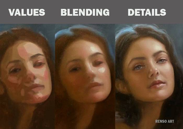
3.- Flat shapes
Of course! Here’s a longer, more detailed version that keeps your voice but improves clarity and flow:
The difference between this study and the previous one is in how we simplify the face. In the first example, we focused on breaking the portrait down into planes, thinking about the structure and how light moves across the surface. In this second approach, the separation is based on values — light, midtones, and darks — instead of form.
This helps you train your eye to group areas by tonal value rather than getting distracted by small shapes or outlines. You’re not thinking about the three-dimensional form as much as you’re organizing the image into clear zones of light and shadow. This is a great way to develop a sense of design in your painting, and to better understand how light defines the structure of the face.
Also, notice how the details come in only at the very end of the process. First comes the big value masses, then the transitions, and finally small refinements. Don’t rush into details too early — they should sit on top of a solid foundation.
For the image on the left, I used a Photoshop filter called Cutout. It’s a great tool to simplify the reference and reduce it to just a few flat value shapes.