
Struggling with your portraits? You might find my E-book helpful. Click here
A portrait’s background is more than a backdrop — it’s part of the mood, story, and focus. The right choice can make the subject sing, whisper, or even tell a completely different tale.
Here are 10 ways you can play with backgrounds:
1️⃣ Color Contrast
Opposite colors (complementaries) can make the subject pop — warm skin against cool blues, or dark hair against a pale wall.

2️⃣ Temperature Contrast
Warm backgrounds bring energy and life; cool backgrounds create calm and distance. Mixing them can create tension or harmony.
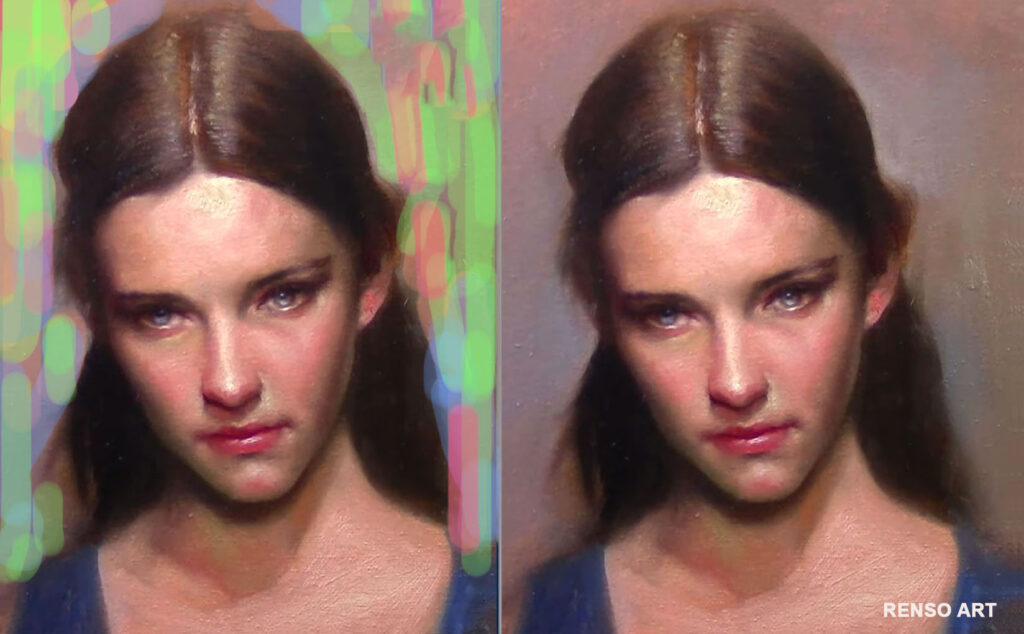
3️⃣ Busy vs. Minimal
Patterns, scenery, or objects add story. A blank or blurred background gives full attention to the subject.
4️⃣ Texture vs. Smooth
Thick brushstrokes or rough texture add depth and richness; a smooth surface brings stillness and simplicity.
5️⃣ Light vs. Dark
High-value contrast can make the subject dramatic; low contrast creates a softer, dreamier feel.

6️⃣ Sharp vs. Soft Focus
A sharply detailed background keeps everything in the same “visual world.” A blurred or abstract background pushes the subject forward.
7️⃣ Realistic vs. Stylized
A lifelike setting grounds the portrait in reality. A stylized or abstract background adds artistry and symbolism.
8️⃣ Close vs. Distant Space
A close background feels intimate. A distant or open space suggests freedom, loneliness, or grandeur.
9️⃣ Single Color vs. Gradation
A flat color background is graphic and bold; a gradient background can subtly lead the eye and add atmosphere.

🔟 Symbolic Elements
Objects, shapes, or colors that have personal or cultural meaning can transform the portrait into a deeper story.
💬 Which type of background do you love most for portraits — bold and complex, or quiet and simple?
Renso, I love this very useful information that you are sharing.
Thank you
Thank you Renso for your examples.
At the moment I am in doubt with a background for a portrait. The woman has redding Brown hair. So a greenish background would be nice, but on the other hand her blouse is plain green. So I halve a problemen. LOL
I bet a purple would look great maybe grayed down a little bit .