Struggling with your portraits? You might find my E-book helpful. Click here
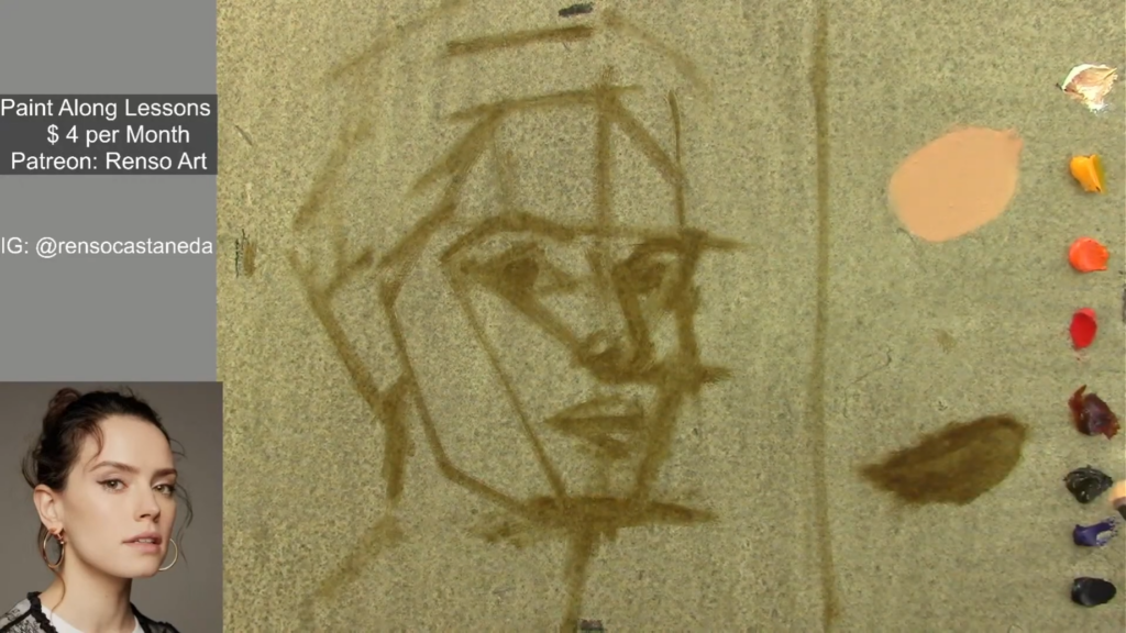
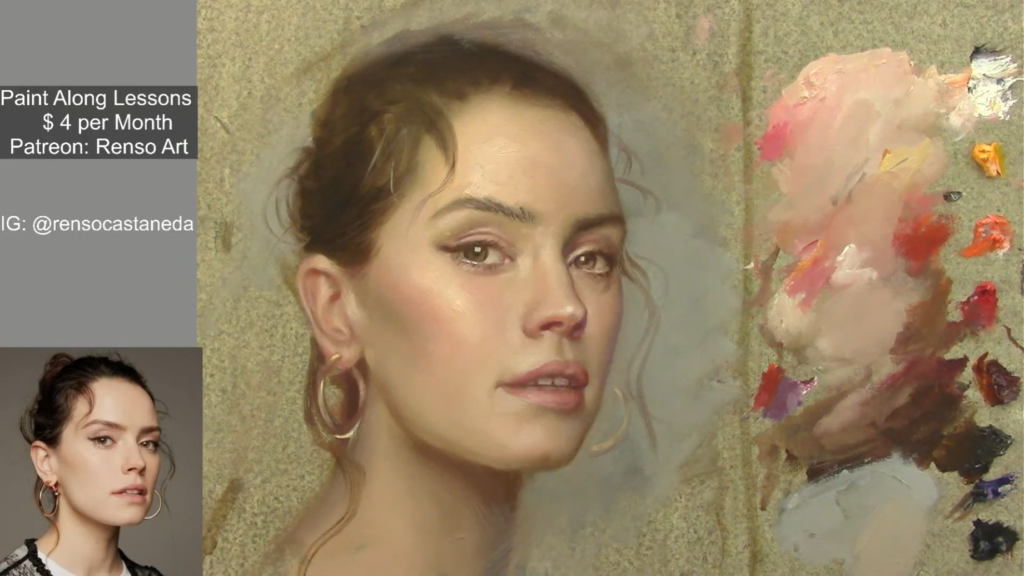
I’ve used white canvases my whole life, BUT from day one I learned that I should kill the white by adding a transparent layer of oil, or by painting a first layer with very thin paint—almost like watercolor. Only after that do I begin the actual painting process.
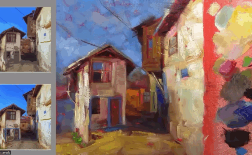
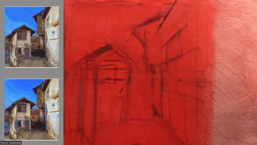
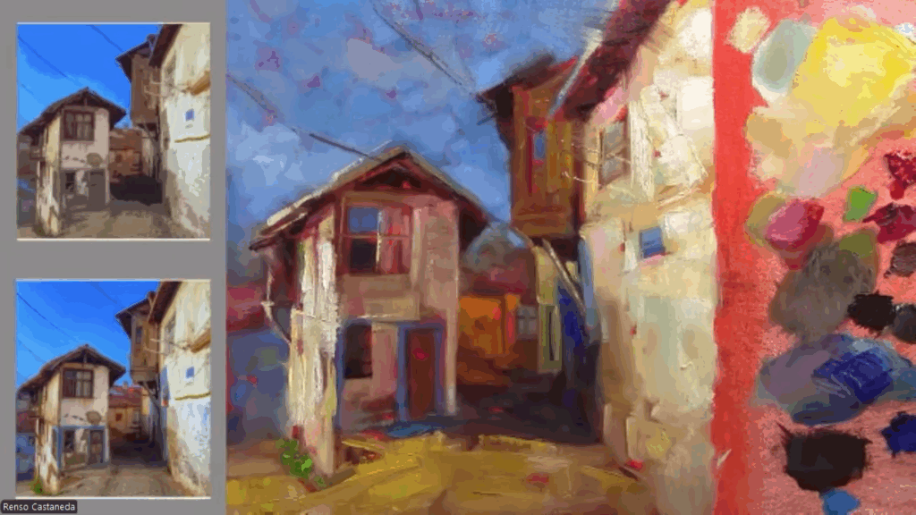
I remember a color theory class focused on the alla prima style that really showed the power of a toned canvas. We painted the same boat scene, but we had divided our canvas into four parts. Each section was toned with a different acrylic color: one a knocked-down orange, another pure yellow, one bright blue, and the last one gray. Two warm, two cool—one saturated, one desaturated. The results were completely different. I especially loved the parts where we used saturated tones—the color seemed to breathe through the layers, bringing more life, saturation, and harmony to the whole painting.
From that day on, I started using toned canvases. At first, I preferred gray. Later, I moved to orangey tones. I even experimented with fluorescent pink acrylic a few times—it looked amazing, but it was hard to make everything harmonize. That pink kept floating to the surface and demanded a lot of work.
Even today, I still use toned canvases for alla prima paintings. I only go back to white canvases when I plan to spend a long time on a piece with lots of layers. And when I paint with acrylics, I also prefer white. Acrylics dry fast and are more transparent, so applying light colors on a midtone base is harder—it takes more layers to get them to pop. For example, a yellow flower will glow more quickly on white canvas than on a toned one.
Here a list of advantages of painting on a toned canvas:
1. Better Value Control
A white canvas can be blinding and make it difficult to judge mid-tones accurately. By starting with a neutral or warm undertone, you establish a middle ground, making it easier to gauge highlights and shadows. This helps prevent overly dark or washed-out paintings.
2. Enhanced Color Harmony
A toned ground subtly influences the colors layered on top, creating a unified feel. For example, a warm underpainting (like burnt sienna or yellow ochre) can add richness to landscapes, while a cool gray can help balance vibrant colors in portraits.
3. Faster Coverage & Fewer Gaps
White canvas peeking through can disrupt the illusion of depth. A toned background ensures that even if thin layers are applied, the painting looks cohesive from the first brushstroke.
4. Historical Precedence
Many classical masters, including Rubens and Rembrandt, used toned grounds to speed up their process and enhance depth. The Old Masters often worked on warm brown or gray imprimatura layers before adding details.
5. Reduced Intimidation
A blank white canvas can feel daunting. A toned surface breaks the “fear of the void,” allowing you to sketch loosely and build confidence before committing to finer details.
How to Choose Your Tone
- Warm tones (ochre, sienna, reds): Great for landscapes, sunlit scenes, and classical realism.
- Cool tones (gray, blue, green): Ideal for portraits, moody atmospheres, and modern works.
- Neutral mid-tone (gray or beige): A versatile choice for any subject.
Try It Yourself!
Next time you start a painting, experiment with a toned canvas. Apply a thin wash of acrylic or oil paint diluted with solvent, let it dry, and observe how it changes your approach. You might find that this small adjustment makes a big difference in your art.
Have you tried painting on a toned ground? Share your experiences in the comments!


I learned to always paint on toned canvasses. Though I still don’t really know what the effect is of a certain colour on the final outcome.