Struggling with your portraits? You might find my E-book helpful. Click here
When you paint from a reference photo, it’s tempting to replicate it exactly — every color, every shadow, every detail. After all, the photo is “real,” right? But painting gives us a creative power that photography doesn’t: the ability to transform the scene into something more personal, emotional, and atmospheric.
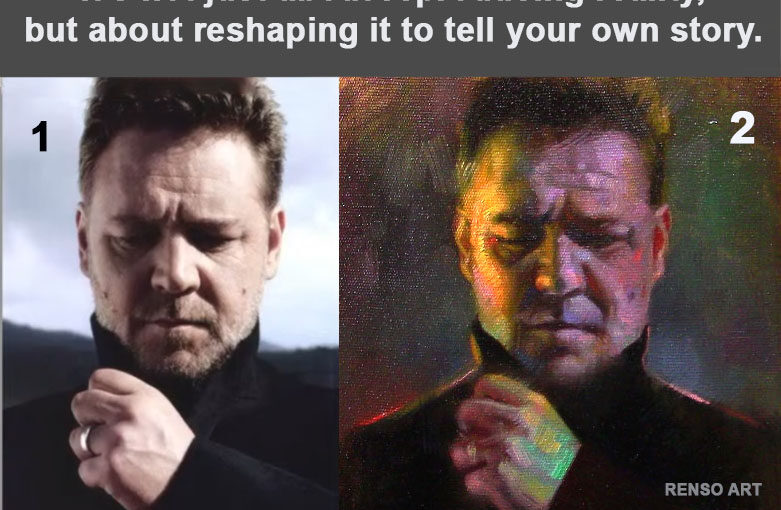
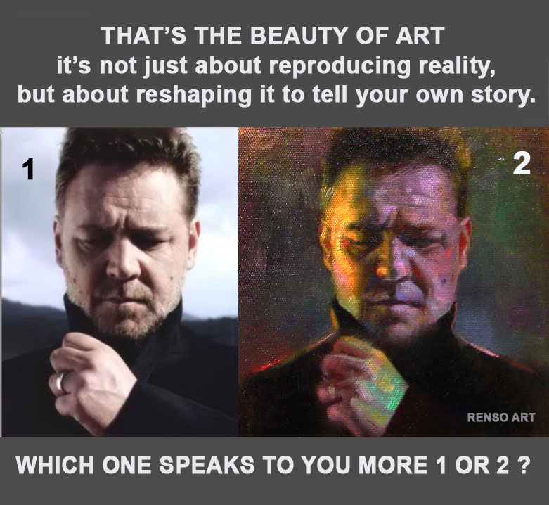
In this comparison, the image on the left is the original photo — calm, natural, and grounded in reality. The one on the right is my painting — the same subject, but with a completely different emotional temperature.
Why Not Copy the Colors Exactly?
Because colors tell the story.
A photo might capture the surface reality, but color choices in a painting can amplify emotion, create tension, or invite mystery.
- Cooler shadows can evoke melancholy or introspection.
- Warmer highlights can suggest hope, vitality, or even drama.
- Unexpected hues — such as hints of green in skin tones or magenta in shadows — can make a portrait more alive than a literal copy.
Step-by-Step Process
1️⃣ Choosing the Reference
I selected a photo that already had strong mood and lighting — the slightly downward gaze and hand gesture added an emotional weight that I could build on.
2️⃣ Deciding on the Mood
Before touching the canvas, I asked: What do I want the viewer to feel?
For this painting, I wanted more intensity than the photo gave me, so I planned to boost contrasts and use bolder colors.
3️⃣ Adjusting the Palette
- In the shadows: I cooled them down with purples and deep greens.
- In the highlights: I pushed warm yellows and reds to create a glow.
- In transitions: I blended in unexpected colors (teal, magenta) to give life to skin tones.
4️⃣ Brushwork and Edges
Rather than perfectly smooth blending, I left some strokes visible. This makes the painting feel more alive and lets the colors vibrate against each other.
5️⃣ Stepping Back
Halfway through, I always step back several feet from the canvas. This is when I ask myself, Does this version tell a stronger story than the photo? If not, I make bolder changes.
Tips for Artists Wanting to Try This
- Don’t fight your instincts. If a color feels right, use it — even if it’s not in the photo.
- Experiment with temperature shifts. Try making shadows cooler and highlights warmer (or vice versa) to see how it changes the mood.
- Use color to guide the eye. Strategic contrast can pull focus to the most important part of your composition.
- Think story, not accuracy. Ask: What do I want this image to say? rather than How do I match it exactly?
The Takeaway
The freedom to reinterpret color is one of painting’s greatest joys. It’s not about matching the photo pixel by pixel — it’s about expressing something the camera can’t.
Now I’m curious — which one speaks to you more?
The calm realism of the photo, or the emotive colors of my painting?
I really enjoy these short bits of art advice! More please!
This advise is perfect for me…I love to be reminded to step back and look at my painting as a whole and then place the little color nuances and bolder strokes where I “feel” but not necessarily “see” in the photo reference. It makes the painted version more of the Artist’s own creation…and not just a faithful copy of the photo image. It adds the character and brings in the emotional aspect!