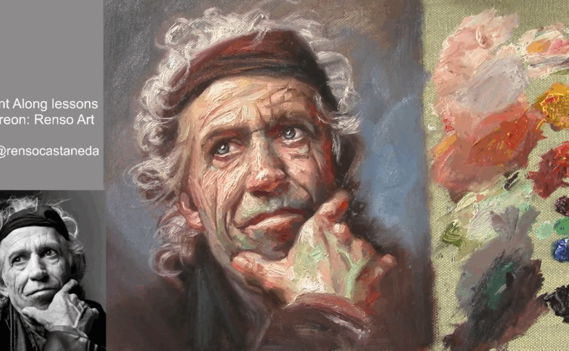
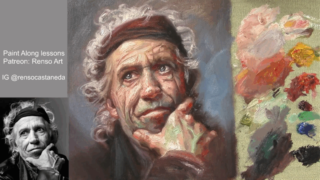
Struggling with your portraits? You might find my E-book helpful. Click here
I painted most of the time from color photos or a live model. But as a teacher, I started to think: what would be the best way to remove the idea that color is more important than values? How could students better understand how light behaves and creates form?
This reflection came from listening to many beginners who came to my classes and were always asking how to match colors. That was all they cared about. The truth is, if you match colors correctly, you’re also matching values — but doing both at the same time is very difficult.
That’s why many teachers separate value from color. When students focus on values first, they start to see real improvement. And once they’ve mastered that, they become much better at mixing color too.
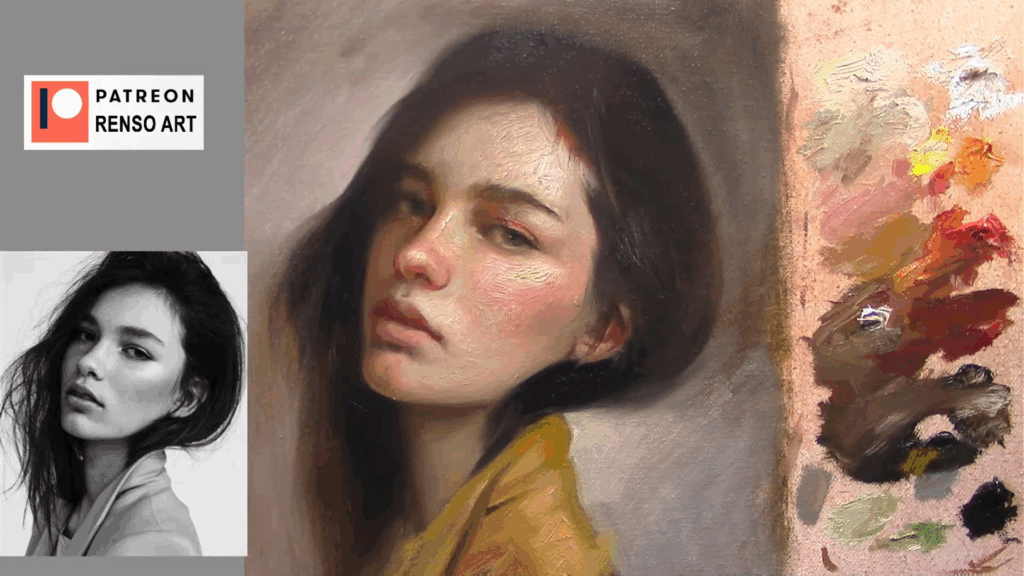
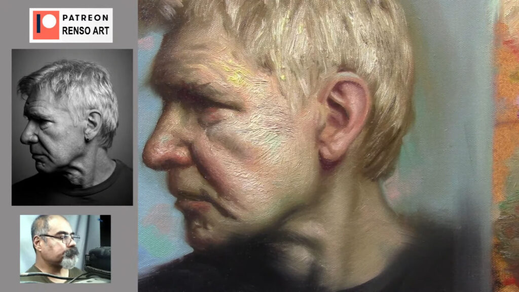
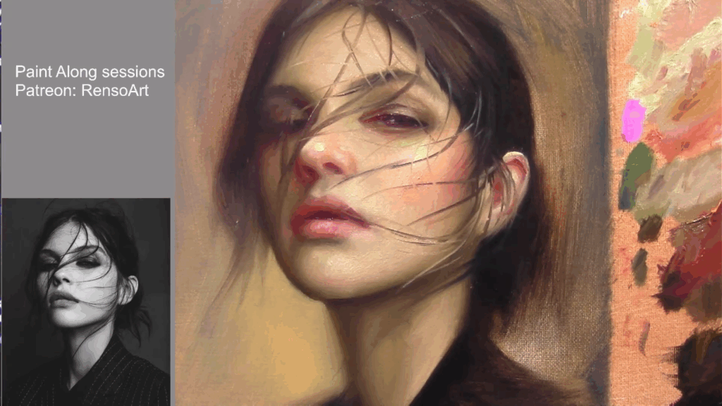
Working from a black-and-white (B&W) reference is a highly effective exercise that strengthens an artist’s ability to perceive and replicate values, improves observational skills, and builds a solid foundation for more advanced techniques.
Link to full video: https://www.youtube.com/live/9QXBP0SYxS8
1. Mastering Values: The Backbone of Realism
Values—the spectrum of lightness and darkness in an image—are fundamental to creating the illusion of depth and three-dimensionality. When painting from a B&W reference, you eliminate the distraction of color, forcing yourself to focus solely on tonal relationships. This helps you:
- Distinguish subtle shifts in contrast that define form.
- Avoid over-relying on color to create depth (a common mistake among beginners).
- Develop a stronger sense of light logic—how highlights, midtones, and shadows interact.
Many great classical artists, such as Rembrandt and Caravaggio, used strong value structures to achieve dramatic realism. By practicing in grayscale, you train your eye to see like they did.
Link to full video: https://www.youtube.com/live/Jt0QoDY9SSY
2. Simplifying Composition and Form
Color can sometimes obscure the underlying structure of a subject. A B&W reference strips away hues, making it easier to analyze:
- Shapes and Silhouettes – Without color, you see the purest form of an object’s outline.
- Focal Points – High-contrast areas naturally draw the eye, helping you understand visual hierarchy.
- Edges and Transitions – Soft vs. hard edges become more apparent, improving your rendering techniques.
This simplification is especially useful for portrait artists, as facial features rely heavily on accurate value transitions rather than just skin tones.
Link to full video: https://www.youtube.com/live/uz4toKd09MM
3. Enhancing Color Application Later
Once you’ve trained your eye to see values correctly, adding color becomes much more intuitive. Many artists struggle with muddy or flat paintings because they haven’t established a strong value structure first. By practicing in black and white:
- You learn how colors behave in terms of lightness/darkness (e.g., yellow is naturally lighter than purple).
- Mixing colors becomes easier because you understand their value relationships.
- You avoid the pitfall of relying on hue shifts instead of value contrast for dimension.
Digital artists, in particular, can benefit from starting a painting in grayscale before adding color layers—a technique known as “value blocking.”
4. Improving Observational Skills
Since our brains are wired to prioritize color, removing it forces you to look more carefully at:
- Subtle gradients (e.g., how a shadow transitions smoothly into a midtone).
- Texture and detail (e.g., how different materials reflect light differently, even in B&W).
- Negative space (e.g., how the background interacts with the subject).
This heightened observation translates into all areas of art, from still life to landscapes.
Link to full video: https://youtube.com/live/08iolV2ZcYw
5. Versatility Across Mediums and Styles
Whether you work in oils, watercolor, charcoal, or digital art, value studies are universally applicable. Even abstract and stylized artists benefit from understanding core value relationships. Additionally:
- Traditional artists can use B&W studies as underpaintings (grisaille technique).
- Concept artists use grayscale thumbnails to quickly establish lighting and composition.
- Animators and illustrators rely on clear value separation for readability.
How to Practice Effectively
To get the most out of this exercise:
- Start with high-contrast references (e.g., chiaroscuro lighting) before moving to subtle gradations.
- Limit your palette—try using just black, white, and one or two grays to force decision-making.
- Compare your work to the reference by squinting or flipping the image upside down to spot errors.
- Transition to color gradually—apply what you’ve learned by glazing color over a monochrome base.
Conclusion
Painting from black-and-white references is one of the most effective ways to sharpen your artistic eye. It builds a critical foundation in value control, composition, and form—skills that directly improve your ability to work with color later. Incorporating grayscale studies into your practice will lead to more confident, dynamic, and realistic artwork.
So next time you pick up a brush or stylus, try starting in black and white—you might be surprised at how much it improves your art!

- Why Short Portrait Sessions Are One of the Most Valuable Practices for Painters
- From Planes to Realism: How to Soften Structure Without Losing Form
- How to Paint Planes of the Face in Warm and Cool Light
- Top 5 Mistakes Beginners Make in Portraits
- How to Self-Critique Your Own Paintings