Struggling with your portraits? You might find my E-book helpful. Click here
When you start painting portraits, it’s easy to get lost in the details and forget what really builds a strong painting. I’ve made all these mistakes myself, and I still see them often in students’ work. I remember painting a lot of details on the eyes, somebody told me the likeness it was just on the eyes and that was enough for me to put a lot of time on the eyes, it took me a bit to understand that likeness is on the whole face and even without details we can get the likeness when values and proportions are accurate. Here are the five most common ones — and how to fix them.
1. Jumping Into Color Too Soon
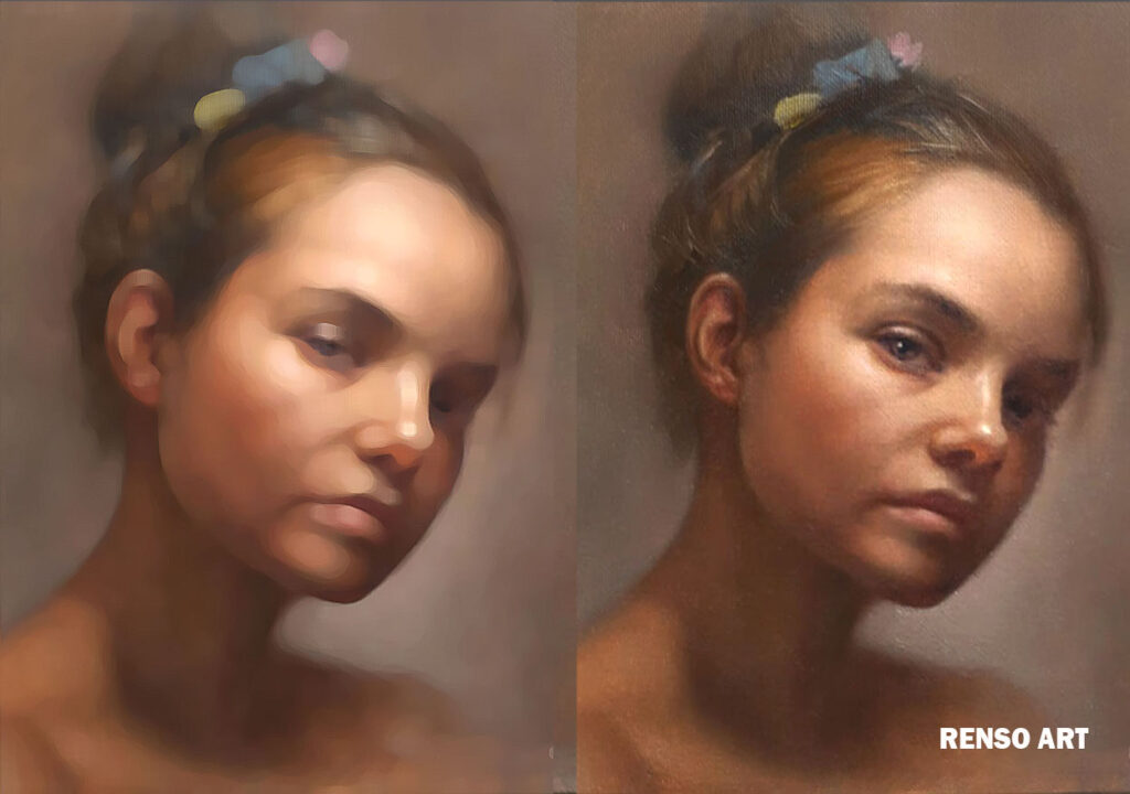
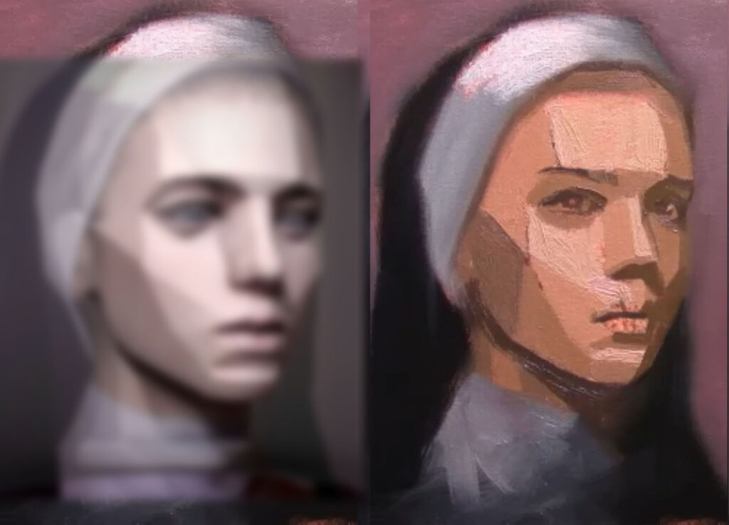
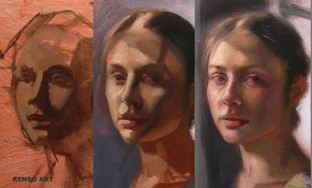
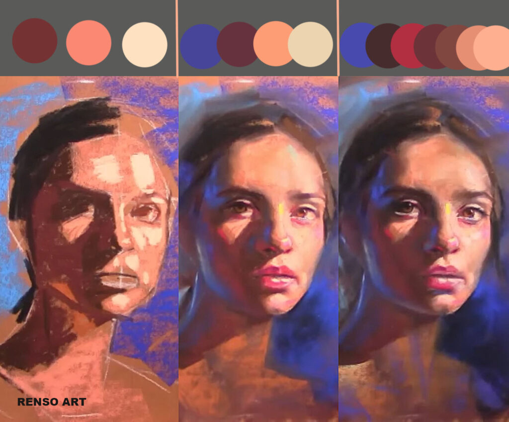
Many beginners are excited to start painting and go straight into mixing skin tones. It’s understandable — color is what makes a painting look alive. But if the value structure underneath isn’t solid, all that beautiful color won’t hold the portrait together. You can think of values (light and dark) as the bones of your painting, and color as the skin that sits on top. Without a strong skeleton, the form collapses.
The biggest mistake is skipping the monochrome or value study. Working first in grayscale — or with a limited palette like burnt umber and white — helps you understand how light falls across the face. It trains your eye to see contrast, depth, and form before worrying about hue. Once you understand the pattern of light and shadow, applying color becomes much easier and more accurate.
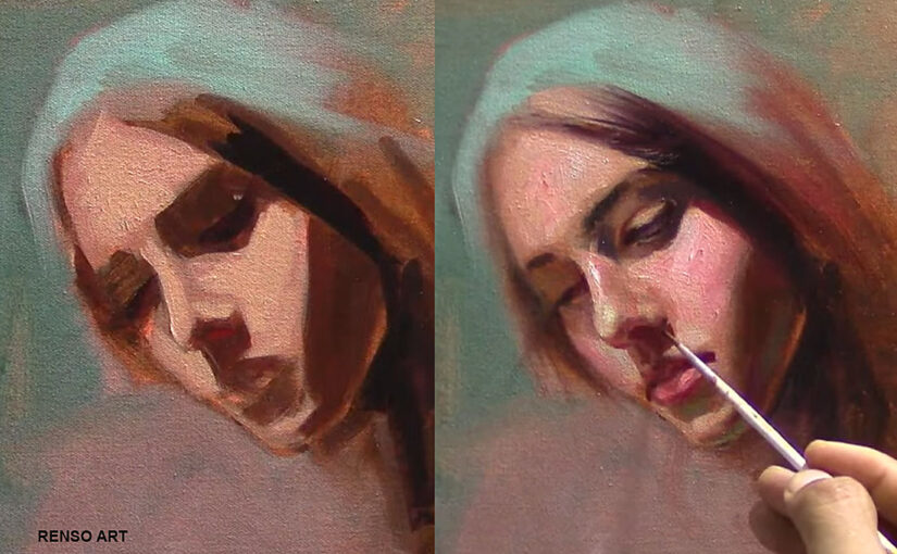
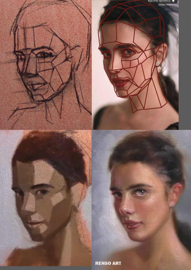
2. Drawing That’s “Close Enough”
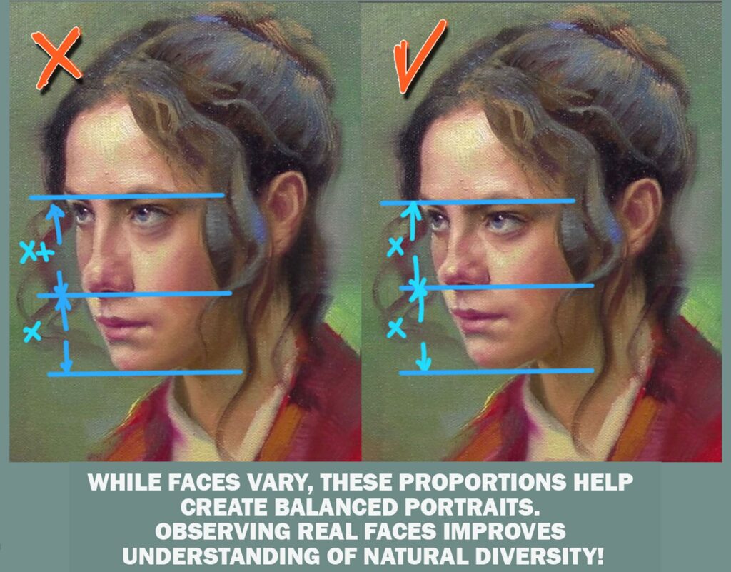
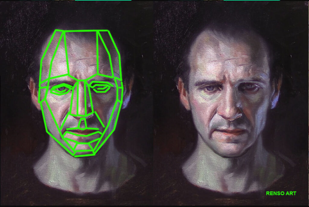
Portraits depend on accuracy. A small mistake — even a millimeter — in the placement of an eye or the tilt of the mouth can completely change the likeness. The truth is, painting doesn’t fix drawing problems. If the structure underneath isn’t right, the paint will only make it more obvious.
Slow down in the drawing stage. Take your time to compare distances between features — how far is the nose from the eyes, or the mouth from the chin? Use horizontal and vertical alignment lines to check proportions. If you tilt your head slightly or view your drawing in a mirror, you’ll instantly notice what feels off. Think of this step as building the foundation of a house: once it’s solid, you can paint freely without worrying that something will collapse later.
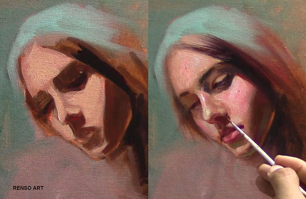
3. Overblending Everything
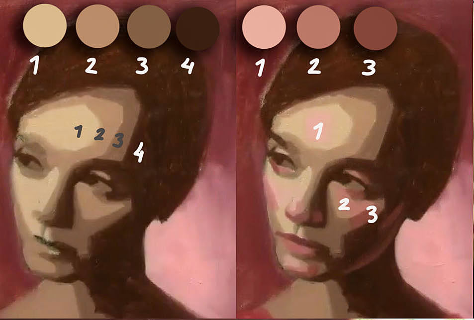
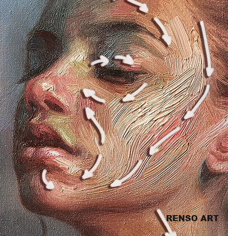
It’s tempting to blend every brushstroke until the surface looks smooth and polished. But too much blending kills form, texture, and the sense of life. Faces are not made of plastic — they have planes, transitions, and edges that shift from soft to hard depending on the light.
Instead of chasing smoothness, think about structure. Leave some visible strokes to describe direction and form. Keep sharp edges where light meets shadow, and softer transitions where the planes turn gradually. Try stepping back from your painting: if it reads well from a distance, it’s likely finished. Remember — expression often lives in those visible strokes.
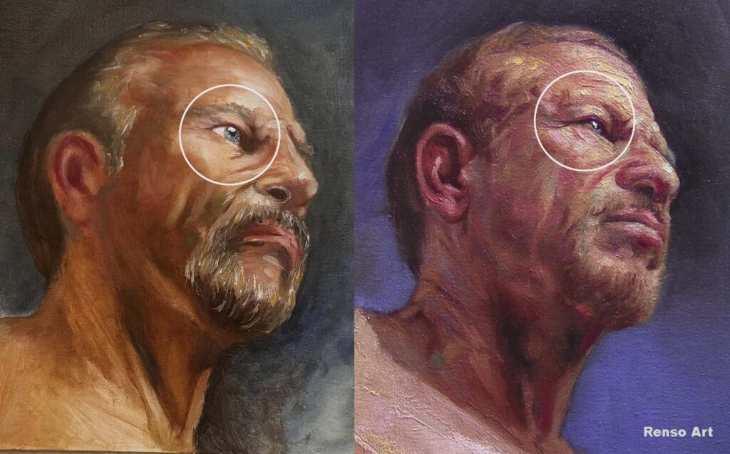
4. Painting What You Think You See
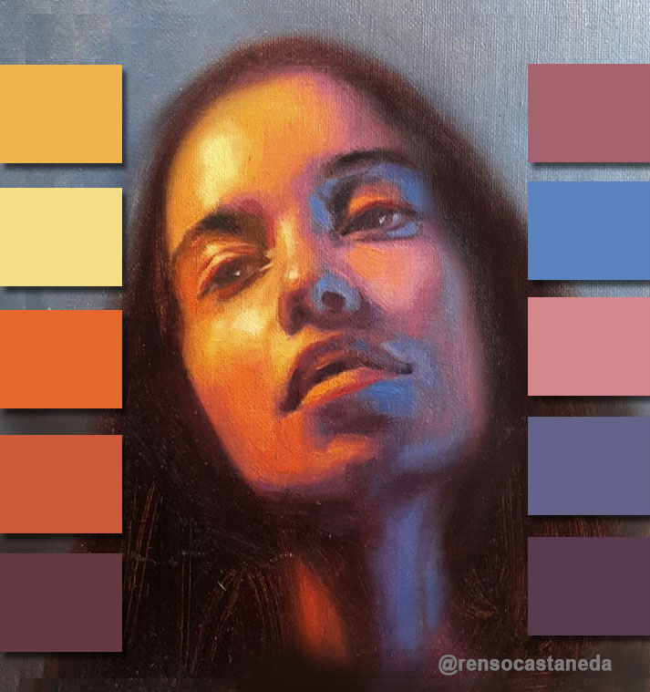
Our brains love shortcuts. We carry an idea of how a face “should” look — two eyes, one nose, one mouth — and we end up painting that idea instead of the real person. To break that habit, we need to paint what we see, but also understand what we know about structure and light.
For example, beginners often paint the whites of the eyes pure white, even if they’re in shadow. But in real life, the sclera usually has grays, blues, or warm tones from reflected light. The same goes for teeth, hair, or skin — nothing is ever just one color. Observation and knowledge must work together. The more you study anatomy and light, the easier it becomes to notice these subtle variations that make your portraits come alive.
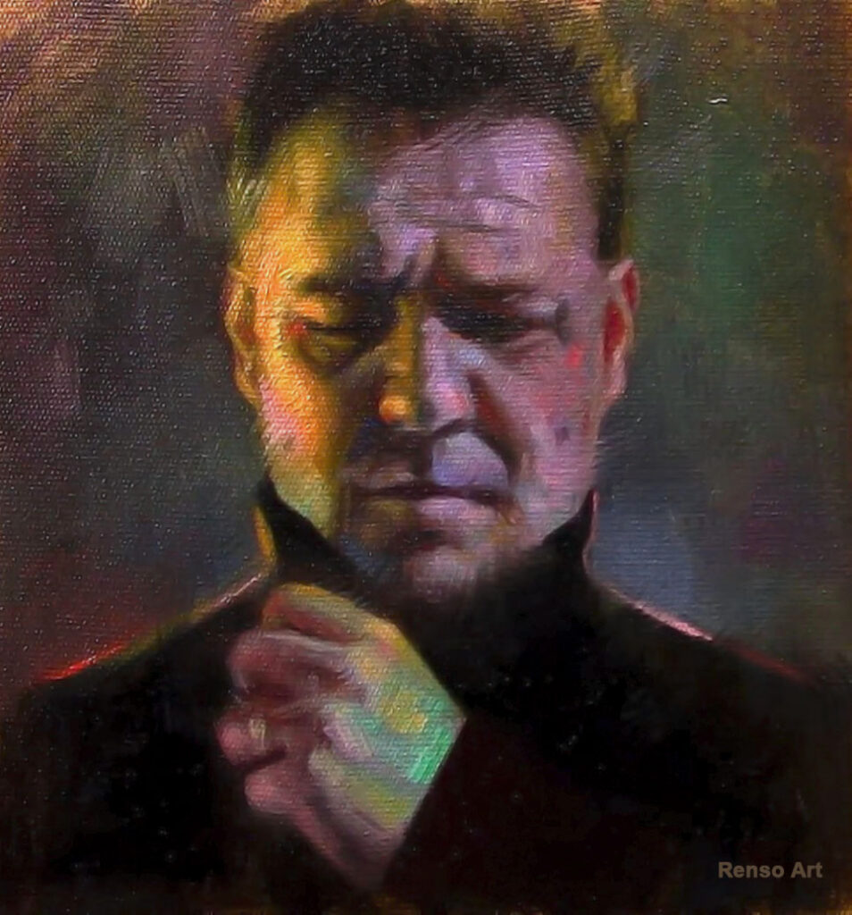
5. Ignoring the Background
Many painters focus entirely on the face, leaving the background as an afterthought. But the background plays a huge role in the mood and balance of a portrait. It’s not just empty space — it’s part of the design.
A well-chosen background supports the story of the portrait. Soft, neutral tones can make a face glow; darker tones can add drama; textured or abstract shapes can add movement. The key is to make sure the background doesn’t fight for attention. Ask yourself: does it help the viewer focus on the subject, or does it distract? Even a simple, quiet background — if it’s thoughtfully painted — can make the portrait feel more complete and professional.
Final Thought
Making mistakes is part of learning. The goal isn’t to avoid them forever but to recognize them faster each time. Every portrait teaches you something new — if you take the time to look and reflect before starting the next one.