Why Your Colors Look Muddy (and How to Fix It)

Recently, a student on Patreon asked me: “Why do I always get muddy colors?”

My answer was this: all the colors we use are muddy to some degree. The only “clean” colors are the pure ones straight from the palette—yellow, orange, red, green, blue etc. As soon as we start mixing, they begin to desaturate and shift toward gray. The more colors we add, the stronger this effect becomes.

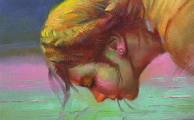
And it doesn’t stop at the palette. Once we put paint on the canvas and start moving the brushstroke around to “find the right spot,” the paint keeps mixing. If we keep adding more strokes and then blend to smooth transitions, the mixture continues to dull little by little until it looks muddy.

With experience, you start to anticipate what will happen with your colors. Sometimes, for example, I’ll drop in a touch of pure orange on the skin and blend just slightly—I end up with a fresh, clean tone because I balanced the mixture with a primary color. The trick is in the pressure of the brush and how much of that pure color you add. Too much, and it changes the mixture completely.

Another approach is to place your color down and resist the urge to move it too much. Beginners often expect colors to stay the same on the canvas as they looked on the palette, but in practice, brushwork and blending change everything.


Struggling with your portraits? You might find my E-book helpful. Click here

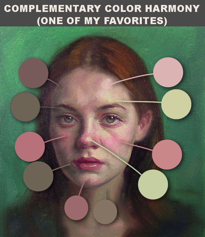
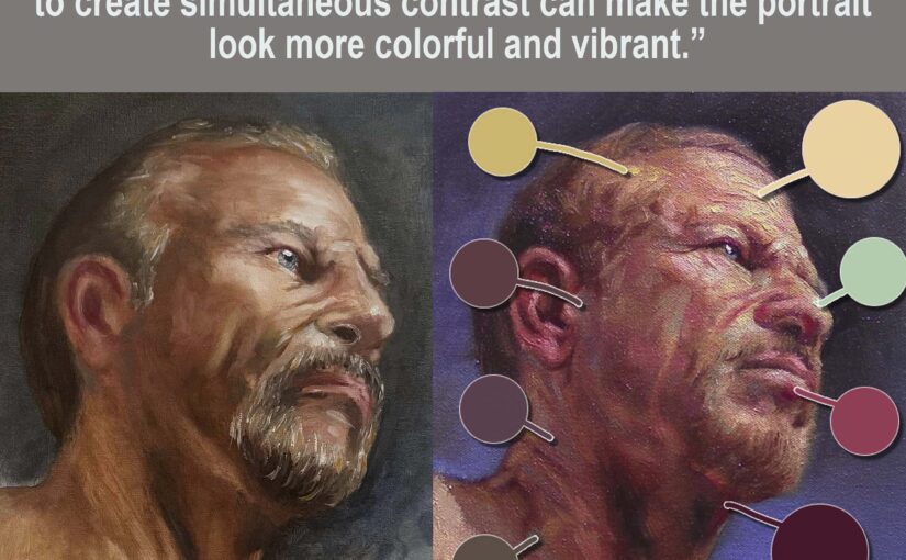
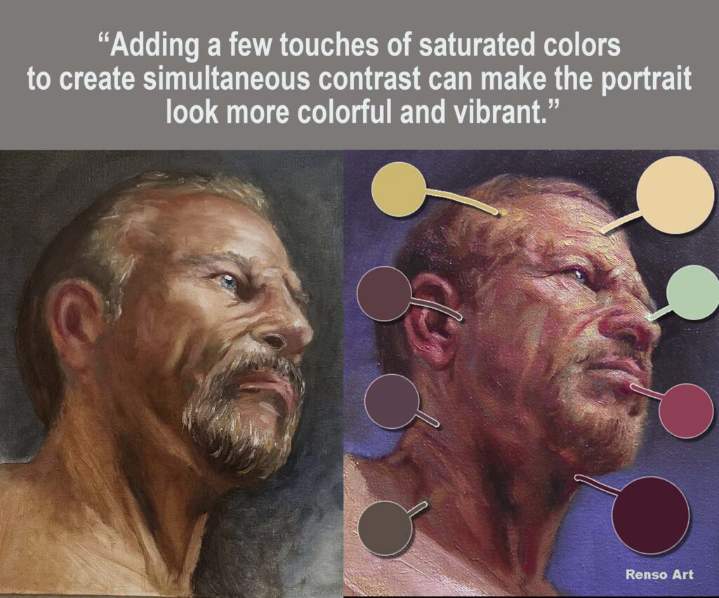
The best way to fix it without saturating the skin color too much : “Adding a few touches of saturated colors to create simultaneous contrast can make the portrait look more colorful and vibrant.”

Common Causes of Muddy Colors

1. Too Many Colors Mixed Together

When you keep adding more and more pigments, you’re really mixing all three primaries together (red, yellow, and blue). The result is a neutral, grayish-brown tone.

Tip: Limit your palette when mixing. Often two colors—and sometimes just a touch of a third—are all you need. Try to keep your mixtures clean and direct.


2. Using Opaque Paint in the Wrong Place

Some paints are naturally opaque, and when layered carelessly, they can kill the brightness of the color underneath.

Tip: For glazing or subtle layering, choose transparent colors. Save your opaque paints for highlights or solid passages.


3. Not Cleaning the Brush Enough

If your brush still has leftover paint from a previous stroke, it contaminates your mixture before you even realize it.

Tip: Wipe or wash your brush between different mixtures, especially when switching between warm and cool colors.


4. Confusing Warm and Cool Colors

Mixing a warm version of a color with its opposite temperature can quickly dull the mixture.

Tip: If you want bright mixes, combine warm with warm or cool with cool. Use temperature shifts carefully.


5. Painting Over Wet Layers Without a Plan

In oil painting especially, working wet-into-wet without control can easily muddy colors. Too much brushing makes everything blend into a flat tone.

Tip: Place your strokes and leave them alone. Think of it like cooking—too much stirring spoils the soup.


Final Thoughts

Muddy colors happen to everyone, even experienced painters. The key is awareness. Keep your palette simple, clean your brush often, and think about the temperature and transparency of the paints you’re using. With practice, you’ll start to predict how your colors will behave and learn when to let a brushstroke sit on its own.

When you get this balance right, your colors will look fresher, brighter, and more alive—and painting will feel a lot more rewarding.


How to Glaze in Oil Painting: Step-by-Step Guide for Beginners.

Struggling with your portraits? You might find my E-book helpful. Click here

Glazing in Oil Painting

Glazing is a thin, transparent layer of oil paint applied over an underpainting. It’s one of the most powerful tools in oil painting because it lets you change the mood, adjust colors, and create a glowing depth that flat paint cannot achieve.

You can glaze with pure transparent colors or with mixes that include white (more opaque). Transparent layers let light shine through, while opaque ones cover more of what’s underneath. Both are useful—what matters is knowing when and how to use them.


A Short History of Glazing

Glazing has been around for centuries. Renaissance and Baroque painters like Jan van Eyck, Titian, and Rembrandt perfected the technique. They often painted a detailed grayscale underpainting (sometimes called a “grisaille”) and then added color through glazes.

Some of these artists built their works with 40–60 layers of glazes. The results were luminous paintings where colors seemed to glow from within. Light would travel through the transparent layers, bounce off the underpainting, and return to the viewer’s eye—creating an effect that mixed paint on the palette simply can’t match.

Glazing also allowed them to adjust colors without starting over. Too bright? A thin dark glaze could tone it down. Too dull? A warm or cool glaze could bring it to life. That flexibility is one reason glazing became such a key part of oil painting tradition.


How to Glaze in Oil Painting

Step 1: Prepare Your Surface

Make sure your underpainting is completely dry before you start glazing. If it’s still wet, the glaze will mix with the paint below instead of sitting transparently on top.

Step 2: Mix Your Medium

The traditional medium for glazing is a 50/50 mix of turpentine and linseed oil. (lately I am using just linseed oil) This makes the paint thinner, smoother, and more transparent. Today, many artists also use modern glazing mediums that dry faster and are less toxic—use what works best for you.

Step 3: Choose Your Brushes

Keep two brushes handy:

  • Soft synthetic or sable brush → to apply the glaze smoothly.
  • Stiff brush → to blend, soften, or “fade” the glaze into the underpainting because sometimes to glaze does not stick to the paint if that happens to you add more paint than medium and press harder with the brush.

Step 4: Apply the Glaze

  • Load a small amount of thinned paint on the soft brush.
  • Spread it evenly over the area you want to glaze.
  • Use the stiffer brush to feather the edges so it blends naturally.

Step 5: Decide the Purpose

Glazing can be used in two simple but powerful ways:

  1. Tone down a color → e.g., a cool glaze over a too-bright red to calm it.
  2. Enhance a color → e.g., a warm glaze over a dull blue to make it glow.

Why Try Glazing?

Even if you don’t use dozens of layers like the Old Masters, a few glazes can transform your painting. They give depth, atmosphere, and subtle color shifts that are impossible to get with just direct paint.

It’s also a technique that connects us to centuries of painting tradition. When you glaze, you’re painting in the footsteps of Rembrandt, Titian, and countless others who discovered the magic of light shining through paint.

So, whether you’re adjusting a single passage or layering for a glowing effect, glazing is a tool worth practicing—it can truly bring your paintings to life.


What Are Your Favorite Color Schemes for Portraits?

Struggling with your portraits? You might find my E-book helpful. Click here

This has always been difficult for me—mastering color harmonies, especially in portraits. I practiced more with still lifes and landscapes at first, but I remember seeing most of my paintings turn out kind of monochromatic. Some friends had really colorful work, while others, like me, stayed stuck in monochrome.

Trying to master color harmonies can be tough. A good way to start is by making small sketches, maybe 6 x 6 inches. Don’t focus on details—just use big brushstrokes and explore as many color harmonies as possible. It’s not about the final result of each sketch; it’s about the practice.

When you paint portraits, you’re not just recording a likeness—you’re also shaping mood, atmosphere, and story. One of the most powerful tools for this is your choice of color scheme. Color can heighten drama, create harmony, or suggest a personality that words can’t fully capture.

In this post, I’ll go through some of the most popular approaches to color in portrait painting, along with examples of how each scheme works.


1. Complementary Color Schemes

Complementary colors are pairs that sit opposite on the color wheel—like blue and orange, red and green, or purple and yellow.

Why it works:

  • The high contrast between complements makes portraits feel vibrant.
  • Skin tones often carry natural warmth, so pairing them with a cooler background or clothing can create balance.

Example:
In this case I pair red and green on this portrait, I like the balance I got, look all different color variations, is not just about pure green and red.


2. Analogous Color Schemes

Analogous colors are neighbors on the wheel—such as blue, blue-green, and green.

Why it works:

  • These schemes give a calm, cohesive effect.
  • Perfect for portraits that need to feel serene, intimate, or unified.

Example:
Think of a child’s portrait painted mostly with violets, pinks, and reds. Everything feels connected, soft, and tender without the distraction of clashing hues.


3. The Temperature Palette (A Limited Scheme)

The Temperature Palette uses just three colors: White, Burnt Sienna and Ultramarine blue

Why it works:

  • It simplifies decisions and keeps the focus on value and temperature.
  • Even with so few paints, you can suggest a full range of natural skin tones.

Example:
A portrait made with the Temperature Palette can feel timeless. Subtle grays and muted tones give the figure weight and depth, while the warm reds bring life to cheeks and lips.

Limited Palette

4. Split-Complementary Schemes

This is a twist on complements. Instead of using one opposite color, you use the two hues flanking it. For example: yellow paired with purple and violet.

Why it works:

  • It offers contrast without the harshness of direct complements.
  • Portraits painted this way often look lively and dynamic.

Example:
The left of the face is warm yellow the rigth side there are violets and purples creating a more dramatic effect.


5. Expressive and Unconventional Schemes

Not every portrait aims for realism. Some of the most memorable works push color into unexpected places: purple shadows, green underpaintings, or neon backgrounds.

Why it works:

  • It captures mood and personality rather than just physical likeness.
  • It allows the artist’s voice to come forward strongly.

Example:
Van Gogh often used high-key, unnatural color in his portraits. A face might be tinged with yellows or greens, yet the overall image feels more “true” to the person’s spirit than a literal skin tone ever could.


6. Personal Favorites Evolve Over Time

When artists talk about their “favorite” color schemes, it’s rarely a fixed answer (even when i say a have a favorite one). Early in your journey, you might gravitate toward the drama of complementary contrasts. Later, you may become fascinated with the subtle beauty of analogous harmonies.

Color choices often mirror life experience and mood. A phase of exploring bright, saturated hues might give way to years of muted, earthy palettes. The important part is noticing what excites you at the easel right now.


Closing Thoughts

Portrait painting is as much about color choices as it is about anatomy or proportion. Color schemes help you set the tone—whether you want drama, calm, intimacy, or bold expression.

The real question isn’t just what are the best schemes, but: Which ones speak to you right now? Your favorite color harmony will shape not only your portraits, but the story you tell through them.