Struggling with your portraits? You might find my E-book helpful. Click here
Composition is one of the most powerful tools in portrait painting and drawing. It goes beyond simply placing a face in the center of the canvas. A strong composition directs the viewer’s attention, creates emotion, and brings harmony to the entire artwork.
At its core, composition is about arranging visual elements with purpose—the placement of the head, the tilt of the shoulders, the direction of the gaze, the background, and even the negative space all play a role in telling a story.
A portrait is not only about resemblance; it’s about presence. Where you place the figure can evoke very different emotions. A face looking out from the corner of the canvas might feel more intimate or mysterious than one facing forward in the center. The use of diagonals can add dynamism. Symmetry can create a sense of calm and dignity. Asymmetry can make the image more intriguing or alive.
Lighting, too, is part of composition. A strong light source can shape the forms and guide the eye through light and shadow. Compositional decisions about value contrast—dark against light—can make the face pop or blend softly into the scene.
Backgrounds matter. Even a plain one affects mood. A detailed background can add context. A blurred one can enhance focus. Always ask: does this background support the story I’m trying to tell?
In portrait drawing and painting, composition helps create connection—between subject and viewer, and between the artwork and the emotions it stirs.
Classcial Composition Mistakes

When planning your next portrait, don’t start with the eyes—start with the idea. Then let composition bring that idea to life.
Here’s a list of classical composition mistakes in portrait painting—especially common among beginners, but even experienced artists can fall into these traps. These are based on classical principles of design, placement, and visual hierarchy:
🔻 1. Centering the Face Too Rigidly
Mistake: Placing the head dead center in the canvas without intention.
Why it’s a problem: It creates a static, unnatural feeling. Classical compositions often used asymmetry to bring life and movement.
Classical tip: Use the rule of thirds or golden ratio to offset the subject slightly.
🔻 2. Cropping Without Purpose
Mistake: Cutting off the top of the head, chin, or shoulders awkwardly.
Why it’s a problem: It feels careless or claustrophobic.
Classical tip: Study how masters crop at natural transitions—like just above the hairline or below the collarbone—to maintain grace.
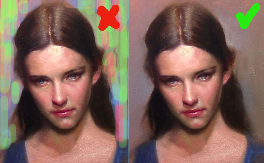
🔻 3. Flat or highly detailed Backgrounds
Mistake: A single-tone or highly detailed background with no relationship to the subject.
Why it’s a problem: It either competes with or ignores the figure.
Classical tip: Use background tones and shapes to support the silhouette and guide the eye.

🔻 4. Ignoring the “Pyramid” Composition
Mistake: A scattered or unstable arrangement of the head, shoulders, and torso.
Why it’s a problem: The viewer’s eye wanders or doesn’t know where to rest.
Classical tip: The pyramidal composition (broad at the base, narrowing toward the top) adds elegance and stability.
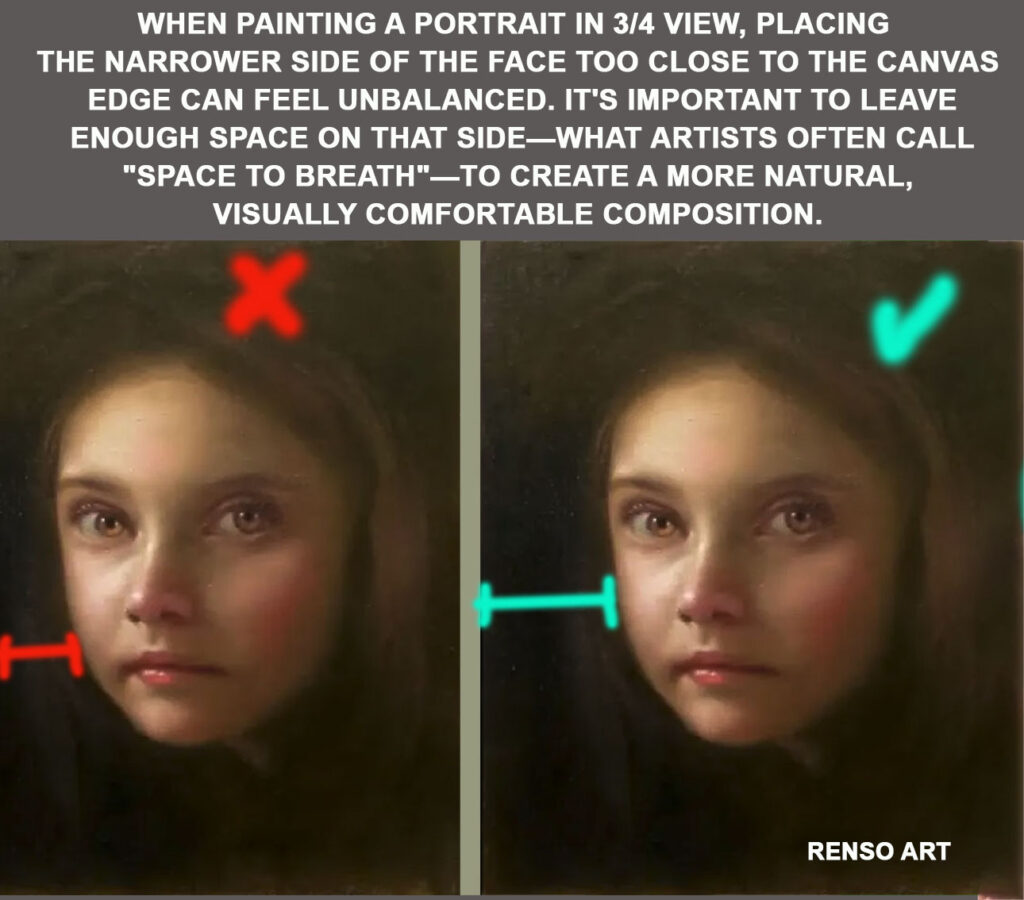
🔻 5. Weak Negative Space
Mistake: Not paying attention to the shapes formed around the figure.
Why it’s a problem: Poor negative space can make the portrait feel boxed in or poorly designed.
Classical tip: Treat negative space like a compositional partner—shapes should flow and balance the main figure, use soft edges
🔻 6. Over-Detailing the Wrong Areas
Mistake: Equal detail across the whole face and body.
Why it’s a problem: The viewer has no visual path—no focus.
Classical tip: Follow the hierarchy of focus: eyes, then features, then fade into broader shapes. Let some edges stay soft or lost.
🔻 7. Lack of Gesture or Flow
Mistake: A stiff, lifeless pose.
Why it’s a problem: It feels posed rather than lived.
Classical tip: Find the gesture line or subtle S-curve in the spine or posture—even in portraits. Think of rhythm and flow.
🔻 8. Awkward Lighting
Mistake: Flat or inconsistent light direction.
Why it’s a problem: Makes the form hard to read.
Classical tip: Use single, directional lighting (Rembrandt or chiaroscuro) to model the face clearly and sculpturally.
🔻 9. Ignoring the Story or Mood
Mistake: A technically correct portrait that says nothing.
Why it’s a problem: Classical art always aimed to express character, nobility, or emotion.
Classical tip: Consider gesture, gaze, clothing, light, and posture as part of the narrative.
- Why Short Portrait Sessions Are One of the Most Valuable Practices for Painters
- From Planes to Realism: How to Soften Structure Without Losing Form
- How to Paint Planes of the Face in Warm and Cool Light
- Top 5 Mistakes Beginners Make in Portraits
- How to Self-Critique Your Own Paintings
