Struggling with your portraits? You might find my E-book helpful. Click here
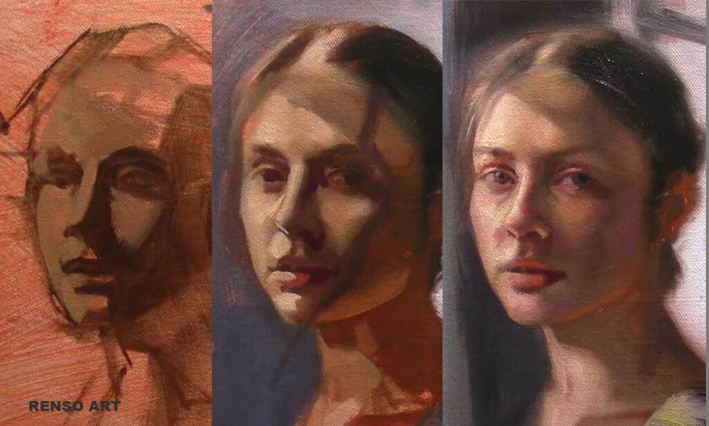
When people see a portrait painted in a short session, they often focus on the outcome. They ask whether it looks finished, how accurate it is, or how long it took. Speed tends to get all the attention.
But short portrait sessions are not about speed.
And they are definitely not about the final result.
They are about practice.
In fact, one of the biggest benefits of working in a limited amount of time is that it changes your mindset. The pressure to create a “good painting” slowly disappears. You no longer expect perfection. Instead, your attention shifts to the process itself: observing, deciding, and responding.
This shift is important.
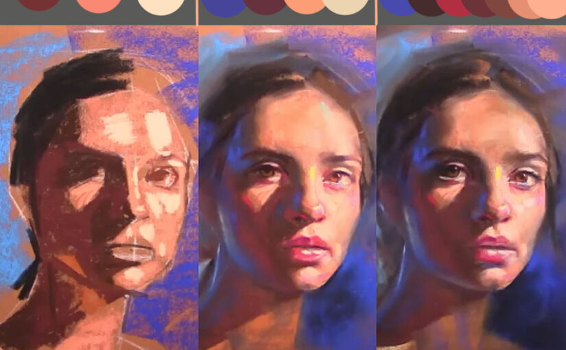
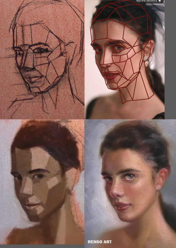
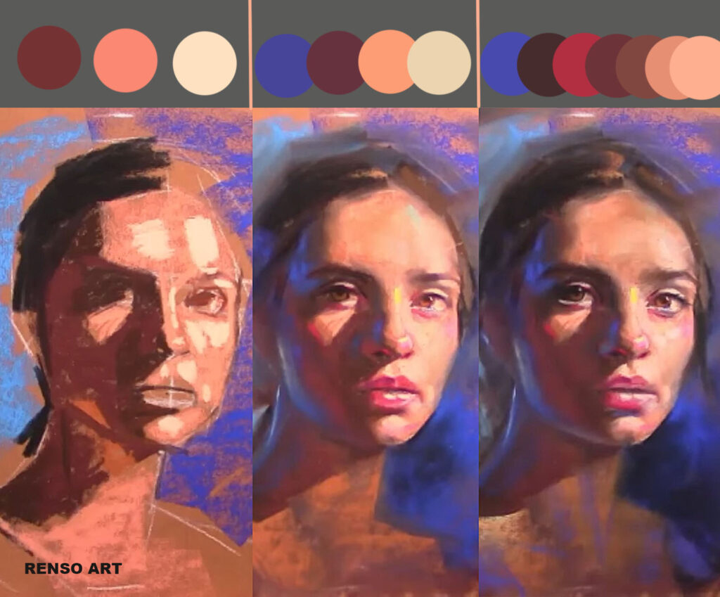
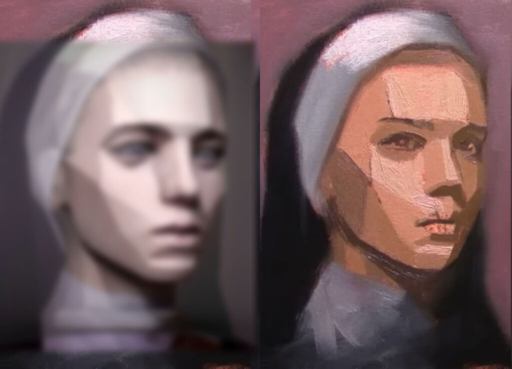
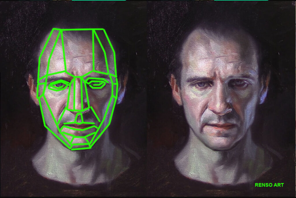
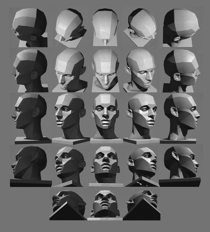
When time is limited, you are forced to let go of unnecessary details. You can’t polish every edge or adjust every small shape. What remains are the essentials: the overall proportions, the relationship between light and shadow, the structure of the head, and the character of the face.
This is where real learning happens.
Short portrait sessions train you to see the face as a whole rather than as separate features. You begin to think in terms of big shapes and value masses instead of eyes, noses, and mouths. You start grouping information, simplifying complexity, and organizing what you see.
These skills are fundamental to portrait painting, and they are often lost when we work too slowly or become overly attached to details too early.
Another key benefit of this practice is decision-making.
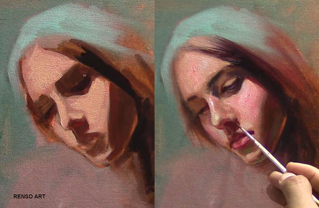
When time is limited, hesitation becomes less useful. You must make choices, place a brushstroke, evaluate it, and move on. There is no room for endless correction.
This builds confidence — not because every decision is perfect, but because you learn to trust your judgment. You become more comfortable adjusting and correcting without frustration. Over time, this creates a more fluid and relaxed way of painting.
Short sessions also encourage a healthier relationship with mistakes. Because the goal is practice, not a finished artwork, mistakes lose their emotional weight. They become information. Each painting becomes a small experiment rather than a test of ability.
This mindset is especially important for students, but it remains valuable at every level.
What many painters discover is that this type of practice improves not only short studies, but longer, more developed portraits as well. When you train yourself to establish structure, values, and proportions quickly, your longer paintings start on a much stronger foundation.
Details become easier because they are built on clarity, not confusion. Refinement becomes enjoyable instead of stressful.
A short portrait session is not a shortcut.
It does not replace careful study or longer work.
It complements it.
It sharpens your observation, simplifies your process, and strengthens your understanding of form and light. Most importantly, it keeps the focus where it should be: on learning, seeing, and growing as a painter.
Sometimes the goal is not to finish a perfect portrait.
Sometimes the goal is simply to practice.
And with consistent practice, improvement follows naturally.