Common Beginner Mistakes in Portrait Painting (And How to Fix Them)

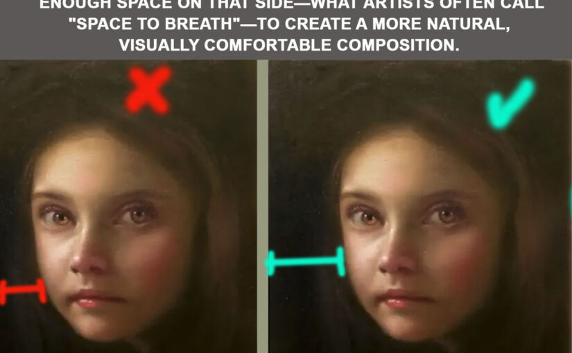
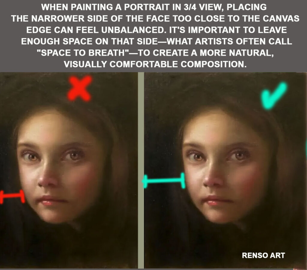
Portrait painting is fun but also very challenging. Beginners usually run into the same problems, and that can slow down progress. The good thing is, once you know the issues, it’s much easier to fix them.

From my own experience, and from seeing what many new painters struggle with, here are the most common mistakes in portrait painting and some tips to avoid them.

Struggling with your portraits? You might find my E-book helpful. Click here


1. Weak Foundation Drawing / Underpainting

Issue: Starting with a vague or inaccurate sketch creates proportion mistakes that get worse as you build layers.
Fix:
✔ Begin with a simple block-in using clear shapes.
✔ Check proportions often (sight-size and Loomis proportions can help).
✔ Correct errors in the drawing before painting.


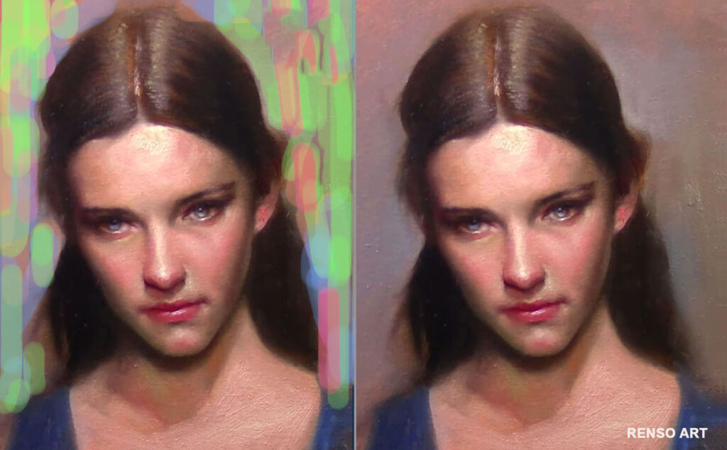
2. Poor Reference Photos

Issue: Low-contrast, blurry, or heavily filtered images distort features and colors, making accuracy impossible.
Fix:
✔ Work from sharp, well-lit photos (higher contrast works best).
✔ Avoid strong filters.
✔ From life? Make sure your subject is well lit.


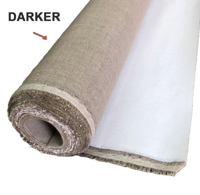
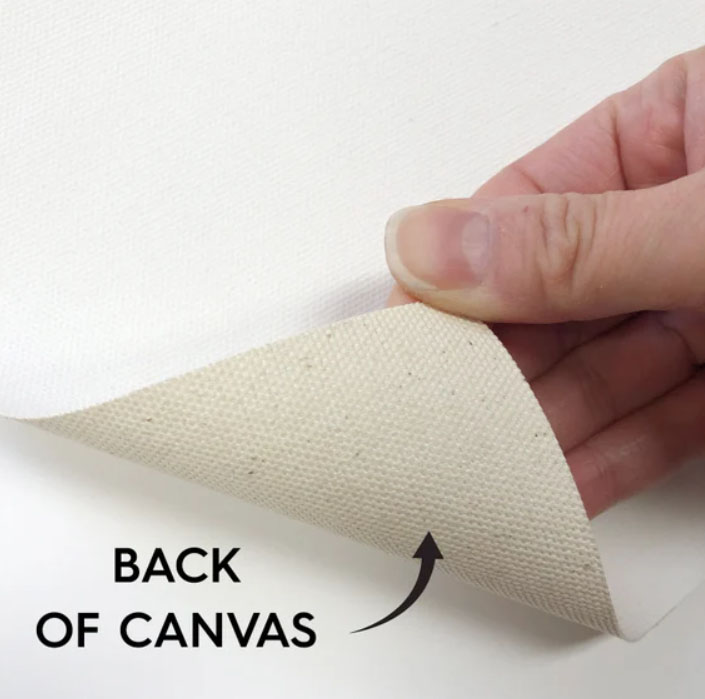
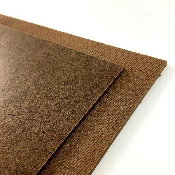
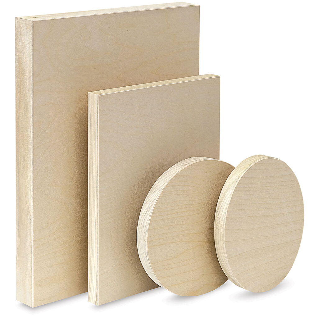
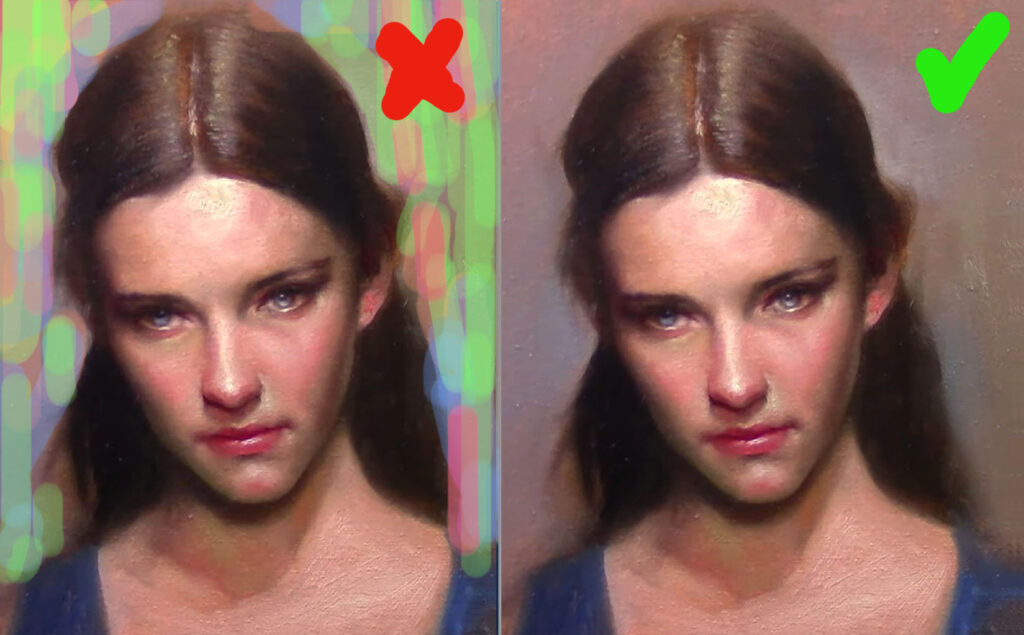
3. Skipping Canvas Preparation

Issue: Painting on cheap or unprimed surfaces causes paint to sink in, colors to dull, and blending to suffer.
Fix:
✔ Use a properly primed canvas or panel.
✔ Add an extra layer of gesso.
✔ Tone the surface with a neutral wash (like burnt umber) to reduce glare from white.


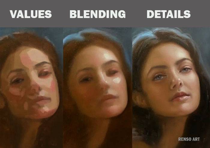
4. Over-Detailing Too Early

Issue: Jumping into eyelashes or highlights before establishing big shapes creates a patchy, disjointed portrait.
Fix:
✔ Squint to simplify values into large planes.
✔ Lay in main light and shadow areas before details.
✔ Think of the head as big structural planes, not lines.


5. Shadows Too Weak

Issue: Fear of darks makes shadows look flat or gray, leaving the portrait without depth.
Fix:
✔ Push shadows darker and richer than you expect.
✔ Transparent pigments (burnt umber, alizarin crimson) add depth.
✔ Beginners should avoid pure black—advanced painters can use any black but you can mix a chromatic black (ultramarine + alizarin or black + color).


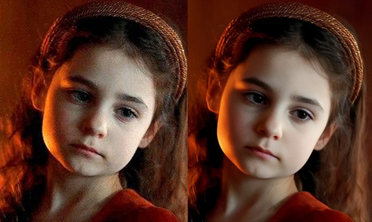
6. Flesh Tones Too Pale

Issue: Overusing white results in chalky, lifeless skin.
Fix:
✔ Begin with middle values—earth tones mixed with reds/greens.
✔ Never use pure white in shadows.
✔ Observe real skin—it contains subtle shifts of reds, greens, and violets.


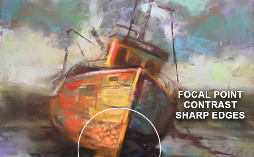
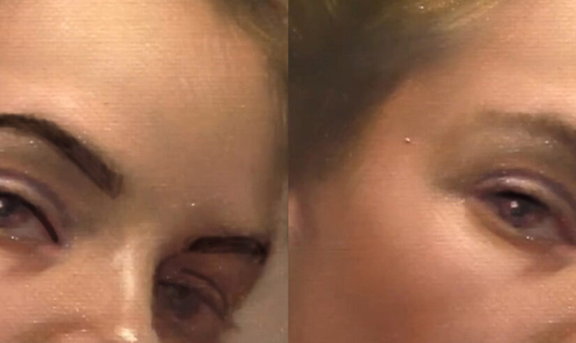
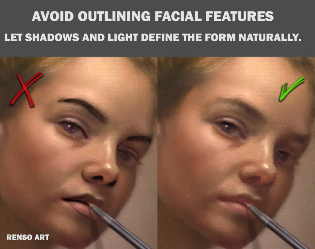
7. Too Many Harsh Edges

Issue: Crisp lines everywhere make features look cut out and artificial.
Fix:
✔ Blur edges where the form turns away from the light.
✔ Reserve sharp edges for accents in focal points (like the eyes or mouth corners).
✔ Use dry brushing or feathering for gentle transitions.


8. Disorganized Palette

Issue: A messy palette leads to muddy color mixtures and wrong values.
Fix:
✔ Arrange paints in a consistent order (warm/cool, light/dark).
✔ Wipe mixing areas regularly.
✔ Begin with a limited palette to learn values.
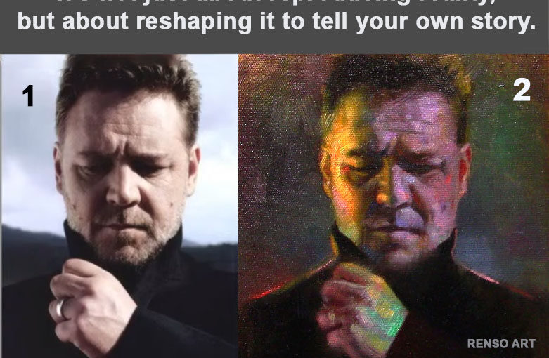
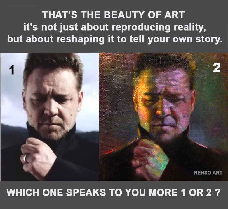

Final Thoughts

Every artist makes these mistakes at first—the key is recognizing and correcting them. By focusing on strong fundamentals (drawing, values, edges, and color mixing), your portraits will improve dramatically.

Which of these mistakes do you struggle with the most? Let me know—I’d love to help with more detailed tips!

(Bonus tip: Study master portraits—Rembrandt, Sargent, and Zorn are great for learning brushwork and color harmony!)

How Backgrounds Shape a Portrait

Struggling with your portraits? You might find my E-book helpful. Click here

A portrait’s background is more than a backdrop — it’s part of the mood, story, and focus. The right choice can make the subject sing, whisper, or even tell a completely different tale.

Here are 10 ways you can play with backgrounds:

1️⃣ Color Contrast
Opposite colors (complementaries) can make the subject pop — warm skin against cool blues, or dark hair against a pale wall.

2️⃣ Temperature Contrast
Warm backgrounds bring energy and life; cool backgrounds create calm and distance. Mixing them can create tension or harmony.

3️⃣ Busy vs. Minimal
Patterns, scenery, or objects add story. A blank or blurred background gives full attention to the subject.

4️⃣ Texture vs. Smooth
Thick brushstrokes or rough texture add depth and richness; a smooth surface brings stillness and simplicity.

5️⃣ Light vs. Dark
High-value contrast can make the subject dramatic; low contrast creates a softer, dreamier feel.

6️⃣ Sharp vs. Soft Focus
A sharply detailed background keeps everything in the same “visual world.” A blurred or abstract background pushes the subject forward.

7️⃣ Realistic vs. Stylized
A lifelike setting grounds the portrait in reality. A stylized or abstract background adds artistry and symbolism.

8️⃣ Close vs. Distant Space
A close background feels intimate. A distant or open space suggests freedom, loneliness, or grandeur.

9️⃣ Single Color vs. Gradation
A flat color background is graphic and bold; a gradient background can subtly lead the eye and add atmosphere.

🔟 Symbolic Elements
Objects, shapes, or colors that have personal or cultural meaning can transform the portrait into a deeper story.

💬 Which type of background do you love most for portraits — bold and complex, or quiet and simple?

Freedom in Color: Transforming a Photo into an Emotional Painting

Struggling with your portraits? You might find my E-book helpful. Click here

When you paint from a reference photo, it’s tempting to replicate it exactly — every color, every shadow, every detail. After all, the photo is “real,” right? But painting gives us a creative power that photography doesn’t: the ability to transform the scene into something more personal, emotional, and atmospheric.

In this comparison, the image on the left is the original photo — calm, natural, and grounded in reality. The one on the right is my painting — the same subject, but with a completely different emotional temperature.


Why Not Copy the Colors Exactly?

Because colors tell the story.
A photo might capture the surface reality, but color choices in a painting can amplify emotion, create tension, or invite mystery.

  • Cooler shadows can evoke melancholy or introspection.
  • Warmer highlights can suggest hope, vitality, or even drama.
  • Unexpected hues — such as hints of green in skin tones or magenta in shadows — can make a portrait more alive than a literal copy.

Step-by-Step Process

1️⃣ Choosing the Reference

I selected a photo that already had strong mood and lighting — the slightly downward gaze and hand gesture added an emotional weight that I could build on.

2️⃣ Deciding on the Mood

Before touching the canvas, I asked: What do I want the viewer to feel?
For this painting, I wanted more intensity than the photo gave me, so I planned to boost contrasts and use bolder colors.

3️⃣ Adjusting the Palette

  • In the shadows: I cooled them down with purples and deep greens.
  • In the highlights: I pushed warm yellows and reds to create a glow.
  • In transitions: I blended in unexpected colors (teal, magenta) to give life to skin tones.

4️⃣ Brushwork and Edges

Rather than perfectly smooth blending, I left some strokes visible. This makes the painting feel more alive and lets the colors vibrate against each other.

5️⃣ Stepping Back

Halfway through, I always step back several feet from the canvas. This is when I ask myself, Does this version tell a stronger story than the photo? If not, I make bolder changes.


Tips for Artists Wanting to Try This

  1. Don’t fight your instincts. If a color feels right, use it — even if it’s not in the photo.
  2. Experiment with temperature shifts. Try making shadows cooler and highlights warmer (or vice versa) to see how it changes the mood.
  3. Use color to guide the eye. Strategic contrast can pull focus to the most important part of your composition.
  4. Think story, not accuracy. Ask: What do I want this image to say? rather than How do I match it exactly?

The Takeaway

The freedom to reinterpret color is one of painting’s greatest joys. It’s not about matching the photo pixel by pixel — it’s about expressing something the camera can’t.

Now I’m curious — which one speaks to you more?
The calm realism of the photo, or the emotive colors of my painting?


Understanding the Focal Point in Painting: Still Lifes and Landscapes as Examples

Struggling with your portraits? You might find my E-book helpful. Click here

In every painting, there’s a moment where your eye stops—where it lands and lingers. That’s the focal point. Whether you’re working on a still life with a bunch of grapes and a vase, or a quiet landscape at dusk, the focal point is what holds the viewer’s attention and gives structure to the entire composition.

Let’s break it down with examples from my classes.

What is a Focal Point?

The focal point is the area of a painting that draws the viewer in first. It’s where the visual weight is centered. That doesn’t mean the rest of the painting isn’t important, but the focal point is your main “story moment.”

Think of it like a stage play: you might have several characters on stage, but only one is delivering the key line. Everything else supports that moment.

In many of my still life classes, we use objects like fruit, vases, or folded fabric. The challenge is always the same: which object tells the story?

Let’s say we have a lemon, a glass bottle, and a crumpled napkin. If the lemon is your focal point, you might:

  • Place it off-center using the Rule of Thirds
  • Make it the most saturated color in the scene
  • Sharpen the edges and contrast around it
  • Simplify the surroundings to avoid distraction

In class, we painted a composition where the light hit a lemon just perfectly, and we built the rest of the scene to support that lemon—softening edges around the background, muting other colors. It made the painting feel focused.


Focal Point in Landscapes

Landscapes can be trickier, because everything feels important—sky, mountains, trees. But here’s the trick: choose a “moment.”

In one class, we painted a path leading into the woods. The focal point was not the trees or the sky, but a small patch of light hitting the path. We:

  • Directed the lines of the path toward that light
  • Used higher contrast where the light met the shadow
  • Toned down the sky to keep attention on the ground

Another example: a ship, its color and placement made it the natural focal point. Everything else—the muted water, the gentle sky—helped guide the eye there.


Common Ways to Create a Focal Point

Here are some tools we use regularly in class:

  • Contrast – Light against dark, or warm against cool, draws attention.
  • Detail – Sharper edges and more texture pull the eye in.
  • Color – A pop of saturated or unexpected color stands out.
  • Placement – Objects near the Rule of Thirds lines feel naturally strong.
  • Leading Lines – Paths, shadows, or objects pointing toward your subject.

Final Thoughts

If your painting feels scattered, ask yourself: Where do I want the viewer to look first? That question alone can clarify a lot.

Every time we paint together in class—whether a bowl of peaches or a mountain trail—I encourage students to make a clear decision about the focal point. It doesn’t mean being rigid, but it gives your painting purpose and clarity.

Next time you set up a composition, try this: squint, step back, and see what jumps out. Then, build your painting around that.

See you in class,
—Renso


Oil Painting Supports, Choosing the Right Support

Struggling with your portraits? You might find my E-book helpful. Click here

Choosing the Right Support for Oil Painting

An oil painting support is any surface suitable for applying oil paint. Artists use a variety of materials as supports, including different types of wood and canvas. Each support has its own characteristics, advantages, and drawbacks.

I have used all of them, about the linen, cotton canvas and canvas pad you will not feel any difference between them.

The main difference is when you apply paint, harder surfaces can make it feel like the paint doesn’t stick well. You may need to use less pressure when laying down the oil paint or switch to softer brushes—but that’s just my personal experience.

Linen Canvas

Linen is made from the fibers of the flax plant. After harvesting, the plant is soaked in water until the outer layers decay, leaving behind strong fibers that are then spun into yarn and woven into canvas. Because flax fibers are long and durable, linen canvas provides a sturdy and long-lasting surface for oil painting. Many masterpieces that have stood the test of time were painted on linen, making it a preferred choice among professional artists.

However, linen canvas is expensive and may not be the best option for beginners. It is available in various forms, including rolled or pre-stretched, and can be purchased either primed (for oil or acrylic painting) or unprimed.


Cotton Canvas

Cotton canvas is the most popular support for beginner oil painters. It is strong, more affordable than linen, and has a consistent weave.

There is an ongoing debate in the art world about whether linen or cotton is the better painting support. Some artists believe linen lasts longer, while others, including myself, prefer working with cotton. If properly primed and sized, both surfaces can protect the painting from deterioration and ensure its longevity.

When choosing between linen and cotton, focus on which surface feels best to work on rather than worrying about how long it will last. If durability is a concern, consider using a heavy-grade cotton canvas and stretching it yourself. Cotton canvas is available in rolls or pre-stretched, primed, or unprimed.


Canvas Pads

For artists on a budget who still want a decent painting surface, canvas pads are a great option. Available in different sizes, they are ideal for beginners practicing oil painting or doing quick studies. When purchasing a canvas pad, choose a heavy-weight variety that can properly hold oil paint.


Masonite or Hardboard

Masonite is a brand name for a synthetic hardboard made from compressed wood particles. Hardboard is rigid, inexpensive, and popular among oil painters. However, large hardboards may warp over time, so reinforcing them with a frame is recommended.

Artists can use plain hardboards or opt for canvas boards—hardboards covered with a pre-primed canvas surface, ready for painting.

For me is good for small paintings, for bigger ones the material is too heavy, I painted once a 40 x 40 inches painting after framed it was so heavy to hang it, you you can try both sides, one side looks like canvas.


Wood Panels

The earliest known oil paintings were created on wood panels, typically made of oak or poplar. These panels were coated with a preparatory ground of animal glue and chalk, then polished to create a smooth painting surface.

While solid hardwood panels are less common today due to their high cost and weight, plywood has become a popular alternative. High-quality plywood made from birch, poplar, or mahogany can be used for oil painting if properly prepared. However, avoid softwoods like pine, as they contain resins and do not resist moisture well.

“I don’t remember the type of wood I used, but I tried it twice. It’s not as heavy as the Masonite boards I’ve used. It’s ready to hang as soon as you finish your painting, and since you can paint all the sides, it feels like it doesn’t even need a frame.”


Final Thoughts

Your choice of painting support depends on your artistic style and personal preference. Experiment with different surfaces to see what works best for you. In my experience, canvas remains the most versatile and reliable support for oil painting.


Hatching and Cross-Hatching with Ink: A Guide for Artists

Struggling with your oil portraits? You might find my E-book helpful. Click here

When working with ink, shading is everything. Since ink doesn’t allow for blending like paint or graphite, artists rely on hatching and cross-hatching to build form, texture, and depth. These techniques use lines—simple, repetitive marks—to create the illusion of shadow and volume.

In this post, we’ll cover the fundamentals of hatching and cross-hatching, how they differ, and tips to use them effectively in your ink drawings.


What is Hatching?

Hatching involves drawing a series of parallel lines to suggest shading. The lines can be straight or curved, depending on the form you’re describing. The closer the lines are together, the darker the value appears.

Use hatching to:

  • Shade smooth surfaces like skin or fabric
  • Suggest direction and form
  • Build gradual shadows

You can also vary the thickness and pressure of your lines to enhance contrast and texture.


What is Cross-Hatching?

Cross-hatching takes hatching a step further by adding a second (or third) layer of lines, often at an angle to the first. This crisscrossing of lines deepens the value and adds complexity to the shading.

Use cross-hatching to:

  • Create darker shadows
  • Build rich tonal variation
  • Add dramatic texture and structure

The more layers you cross, the darker the area becomes—but be careful not to overdo it, as too many lines can muddy your drawing.


Tips for Effective Hatching and Cross-Hatching

Here are some key pointers to help you master these techniques:

1. Follow the Form

Let your lines describe the shape of the object. Curved lines work well on round surfaces, while straight lines suit flat areas.

2. Control Spacing

Closer lines = darker values. Wider spacing = lighter values. Practice consistent spacing to control tone accurately.

3. Vary Line Direction

Changing the direction of your hatching adds interest and can help define separate planes in your subject.

4. Use Pen Pressure Carefully

In ink, pressure affects the boldness of your lines. Practice using lighter and heavier strokes to introduce subtle value shifts.

5. Plan Your Light Source

Before you start shading, decide where the light is coming from. This will guide where to place the darkest cross-hatching and where to leave areas untouched for highlights.


Final Thoughts

Hatching and cross-hatching are essential tools for any ink artist. With practice, you’ll be able to create detailed, expressive drawings using nothing but lines. These techniques might seem simple, but they offer endless possibilities for texture, contrast, and storytelling.

Whether you’re sketching portraits, still lifes, or imaginary worlds, let your lines speak. The beauty of ink is in its clarity and discipline—and in how a few strokes can bring an entire form to life.


The Role of Composition in Portrait Painting

Struggling with your portraits? You might find my E-book helpful. Click here

Composition is one of the most powerful tools in portrait painting and drawing. It goes beyond simply placing a face in the center of the canvas. A strong composition directs the viewer’s attention, creates emotion, and brings harmony to the entire artwork.

At its core, composition is about arranging visual elements with purpose—the placement of the head, the tilt of the shoulders, the direction of the gaze, the background, and even the negative space all play a role in telling a story.

A portrait is not only about resemblance; it’s about presence. Where you place the figure can evoke very different emotions. A face looking out from the corner of the canvas might feel more intimate or mysterious than one facing forward in the center. The use of diagonals can add dynamism. Symmetry can create a sense of calm and dignity. Asymmetry can make the image more intriguing or alive.

Lighting, too, is part of composition. A strong light source can shape the forms and guide the eye through light and shadow. Compositional decisions about value contrast—dark against light—can make the face pop or blend softly into the scene.

Backgrounds matter. Even a plain one affects mood. A detailed background can add context. A blurred one can enhance focus. Always ask: does this background support the story I’m trying to tell?

In portrait drawing and painting, composition helps create connection—between subject and viewer, and between the artwork and the emotions it stirs.

Classcial Composition Mistakes

When planning your next portrait, don’t start with the eyes—start with the idea. Then let composition bring that idea to life.

Here’s a list of classical composition mistakes in portrait painting—especially common among beginners, but even experienced artists can fall into these traps. These are based on classical principles of design, placement, and visual hierarchy:


🔻 1. Centering the Face Too Rigidly

Mistake: Placing the head dead center in the canvas without intention.
Why it’s a problem: It creates a static, unnatural feeling. Classical compositions often used asymmetry to bring life and movement.
Classical tip: Use the rule of thirds or golden ratio to offset the subject slightly.


🔻 2. Cropping Without Purpose

Mistake: Cutting off the top of the head, chin, or shoulders awkwardly.
Why it’s a problem: It feels careless or claustrophobic.
Classical tip: Study how masters crop at natural transitions—like just above the hairline or below the collarbone—to maintain grace.


🔻 3. Flat or highly detailed Backgrounds

Mistake: A single-tone or highly detailed background with no relationship to the subject.
Why it’s a problem: It either competes with or ignores the figure.
Classical tip: Use background tones and shapes to support the silhouette and guide the eye.


🔻 4. Ignoring the “Pyramid” Composition

Mistake: A scattered or unstable arrangement of the head, shoulders, and torso.
Why it’s a problem: The viewer’s eye wanders or doesn’t know where to rest.
Classical tip: The pyramidal composition (broad at the base, narrowing toward the top) adds elegance and stability.


🔻 5. Weak Negative Space

Mistake: Not paying attention to the shapes formed around the figure.
Why it’s a problem: Poor negative space can make the portrait feel boxed in or poorly designed.
Classical tip: Treat negative space like a compositional partner—shapes should flow and balance the main figure, use soft edges


🔻 6. Over-Detailing the Wrong Areas

Mistake: Equal detail across the whole face and body.
Why it’s a problem: The viewer has no visual path—no focus.
Classical tip: Follow the hierarchy of focus: eyes, then features, then fade into broader shapes. Let some edges stay soft or lost.


🔻 7. Lack of Gesture or Flow

Mistake: A stiff, lifeless pose.
Why it’s a problem: It feels posed rather than lived.
Classical tip: Find the gesture line or subtle S-curve in the spine or posture—even in portraits. Think of rhythm and flow.


🔻 8. Awkward Lighting

Mistake: Flat or inconsistent light direction.
Why it’s a problem: Makes the form hard to read.
Classical tip: Use single, directional lighting (Rembrandt or chiaroscuro) to model the face clearly and sculpturally.


🔻 9. Ignoring the Story or Mood

Mistake: A technically correct portrait that says nothing.
Why it’s a problem: Classical art always aimed to express character, nobility, or emotion.
Classical tip: Consider gesture, gaze, clothing, light, and posture as part of the narrative.