The Sphere: The Foundation of Realistic Portrait Painting

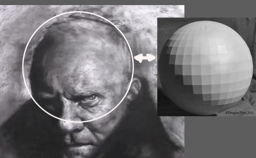
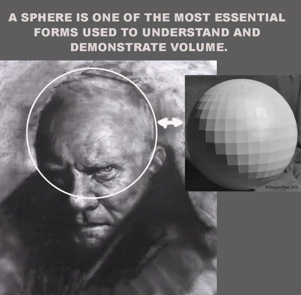
When learning to paint portraits, one of the most fundamental—and often overlooked—skills is understanding how light interacts with simple geometric forms. Among these, the sphere stands out as the most essential shape for mastering volume and dimension in painting. Why? Because the human head, despite its intricate details and unique features, is fundamentally composed of rounded, spherical forms.

Why the Sphere Matters in Portraiture

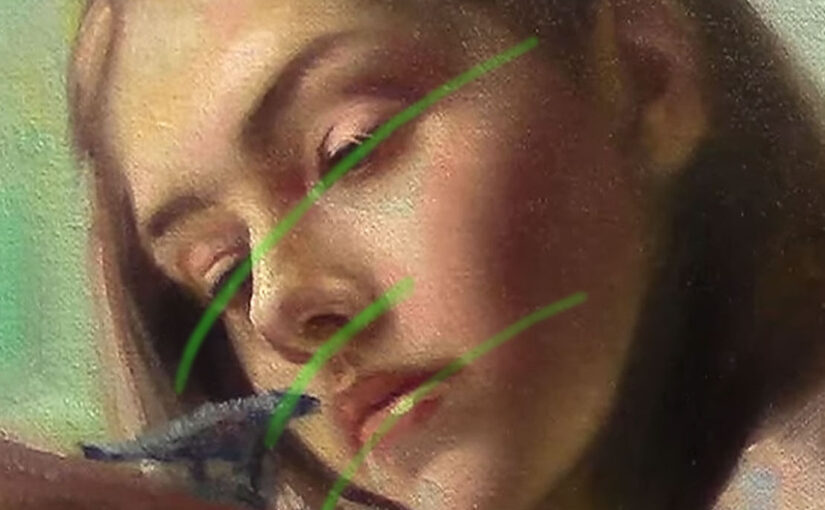
At first glance, a sphere might seem too simplistic to relate to something as complex as a human face. Yet, when we break down the structure of the head, we see that the forehead, cheeks, chin, and even the cranium are all built upon curved surfaces that behave similarly to a sphere under light.

When light hits a sphere, it creates a predictable pattern of values:

  • Highlight – The brightest point where light strikes most directly.
  • Midtones – Gradual transitions as the surface curves away from the light.
  • Core Shadow – The darkest area where the form turns away from the light source.
  • Reflected Light – Subtle illumination bouncing back into the shadow from surrounding surfaces.
  • Cast Shadow – The shadow the sphere projects onto nearby surfaces.

Understanding these elements is crucial because they teach artists how to model three-dimensional form on a two-dimensional canvas. Without this knowledge, portraits can appear flat, lifeless, or unconvincing.

sphere study for portrait painters

Applying Spherical Logic to the Human Head

Once an artist masters rendering a sphere, they can apply the same principles to the rounded planes of the face:

  • The Forehead – Like the top of a sphere, it catches light and softly transitions into shadow as it curves toward the temples.
  • The Cheeks – These rounded surfaces exhibit highlights, midtones, and subtle reflected light, especially near the cheekbones.
  • The Chin – Depending on the angle of light, it may have a strong highlight or fall into shadow, much like the bottom curve of a sphere.
  • The Cranium – Even the shape of the skull follows spherical logic, with light wrapping around its form.

By recognizing these similarities, artists can create smoother, more natural transitions in their portraits, avoiding harsh edges or unnatural flatness.

The Path to Mastery

Practicing sphere studies is one of the best ways to internalize these concepts. Here’s how to make the most of it:

  1. Observe Real Light – Study how light behaves on a physical sphere or egg under a single light source.
  2. Paint Value Studies – Practice rendering spheres in grayscale to focus purely on light and shadow.
  3. Compare to Facial Features – Analyze how the same light logic applies to noses, eye sockets, and jawlines.
  4. Apply Gradually – Start with simplified portrait sketches, focusing on big rounded forms before adding details.

Conclusion

The sphere is more than just a basic exercise—it’s the key to unlocking realism in portrait painting. By mastering how light wraps around rounded forms, artists gain the ability to sculpt faces with depth, volume, and lifelike presence.

So the next time you paint a portrait, remember: beneath every face is a series of spheres waiting to be illuminated.

Support my Art by Buying my Canvas Pad https://www.rensoart.com/store-front/

Why I Don’t Copy All the Colors from a Photo When I Paint

Why I Never Copy Colors Exactly from a Photo (And Neither Should You)

Have you ever tried to match every single color in a reference photo while painting—only to end up with a flat, dull result? I’ve been there too. At first glance, it makes sense: if we want realism, shouldn’t we replicate what we see? But here’s the catch—cameras don’t see the world the way our eyes do. And one of the biggest culprits? Shadows.

The Problem with Photo Shadows

In real life, shadows are rarely pure black. They’re filled with subtle shifts—hints of reflected color, soft transitions, and delicate variations in tone. But cameras, especially in high-contrast lighting, tend to “crush” shadows into unnatural darkness. Details vanish, colors flatten, and what should be a gentle gradient turns into an abyss.

If we copy these shadows exactly, our paintings inherit the same problem: harsh, lifeless areas that suck the depth right out of the image. Instead of enhancing form, they flatten it. Instead of suggesting texture, they obscure it.

The Artist’s Job: Translation, Not Replication

Is a concept that highlights the creative responsibility of the artist to interpret the world rather than simply copy it. Instead of aiming for a photo-realistic reproduction of what they see, artists are called to translate emotions, atmosphere, and meaning through their own unique lens.

This idea suggests that true artistry lies in capturing the essence of a subject — its soul, movement, or mood — and expressing it through color, form, brushwork, and composition. It’s not about duplicating reality, but transforming it into something that resonates on a deeper, often more poetic level. The artist becomes a bridge between reality and imagination, guiding the viewer toward a deeper understanding or new perspective.

The Bigger Picture: Guiding the Eye

Art is about control. When we blindly follow a photo, we surrender decisions to the camera’s limitations. But when we adjust shadows intentionally, we:

  • Direct attention (letting the viewer’s eye glide through the piece, not get stuck in black holes).
  • Enhance depth (using softer, more nuanced shadows to push and pull forms in space).
  • Add mood (cool shadows for tranquility, warm ones for energy).

Trust Your Eyes, Not Just the Photo

Next time you paint from a reference, try this: squint at the photo, then squint at your subject in real life (if possible). Notice how much more your eye perceives compared to the camera. That’s your artistic license at work.

So don’t be afraid to stray from the photo. Lighten a shadow. Tweak a color. Let intuition guide you. After all, a great painting doesn’t just show what was there—it reveals what could be seen.

The Therapeutic Nature of Painting

“Art enables us to find ourselves and lose ourselves at the same time.”
Thomas Merton

The Therapeutic Nature of Painting

In a fast-paced world filled with constant stimulation, stress, and emotional strain, painting stands out as a powerful and accessible form of therapy. Even if you are someone who hasn’t held a brush since childhood, the act of painting can offer profound emotional and psychological benefits.

A Creative Escape

Painting provides a break from daily routines and digital distractions —mixing colors, applying brushstrokes, shaping a scene—I’m not going to say it’s completely calm—The challenges we face immerse us in the process, and when that happens, we forget about the world around us. For just a few hours, our thoughts finally rest. This kind of creative engagement is similar to meditation and encourages mindfulness.

“Art is the only way to run away without leaving home.”
Twyla Tharp

Emotional Expression Without Words

Not everyone finds it easy to express emotions verbally. Painting gives people a nonverbal outlet to communicate their feelings. A burst of color, the flow of a line, or the tension in a composition can all convey inner experiences that might be difficult to articulate otherwise. In therapeutic settings, this can be particularly powerful, helping individuals process grief, trauma, anxiety, or depression.

Stress Reduction and Relaxation

Studies have shown that creative activities like painting can lower cortisol levels—the hormone associated with stress. The repetitive motions, tactile sensations, and visual stimulation of painting help the nervous system slow down, offering a sense of calm and even joy. For many, just setting aside time to create something with their hands becomes an important form of self-care.

link: Study: How Art-Making Reduces Stress Hormones

The Therapeutic Nature of Painting

Building Confidence and Focus

Painting isn’t just soothing—it can also be empowering. Completing a piece of art, even a simple one, gives a sense of accomplishment. It builds confidence and reinforces the idea that effort and patience lead to growth. Over time, painting helps improve concentration, decision-making, and problem-solving, as each brushstroke involves a series of thoughtful choices.

A Practice for All Ages

One of the beautiful aspects of painting is that it welcomes everyone. Children, adults, and seniors alike can find therapeutic value in picking up a brush. For older adults in particular, painting can be a way to stay mentally active, maintain motor skills, and find community in group settings or classes.

The Therapeutic Nature of Painting

Painting as Self-Care

You don’t need to be a professional artist to benefit from painting. It’s not about the end result; it’s about the experience itself. Setting aside regular time to paint can become a nurturing ritual, offering space to reflect, play, and reconnect with yourself.

In the end, painting is much more than a hobby—it’s a deeply human way of healing, exploring, and finding peace. Whether you’re painting a portrait, a landscape, or simply letting colors move across the canvas, you’re giving yourself the gift of presence, expression, and restoration.

Want to explore the therapeutic side of painting with others? Join my next paint-along session and experience it for yourself. [Sign up here: https://www.patreon.com/c/rensocastaneda


Why Eye Alignment Is Crucial in Painting Portraits

The Importance of Proper Eye Alignment in Portrait Paintings

One of the biggest challenges in drawing realistic portraits is getting the alignment of the eyes correct. Even a slight misplacement can make a face look unnatural or distorted. Understanding why eye alignment matters—and how to master it—will dramatically improve your portrait drawings.

Eye Alignment

1. Eyes Define Facial Structure

The eyes are the focal point of a face, and their position affects the entire composition. If they’re misaligned:

  • The face may appear lopsided or unbalanced.
  • The perspective of the head can look off (e.g., one eye seeming higher than the other in a straight-on view).
  • Other features (nose, mouth, eyebrows) will also appear misplaced because they relate to eye positioning.

2. Eyes Follow the Curve of the Face

A common mistake beginners make is drawing eyes as if they sit on a flat surface, like a mask. In reality:

  • The eyes wrap around the spherical form of the skull.
  • In a three-quarter view, the eye farther away will appear slightly narrower due to perspective.
  • The eyelids follow this curvature, so they shouldn’t be drawn as straight lines.
Eye Alignment

How to Fix This:

  • Lightly sketch the eye plane curve (an imaginary line wrapping around the face) before placing the eyes.
  • Use guidelines to ensure both eyes follow the same angle.

3. Proper Spacing Prevents Distortion

The distance between the eyes is usually equal to one eye’s width (the “five-eye rule” states that the space between the eyes, each eye, and the sides of the head should each be roughly the same width).

  • If eyes are too close, the face looks compressed.
  • If eyes are too far apart, the face appears unnaturally wide.

Pro Tip:

  • When sketching, measure the inner corners, outer corners, and pupils to ensure symmetry.

4. Eye Alignment Affects Expression

Even subtle shifts in eye positioning can change a portrait’s mood:

  • Slightly upturned eyes can make a face look more friendly.
  • Drooping or misaligned eyes can unintentionally create a tired or sad expression.
  • Asymmetrical eyes (if not intentional) can make a face seem uncanny or unrealistic.

5. How to Practice Eye Alignment

To improve, try these exercises:
Draw Eye Guidelines First – Always sketch the horizontal eye line (which curves with the head’s angle) before detailing the eyes.
Use the “Triangle Method” – The pupils and the bottom of the nose should form an equilateral triangle in a front view.
Flip Your Drawing – Check for alignment errors by flipping your artwork (digitally or with a mirror).
Study Real Faces – Observe how eyes align in photos and real life, noting how perspective changes their shape.

Eye Alignment

Final Thoughts

Mastering eye alignment is essential for creating believable, expressive portraits. By understanding how eyes relate to the skull’s structure, spacing, and perspective, you’ll avoid common mistakes and bring more realism to your art.

Have you struggled with eye alignment before? What techniques helped you improve? Share your experiences in the comments!


The Magic of Simultaneous Contrast

How Colors Influence Each Other

Color is never static. A single pigment can shift in hue, intensity, and even temperature depending on what surrounds it. This mesmerizing phenomenon—simultaneous contrast—is one of the most essential yet often overlooked principles in painting. Understanding it can revolutionize the way you mix, layer, and compose colors in your work.

What Is Simultaneous Contrast?

Simultaneous contrast occurs when two adjacent colors influence each other, altering our perception of their tone, brightness, and even hue. This effect is strongest with complementary colors (opposites on the color wheel) but happens across all color relationships.

Key Observations:

  • A gray square on a red background will appear slightly greenish, while the same gray on a green background will look reddish.
  • A bright yellow will seem more intense against black but washed out against white.
  • Two different blues placed on different grounds may appear as entirely separate colors.

This isn’t just an optical trick—it’s rooted in how our eyes and brain process color.

The Science Behind the Illusion

French chemist Michel Eugène Chevreul first systematically studied simultaneous contrast in the early 19th century while working at the Gobelins Manufactory, a famous tapestry workshop. He noticed that when two colors were placed side by side, they appeared to repel each other, each taking on hints of the other’s complement.

This happens because of lateral inhibition in our visual system: our eyes exaggerate differences between adjacent colors to enhance edges and contrasts. Essentially, the brain amplifies the distinction, making colors appear more divergent than they truly are.

Simultaneous contrast

How Great Artists Have Used Simultaneous Contrast

Master painters have long exploited this effect to create vibrancy, depth, and movement:

1. Impressionists & Pointillists

Artists like Claude Monet and Georges Seurat used small strokes of contrasting colors to make their paintings shimmer. Instead of mixing green on the palette, they might place tiny dots of blue and yellow side by side, letting the viewer’s eye blend them optically—a technique that relies on simultaneous contrast.

2. Post-Impressionists & Fauvists

Vincent van Gogh intensified emotional impact by placing complementary colors (like blue and orange) next to each other, creating a vibrating energy. The Fauvists, like Henri Matisse, took this further, using wildly exaggerated color contrasts for expressive effect.

Simultaneous contrast

3. Modern & Abstract Art

From Josef Albers’ Homage to the Square series to Mark Rothko’s color fields, modern artists explored how color interactions could evoke mood and spatial illusions without traditional perspective.

Practical Applications for Painters

Want to harness simultaneous contrast in your own work? Here’s how:

1. Enhancing Luminosity

Instead of relying solely on white to lighten a color, try surrounding it with a darker or complementary hue. A dull orange can appear much brighter when placed next to a deep blue.

2. Creating Depth

Warm colors advance, while cool colors recede—but simultaneous contrast can amplify this. A red object against a green background will seem to pop forward even more due to the heightened contrast.

3. Mixing Colors Optically

Rather than blending pigments on the palette, try layering transparent glazes of complementary colors (like a red glaze over green underpainting) to create rich, luminous effects.

4. Correcting Perceived Color Shifts

If a color isn’t reading correctly, the issue might be its surroundings. Adjusting adjacent hues can make a muted tone appear more vibrant without repainting it.

Simultaneous contrast

Try This Experiment

To see simultaneous contrast in action:

  1. Paint a neutral gray square in the center of two differently colored backgrounds (e.g., one red, one green).
  2. Observe how the gray takes on a cooler or warmer tint depending on its surroundings.
  3. Repeat with other color combinations—like blue/orange or purple/yellow—and note the shifts.
Simultaneous contrast

Final Thoughts

Simultaneous contrast is more than just a technical curiosity—it’s a fundamental tool for controlling mood, emphasis, and harmony in painting. By mastering how colors interact, you can create works that pulse with energy, depth, and optical intrigue.

Have you noticed simultaneous contrast in your own paintings? Share your experiences or experiments in the comments!


Keep exploring, and let color surprise you! 🎨✨

*(For further study, check out Josef Albers’ *Interaction of Color* or Chevreul’s The Principles of Harmony and Contrast of Colors.)*

Skipping the Foundation Steps on drawing and painting

The Pitfalls of Skipping Foundation Steps in Drawing and Painting (With Recommended Exercises & Resources)

I’ve seen so many people start painting without any foundation. A few of them actually did pretty well—and why is that? I don’t know. Maybe talent exists, or maybe they just have a good eye for capturing things, strong visual memory—who knows?

In my case, I firmly believe in practice and more practice to get better. But here’s the thing: while those people were pretty good at copying what they saw, they lacked real knowledge. And I truly believe that to become a better painter, you need knowledge.

Have you ever heard that phrase: “We paint what we see, what we know, and what we want to see”? It’s completely true. If you skip the fundamentals, your progress will be much slower—because without a solid foundation, even talent can only take you so far.

Neglecting foundational skills can lead to frustration, poor technique, and slow progress.

Why Foundation Steps Matter

The foundation steps in drawing and painting are essential because they teach:

  • Observation skills – Learning to see shapes, proportions, and values accurately.
  • Hand-eye coordination – Developing control over lines, strokes, and brushwork.
  • Understanding form and structure – Breaking down objects into basic shapes before adding details.
  • Perspective and composition – Creating depth and balance in artwork.
  • Color theory and value – Knowing how colors interact and how light affects form.

Without these basics, artists may struggle with:

  • Unintentional distortions in proportions.
  • Flat or lifeless drawings due to poor shading.
  • Weak compositions that lack balance.
  • Difficulty in rendering realistic textures and lighting.

Common Foundation Steps Found Online (With Recommended Exercises)

Most art tutorials and courses emphasize these core exercises. Here’s how to practice them effectively:

1. Basic Shapes & Forms

  • Exercise: Draw simple shapes (circles, squares, triangles) and convert them into 3D forms (spheres, cubes, cylinders).
  • Recommended Resource: Drawabox (Free Online Course) – Focuses on construction drawing.

Why is it so hard to capture shape and volume?

2. Line Control & Contour Drawing

  • Exercise: Practice straight lines, curves, and hatching daily. Try blind contour drawing (drawing an object without looking at the paper) to improve observation.
  • Recommended Resource: “The Natural Way to Draw” by Kimon Nicolaïdes – Great for contour exercises.

3. Perspective Drawing

  • Exercise: Start with 1-point perspective (e.g., drawing a road or hallway), then move to 2-point (e.g., buildings).
  • Recommended Resource: “Perspective Made Easy” by Ernest Norling – Simple, practical guide.

4. Value & Shading

  • Exercise: Create a 10-step value scale (from white to black) and shade simple forms (sphere, cube) under a light source.
  • Recommended Resource: Ctrl+Paint (Free Digital Painting Tutorials) – Covers lighting basics.

Why you should Start Painting in Black and White?

5. Anatomy & Proportions (For Figure Drawing)

  • Exercise: Practice gesture drawing (30-second to 2-minute poses) to capture movement. Use websites like Line of Action or Quickposes.
  • Recommended Resource: Proko’s Figure Drawing Fundamentals (YouTube/Paid Course) – Excellent for beginners.

Consideration in the Structure of the Face

structure of the face

6. Color Theory

  • Exercise: Paint a color wheel and experiment with complementary colors (e.g., red & green, blue & orange).
  • Recommended Resource: “Color and Light” by James Gurney – A must-read for painters.

7. Composition & Focal Points

  • Exercise: Analyze famous paintings and sketch thumbnails to study their compositions.
  • Recommended Resource: “Framed Ink” by Marcos Mateu-Mestre – Focuses on visual storytelling.

How to Learn Efficiently Without Getting Bored

  • Combine fundamentals with fun projects – Practice shading by drawing your favorite objects.
  • Follow structured courses – Websites like Proko, Drawabox, or Ctrl+Paint offer step-by-step guides.
  • Analyze other artists’ work – Study how professionals use fundamentals in their art.

Conclusion & Next Steps

Instead of skipping steps, integrate them into enjoyable exercises to build a strong artistic foundation. Here’s a simple 30-Day Practice Plan to get started:

  1. Week 1: Basic shapes, lines, and simple perspective.
  2. Week 2: Shading forms and gesture drawing.
  3. Week 3: Color mixing and composition studies.
  4. Week 4: Apply all fundamentals in a final sketch or painting.

Support my Work buying My Canvas PAd https://www.rensoart.com/store-front/