
Struggling with your portraits? You might find my E-book helpful. Click here
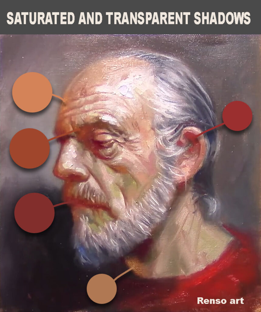
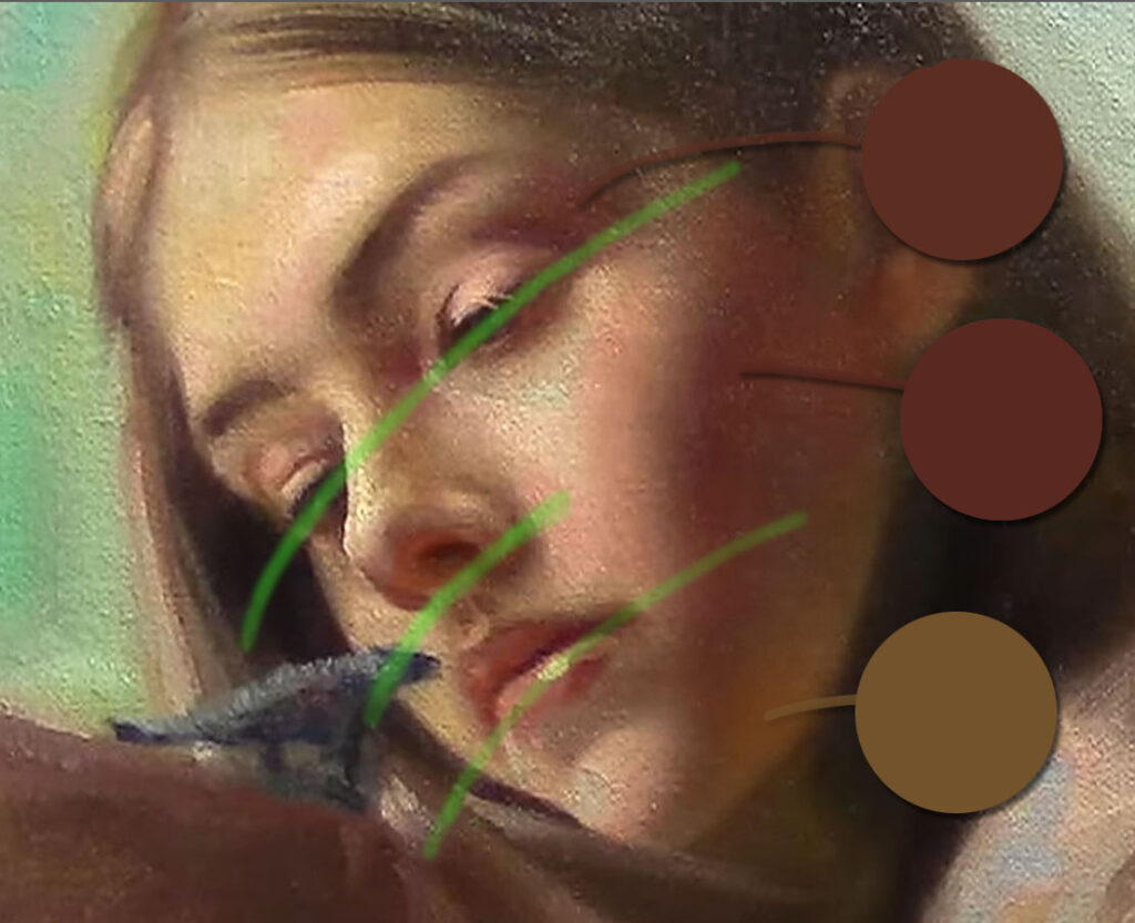
To understand this rule, you need to stop thinking about copying the colors in the shadows. I remember ignoring this rule because I was trying to match the skin tones as closely as possible. I even mixed the colors with a palette knife and brought it close to the model’s face—almost touching her skin—to compare if the color was accurate. When I finally understood this rule, I stopped trying to match the colors. It had been frustrating; I never felt completely comfortable when the colors didn’t match. But once you see how a transparent shadow creates volume in your paintings, you’ll realize that the interplay between color saturation and transparency in shadows is a subtle but powerful tool that goes beyond just matching the colors.
Understanding how these elements work together can elevate your artwork—making your scenes feel more luminous, natural, and alive. knowing when and how to use saturated colors in transparent shadows will help you create depth, harmony, and mood.
🌑 What Are Transparent Shadows?
Transparent shadows are shadows where the paint is applied in a thin, allowing the colors underneath to show through. This technique is especially common in oil painting and watercolor, where the use of medium (like linseed oil, turpentine, or water) affects how much the light passes through the paint.
Transparent shadows allow painters to:
- Suggest depth without heavy buildup of paint.
- Achieve a luminous, glowing effect, especially when layers of color interact.
- Keep the value range realistic, preventing shadows from becoming too dark or flat.
🌈 Where Does Saturation Come In?
Saturation refers to the intensity or purity of a color. Highly saturated colors are bold and vivid, while desaturated colors appear more muted or gray.
In general:
- Lit areas tend to feature stronger saturation, especially when directly hit by warm or cool light.
- Shadows, being areas of less direct light, are often less saturated—but not always.
Here’s where it gets interesting: shadows can still contain saturated color, especially when reflected light or colored environments influence them.
🔁 How Saturated Colors and Transparent Shadows Work Together
Contrary to the idea that shadows are always dull and gray, many artists use transparent paint to introduce rich, saturated hues into their shadows, often as a result of reflected light from nearby surfaces. For example:
- In a landscape, the blue of the sky may tint the shadows a rich violet or ultramarine.
- A red wall might reflect into the shadow side of a face, adding warm tones to the cooler shadow.
- In still life, nearby colored objects can “bounce” light into the shadows, enriching them with saturated hues.
By keeping the paint thin and transparent, artists allow these colors to glow subtly without overpowering the shadow’s depth.
🖌️ Practical Painting Tips:
- Keep shadows thin and lights thicker in paint
- Keep shadow colors cooler or warmer depending on your light source—this enhances realism.
- Introduce reflected local color into your shadows for harmony and color unity.
- Avoid over-mixing shadow colors; this can lead to dull, muddy results. Instead, layer colors for optical blending.
- Experiment with transparent pigments like Alizarin Crimson, Ultramarine Blue, or Burnt Sienna in your shadows.
🎯 Why This Matters Artist Learning Goals):
Artists who understand how to combine transparent painting techniques with saturated color in shadows will be able to:
- Create more realistic and vibrant artwork
- Add depth and mood to their compositions
- Avoid flat or lifeless shadow areas
- Improve their use of color theory in painting
- Develop a professional-level understanding of light and color