
How Colors Influence Each Other
Struggling with your portraits? You might find my E-book helpful. Click here
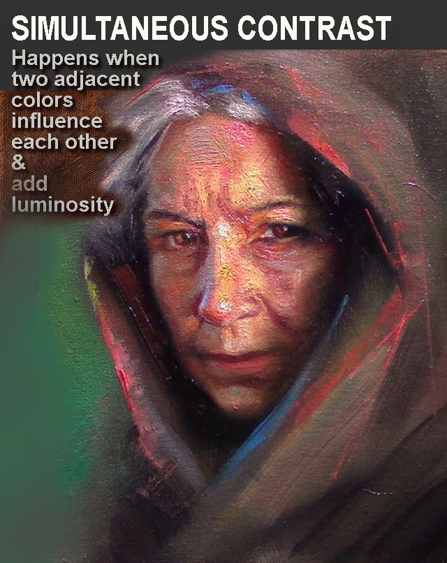
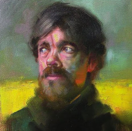
Color is never static. A single pigment can shift in hue, intensity, and even temperature depending on what surrounds it. This mesmerizing phenomenon—simultaneous contrast—is one of the most essential yet often overlooked principles in painting. Understanding it can revolutionize the way you mix, layer, and compose colors in your work.
What Is Simultaneous Contrast?
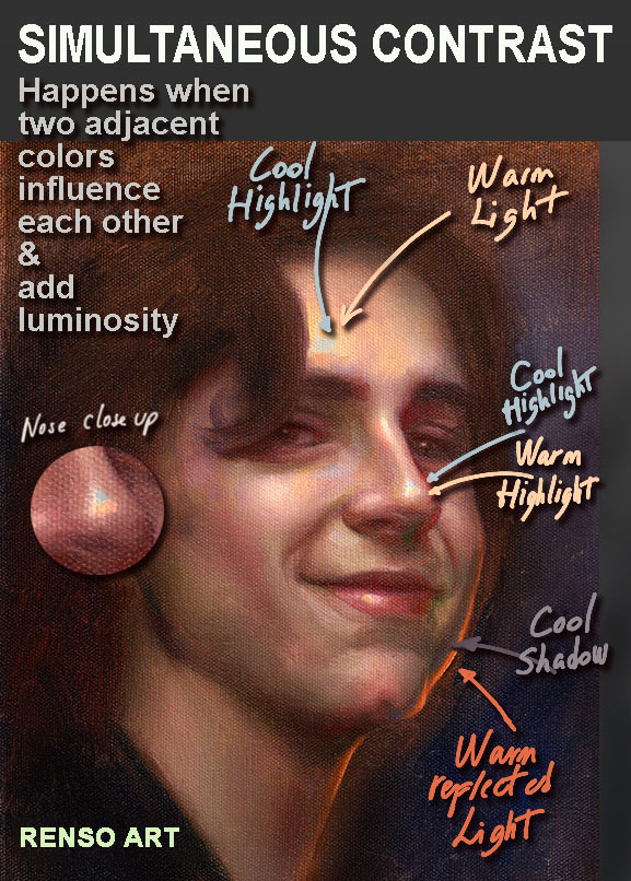
Simultaneous contrast occurs when two adjacent colors influence each other, altering our perception of their tone, brightness, and even hue. This effect is strongest with complementary colors (opposites on the color wheel) but happens across all color relationships.
Key Observations:
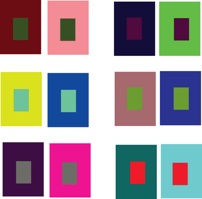
- A gray square on a red background will appear slightly greenish, while the same gray on a green background will look reddish.
- A bright yellow will seem more intense against black but washed out against white.
- Two different blues placed on different grounds may appear as entirely separate colors.
This isn’t just an optical trick—it’s rooted in how our eyes and brain process color.
The Science Behind the Illusion
French chemist Michel Eugène Chevreul first systematically studied simultaneous contrast in the early 19th century while working at the Gobelins Manufactory, a famous tapestry workshop. He noticed that when two colors were placed side by side, they appeared to repel each other, each taking on hints of the other’s complement.
This happens because of lateral inhibition in our visual system: our eyes exaggerate differences between adjacent colors to enhance edges and contrasts. Essentially, the brain amplifies the distinction, making colors appear more divergent than they truly are.
How Great Artists Have Used Simultaneous Contrast
Master painters have long exploited this effect to create vibrancy, depth, and movement:
1. Impressionists & Pointillists
Artists like Claude Monet and Georges Seurat used small strokes of contrasting colors to make their paintings shimmer. Instead of mixing green on the palette, they might place tiny dots of blue and yellow side by side, letting the viewer’s eye blend them optically—a technique that relies on simultaneous contrast.
2. Post-Impressionists & Fauvists
Vincent van Gogh intensified emotional impact by placing complementary colors (like blue and orange) next to each other, creating a vibrating energy. The Fauvists, like Henri Matisse, took this further, using wildly exaggerated color contrasts for expressive effect.

3. Modern & Abstract Art
From Josef Albers’ Homage to the Square series to Mark Rothko’s color fields, modern artists explored how color interactions could evoke mood and spatial illusions without traditional perspective.
Practical Applications for Painters
Want to harness simultaneous contrast in your own work? Here’s how:
1. Enhancing Luminosity
Instead of relying solely on white to lighten a color, try surrounding it with a darker or complementary hue. A dull orange can appear much brighter when placed next to a deep blue.
2. Creating Depth
Warm colors advance, while cool colors recede—but simultaneous contrast can amplify this. A red object against a green background will seem to pop forward even more due to the heightened contrast.
3. Mixing Colors Optically
Rather than blending pigments on the palette, try layering transparent glazes of complementary colors (like a red glaze over green underpainting) to create rich, luminous effects.
4. Correcting Perceived Color Shifts
If a color isn’t reading correctly, the issue might be its surroundings. Adjusting adjacent hues can make a muted tone appear more vibrant without repainting it.
Try This Experiment
To see simultaneous contrast in action:
- Paint a neutral gray square in the center of two differently colored backgrounds (e.g., one red, one green).
- Observe how the gray takes on a cooler or warmer tint depending on its surroundings.
- Repeat with other color combinations—like blue/orange or purple/yellow—and note the shifts.
Final Thoughts
Simultaneous contrast is more than just a technical curiosity—it’s a fundamental tool for controlling mood, emphasis, and harmony in painting. By mastering how colors interact, you can create works that pulse with energy, depth, and optical intrigue.
Have you noticed simultaneous contrast in your own paintings? Share your experiences or experiments in the comments!
Keep exploring, and let color surprise you! 🎨✨
*(For further study, check out Josef Albers’ *Interaction of Color* or Chevreul’s The Principles of Harmony and Contrast of Colors.)*